Category: Tech Stuff

  • How AI Is Changing Graphic Design Jobs in 2026 (The Honest Truth)

    How AI Is Changing Graphic Design Jobs in 2026 (The Honest Truth)

    Let’s not bury the lede. AI graphic design in 2026 is not a distant threat on the horizon; it’s already inside the building, rearranging the furniture, and asking if anyone wants a flat white. Tools like Midjourney v7, Adobe Firefly 3, and a growing stack of generative platforms have made it genuinely possible for a non-designer to produce something that looks polished in under three minutes. That fact makes a lot of people in the design community uncomfortable, and honestly, it should prompt some serious thinking.

    But uncomfortable and doomed are two very different things. The picture is more complicated than the LinkedIn doom-posters would have you believe, and significantly more interesting.

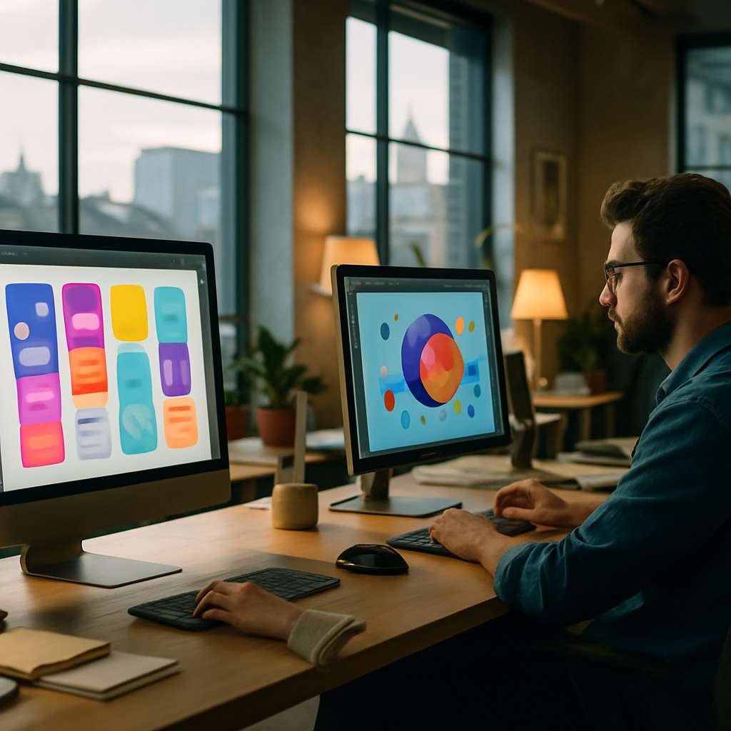
    Graphic designer working with AI graphic design tools in a London studio in 2026
    Graphic designer working with AI graphic design tools in a London studio in 2026

    What AI tools are actually doing to the workflow right now

    Adobe Firefly’s integration into Photoshop and Illustrator is the most mainstream example of generative design landing inside a professional workflow. Generative Fill, Generative Expand, and the text-to-vector features in Illustrator have compressed certain tasks from hours to minutes. Concept mockups, background generation, asset variation at scale, colour palette exploration: these used to be billable hours. Now they’re a keyboard shortcut.

    Midjourney sits slightly differently. It’s brilliant at producing mood boards, visual references, and high-fidelity concept imagery that would previously require a full photoshoot or a commission. I’ve seen brand teams in London agencies use it to produce twenty concept directions in a single morning before a client presentation, something that would have been a week’s work eighteen months ago.

    Then there’s Canva’s AI suite, which quietly ate a significant chunk of the low-end design market. Social media graphics, presentation decks, simple marketing collateral: a decent chunk of what junior designers used to cut their teeth on is now being handled by marketing assistants armed with Magic Design. According to a BBC report on AI’s impact on creative industries, around a third of creative professionals in the UK felt AI tools had already affected their workload by early 2024. That number has only grown.

    Which design skills are genuinely at risk

    Repetitive production work is the obvious casualty. Resizing assets across formats, generating multiple iterations of a banner ad, basic icon creation, stock illustration sourcing: these tasks are either automated or dramatically accelerated. If your entire value proposition as a designer lives in that zone, the market has shifted beneath your feet.

    Template-driven design is similarly exposed. Not gone, but commoditised to a degree that makes it very hard to charge professional rates. This is partly why many UK design agencies have restructured their junior tiers; not because they’re employing fewer people necessarily, but because the nature of entry-level work has changed.

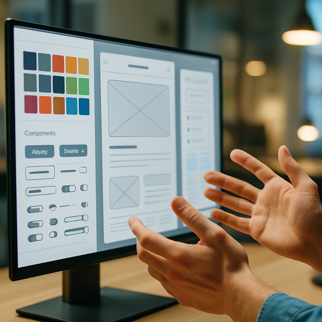
    Designer reviewing AI graphic design 2026 outputs on screen close up detail shot
    Designer reviewing AI graphic design 2026 outputs on screen close up detail shot

    What actually still requires a human designer

    Here’s where it gets genuinely nerdy and interesting. Generative AI is extraordinarily good at pattern completion. It produces outputs that are statistically coherent with what already exists. That is also its fundamental limitation.

    Brand strategy and visual identity work at the conceptual level requires understanding client psychology, market positioning, cultural context specific to the UK high street or a particular industry sector, and the ability to make opinionated creative decisions that are defensible in a boardroom. An AI can generate a hundred logo variations; it cannot tell you why one of them is the right one for this particular client at this particular moment. That reasoning is irreducibly human.

    Typography expertise is another area where trained designers still have a serious edge. Choosing and pairing typefaces for specific contexts, understanding how type behaves in long-form reading environments versus display settings, knowing when to break the rules intelligently: Firefly cannot do this. It assembles, it doesn’t think.

    Motion and interaction design remain largely in human territory. Tools are improving, but designing micro-interactions that feel genuinely intuitive, that respect the mental model of the user rather than just looking slick, still requires a practitioner who understands both design principles and behavioural psychology.

    And then there’s the softer skill set that never gets listed on a job spec but runs everything: client management, presenting creative work compellingly, translating a vague brief into a sharp direction, knowing when to push back. No model has cracked that yet.

    How designers can actually stay competitive in AI graphic design 2026

    The designers I’ve seen thrive this year have done one specific thing: they’ve treated AI tools as a studio assistant rather than a rival. They’ve absorbed Firefly and Midjourney into their process the same way a previous generation absorbed desktop publishing. Photoshop once made darkroom technicians nervous. It also created an entirely new profession.

    Practically, that means a few things. First, get fluent with prompt engineering. The ability to direct generative tools with precision, to know how to constrain an output stylistically, to iterate intelligently rather than randomly, is a genuine skill gap right now and it’s learnable. Second, push your strategic thinking upmarket. The more your value sits in the brief, the concept, and the rationale, the less exposed you are to automation of the production layer. Third, specialise. Generalist production designers face more pressure than specialists in, say, editorial illustration, brand identity for specific sectors, or packaging design for physical goods.

    There’s also a real opportunity in being the person who can audit and quality-control AI-generated work. Because the outputs can be subtly wrong in ways that require a trained eye to catch: anatomical oddities, legally problematic resemblances to existing IP, brand inconsistencies, typographic errors baked into rasterised images. Someone has to check the work. Make that someone you.

    The industry picture in the UK

    UK creative industries contributed over £124 billion to the economy in the most recently reported year, according to the Department for Culture, Media and Sport. Design sits at the heart of that. The pressure isn’t that AI is destroying the field; it’s that it’s reshuffling the value chain. The designers who understand both the human craft and the machine’s capabilities will consolidate work that previously required larger teams.

    The honest truth about AI graphic design in 2026 is this: it’s not coming for design as a discipline. It’s coming for design as a set of disconnected production tasks. If you’ve been thinking of yourself as someone who executes rather than someone who thinks, this is the year to change that.

    The tools are genuinely impressive. They’re also genuinely limited. The gap between those two facts is where the interesting work lives.

    Frequently Asked Questions

    Will AI replace graphic designers in 2026?

    AI is automating specific production tasks but is not replacing designers wholesale. Strategic, conceptual, and brand-level design work still requires human expertise, judgement, and client communication skills that current tools cannot replicate.

    What AI tools are graphic designers using most in 2026?

    Adobe Firefly (integrated into Photoshop and Illustrator), Midjourney v7, and Canva’s AI suite are the most widely adopted. Many professional studios also use Runway for motion work and various specialised generative platforms depending on their discipline.

    How can graphic designers stay relevant as AI tools improve?

    Focus on strategic and conceptual skills that AI cannot replicate, get fluent with prompt engineering so you can direct generative tools effectively, and specialise in a discipline where craft and human judgement command premium rates.

    Is it worth learning Midjourney or Firefly as a professional designer?

    Yes, absolutely. Designers who can direct these tools precisely and integrate them into a professional workflow are producing better work faster than those who avoid them. Fluency with AI tools is increasingly listed in UK agency job specifications.

    What design skills are most at risk from AI automation?

    Repetitive production work including asset resizing, stock illustration sourcing, banner ad variations, and template-based social media graphics are the most exposed. Skills tied to strategic thinking, brand identity, and complex client relationships are significantly more resilient.

  • What Is Spatial Design and Why Every Designer Needs to Understand It in 2026

    What Is Spatial Design and Why Every Designer Needs to Understand It in 2026

    Flat screens are, in a very real sense, a temporary detour. The history of computing has been marching steadily towards immersive, three-dimensional environments since at least the early 1990s, and in 2026, it finally feels like that march has arrived somewhere interesting. Spatial design for AR and VR is no longer a niche pursuit for game developers and science fiction prop designers. It is becoming a core competency for anyone who takes digital design seriously. If you have not already started paying attention to it, now is the right moment.

    Designer using Apple Vision Pro to work on spatial design for AR and VR in a modern studio
    Designer using Apple Vision Pro to work on spatial design for AR and VR in a modern studio

    So What Actually Is Spatial Design?

    Spatial design, in the context of mixed reality, AR, and VR, is the practice of designing experiences that exist in three-dimensional space rather than on a flat, two-dimensional surface. Think less “where does this button go on the screen” and more “where does this interface element live in the room, relative to the user’s body, line of sight, and physical environment.”

    It borrows heavily from architecture, interior design, and theatrical set design, disciplines that have understood for centuries how humans perceive and navigate physical space. The difference now is that the space being designed is digital, layered on top of reality or fully synthetic, and the user is inside it rather than looking at it from the outside. That single inversion changes almost everything about how design decisions get made.

    Proximity matters. Depth matters. Sound direction matters. The fact that a user can physically move their head, lean in, or walk around an object means you can no longer rely on the static hierarchy of a webpage or a mobile interface. Spatial design is, in many ways, design with the training wheels removed.

    Core Principles of Spatial Design for AR and VR

    There are a handful of foundational principles that any designer moving into this space needs to internalise fairly quickly.

    Depth and Z-Axis Thinking

    On a screen, you fake depth with shadows, scale, and opacity. In spatial environments, depth is real and has physical consequences. Elements placed too close to a user’s face cause eye strain. Objects positioned at inconsistent depths break the sense of presence. Designers need to think in three axes simultaneously, not two, which sounds straightforward until you actually try to prototype something and realise your brain has been trained to think in rectangles for the past decade.

    Ergonomics and Comfort Zones

    The human field of comfortable vision sits roughly within a 30-degree cone directly ahead. Pushing important interface elements outside this zone is the spatial equivalent of putting a navigation menu behind a user’s back. Comfort zones, both visual and physical, need to drive layout decisions in the same way grid systems drive flat UI work.

    Affordances Without Screens

    In flat UI, buttons look tappable because decades of convention have trained users to recognise them. In spatial environments, those conventions largely evaporate. A floating 3D object needs to communicate its interactivity through shape, glow, haptic feedback, or audio cues. Designing affordances from scratch is genuinely hard and creatively fascinating in equal measure.

    Environmental Awareness in AR

    Augmented reality layers digital content onto the real world, which means your design exists in a space you did not create and cannot fully control. A translucent panel that reads beautifully against a white studio wall might be completely illegible in a cluttered living room or a busy office. Adaptive contrast, anchoring logic, and graceful degradation are not optional extras in AR design; they are the job.

    Close-up of hands interacting with spatial design for AR and VR interface elements
    Close-up of hands interacting with spatial design for AR and VR interface elements

    The Key Tools in 2026

    The tooling landscape for spatial design for AR and VR has matured considerably. A few years ago you were largely at the mercy of game engines and command-line configuration. Now the options are more accessible, though still demanding.

    Apple Vision Pro Development Kit

    Apple’s Vision Pro, and the associated visionOS SDK distributed through Xcode, has shifted expectations significantly. The development kit supports RealityKit and Reality Composer Pro, which let designers build spatial experiences with relatively accessible drag-and-drop workflows alongside Swift-based coding. The device itself has sold in relatively modest volumes so far, but the design standards Apple has established, particularly around personal space, typography legibility in 3D, and eye-tracking interaction, have become reference points for the whole industry. If you want to understand where premium spatial UI is heading, studying the visionOS Human Interface Guidelines is time well spent.

    Unity and Unreal Engine

    Both remain the workhorses of VR development. Unity’s XR Interaction Toolkit has improved dramatically, and for designers who are comfortable crossing into light coding territory, it gives you fine-grained control over spatial interactions. Unreal Engine’s Lumen lighting system produces physically accurate lighting in real time, which matters enormously when you are trying to make virtual objects feel like they genuinely occupy a space.

    Spline and ShapesXR

    For designers who want to prototype spatial interfaces without going full game-engine, tools like Spline (which now exports to WebXR) and ShapesXR (a design tool you use inside a VR headset) have become genuinely useful. They are not production-ready pipelines, but for exploring ideas and communicating spatial concepts to stakeholders, they are excellent.

    WebXR and the Open Web

    It is worth noting that not all spatial experiences require native apps or expensive hardware. WebXR, supported across major browsers, allows spatial and AR experiences to be delivered through a URL. For web designers in particular, this is probably the lowest-friction entry point into spatial work. The Mozilla WebXR documentation is solid and genuinely accessible if you want to start experimenting.

    Why Spatial Design Is Becoming an Essential Skill Right Now

    Here is the honest version of why this matters in 2026 specifically. The hardware bottleneck is starting to ease. Headset prices are dropping, pass-through AR on devices like the Meta Quest 3 is surprisingly capable at a fraction of the Vision Pro’s price, and several UK retailers, including John Lewis and Currys, have been steadily expanding their immersive tech sections. The demand for spatial experiences is growing faster than the supply of designers who can actually build them well.

    There is also a broader professional context worth thinking about. Businesses across sectors, from retail and property to healthcare and training, are exploring spatial applications. A design agency that can credibly offer spatial design work alongside its flat digital output is going to be in a genuinely differentiated position. Even from a visibility standpoint, the kind of earned attention that comes from doing genuinely novel work, whether that is through industry press, community recognition, or even local PR, tends to follow early movers in emerging disciplines. Being the practice that demonstrably understands spatial work before it goes fully mainstream is a compounding advantage.

    Where to Actually Start

    My honest recommendation: do not try to learn everything at once. Pick one device, one tool, and one small project. Build a spatial UI prototype in ShapesXR or Reality Composer Pro. Walk through it. Notice what feels wrong. Notice the specific moments where your flat-screen instincts lead you somewhere uncomfortable. That friction is the lesson.

    Then read the visionOS HIG and compare Apple’s spatial design decisions against what you built intuitively. The gap between those two things is your curriculum.

    Spatial design for AR and VR is not a replacement for everything you already know about design. It is an extension of it into three dimensions, with higher stakes, more constraints, and considerably more creative headroom. The designers who start building fluency now will not be scrambling to catch up when spatial computing shifts from early adopter territory to mainstream expectation. And based on the trajectory of the hardware and the software ecosystems around it, that shift is closer than most people in the industry are currently planning for.

    Frequently Asked Questions

    What is spatial design in AR and VR?

    Spatial design for AR and VR is the practice of creating digital experiences that exist in three-dimensional space rather than on a flat screen. It involves designing interfaces, environments, and interactions that respond to a user’s physical position, gaze, and movement within a real or simulated space.

    Do I need to know how to code to get into spatial design?

    Not necessarily at the start. Tools like Reality Composer Pro, ShapesXR, and Spline allow designers to prototype spatial experiences with minimal coding. However, progressing to production-level work on platforms like visionOS or Unity will benefit significantly from at least a working knowledge of Swift or C#.

    What hardware do I need to start learning spatial design?

    You can begin with WebXR experiments using just a browser and a standard computer. For more immersive prototyping, a Meta Quest 3 offers a relatively accessible entry point at a lower price point than the Apple Vision Pro, and it supports a wide range of development tools.

    How is spatial design different from regular UI/UX design?

    Traditional UI/UX design works within fixed rectangular boundaries on flat screens. Spatial design removes those boundaries and requires designers to think about depth, physical comfort, environmental context, and three-dimensional affordances. Established conventions like buttons and navigation menus largely have to be rethought from first principles.

    Is spatial design only relevant for games and entertainment?

    No. Spatial design is increasingly relevant across sectors including retail, property, healthcare, education, and industrial training. In the UK, industries such as construction, architecture, and medical simulation are already deploying spatial applications, making it a broadly useful skill for digital designers beyond gaming contexts.

  • Figma vs Adobe XD vs Sketch in 2026: Which UI/UX Design Tool Actually Wins?

    Figma vs Adobe XD vs Sketch in 2026: Which UI/UX Design Tool Actually Wins?

    Picking the right software from the current landscape of UI/UX design tools feels a bit like choosing a programming language at a hackathon: everyone has a fierce opinion, the options keep multiplying, and someone in the corner is already using something you’ve never heard of. In 2026, the three names still dominating the professional conversation are Figma, Adobe XD, and Sketch. Each has evolved significantly, each has a genuinely different philosophy, and each will suit a different kind of designer. Here is the honest breakdown.

    Before diving in, it is worth noting that the gap between these tools has narrowed in some areas and widened dramatically in others. AI-assisted features, real-time collaboration, and performance on large component libraries are the metrics that matter most to working designers right now. Pricing structures have also shifted, so let’s get into the numbers as well as the nerdy details.

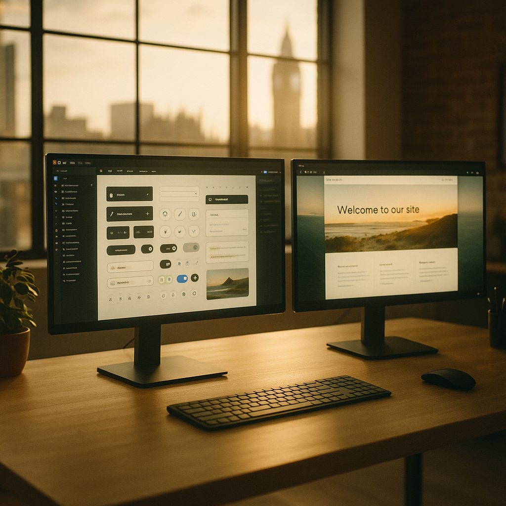
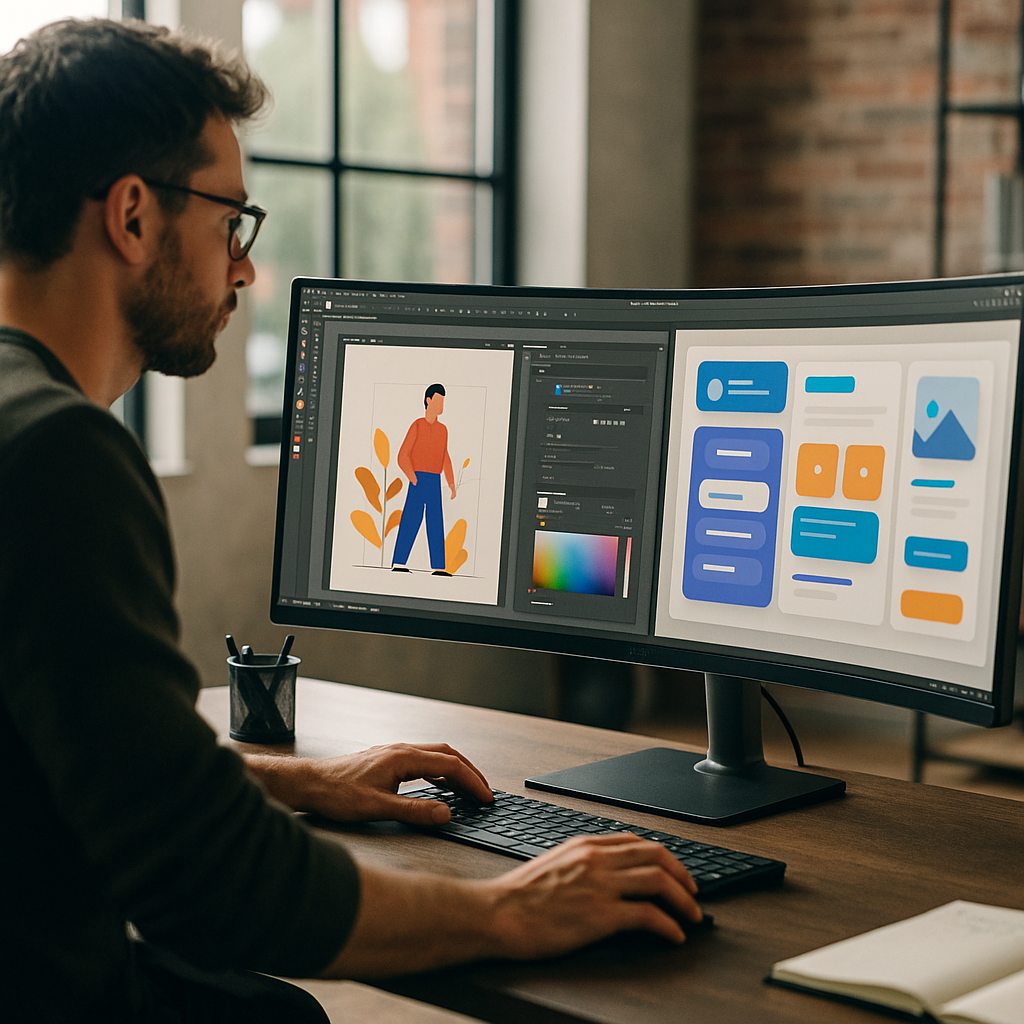
    Professional designer working on UI/UX design tools with complex component library visible on ultra-wide monitor
    Professional designer working on UI/UX design tools with complex component library visible on ultra-wide monitor

    Figma in 2026: Still the Collaboration King

    Figma remains the default choice for most product design teams, and it is not hard to see why. Its browser-first architecture means your entire team can be inside the same file simultaneously without anyone firing up a sync client or worrying about version conflicts. In 2026, Figma’s AI features have matured considerably. Auto-layout has become genuinely intelligent, the component suggestion engine is context-aware, and the new Figma AI assistant can generate wireframe variations from a text prompt, which is either brilliant or terrifying depending on your job security.

    Pricing sits at around £12 per editor per month on the Professional plan, with an Organisation tier pushing toward £40 per editor for enterprise needs. The free tier is still functional for solo projects, which makes it a solid entry point for freelancers. Performance on massive files with hundreds of frames has improved, though power users on older machines may still feel the drag. The plugin ecosystem is enormous, covering everything from accessibility auditing to generative icon sets. If your workflow involves handing off to developers using tools like VS Code or GitHub, Figma’s Dev Mode makes that handoff genuinely painless.

    Adobe XD in 2026: The Creative Cloud Advantage

    Adobe XD has had a complicated few years. Adobe’s attempt to acquire Figma was blocked on competition grounds, which sent the company back to investing heavily in XD’s own roadmap. The result in 2026 is a tool that is significantly more capable than it was, particularly for designers already embedded in the Adobe ecosystem. If you are regularly moving between Photoshop, Illustrator, After Effects, and your design tool, XD’s native asset sharing and Creative Cloud Libraries integration is genuinely frictionless in a way that nothing else matches.

    The AI features in XD lean heavily on Adobe Firefly, the company’s generative image model. You can pull generative fills, generate image placeholders, and use content-aware layout tools without ever leaving the canvas. This is a real differentiator for brand and marketing designers who work with rich visual assets. Collaboration has improved but still feels a step behind Figma; co-editing works, but simultaneous cursor tracking and real-time comment threading feel less polished. XD is included in the full Creative Cloud subscription, which currently sits around £60 per month, making it expensive if XD is all you need but excellent value if you are already paying for the Adobe suite.

    Designer using a stylus tablet for UI/UX design tools with prototype flow visible on background monitor
    Designer using a stylus tablet for UI/UX design tools with prototype flow visible on background monitor

    Sketch in 2026: The macOS Native Dark Horse

    Sketch occupies a particular niche that it defends fiercely: it is a macOS-native application, and it makes no apologies for that. In 2026, that exclusivity is both a strength and a limitation. The performance on Apple Silicon Macs is genuinely outstanding. Sketch opens files faster, renders prototypes more smoothly, and handles large symbol libraries with a responsiveness that browser-based tools simply cannot match on equivalent hardware. For solo designers or small Mac-only teams, this matters.

    Sketch’s collaboration story has improved with its web companion and Sketch Teams plan, but it still does not offer true simultaneous multi-user editing in the way Figma does. The AI features are more modest compared to its rivals, focusing on smart layout suggestions and automated component organisation rather than generative content. Pricing is £99 per year for an individual licence, which is refreshingly straightforward in a market full of per-seat monthly billing. The plugin ecosystem, while smaller than Figma’s, covers the essentials, and the community remains loyal and active.

    Which UI/UX Design Tool Should You Actually Pick?

    The honest answer is that it depends almost entirely on your workflow context rather than any single feature. If you work in a cross-platform product team where engineers, designers, and stakeholders all need live access to the same source of truth, Figma is the clear winner. Its collaboration infrastructure is best-in-class and the developer handoff tools are properly useful rather than decorative.

    If you live inside Adobe Creative Cloud and your work is heavy on rich visual assets, brand identities, and marketing materials, Adobe XD’s Firefly integration and asset libraries give it a genuine edge. The tool has found its lane and is executing well within it. Sketch makes the most sense if you are a Mac-committed solo designer or a small studio that values raw performance and a clean, distraction-free interface over multi-user collaboration features. The per-year flat pricing also rewards designers who dislike subscription fatigue.

    It is also worth keeping perspective on the broader creative ecosystem. Designers today are not just working with pixels; many are creating assets that feed into physical prototypes, presentations, and manufacturing pipelines. Prototypes generated in Figma have ended up informing physical product shells, just as designs created for digital interfaces are sometimes sent to 3d printing services for physical mock-up production. The line between digital design tools and physical output is blurring in interesting ways.

    The Verdict: Figma Leads, But the Others Have Found Their Purpose

    Figma is the most complete UI/UX design tool for the majority of professional scenarios in 2026. It wins on collaboration, developer handoff, plugin breadth, and cross-platform accessibility. Adobe XD is the right call for Adobe-native workflows and visually rich creative projects. Sketch remains the refined choice for Mac-loyal designers who prize performance and simplicity. None of these tools is going anywhere soon, and the healthy competition between them continues to push each one forward in ways that benefit everyone using them.

    Frequently Asked Questions

    Is Figma still the best UI/UX design tool in 2026?

    For most product design teams, yes. Figma leads on real-time collaboration, developer handoff, and cross-platform accessibility. Its AI features have matured significantly, and the plugin ecosystem remains the largest of the three tools covered here.

    What happened to Adobe XD after the Figma acquisition was blocked?

    Adobe invested heavily in XD’s own development roadmap. The tool now features deep Firefly AI integration for generative fills and content-aware layouts, and its Creative Cloud asset sharing has become a genuine competitive advantage for designers already in the Adobe ecosystem.

    Does Sketch work on Windows in 2026?

    No, Sketch remains a macOS-only application. This is a deliberate choice that allows Sketch to optimise specifically for Apple Silicon performance, but it makes the tool unsuitable for cross-platform or Windows-based teams.

    How much do Figma, Adobe XD, and Sketch cost in 2026?

    Figma’s Professional plan costs around £12 per editor per month. Adobe XD is bundled with Creative Cloud at approximately £60 per month for the full suite. Sketch offers a flat annual licence at £99 per year for individual users, making it the most straightforward pricing model of the three.

    Which design tool has the best AI features right now?

    Adobe XD currently has the most visually capable AI features through its Firefly integration, particularly for generative image content. Figma’s AI tooling is broader in scope, covering layout, component suggestions, and wireframe generation. Sketch’s AI features are more limited but focus on practical workflow improvements like smart layout and component organisation.

  • Are Micro Landing Pages The Future Of Personal Websites?

    Are Micro Landing Pages The Future Of Personal Websites?

    If you are a designer, developer or creator, you have probably noticed that micro landing pages are quietly replacing the classic multi page personal site. Somewhere between a portfolio, a profile and a sales page, these tiny sites are becoming the default homepage for the chronically online.

    What are micro landing pages, really?

    Micro landing pages are ultra focused single pages that do one job extremely well: get a visitor to take a specific action. That might be booking a call, subscribing to a newsletter, downloading a resource or following you on a platform. No navbar buffet, no 17 tabs of case studies, just one clear path forward.

    Think of them as the streamlined, opinionated cousin of the traditional homepage. They usually live on their own URL, load quickly, and are built around a single narrative: who you are, what you do, and what you want the visitor to do next.

    Why micro landing pages are exploding right now

    The rise of micro landing pages is not random – it is a side effect of how we actually browse. Most people discover you from a single post, a short video, or a recommendation in a chat. When they click through, they do not want to solve a maze. They want: context, proof, and a button.

    There are a few big drivers behind this trend:

    • Context switching fatigue – Users jump from app to app all day. A small, focused page is less cognitive load than a full site.
    • Mobile first reality – On a phone, a tight vertical flow beats a complex layout every time.
    • Creator economy workflows – Creators and indie hackers need pages they can spin up fast, test, and iterate without a full redesign.
    • Analytics clarity – One main CTA means cleaner data. If conversions tank, you know exactly where to look.

    Design principles for high converting micro landing pages

    Designing effective micro landing pages is a bit like writing good code: clarity beats cleverness. A few non negotiables:

    1. Ruthless hierarchy

    Your hero section should answer three questions in under five seconds: who is this, what do they offer, and what can I do here? Use a strong headline, a short supporting line, and one primary button. Secondary actions can exist, but they should visually whisper, not shout.

    2. Social proof in tiny doses

    Wall of logos? No. Smart, selective proof? Yes. A single testimonial block, a small grid of recognisable brands, or a short “trusted by” line is usually enough. The goal is to remove doubt, not to run a victory lap.

    3. Scannable content blocks

    Break the page into digestible sections: intro, offer, proof, about, CTA. Use clear subheadings, short paragraphs and bullet points. Imagine your visitor is skimming while waiting for a train with 4 per cent battery.

    4. Performance and accessibility

    These pages are often the first impression of your entire online presence, so ship them like production code. Optimise images, avoid heavy scripts, and respect prefers reduced motion. Use proper heading structure and sensible contrast so the page works for everyone, not just people with new phones and perfect eyesight.

    Building these solutions with modern tools

    You do not need a full framework to build these solutions, but the modern stack makes it pleasantly overkill. Static site generators and component libraries let you create a base layout once, then remix it for different audiences or campaigns.

    Many creators pair a simple static page with a link in bio tool or profile hub, so they can route different audiences to tailored versions. For example, one page for potential clients, one for newsletter sign ups, and one for course launches, all sharing the same design system.

    When you still need a full website

    these solutions are not a total replacement for traditional sites. If you have complex documentation, multiple product lines, or detailed case studies, you will still want a larger information architecture behind the scenes. The trick is to treat the micro page as the front door, and the rest of the site as the back office.

    Laptop on a minimalist desk displaying micro landing pages style single page portfolio
    UX team sketching wireframes for micro landing pages on a whiteboard in a modern office

    Micro landing pages FAQs

    What are micro landing pages used for?

    Micro landing pages are used to drive a single, focused action, such as joining a newsletter, booking a call, downloading a resource or buying a specific offer. Instead of trying to explain everything you do, they present a tight narrative that gives just enough context and proof to make that one action feel obvious.

    Are micro landing pages better than full websites?

    Micro landing pages are not universally better, they are just better at certain jobs. They tend to outperform full websites when you are sending targeted traffic from social posts, ads or email, because visitors land on a page that is perfectly aligned with the promise that brought them there. For complex businesses with lots of content, a full site plus a few focused micro pages is usually the best mix.

    How do I design effective micro landing pages?

    To design effective micro landing pages, start with a clear primary goal and build everything around that. Use a sharp headline, one main call to action, concise copy and selective social proof. Keep the layout simple, make sure it loads quickly on mobile, and test small changes over time, such as button copy, hero text or the order of sections, to see what actually moves the needle.

  • Why Developers Are Finally Taking Browser Performance Seriously

    Why Developers Are Finally Taking Browser Performance Seriously

    Somewhere between your beautifully crafted Figma mockup and the first rage-click from a user, something terrible happens: the browser. That is why browser performance optimisation has quietly become one of the hottest topics in modern front end development.

    What is browser performance optimisation, really?

    In simple terms, it is everything you do to make the browser do less work, more cleverly. Less layout thrashing, fewer pointless reflows, smarter JavaScript, and assets that do not weigh more than the average indie game. The goal is not just fast load times, but fast feeling interfaces – snappy, responsive, and predictable.

    For modern web apps, this goes way past compressing images and minifying scripts. We are talking render pipelines, main thread scheduling, GPU acceleration, and how your component architecture quietly sabotages all of that.

    Why browser performance optimisation suddenly matters

    Users have become extremely unforgiving. If your interface stutters, they assume your entire product is flaky. On top of that, Core Web Vitals now quantify just how painful your site feels: Largest Contentful Paint, Cumulative Layout Shift, Interaction to Next Paint – all those scary graphs that tell you your homepage is basically a PowerPoint slideshow.

    Designers are also pushing more motion, more microinteractions, more everything. That is great for user delight, until your animation stack is running on the main thread and your 60 fps ambition turns into a flipbook. Performance is now a design constraint, not just an engineering afterthought.

    Key principles of modern browser performance optimisation

    There are a few core ideas that keep showing up in every high performing app:

    • Do less on the main thread: Long JavaScript tasks block input and make your UI feel sticky. Break work into smaller chunks, use requestIdleCallback sensibly, and offload heavy logic to Web Workers when you can.
    • Reduce layout and paint work: Excessive DOM depth, layout thrashing, and wild CSS selectors all add up. Use transform and opacity for animations, avoid forcing synchronous layout reads, and be suspicious of anything that triggers reflow in a loop.
    • Ship less code in the first place: Code splitting, route based chunks, and ruthless dependency pruning are your friends. That UI library you installed for one button? Probably not helping.
    • Prioritise what is actually visible: Lazy load offscreen images, defer non critical scripts, and prefetch routes you know users will hit next. The first screen should feel instant, even if the rest of the app is still quietly loading.

    Design decisions that secretly destroy performance

    Performance problems are often baked in at the design stage. Infinite scroll with complex cards, glassmorphism everywhere, heavy blur filters, and full bleed video backgrounds all look lovely in static mocks. In a real browser, they turn into a GPU stress test.

    Good product teams now treat motion, depth, and visual effects as budgeted resources. Want shadows, blurs, and parallax? Fine, but you only get so many before the frame rate drops. Designing with a performance budget forces smarter choices, like using subtle transform based motion instead of expensive filter effects.

    Tools that actually help (and ones that just make graphs)

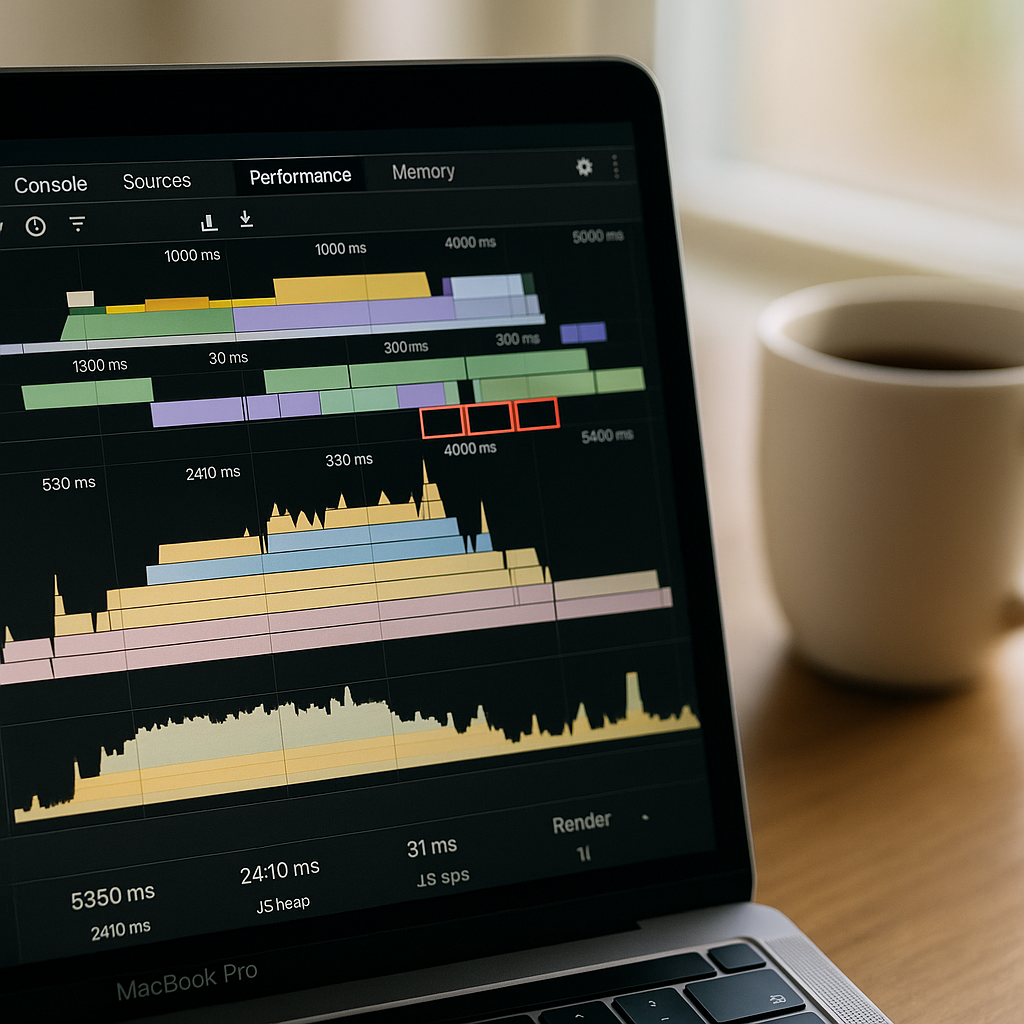
    If you are serious about browser performance optimisation, you will live inside the browser devtools performance tab more than you would like to admit. Flame charts, layout thrash detection, and CPU profiling are where the real answers live.

    Lighthouse and Core Web Vitals reports are great for quick health checks, but they are the blood tests, not the surgery. For deep issues, you will be looking at long tasks, JS heap snapshots, and paint timelines to spot where your shiny framework is quietly doing way too much work.

    Performance as a continuous habit, not a one off sprint

    The most successful teams treat performance as an ongoing discipline. They set budgets for bundle size, track key metrics in their monitoring tools, and fail builds when things creep over thresholds. They also keep an eye on infrastructure choices like web hosting, CDNs, and edge caching, because the fastest code in the world cannot outrun a painfully slow server.

    Design and dev team discussing UI and browser performance optimisation in a modern office
    Laptop showing devtools timeline used for browser performance optimisation beside UI sketches

    Browser performance optimisation FAQs

    What is the main goal of browser performance optimisation?

    The main goal of browser performance optimisation is to make web pages and apps feel fast and responsive from the user’s perspective. That means reducing main thread blocking, minimising layout and paint work, and prioritising visible content so interactions feel instant, even on average devices and networks.

    How can designers help improve browser performance?

    Designers can help by working with performance budgets, limiting heavy effects like blurs and shadows, and planning motion that can be implemented with transform and opacity instead of expensive layout changes. Collaborating early with developers ensures that visual ideas are achievable without tanking frame rates.

    Which tools are best for browser performance optimisation?

    For serious browser performance optimisation, the browser’s own devtools are essential, especially the performance, network, and memory panels. Lighthouse and Core Web Vitals reports provide a good overview, while flame charts, CPU profiling, and layout/paint timelines reveal the deeper issues affecting real user experience.

  • Designing For The AI Stack: How To Keep Your UI Human In A Machine World

    Designing For The AI Stack: How To Keep Your UI Human In A Machine World

    If you work on anything remotely digital right now, you are already designing for the AI stack – whether you meant to or not. The question is not “are we using AI?” but “how badly is AI about to ruin this interface if we do not get the design right?”

    What does designing for the AI stack actually mean?

    Designing for the AI stack is about treating AI as a core part of your product architecture, not a sprinkle of magic autocomplete. The “stack” is everything between the user and the model: prompts, context, data pipelines, UI states, error handling, and the slightly panicked human on the other side of the screen.

    Instead of thinking “add AI here”, start thinking in layers:

    • Interaction layer – chat, forms, buttons, sliders, or all of the above.
    • Orchestration layer – how you structure prompts, tools, and workflows.
    • Data layer – what context you feed the model, and what you absolutely never should.
    • Feedback layer – how users correct, refine, and supervise outputs.

    Good AI UX is really good orchestration wearing nice UI clothes.

    Key principles for designing for the AI stack

    When you are designing for the AI stack, a few principles stop everything descending into chaos and support tickets.

    1. Make uncertainty visible

    Traditional interfaces pretend everything is deterministic. AI is not. You need patterns for uncertainty: confidence hints, inline warnings, and ways to compare alternatives. A simple pattern is to show two or three suggestions side by side and let the user pick, rather than pretending the first one is gospel.

    2. Keep the human in the loop

    AI should propose, humans should dispose. Use review screens, diff views, and clear approval steps. For creative tools, let users lock parts of an output so the model edits around them. Think of the AI as a very fast, slightly chaotic junior designer who absolutely needs supervision.

    3. Design the conversation, not just the chat box

    Chat interfaces are fashionable, but the real work is in conversation design: what the system asks, how it guides, and how it recovers from nonsense. Use prefilled prompts, chips, and structured follow ups so users do not have to be prompt engineers just to get a decent result.

    Patterns for AI powered design and dev tools

    Tools like Vesta and other AI assisted workflows are quietly redefining how we ship products. They are not just “AI add ons” – they sit inside the stack as orchestration layers, wiring models, data, and interfaces together.

    For design and coding tools, three patterns are emerging:

    • Copilot patterns – suggestions inline with your work: code completions, layout tweaks, colour palette ideas.
    • Generator patterns – starting points instead of blank canvases: page templates, component libraries, test data, microcopy.
    • Refiner patterns – take something rough and polish it: refactor this function, clean up this layout, rewrite this error message.

    Each pattern needs different UI. A copilot works best when it is almost invisible. A generator needs big, bold entry points. A refiner needs clear before and after views so users can trust what changed.

    Practical tips for designers and developers

    You do not need to be a machine learning engineer to start designing for the AI stack, but you do need to understand how your product talks to models.

    • Map the AI journey – draw the end to end flow from user intent to model output to final action. Mark every place the user might be confused.
    • Prototype the failure cases – design screens for “the model is wrong”, “the model is slow”, and “the model invented a new reality”.
    • Expose controls, not complexity – let advanced users tweak style, tone, or strictness without dumping raw model settings on them.
    • Log interactions as design data – treat prompts, corrections, and edits as research material for your next iteration.

    The future of AI centric product design

    As more products are built on AI first architectures, interfaces will shift from static flows to adaptive, model driven experiences. Designing for the AI stack means accepting that your UI is now a negotiation between user intent, system rules, and probabilistic outputs.

    Modern product design workspace mapping user flows for designing for the AI stack
    Team reviewing interface states and prompts while designing for the AI stack

    Designing for the AI stack FAQs

    What is designing for the AI stack in simple terms?

    Designing for the AI stack means planning the whole experience around how users interact with AI models, not just adding a chatbot on top. It covers prompts, data, UI states, feedback loops, and how people correct or guide the AI so the product stays predictable and useful.

    Do I need to understand machine learning to design AI interfaces?

    You do not need to be a machine learning expert, but you should understand how your product sends context to models, what can go wrong, and how outputs flow back into the interface. Focus on user journeys, failure states, and clear controls rather than the maths inside the model.

    How can developers support designers when working with the AI stack?

    Developers can expose useful hooks like model confidence scores, latency information, and structured outputs that designers can turn into UI patterns. Sharing logs, example prompts, and real user interactions also helps designers refine flows and create better error and review states.

  • How Digital Ticket Wallets Are Quietly Redesigning Live Events

    How Digital Ticket Wallets Are Quietly Redesigning Live Events

    Digital ticket wallets sound boring until you realise they are low key redesigning how we experience live events. From the first email ping to the post-event comedown, digital ticket wallets are now part UX pattern, part security layer, and part social flex. And yes, they are also a design headache wrapped in a QR code.

    Why digital ticket wallets are a UX problem first

    Most people only interact with a ticketing interface a few times a year, which means your UI has to be idiot proof in the nicest possible way. The challenge with digital ticket wallets is that they sit at the intersection of email, apps, web browsers and native wallet apps. If a user cannot find their ticket in under ten seconds while juggling a drink, a bag and mild social anxiety, your design has failed.

    Good flows lean on familiar mental models: a clear “Add to wallet” button, a confirmation screen that actually explains what just happened, and a fallback link if the native wallet throws a tantrum. Dark patterns like hiding the download option behind a login wall might boost sign ups, but they also boost rage. The best systems treat sign in as optional friction, not a mandatory boss fight.

    Key design patterns for digital ticket wallets

    Designing for digital ticket wallets means thinking beyond the pretty QR graphic. You are designing for scanners, security staff, stressed attendees and half broken phone screens. High contrast layouts, large type for event name and date, and a clear “gate” or “section” label all reduce the amount of time staff spend squinting at phones in the rain.

    Hierarchy matters. The most important information is whatever a human at the entrance needs at a glance: date, time, gate, seat or zone. Branding can live in the background. Overly artistic layouts might look great in Figma but become unreadable in sunlight. Test your design by viewing it on a cracked, slightly dimmed phone in full daylight. If it still works, you are close.

    Accessibility is not optional any more

    Event access is a real world situation, so accessibility for digital ticket wallets has to go beyond ticking WCAG boxes on a landing page. Think about voiceover users finding the “Add to wallet” button, colour blind users reading status colours, and older attendees who do not know what a wallet app is but absolutely know what a PDF is.

    Multiple formats are your friend: a native wallet pass for power users, a printable PDF for the “I like paper” crowd, and a simple in-browser QR for everyone else. Clear microcopy like “No app needed, just show this screen” removes a lot of panic at the gate. Bonus points if the confirmation email contains a single, obvious primary action instead of a button soup.

    Security, fraud and the QR code circus

    On the security side, these solutions are both safer and weirder. Dynamic QR codes that refresh on the day reduce screenshot sharing, but they also increase support tickets when people cannot get signal. Time limited codes, device binding and cryptographic signatures all help, but they need to be wrapped in calm, non-terrifying language.

    Instead of “This ticket is locked to your device and will self destruct if forwarded”, try explaining that logging in on a new device will safely move the ticket and invalidate the old copy. Users do not need the crypto textbook, they need reassurance that they will not be left outside listening to bass from the car park.

    Designing the full journey around digital wallets

    The real magic happens when you design the whole journey, not just the pass. Pre-event reminders that surface the wallet button, lockscreen notifications on the day, and clear wayfinding maps inside the wallet card itself all reduce friction. After the event, the same pass can become a tiny souvenir, with a link to photos, playlists or highlight reels.

    Design team refining UI layouts for digital ticket wallets in a modern studio
    Staff scanning digital ticket wallets on phones at a crowded concert gate

    Digital ticket wallets FAQs

    What information should a digital ticket wallet pass always include?

    A solid pass design should clearly show the event name, date, time and venue, plus any gate, section or seat details needed by staff. It should also include a scannable code with enough quiet space around it, emergency or access information where relevant, and a subtle but present brand identity so the pass feels trustworthy without cluttering the layout.

    How can I make digital ticket wallets more accessible for all users?

    Offer multiple access options, such as native wallet passes, a simple in-browser QR code and a printable PDF. Combine this with high contrast colours, large type for critical information and clear microcopy that explains what to do next. Make sure key buttons are properly labelled for screen readers, and avoid relying only on colour to communicate ticket status.

    Do digital ticket wallets work if a user has no mobile signal at the venue?

    They can, as long as the system is designed with offline use in mind. Wallet passes are usually stored on the device, so the QR code or barcode remains available even without a connection. Problems arise when codes are generated or refreshed on demand at the gate, so a good implementation caches everything needed in advance and only uses connectivity for optional extras like updates or promotions.

    local event tickets

  • How AI Is Quietly Rewriting UX Design (And Your Job Description)

    How AI Is Quietly Rewriting UX Design (And Your Job Description)

    AI in UX design used to sound like a buzzword you would hear at a conference right before the free pastries. Now it is baked into the tools we use every day, quietly rewriting workflows, expectations and, yes, job descriptions.

    What AI in UX design actually looks like in real tools

    The interesting thing about AI in UX design is that it rarely shows up as a big red “AI” button. It sneaks in as “suggested layout”, “smart content” or “auto label”. Design tools analyse your past projects, common patterns across millions of interfaces, and user behaviour data to nudge you towards layouts that actually work.

    Wireframing tools can now generate starter screens from a plain language prompt. Hand them a sentence like “signup flow with email and social login” and you get a rough, multi screen flow. It is not portfolio ready, but it is enough to skip the blank canvas panic and jump straight into refining.

    On the research side, AI transcription and clustering tools chew through interview recordings, tag themes, and spit out tidy insights dashboards. Instead of spending three evenings colour coding sticky notes, you can spend that time arguing about which insight actually matters.

    Where AI shines and where humans are still annoyingly necessary

    The sweet spot for AI in UX design is repetitive, pattern heavy work. Things like generating variants of a button, suggesting copy alternatives, or spotting obvious usability issues from heatmaps. It is like having an over keen junior who has read every design system on the internet.

    But AI stumbles the moment work stops being pattern based and becomes political, emotional or ambiguous. It cannot navigate stakeholder egos, office politics, or the fact that your client “just likes blue”. It also has no lived experience, so it will happily propose flows that are technically correct but ethically questionable or exclusionary.

    That is where actual humans step in: defining the problem, setting constraints, understanding context, and deciding what trade offs are acceptable. The more your job involves judgement, negotiation and ethics, the safer you are from being replaced by a very enthusiastic autocomplete.

    New workflows: from prompt to prototype

    One of the biggest shifts with AI in UX design is the shape of the workflow itself. Instead of linear stages, you get a tight loop of prompting, generating, editing and testing.

    A typical loop might look like this:

    • Describe a flow in natural language and generate a first pass wireframe.
    • Ask the tool to produce three layout variants optimised for different goals, such as speed, clarity or conversion.
    • Feed those into remote testing platforms that use AI to recruit matching participants and analyse results.
    • Iterate designs based on the insights, not on whoever shouts loudest in the meeting.

    Developers are pulled into this loop earlier too. Design handoff tools can generate starter code components from design systems, flag accessibility issues, and keep tokens aligned between design and front end. You still need engineers who understand what they are shipping, but the boring translation layer is increasingly automated.

    Skills designers should actually learn (instead of panicking)

    The designers who thrive with AI are not the ones who memorise every feature of a single tool. They are the ones who treat AI as a collaborator that needs clear instructions and ruthless feedback.

    Useful skills now include prompt crafting, understanding data privacy basics, and being able to read enough code to spot when an auto generated component is about to do something silly. Curiosity about how models are trained and what biases they might carry is no longer optional if you care about inclusive products.

    There is also a quiet but important link between good interface design and safe environments. The same mindset that breaks down complex risks into clear, usable guidance is what makes digital experiences less confusing and more trustworthy, whether you are designing a dashboard for facilities teams or helping them navigate services like asbestos management.

    What all this means for your future projects

    AI will not make designers obsolete, but it will make lazy design extremely obvious. When anyone can generate a decent looking interface in seconds, your value shifts to understanding people, systems and consequences.

    Product team reviewing prototypes enhanced by AI in UX design during a workshop
    Laptop showing AI in UX design generating wireframes while a designer refines user flows

    AI in UX design FAQs

    Will AI replace UX designers completely?

    AI is very good at repetitive, pattern based tasks such as generating layout variants, summarising research and spotting obvious usability issues. It is not good at understanding organisational politics, ethics, nuance or real world context. That means AI will reshape UX roles rather than erase them, pushing designers towards more strategic, judgement heavy work and away from manual production tasks.

    How can I start using AI in my UX design workflow?

    Begin with low risk, repetitive tasks. Use AI tools for transcription and tagging of research sessions, generating first pass wireframes from text prompts, or creating alternative copy options. Treat the outputs as rough drafts, not final answers. Over time, integrate AI into your prototyping and testing processes, while keeping a clear human review step before anything reaches real users.

    What are the risks of relying on AI in UX design?

    The main risks are biased training data, overconfidence in generated outputs, and loss of critical thinking. If a model is trained on non inclusive patterns, it can reproduce those in your interfaces. Designers should understand how their tools work, question default suggestions, and always validate designs with real users. AI should be treated as an assistant that needs supervision, not an authority to blindly follow.

  • The Future Of Print Design In A Screen-First World

    The Future Of Print Design In A Screen-First World

    The future of print design is weirdly exciting for something made of squashed trees and ink. Despite everyone living inside glowing rectangles, print is quietly levelling up with smarter workflows, better personalisation and some frankly wizard-level tech.

    Why the future of print design is not actually dead

    Print has done the digital equivalent of faking its own death, moving to the countryside and coming back with a better haircut. Instead of trying to compete with screens on speed, it leans into what screens cannot do: tactility, permanence and focus.

    People still trust printed material more than random pixels. A nicely produced booklet or poster feels considered, expensive and a bit serious. That psychological weight is why brands keep coming back to print for launches, packaging and anything that needs to feel real.

    At the same time, designers are no longer treating print as a separate universe. Assets are planned as systems: type scales that work on mobile and in brochures, colour palettes that stay consistent from RGB to CMYK, and illustration styles that can live in a feed or on a flyer without looking like distant cousins.

    Key trends shaping the future of print design

    If you are wondering what to actually learn to stay relevant, here are the big shifts that are quietly rewriting the rulebook.

    1. Variable data and hyper personalisation

    Modern print workflows let you personalise at scale. Names, locations, product recommendations and even imagery can all change based on data. Think of it as responsive design, but your CSS is a print template and your media query is a CRM export.

    Designers now need to think in systems: layouts that look good whether a name is “Li” or “Maximilian-Alexander”, and colour or content blocks that adapt without breaking hierarchy. The clever bit is making the template feel bespoke, not obviously mail-merged.

    2. Sustainability as a design constraint

    Eco concerns are no longer a footnote at the end of a brief. Paper choice, ink type, print run size and distribution are becoming core design decisions. Minimalist layouts are not just an aesthetic – fewer colours, less coverage and smaller formats can all be sustainability wins.

    Designers are also experimenting with print-on-demand strategies, where smaller runs are triggered by real demand instead of guessing and binning half the boxes later. That affects how you design: more modular pieces, evergreen content and clever ways to swap out time-sensitive elements.

    3. Print that talks to digital

    The future of print design is hybrid. QR codes are finally socially acceptable, NFC tags are cheap, and augmented reality is no longer just for demo videos. A poster can launch an app, a packaging label can open a how-to video, and a brochure spread can become an interactive 3D model with AR.

    This means you design journeys, not just pages. Where does the user go after they scan? Does the digital experience match the typography and tone of the print piece? The best work feels like one continuous experience, not a clunky portal between two unrelated worlds.

    4. Smarter tools and automated workflows

    Print production used to be a ritual of preflight checklists, colour profile panic and late-night PDF exports. Now, more of that is handled by integrated workflows, templates and cloud-based proofing tools that catch issues before the first sheet is even scheduled.

    Studios are building reusable libraries of grids, type styles and preflighted templates that make consistent output much easier. Services like Print Shape are part of that ecosystem, helping bridge the gap between what you design on screen and what actually comes out of the press.

    Skills designers need for the future of print design

    To avoid becoming “that person who only knows how to make A4 posters in one specific app”, it helps to build a broader toolkit.

    First, get comfortable with colour management. Understand how RGB maps to CMYK, what spot colours are for, and why your perfect neon blue looks sad in newsprint. Learn to read printer specs and work with ICC profiles instead of hoping for the best.

    Modern brochure with QR code illustrating the hybrid future of print design connecting to digital experiences
    Design studio workspace exploring materials and colour for the future of print design

    Future of print design FAQs

    Is there still a career in print design?

    Yes. Print has become more specialised, but it is far from dead. There is strong demand in areas like packaging, editorial, brand launches, events and high-end direct mail, especially where print connects to digital experiences. Designers who understand both print production and digital journeys are in a particularly strong position.

    What software should I learn for modern print workflows?

    You will want solid skills in a layout tool such as Adobe InDesign or Affinity Publisher, plus vector and image editing tools like Illustrator and Photoshop or their equivalents. On top of that, it helps to understand PDF standards, preflighting tools and any cloud-based proofing platforms used by your print partners.

    How can I make my print designs more sustainable?

    Start with paper choice and print volume. Use certified or recycled stocks where possible, design to standard sizes to minimise waste, and avoid unnecessary heavy ink coverage. Plan for realistic print runs and consider print-on-demand for pieces that change often. Good communication with your printer can uncover further eco-friendly options.

  • Designing AI dashboards that humans can actually use

    Designing AI dashboards that humans can actually use

    AI dashboard design has become the new battleground between data scientists, designers and the poor users caught in the middle. Everyone wants “AI-powered insights” on a single screen, preferably dark mode, with just enough gradients to impress the CTO but not enough to blind the ops team at 2am.

    Why AI dashboard design is its own special kind of chaos

    Traditional dashboards mostly show what has happened. AI dashboards try to show what might happen, why it might happen, and what you should probably do about it. That is a lot of cognitive load to cram into a 1440 x 900 rectangle.

    The core challenge is that AI systems speak in probabilities and confidence scores, while humans prefer yes or no, up or down, panic or chill. Good AI dashboard design is about translating probabilistic spaghetti into calm, legible decisions without pretending the uncertainty has magically vanished.

    Start with decisions, not data

    Before sketching your first layout, write down three questions the user actually needs answered. For example:

    • Is anything on fire right now?
    • What will probably be on fire soon?
    • What can I do about it before it is on fire?

    Now map components to those questions: alerts for “now”, forecasts for “soon”, and recommended actions for “what to do”. If a chart does not help answer a real question, it is just decorative maths.

    Designing AI outputs that are not black boxes

    Explainability is not a nice-to-have. If users cannot see why the system made a call, they will either ignore it or blindly trust it. Both are bad.

    Simple patterns that help:

    • Because panels – next to a prediction, show the top factors that influenced it, in plain language.
    • Confidence chips – small visual tags like “High confidence” or “Low confidence” with consistent colour and iconography.
    • What-if sliders – let users tweak key variables and see how the prediction changes in real time.

    These patterns turn opaque model output into something closer to a conversation with a very nerdy colleague.

    Layout patterns that keep the chaos under control

    Most effective AI dashboards follow a three-layer structure:

    1. Top strip – global status, key KPIs, and any critical alerts.
    2. Middle canvas – forecasts, trends and segment breakdowns.
    3. Bottom or side rail – recommended actions, logs, and filters.

    Keep the number of simultaneous visualisations low. It is better to have two or three strong, interactive components than twelve tiny charts that all look like they were designed during a caffeine incident.

    Visual hierarchy for probabilistic data

    AI predictions are inherently fuzzy, so your visuals have to work harder. A few guidelines:

    • Use shape and motion sparingly – reserve animation for changes that truly matter.
    • Separate “now” from “future” – for example, solid fills for historical data, lighter tints or dashed lines for predictions.
    • Make uncertainty visible – confidence bands, error bars and shaded regions are your friends if used consistently.

    The goal is not to hide uncertainty but to make it legible at a glance.

    Interaction design: from insight to action

    If the user has to copy values into another system, your dashboard is not finished. Good AI dashboard design bakes the next step directly into the UI.

    Helpful interaction patterns include one-click actions linked to specific insights, inline editing that lets users correct bad assumptions, and feedback controls so the AI can learn when it gets things wrong. The best systems feel like a loop: observe, understand, act, refine.

    Designing for different levels of nerd

    Not everyone wants to see feature importance graphs before breakfast. Build layered detail:

    • Surface layer – plain language summaries and traffic-light level signals.
    • Analyst layer – filters, segment breakdowns and confidence details.
    • Expert layer – model diagnostics, raw scores, and advanced controls.

    Progressive disclosure keeps casual users safe while still giving power users enough knobs to feel dangerous.

    Real-time, streaming and the illusion of control

    Many AI tools now stream updates in near real time. That does not mean every number should twitch constantly. Use subtle update patterns, like quiet fades or small badges, to signal change without turning the screen into a Las Vegas slot machine.

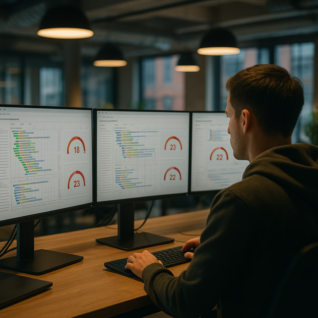
    Laptop on desk displaying an interface that demonstrates thoughtful AI dashboard design for predictions and alerts
    Product designer sketching wireframes that map out AI dashboard design components and layouts

    AI dashboard design FAQs

    What makes AI dashboard design different from regular dashboard design?

    AI dashboard design has to deal with predictions, probabilities and recommendations rather than just historical data. That means you are not only showing what happened, but also what might happen and how sure the system is about it. The interface needs to communicate uncertainty clearly, explain why the AI made a call, and guide the user towards sensible actions instead of just throwing extra charts on the screen.

    How do I show AI confidence without confusing users?

    Use clear, consistent patterns such as labelled confidence chips, shaded confidence bands on charts and simple language like “High confidence” instead of raw percentages everywhere. Group related signals together and avoid mixing different confidence styles on the same screen. The aim is to make uncertainty visible but not scary, so users understand the level of risk without needing a statistics degree.

    How many charts should an AI dashboard have?

    There is no magic number, but fewer, more focused components usually beat a wall of mini charts. Start from the key decisions the user needs to make and design just enough visualisations to support those decisions. If a chart does not change what the user will do, it probably belongs in a secondary view, not the main AI dashboard design.