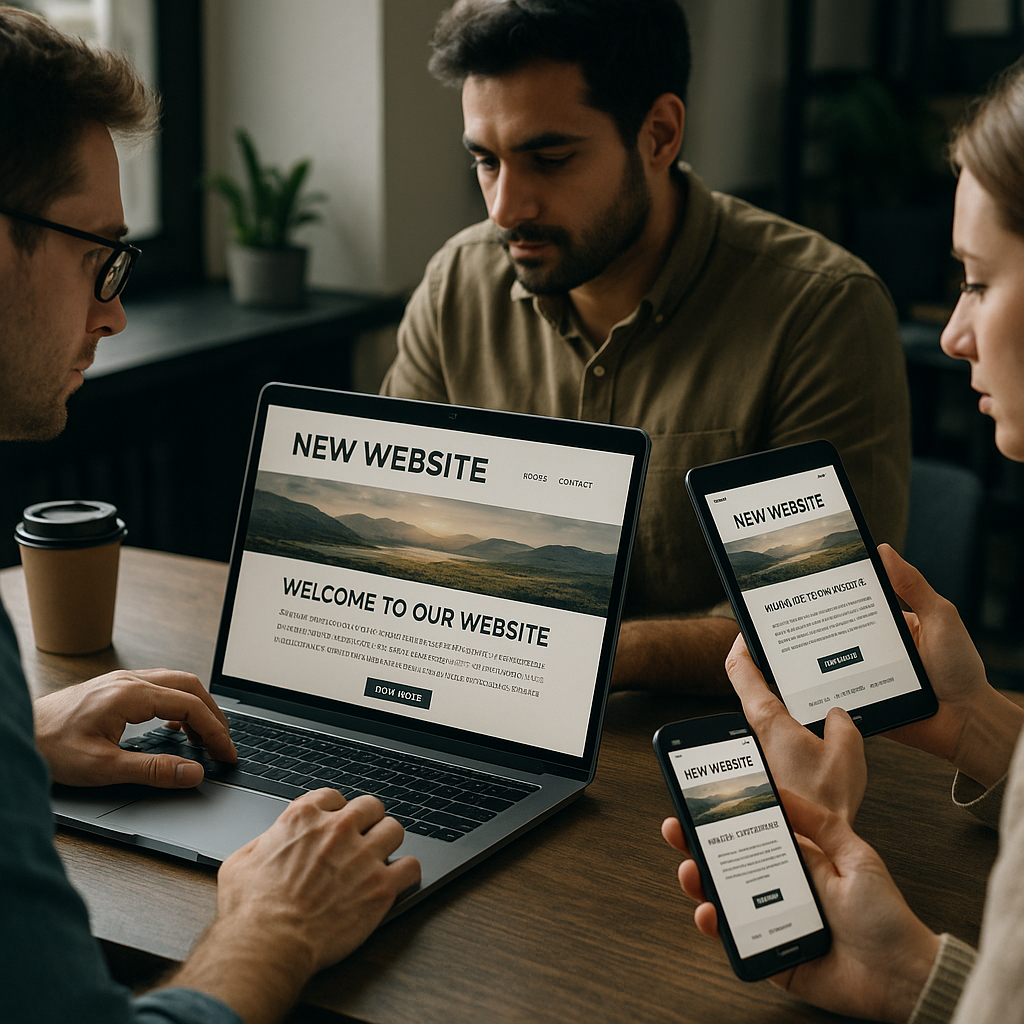
Every year the design community collectively agrees to either resurrect something from the mid-2000s or invent something so futuristic it makes your GPU weep. Web design trends 2026 is doing both simultaneously, and honestly, it’s a brilliant time to be building things for the browser. Whether you’re a front-end developer, a UI/UX designer, or someone who just really cares about whether buttons have the right border radius, this breakdown is for you.
Spatial and Depth-First Layouts Are Taking Over
Flat design had a long, productive run. Then material design added some shadows. Then we went flat again. Now in 2026, we’ve gone properly three-dimensional, not in the garish way of early 3D web experiments, but in a considered, compositional way. Depth-layered layouts use parallax scrolling, perspective transforms, and layered z-index stacking to create genuine visual hierarchy. The result is that pages feel like physical environments rather than documents. Tools like Spline have made it genuinely accessible to embed real-time 3D objects directly into HTML without a WebGL PhD. Expect to see more of this everywhere, particularly in portfolio and product landing pages where the wow factor matters.
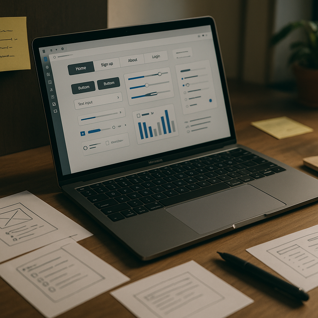
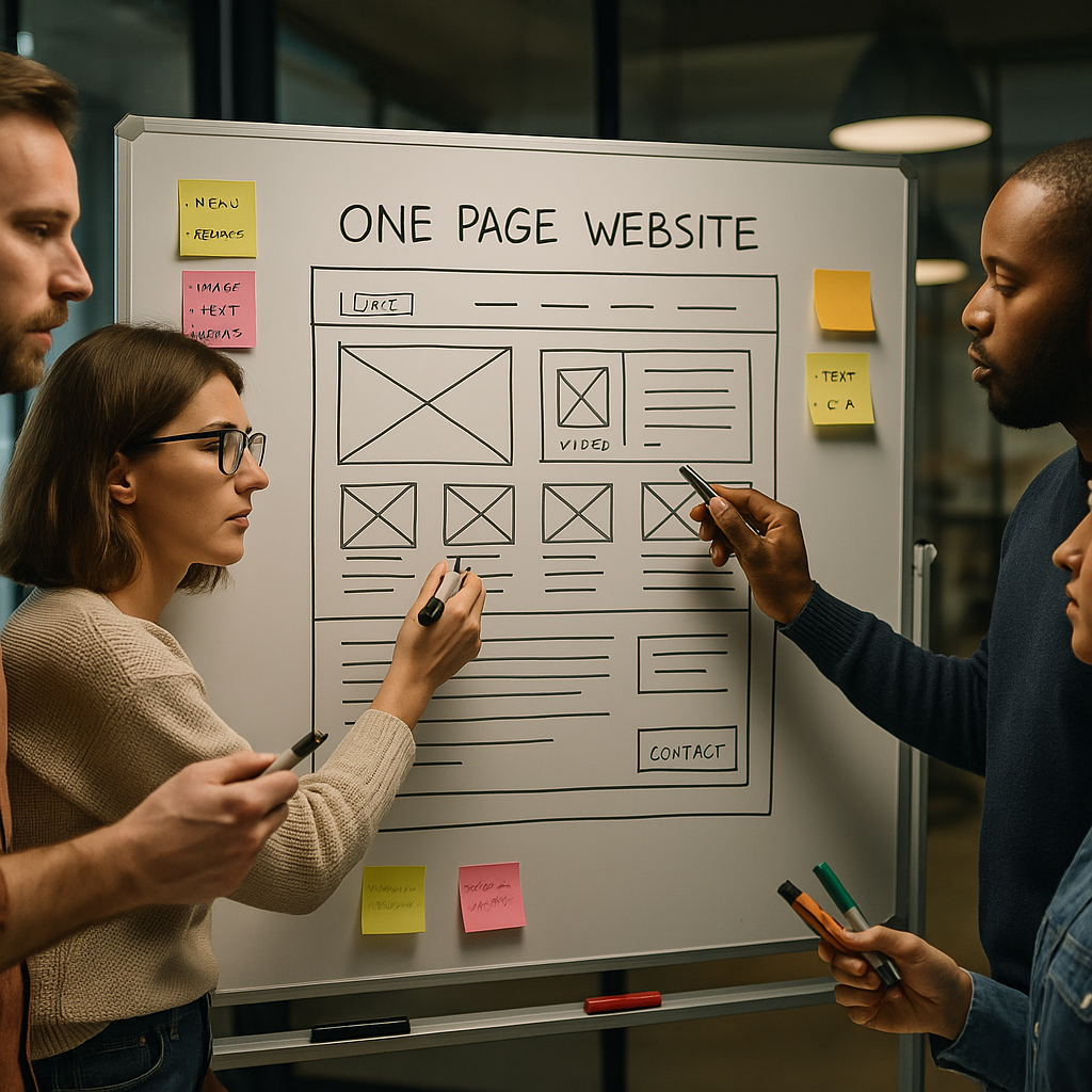
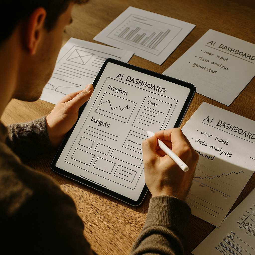
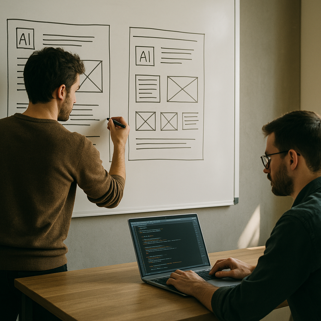
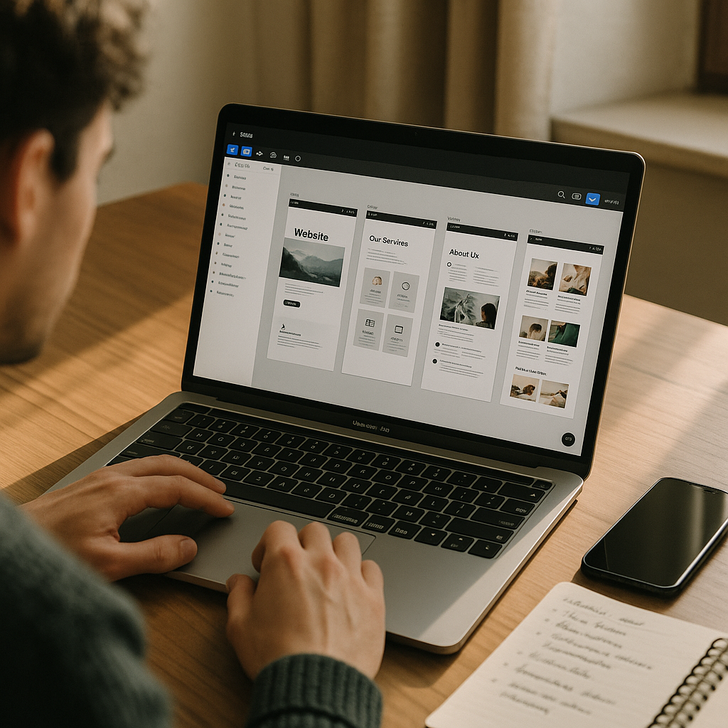
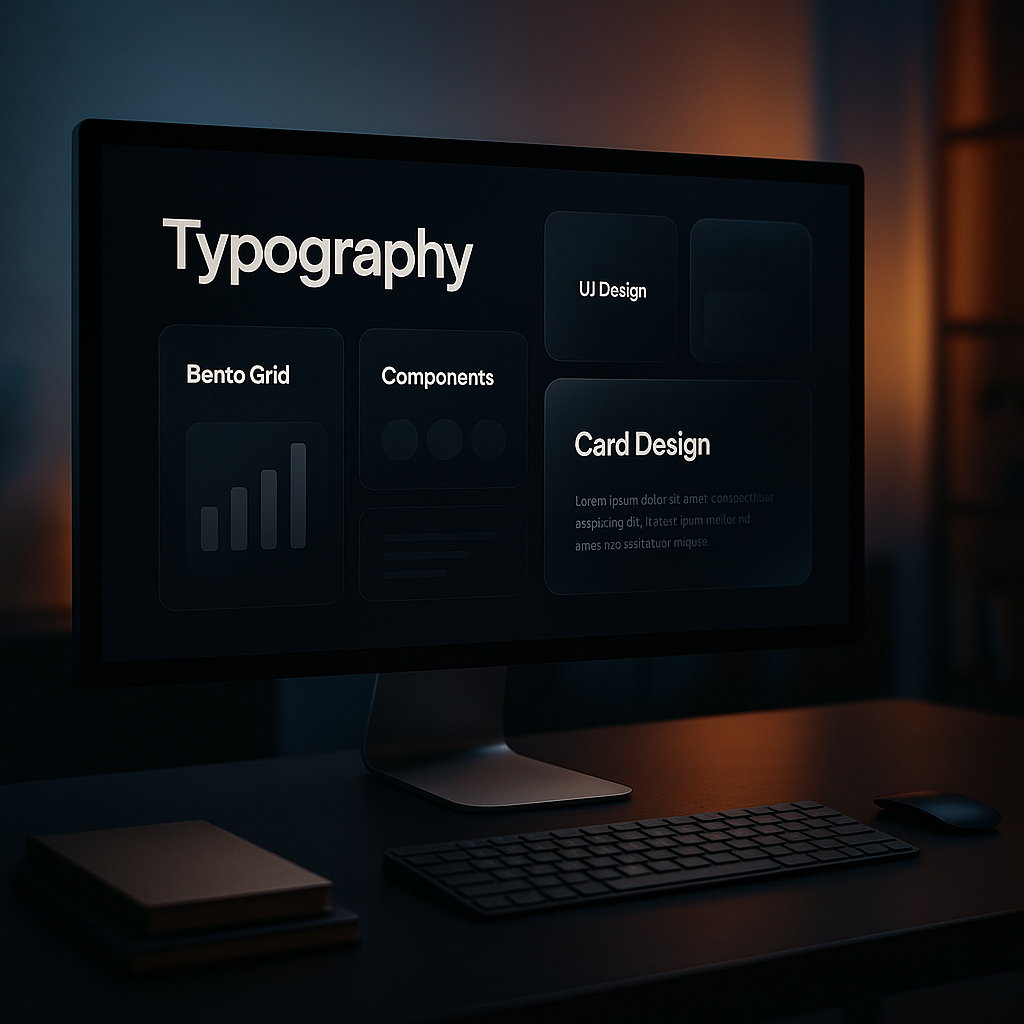
Bento Grid UI: The Comeback Nobody Predicted
If you’ve used a modern Apple product page or poked around any SaaS marketing site recently, you’ll have noticed the bento grid. Named after the Japanese lunchbox, it’s a modular card-based layout where different-sized blocks tile together into a satisfying, information-dense composition. It suits responsive design brilliantly because the grid reshuffles gracefully at different breakpoints. CSS Grid makes building these layouts genuinely pleasant in 2026, especially with subgrid now enjoying solid browser support. The bento aesthetic pairs particularly well with dark mode, glassmorphism-style card surfaces, and tight typographic hierarchy. It’s functional, it’s beautiful, and it photographs brilliantly for design portfolios.
Typography Is the New Hero Image
Variable fonts arrived with a fanfare a few years ago and then quietly became the backbone of modern typographic design. In 2026, designers are weaponising variable font axes to create scroll-triggered typography that morphs weight, width, and slant as users move down the page. This kind of kinetic type is replacing traditional hero imagery on some of the most forward-thinking sites. It loads faster than a full-bleed photograph, it’s fully accessible, and it communicates personality in a way stock imagery simply cannot. Combine that with oversized display type, expressive serif revivals, and deliberate optical sizing, and you’ve got a typographic toolkit that would make any old-school print designer jealous.
Glassmorphism Is Maturing (Finally)
Glassmorphism, the blurred frosted-glass UI style, went through an unfortunate phase where every junior designer applied backdrop-filter: blur() to absolutely everything and called it a day. In 2026, it’s matured considerably. The best implementations use it sparingly: a navigation bar that subtly frosts as you scroll, a modal that layers convincingly over a dynamic background, a card component that catches light from a gradient behind it. The key is that the blur serves a function, either indicating hierarchy, suggesting elevation, or drawing focus, rather than existing purely for aesthetic show. CSS backdrop-filter now has excellent cross-browser support, which means there’s no longer an excuse for dodgy fallback hacks.
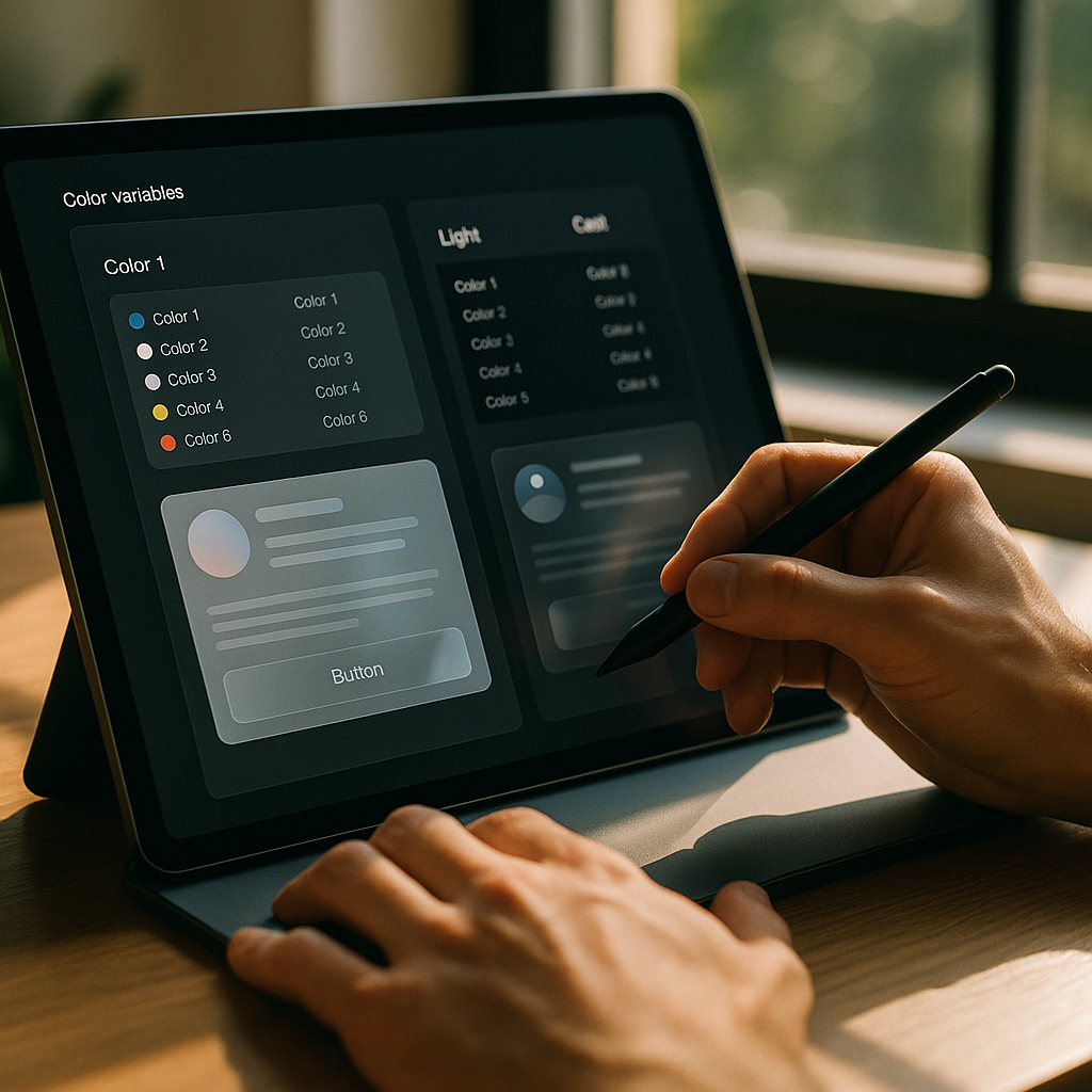
Dark Mode as a Design System Decision, Not an Afterthought
Dark mode used to be something you bolted on after the fact with a CSS class toggle and a prayer. The more sophisticated approach emerging strongly in web design trends 2026 is to design systems where dark mode is a first-class citizen from day one. That means defining colour tokens that semantically describe purpose rather than appearance, using prefers-color-scheme at the design system level, and testing contrast ratios in both modes before a single component ships. Tools like Figma’s variables and Tokens Studio have made this genuinely tractable. The payoff is enormous: a site that feels considered and intentional in both light and dark contexts rather than washed out in one of them.
Micro-Interactions and Haptic-Informed Animation
The bar for what counts as a satisfying interaction has risen sharply. Users expect buttons to respond, loaders to feel alive, and transitions to communicate logic rather than just look pretty. In 2026, the design community has developed a much stronger vocabulary for micro-interactions: the subtle scale on a card hover, the spring physics on a menu open, the progress indicator that communicates exactly what’s happening during a wait state. Libraries like Motion (formerly Framer Motion) and GSAP continue to lead here, but native CSS is closing the gap fast with @starting-style and the View Transitions API enabling smoother page-level transitions without JavaScript dependency.
Brutalism and Raw Aesthetics Still Have a Seat at the Table
Not everything in 2026 is polished and refined. There’s a persistent, deliberate counter-movement of raw, brutalist web design that rejects smooth gradients and gentle rounded corners in favour of stark borders, visible grids, high-contrast type, and unashamedly functional layouts. It works particularly well for creative agencies, editorial platforms, and cultural organisations that want to signal authenticity rather than corporate polish. The trick is that good brutalist web design isn’t lazy, it’s extremely intentional. Every exposed grid line and monospaced font choice is a decision, not a default.
What Web Designers Actually Need to Learn Right Now
If you’re mapping out your skills for the year ahead, the practical priorities are clear. Get comfortable with CSS Container Queries, which have changed how component-level responsive design works at a fundamental level. Understand the View Transitions API and how it enables page-transition animation natively. Get fluent in design tokens and how they connect design tools to production code. And spend time with variable fonts, because kinetic typography is not going away. Web design trends 2026 reward designers who can close the gap between visual intent and technical implementation. The closer you can get those two things to the same person, the better the work gets.
Frequently Asked Questions
What are the biggest web design trends in 2026?
The most prominent web design trends in 2026 include spatial 3D layouts, bento grid UI systems, kinetic variable font typography, matured glassmorphism, and micro-interactions driven by spring physics and native CSS APIs. Dark mode as a first-class design system decision is also a major shift from previous years.
Is flat design still relevant in 2026?
Flat design has largely given way to depth-first and spatial layouts that use layering, perspective, and 3D elements to create visual hierarchy. That said, brutalist and stripped-back aesthetics, which share some DNA with flat design, remain very much alive for editorial and creative contexts.
What CSS features should web designers focus on in 2026?
Container Queries are essential for component-level responsive design and are now widely supported. The View Transitions API enables smooth page transitions without heavy JavaScript. The @starting-style rule and native CSS scroll-driven animations are also significantly changing how micro-interactions are built.
How do I implement dark mode properly in a web design project?
The modern approach is to use semantic colour tokens in your design system that describe function rather than specific colour values, then map them to light and dark values using the prefers-color-scheme media query. Tools like Tokens Studio and Figma Variables make this workflow practical, allowing both modes to be designed and tested from the start.
What tools are web designers using in 2026 for 3D and animation?
Spline is widely used for embedding real-time 3D objects into websites without deep WebGL knowledge. For animation, GSAP and Motion (formerly Framer Motion) remain industry standards, though native CSS is increasingly capable with scroll-driven animations and the View Transitions API reducing reliance on JavaScript libraries.