

Design systems have gone from being the exclusive obsession of large product teams at Monzo or the BBC to something every serious designer and developer needs to understand. And honestly? The barrier to entry has never been lower. If you want to build a design system in Figma 2026 that actually scales, that your devs will love, and that won’t collapse into chaos six months later, this guide is for you. We’re going step by step, and we’re bringing Tokens Studio along for the ride, because design tokens are where the real power lives.
Why Design Tokens Are the Foundation You Can’t Skip
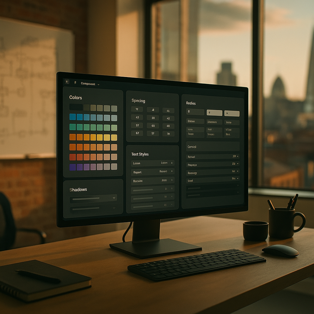
Before you touch a single component, you need to sort your tokens. Think of tokens as variables for your design decisions. Colour values, spacing increments, font sizes, border radii, shadow depths, all of it lives in tokens rather than being hard-coded into individual components. The moment you hardcode #1A1A2E directly into 47 components, you’ve built a maintenance nightmare, not a system.
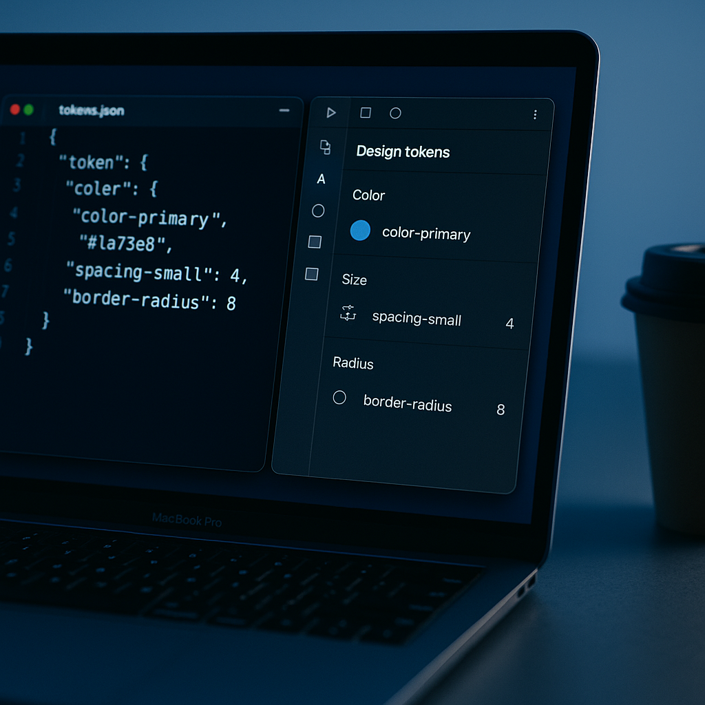
Tokens Studio (the Figma plugin) lets you define, organise, and sync tokens in a JSON format that your developers can consume directly. It also integrates with Style Dictionary, which transforms those tokens into platform-specific outputs: CSS custom properties for the web, Swift constants for iOS, XML for Android. That’s the handoff pipeline sorted before a single component is drawn.
Naming Your Tokens Properly
Naming is where most teams go wrong. There are broadly three tiers of tokens, and understanding them saves enormous grief later.
- Primitive (global) tokens: Raw values.
color.blue.500 = #3B82F6. These are the periodic table of your system. Never reference them directly in components. - Semantic (alias) tokens: Meaningful assignments.
color.action.primary = {color.blue.500}. This is what your components actually reference. - Component tokens: Scoped to a specific component.
button.background.default = {color.action.primary}. Optional but powerful for complex components.
The reason for this three-tier structure? When your brand pivots from blue to teal (and it will happen, trust me), you update one primitive token and the entire system propagates the change. Magic, but actually just good architecture.
Setting Up Tokens Studio in Figma
Install Tokens Studio from the Figma Community. Once it’s running, you’ll see a panel where you can create token sets. Start with a global set for your primitives and a semantic set that references them. In Tokens Studio, you reference another token using curly brace syntax: {color.blue.500}.
For teams working collaboratively, connect Tokens Studio to a GitHub repository. Your token JSON lives in source control alongside your code. Designers push token changes via the plugin; developers pull them and run Style Dictionary to generate updated CSS variables. The design-to-code gap narrows dramatically. According to the UK Government Design Principles, consistency and clarity are foundational to good service design, and a token-based system is precisely how you enforce both at scale.
Component Architecture: Building for Scale
Now the fun part. Components in Figma should follow an Atomic Design hierarchy, even if you don’t call it that out loud in your team documentation.
Atoms First
Build your smallest, indivisible elements first. Buttons, input fields, checkboxes, radio buttons, badges, icons. Each atom should use semantic tokens exclusively, never raw values. Use Figma’s component properties to handle variants: state (default, hover, active, disabled), size (small, medium, large), and hierarchy (primary, secondary, ghost).
Keep each atom in a dedicated page or dedicated section within a page. Organise your layers obsessively. Naming matters here: use the Group/Component Name slash convention so Figma’s asset panel presents them cleanly. Button/Primary/Default reads like a file path, which is exactly what it is.
Molecules and Organisms
Molecules combine atoms into slightly more complex chunks. A form field is a molecule: it combines a label atom, an input atom, and a helper text atom. An organism is a full section: a navigation bar, a hero block, a card grid. Each layer of composition should reference its children as nested component instances, not as detached copies. Detaching components is the design system equivalent of deleting a git history.
Using Figma Variables Alongside Tokens Studio
Figma’s native Variables (introduced in 2023 and considerably more mature now in 2026) and Tokens Studio overlap in interesting ways. Figma Variables are great for live mode switching, light and dark themes, for instance, because they’re native to the runtime. Tokens Studio is better for complex multi-brand setups and for the developer export pipeline. In practice, many teams use both: Variables for the Figma-side interactive prototyping experience, Tokens Studio for the actual production handoff. It’s not either/or; it’s knowing which tool solves which problem.
Developer Handoff That Doesn’t Make Developers Want to Quit
When you build a design system in Figma 2026, the handoff process is where the theory meets reality. A few non-negotiable practices:
- Token JSON in the repo: Developers should be able to run
npm run build:tokensand get updated CSS custom properties automatically. No more screenshots of hex codes. - Component documentation: Use Figma’s built-in description fields to document intended behaviour, states, and usage restrictions. If a component shouldn’t be used without an icon, say so in the description.
- Storybook integration: If your devs are working in React or Vue, push them towards maintaining a Storybook instance that mirrors the Figma component library. When the two drift apart, you have a system problem, not a communication problem.
- Change logs: Every token or component update should be logged. A simple markdown file in the repo works fine. Designers tend to forget that a subtle colour tweak can break contrast ratios across an entire product.
Keeping the System Alive (The Hard Bit)
Building a design system is about 30% of the work. The other 70% is governance, iteration, and adoption. Appoint a system owner, even if it’s a rotating responsibility. Schedule quarterly audits of your token sets and component library. Create a clear contribution process so product teams can propose additions without every random one-off component ending up in the core library.
Teams that genuinely succeed at this, whether they’re a ten-person startup in Sheffield or a hundred-person product org in London, share one trait: they treat the design system as a product in its own right. It has a roadmap, a backlog, and real users (the rest of the design and engineering team).
The payoff is real. Faster prototyping, dramatically reduced QA cycles, consistent accessibility compliance, and designers who can spend their time solving actual UX problems rather than recreating the same button variant for the fourteenth time. That’s why so many teams are keen to build a design system in Figma 2026 rather than continuing to wing it with ad hoc component libraries.
If you take one thing from all of this: start with your tokens. Get the naming right. Everything else builds on top of that foundation, and a solid foundation means the whole system scales without drama. Now go make something properly good.
Frequently Asked Questions
What is a design token and why does it matter for a design system?
A design token is a named variable that stores a design decision, such as a colour value, spacing size, or font size. Rather than hardcoding raw values into components, you reference tokens, which means updating a single token automatically propagates changes across the entire system without manual edits.
Do I need to pay for Tokens Studio to use it with Figma?
Tokens Studio has a free tier that covers basic token management and is perfectly usable for small teams or solo projects. The Pro tier unlocks advanced features like GitHub, GitLab, and Azure DevOps sync, multi-file token sets, and themes, which are essential for larger product teams managing multiple brands or complex theming.
What is the difference between Figma Variables and Tokens Studio?
Figma Variables are a native Figma feature suited to live prototype switching, such as toggling between light and dark mode directly in the canvas. Tokens Studio is a plugin that excels at complex token structures, multi-brand setups, and generating developer-ready outputs via Style Dictionary. Many teams use both together rather than choosing one over the other.
How long does it take to build a design system from scratch in Figma?
A basic but functional token-based design system with core atoms and a documented handoff pipeline can take one to three weeks for an experienced designer working full-time. A comprehensive system covering typography, spacing, colour, elevation, motion, and a full component library for a mature product can take two to four months. The governance and adoption phase never really ends.
How do I make sure developers actually use the design system?
The single biggest driver of developer adoption is reducing friction in the handoff process. When tokens are available as auto-generated CSS custom properties or platform-specific constants directly from the repo, developers don’t need to manually transcribe values, which removes a major pain point. Maintaining a Storybook that mirrors the Figma library also helps bridge the gap between design intent and coded implementation.
Leave a Reply