

There’s a particular kind of satisfaction in watching a design trend get buried, declared dead, mocked on Twitter (or whatever it’s called now), and then quietly come roaring back because the hardware finally caught up with the vision. That’s exactly what’s happened with glassmorphism. The frosted-glass, translucent-panel aesthetic that peaked around 2021 and then got absolutely roasted for being impractical is now showing up everywhere again, and this time it actually makes sense. Glassmorphism app design in 2026 isn’t nostalgia. It’s a legitimate design choice backed by real technical capability.
What Is Glassmorphism (And Why Did It Struggle the First Time Round)?
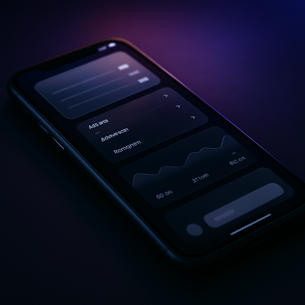
If you missed the first wave, glassmorphism is the UI style characterised by frosted-glass panels, background blur effects, subtle transparency, and soft light-refracting aesthetics. Think macOS’s menu bar, Apple’s iOS control centre, or Microsoft’s Fluent Design system. Elements appear to float above a blurred background layer, giving interfaces a sense of depth and physical plausibility that flat design completely abandoned.
The original problem was brutal and specific: backdrop-filter: blur() on the web was a performance nightmare. On mid-range Android phones from 2020 to 2022, rendering a blurred background behind a translucent card while also doing anything else was genuinely painful. Frame rates tanked. Battery drained. Designers who loved the look had to either fake it with static backgrounds or accept that their beautiful UI was going to feel like treacle on half the devices their users owned. So most of them abandoned it.
Why Glassmorphism App Design in 2026 Is Different
The shift is hardware-led, and it’s significant. Modern mobile chipsets, including the Snapdragon 8 Elite and Apple’s A18 series, have dedicated graphics processing paths that handle compositing and blur operations at a fraction of the battery cost of three years ago. GPU-accelerated backdrop filters are no longer the performance sin they once were on flagship and even mid-range devices.
On the web side, browser support has matured considerably. backdrop-filter now enjoys solid support across Chrome, Firefox, Safari, and Edge without any prefix gymnastics. The BBC’s technology coverage has tracked how the push toward richer visual interfaces correlates directly with the upgrade cycle of UK consumers, and the average device in use today is significantly more capable than it was even two years ago. That matters enormously for UI decisions.
There’s also the OS context to consider. Both iOS and Android have doubled down on blur-heavy system UI. When the operating system itself is built around layered translucency, designing apps that match that visual language no longer feels like a quirk. It feels cohesive.
The Visual Logic: Why Our Brains Actually Love It
Glassmorphism works because it maps to physical intuitions we already have. Frosted glass exists in the real world. We understand instinctively that a frosted panel sits in front of something else, that it has depth, that the blurred content behind it is contextually present but not primary. That spatial relationship communicates hierarchy without requiring heavy borders, hard shadows, or solid backgrounds.
This is where glassmorphism diverges from skeuomorphism, the old Apple approach of making everything look like leather or wood. Glassmorphism doesn’t pretend to be a physical object. It borrows one physical property (translucency and blur) to create a spatial metaphor, then stays resolutely digital in every other respect. That’s a much more elegant theft.
The result is interfaces that feel light, airy, and contextually aware. A card floating over a dynamic wallpaper or a live map background feels alive in a way that a solid-colour card simply doesn’t. It gives designers a tool for expressing hierarchy that doesn’t rely purely on typography scale or colour contrast.
How to Implement Glassmorphism Without Killing Performance
Right. Let’s get into the actual craft, because this is where people still go wrong.
Use backdrop-filter Sparingly and Wisely
The biggest mistake is stacking multiple blurred layers. Each backdrop-filter: blur() call creates a new compositing layer and forces the browser to re-render everything behind it on every frame. One or two blurred panels on a page: fine. Six overlapping ones with different blur radii: you’ve just built a slideshow.
My rule of thumb is that blur should be reserved for the single most important overlay element on screen at any given time. A modal? Yes. A notification toast? Only if it’s the only one. Your entire card grid? Absolutely not.
Control Your Blur Radius
Bigger blur values aren’t always better. A radius between 10px and 20px tends to give the frosted glass effect without punishing the GPU too severely. Anything above 40px starts to look mushy and costs more to render. Resist the urge to crank it up. The aesthetic lives in subtlety.
Use Will-Change Strategically
Adding will-change: transform to a glassmorphic element hints to the browser that it should promote the element to its own compositing layer in advance. This can smooth animations significantly when glass panels are sliding in or out. But use it only on elements that actually animate. Slapping it on everything is the equivalent of pre-loading every image on a 200-page site.
CSS You Actually Need
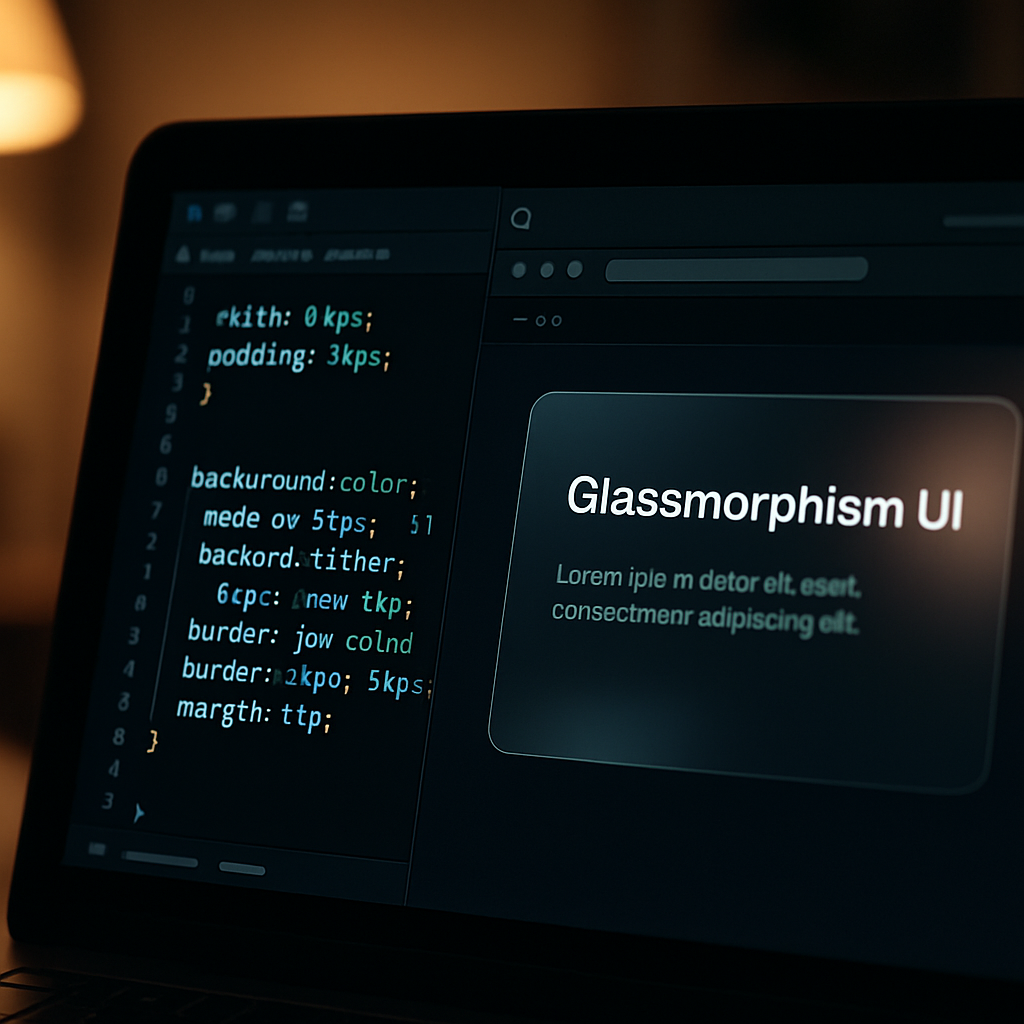
A clean glassmorphism card in CSS looks roughly like this:
.glass-card {
  background: rgba(255, 255, 255, 0.15);
  backdrop-filter: blur(14px);
  -webkit-backdrop-filter: blur(14px);
  border: 1px solid rgba(255, 255, 255, 0.25);
  border-radius: 16px;
  box-shadow: 0 4px 24px rgba(0, 0, 0, 0.12);
}
The border is critical. That thin, semi-transparent white border is what sells the glass edge. Without it, you just have a blurry box. The -webkit-backdrop-filter prefix is still worth including for older Safari versions on iOS devices, which are notoriously slow to die in the wild.
Dark Mode and Glassmorphism: A Natural Pairing
Glassmorphism lives its best life in dark environments. Translucent panels over dark, gradient-rich backgrounds create enormous visual depth. The effect on a light background can work, but it requires much higher contrast on the glass panel itself to maintain accessibility, and you risk the whole thing looking washed out.
If you’re building for dark mode (and in 2026, you really should be building for both), lean into deep, vivid backgrounds: midnight blues, dark purples, near-black gradients with colour at the edges. The glass floats above those backgrounds in a way that feels genuinely spectacular when done well. The WCAG contrast requirements still apply to any text inside those glass panels, so don’t let the aesthetic override readability.
Where Glassmorphism Works Best Right Now
It’s not a universal solution. Glassmorphism suits interfaces where visual richness is expected: music players, dashboard applications, portfolio sites, onboarding flows, and modal overlays. It’s less appropriate for dense data tables, long-form reading environments, or anything where visual noise competes with information density.
The apps doing it best right now are treating it as an accent rather than an entire design language. A glassmorphic header over a solid-content area. A frosted overlay for settings panels. A translucent notification card sliding in from the edge. That restraint is what separates a considered design from something that looks like a Dribbble concept that never survived first contact with real users.
Used with that kind of discipline, glassmorphism app design in 2026 isn’t a trend. It’s a mature technique in a designer’s toolkit, finally with the hardware support it always deserved.
Frequently Asked Questions
What is glassmorphism in app design?
Glassmorphism is a UI design style that uses frosted-glass-like translucency, background blur effects, and subtle transparency to create a sense of depth and layering. It’s characterised by semi-transparent panels with blurred backgrounds behind them, creating a spatial, light aesthetic.
Is glassmorphism bad for performance on mobile?
It used to be, particularly on mid-range Android devices from 2020 to 2022 where backdrop-filter blur was GPU-intensive. In 2026, modern chipsets handle compositing far more efficiently, making glassmorphism much more viable. The key is still to limit the number of blurred layers active simultaneously.
How do I create a glassmorphism effect in CSS?
The core CSS uses backdrop-filter: blur() combined with a semi-transparent background (rgba), a subtle white border, and a soft box-shadow. Keep blur radius between 10px and 20px for best performance, and always include the -webkit-backdrop-filter prefix for Safari compatibility.
What's the difference between glassmorphism and neumorphism?
Glassmorphism uses translucency and blur to simulate frosted glass, creating a sense of floating depth above a background layer. Neumorphism uses soft shadows and highlights to simulate extruded or indented surfaces on a flat background. They’re both post-flat design trends but achieve very different visual results.
Does glassmorphism work well with dark mode?
Yes, it works exceptionally well in dark mode. Translucent glass panels over deep, gradient-rich dark backgrounds create striking visual depth. It’s generally harder to execute cleanly in light mode, where the contrast between panel and background is lower and accessibility becomes more challenging to maintain.
Leave a Reply