Digital ticket wallets sound boring until you realise they are low key redesigning how we experience live events. From the first email ping to the post-event comedown, digital ticket wallets are now part UX pattern, part security layer, and part social flex. And yes, they are also a design headache wrapped in a QR code.
Why digital ticket wallets are a UX problem first
Most people only interact with a ticketing interface a few times a year, which means your UI has to be idiot proof in the nicest possible way. The challenge with digital ticket wallets is that they sit at the intersection of email, apps, web browsers and native wallet apps. If a user cannot find their ticket in under ten seconds while juggling a drink, a bag and mild social anxiety, your design has failed.
Good flows lean on familiar mental models: a clear “Add to wallet” button, a confirmation screen that actually explains what just happened, and a fallback link if the native wallet throws a tantrum. Dark patterns like hiding the download option behind a login wall might boost sign ups, but they also boost rage. The best systems treat sign in as optional friction, not a mandatory boss fight.
Key design patterns for digital ticket wallets
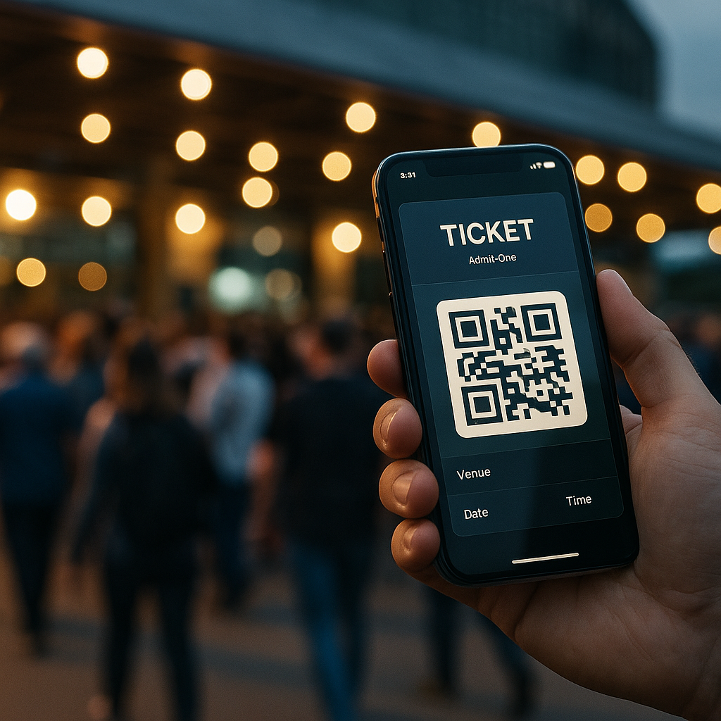
Designing for digital ticket wallets means thinking beyond the pretty QR graphic. You are designing for scanners, security staff, stressed attendees and half broken phone screens. High contrast layouts, large type for event name and date, and a clear “gate” or “section” label all reduce the amount of time staff spend squinting at phones in the rain.
Hierarchy matters. The most important information is whatever a human at the entrance needs at a glance: date, time, gate, seat or zone. Branding can live in the background. Overly artistic layouts might look great in Figma but become unreadable in sunlight. Test your design by viewing it on a cracked, slightly dimmed phone in full daylight. If it still works, you are close.
Accessibility is not optional any more
Event access is a real world situation, so accessibility for digital ticket wallets has to go beyond ticking WCAG boxes on a landing page. Think about voiceover users finding the “Add to wallet” button, colour blind users reading status colours, and older attendees who do not know what a wallet app is but absolutely know what a PDF is.
Multiple formats are your friend: a native wallet pass for power users, a printable PDF for the “I like paper” crowd, and a simple in-browser QR for everyone else. Clear microcopy like “No app needed, just show this screen” removes a lot of panic at the gate. Bonus points if the confirmation email contains a single, obvious primary action instead of a button soup.
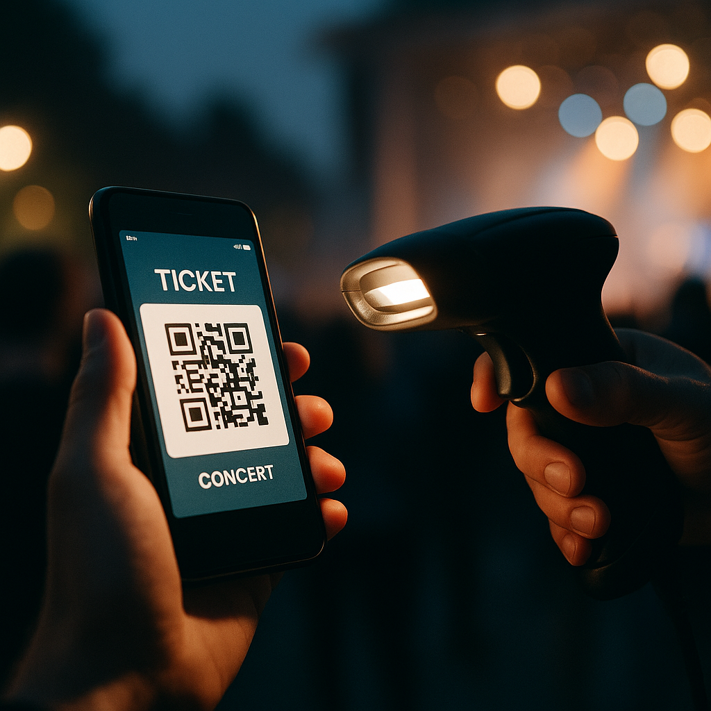
Security, fraud and the QR code circus
On the security side, these solutions are both safer and weirder. Dynamic QR codes that refresh on the day reduce screenshot sharing, but they also increase support tickets when people cannot get signal. Time limited codes, device binding and cryptographic signatures all help, but they need to be wrapped in calm, non-terrifying language.
Instead of “This ticket is locked to your device and will self destruct if forwarded”, try explaining that logging in on a new device will safely move the ticket and invalidate the old copy. Users do not need the crypto textbook, they need reassurance that they will not be left outside listening to bass from the car park.
Designing the full journey around digital wallets
The real magic happens when you design the whole journey, not just the pass. Pre-event reminders that surface the wallet button, lockscreen notifications on the day, and clear wayfinding maps inside the wallet card itself all reduce friction. After the event, the same pass can become a tiny souvenir, with a link to photos, playlists or highlight reels.

Digital ticket wallets FAQs
What information should a digital ticket wallet pass always include?
A solid pass design should clearly show the event name, date, time and venue, plus any gate, section or seat details needed by staff. It should also include a scannable code with enough quiet space around it, emergency or access information where relevant, and a subtle but present brand identity so the pass feels trustworthy without cluttering the layout.
How can I make digital ticket wallets more accessible for all users?
Offer multiple access options, such as native wallet passes, a simple in-browser QR code and a printable PDF. Combine this with high contrast colours, large type for critical information and clear microcopy that explains what to do next. Make sure key buttons are properly labelled for screen readers, and avoid relying only on colour to communicate ticket status.
Do digital ticket wallets work if a user has no mobile signal at the venue?
They can, as long as the system is designed with offline use in mind. Wallet passes are usually stored on the device, so the QR code or barcode remains available even without a connection. Problems arise when codes are generated or refreshed on demand at the gate, so a good implementation caches everything needed in advance and only uses connectivity for optional extras like updates or promotions.
Leave a Reply