Category: Apps

  • Designing App Interfaces for the UK’s Ageing Population: What WCAG Doesn’t Tell You

    Designing App Interfaces for the UK’s Ageing Population: What WCAG Doesn’t Tell You

    WCAG compliance is the floor, not the ceiling. I’ve reviewed dozens of digital products built by UK teams who ticked every accessibility checkbox, shipped their app, and then watched users aged 60 and over abandon it within two minutes. The guidelines cover contrast ratios and keyboard navigation. They do not cover the lived reality of designing for someone who has never used a smartphone until their late fifties, has some degree of age-related macular degeneration, and finds most app navigation patterns genuinely baffling. App design for older users UK accessibility is a specialist discipline, and treating it as a WCAG checklist exercise is where most teams go wrong.

    The UK’s Office for National Statistics puts the over-60 population at roughly 16 million, and that figure keeps climbing. NHS apps, council portals, financial tools, and retail platforms all need these users. They are not a niche edge case.

    Older woman using a tablet app, illustrating app design older users UK accessibility
    Photo by Teona Swift on Pexels

    Cognitive load is the real killer, not contrast

    Working memory declines with age. That is not a controversial claim; it is well-documented cognitive science. What it means for interface design is that the number of simultaneous choices, the density of options on a screen, and the length of multi-step flows all need to come down significantly compared to what you’d ship for a general adult audience.

    I tend to think about it like this: if a 35-year-old can hold four things in their head while navigating your onboarding flow, design as if your 68-year-old user can hold two. That means progressive disclosure is not just a nice UX pattern, it is load-bearing. Break multi-step processes into single-question screens. Put one primary action per view. Cut every secondary option that does not absolutely need to exist on that particular screen.

    The NHS App is a reasonable reference point here. Its appointment booking flow keeps each step minimal, labels are plain English, and the confirmation screen repeats key information rather than assuming users retained it from two screens back. That repetition feels redundant to a younger user and essential to an older one. You cannot design for both with the same screen, and that is fine. Design for the user who needs the most support and you will not alienate the one who needs less.

    Touch target sizing: the WCAG minimum is not enough

    WCAG 2.5.5 recommends a 44×44 CSS pixel minimum for touch targets. In practice, for users over 60, particularly those with any degree of tremor, reduced fine motor control, or arthritis, 44px is still small. Research from the Nielsen Norman Group puts comfortable touch target size for older users closer to 60x60px, with generous spacing between adjacent targets to reduce mis-taps.

    Mis-taps are a huge source of frustration. When a user taps the wrong button repeatedly, they lose confidence in the interface and in themselves. That confidence collapse is much harder to recover from in an older user than a younger one. I’d argue the emotional cost of a mis-tap is asymmetric across age groups, and that asymmetry should drive your sizing decisions.

    Some practical rules I use: make primary call-to-action buttons at least 56px tall, keep destructive actions (delete, log out, cancel) physically separated from confirmatory ones, and never place two tappable elements closer than 12px apart. On a related note, the accessible palette decisions UK product teams often get wrong apply doubly here, older users have reduced contrast sensitivity that compounds the touch accuracy problem when buttons are poorly differentiated visually.

    Font legibility goes further than size

    The standard recommendation is 16px body text minimum. For interfaces targeting users over 60, I’d go to 18px as a floor, with headings at 24px or above. But size is only part of font legibility. The typeface choice itself matters enormously.

    Age-related changes to the lens of the eye reduce sensitivity to fine detail, which is why highly stylised typefaces, thin weights, and fonts with low x-heights become genuinely difficult to parse. Avoid any font weight below 400 for body copy. Prefer humanist sans-serifs, Inter, Atkinson Hyperlegible, or system UI fonts, over geometric ones. Atkinson Hyperlegible was specifically designed for users with low vision and performs exceptionally well in this context; the British Dyslexia Association also endorses it for overlapping reasons.

    Line height matters too. Tight leading, common in sleek modern UI, forces the eye to work harder to track from one line to the next. Set line height at 1.6 or above for body text. And if you are using fluid typography with CSS clamp(), make sure your minimum clamp value never drops below 18px in older-user-facing contexts, even on small viewports.

    NHS-informed interaction patterns worth stealing

    The NHS design system is publicly available and genuinely excellent. The team that built it consulted heavily with patients across age groups, and the patterns reflect real-world usability testing rather than theoretical best practice. A few things in particular stand out.

    First: plain English labels over clever microcopy. “Continue” beats “Let’s go.” “Your appointments” beats “My health hub.” Older users map UI labels directly to mental models formed outside digital contexts. The closer the label matches the real-world concept, the faster comprehension happens.

    Second: explicit error messages that tell users exactly what to fix. “Invalid input” is useless. “Your date of birth should be entered as DD/MM/YYYY, for example, 15/03/1958” is useful. The NHS form patterns specify this level of specificity as standard, and it drastically reduces abandonment in older cohorts.

    Third: visible, persistent navigation. The hamburger menu is a learned pattern that many older users simply never learnt. If your app can run with a bottom tab bar or persistent side navigation rather than a hidden drawer, do it. The cognitive cost of remembering that the menu is behind a three-line icon is higher than it looks.

    You can read more about how strong institutional UI work informs everyday product design in my piece on the design principles behind BBC iPlayer, a lot of the same “reduce ambiguity, increase predictability” logic applies across user groups.

    Testing with real users, not assumptions

    The single most common mistake I see is teams designing for the mythical “older user” based on assumptions rather than running sessions with actual people aged 60 and over. It is not the same thing. The variance within that group is enormous, a 62-year-old software developer has completely different needs from a 78-year-old who has owned a smartphone for six months.

    Age UK runs digital skills programmes across the UK and has published research on common barriers older users face with digital services. Their findings consistently point to confidence and trust as primary blockers alongside the interaction design issues covered above. Users need to feel that the app will not do something unexpected, will not lose their data, and will always give them a clear way back. Irreversible actions without confirmation dialogs are particularly damaging to trust in this cohort.

    Recruit test participants through local libraries, NHS patient groups, or organisations like Age UK. Run tasks, observe without prompting, and note every hesitation. Those hesitations are your redesign brief.

    The data visualisation and information density decisions that come up in ageing-population app design also map directly onto the broader challenge of designing data-dense interfaces that actually work, the same principle of ruthless information hierarchy applies whether your user is 30 or 70.

    WCAG is necessary. It is not sufficient. Get the cognitive load right, size your targets properly, pick legible type, borrow from the NHS design system, and test with real older users. That is the actual brief.

  • How to Design Effective Empty States: The UI Pattern UK SaaS Products Consistently Underestimate

    How to Design Effective Empty States: The UI Pattern UK SaaS Products Consistently Underestimate

    Empty states are the screens nobody designs until the last sprint. You know the ones: the blank table with no rows, the notification panel with nothing in it, the inbox on day one. Most UK SaaS products treat these moments as edge cases. I’d argue they’re some of the most consequential screens in your entire product, and getting them wrong is quietly killing your activation rates.

    The idea behind empty state UI design is simple enough. When a user has no data, no content, and no history in a given context, what do they see? If the answer is a white box and a sad little grey sentence reading “No items found”, you’ve essentially handed a new customer a locked room and no key.

    Smartphone displaying an empty state UI design example relevant to SaaS UK product teams
    Photo by Tima Miroshnichenko on Pexels

    Why empty states matter more than your onboarding flow

    There’s a tendency in UK SaaS product teams to spend weeks on the formal onboarding wizard, complete with progress bars and illustrated walkthroughs, and then dump the user into an empty dashboard with zero guidance. The problem is that onboarding ends. Empty states don’t. A user who creates a new project, a new workspace, a new report, or a new team will hit an empty state every single time they do something new. That’s not an edge case; it’s a recurring event across the entire user lifecycle.

    Slack does this brilliantly. Every new channel you create opens with a short message explaining the channel’s purpose and what a first message might look like. It costs almost nothing to implement and transforms what would be a void into a prompt. Notion does something similar with placeholder text in empty databases. These aren’t accidents; they’re the result of product teams treating empty states as part of the core UX, not an afterthought.

    The three types of empty state and how to handle each one

    Not all empty states are the same, and designing a single generic treatment for all of them is a mistake. I tend to split them into three categories.

    First-use empty states appear when someone uses a feature for the first time and has no data yet. This is prime onboarding real estate. The design should explain what the feature does, show the user what the filled state will look like (even if just as an illustration), and give them a single, clear call to action. One button. Not three. The copy should be active and encouraging without being patronising.

    No-results empty states happen after a search or filter returns nothing. These are different because the user has intent. They were looking for something specific. The design here should acknowledge what they searched for, suggest alternatives (fix the filter, broaden the search, check the spelling), and avoid making the user feel like they’ve hit a wall. If your product is a UK-facing B2B tool and someone searches for an invoice that doesn’t exist, the worst possible response is just “No results”.

    Cleared or completion states occur when a user has genuinely finished something: an empty inbox, a completed task list, a fully processed queue. These deserve a moment of positive reinforcement. Something brief that says “you’re done” works better than the same blank void that appears everywhere else. The tone should feel different to the first-use state, because the context is totally different.

    Copy is doing 70% of the work

    Most empty state design discussions focus heavily on the illustration. And look, a well-crafted illustration helps. But I’ve reviewed products where a decent illustration sat above catastrophically bad copy, and the screens were still useless. The copy is doing most of the heavy lifting.

    A few principles I come back to repeatedly. First: lead with what the feature does, not with what’s missing. “You haven’t added any team members yet” is worse than “Invite your team to start collaborating on projects.” One focuses on absence; the other focuses on possibility. Second: keep the call to action on the screen and make it obvious. Users who hit a blank state shouldn’t have to navigate somewhere else to fix it. If the empty state is a contacts list, there should be an “Add contact” button right there on the screen. Third: match the tone of your product voice. A fintech product aimed at UK accountants shouldn’t suddenly go whimsical with a cartoon dog in the empty state. Consistency matters.

    The GOV.UK Service Manual has good underlying principles about clarity and plain language that translate usefully into SaaS copy, even if the style is obviously different. The core idea, that users shouldn’t need to think hard about what to do next, applies everywhere.

    Illustrations: useful tool or distraction?

    The illustrated empty state became almost universal in SaaS products around 2019 and I’ve watched it calcify into a cliché. Teams reach for an undraw.co illustration, drop it above a heading and a button, and call it done. That’s not necessarily wrong, but it’s rarely right either.

    An illustration earns its place when it genuinely communicates something: the nature of the feature, what the filled state might contain, or a sense of scale. It doesn’t earn its place when it’s decorative filler that adds loading weight without adding meaning. For mobile especially, an oversized illustration that pushes the call to action below the fold is doing active harm.

    If you’re working on a product that needs to feel serious, like a compliance tool, a legal SaaS, or anything facing UK regulated industries, an illustrated empty state can actually undermine trust. A clean typographic treatment with precise copy often performs better than anything illustrated. Test it. Don’t assume.

    Empty states in dashboards: the hardest case

    Dashboard empty states are particularly awkward because dashboards are often module-based. You might have eight widgets and only three have data yet. The result is a patchy grid of partially populated information and multiple empty modules, each with their own small sad state. This fragments the experience badly.

    There’s a strong argument for using a progressive disclosure approach here: show only the modules the user has data for, surface the others as locked or greyed-out with a prompt to set them up. This is the approach I’ve seen work well in UK SaaS products that handle analytics or project management. It’s related to a broader point about structured layout thinking; the article on why British editorial and SaaS sites are returning to structured grid layouts has some useful thinking about how composition affects perceived completeness.

    For data-heavy dashboards specifically, there’s real value in pre-populating with sample data. Show the user what their dashboard could look like with placeholder numbers, labelled clearly as sample data, so they understand the value proposition before they’ve put any real information in. Notion does a version of this with their templates. It’s honest, it’s useful, and it turns what would be a confusing blank grid into an immediate demonstration of product value. More on designing those kinds of interfaces in the piece on designing data-dense dashboards that actually work.

    Testing your empty states properly

    Most teams test empty states by manually clearing their test account and looking at the screen. That’s better than nothing. But the real test is watching a real new user hit an empty state for the first time and seeing what they do. Do they understand what the feature is for? Do they know what to do next? Do they feel lost or do they feel guided?

    User testing sessions with participants who are genuinely unfamiliar with the product are invaluable here. If your team is based in the UK and doing any kind of remote testing through tools like Maze or UserTesting, recruit participants who match your actual user profile, not just whoever is convenient. You’ll learn things from a 45-year-old accountant in Birmingham navigating your empty transaction list that you’d never catch internally.

    Typography also matters on these screens more than people expect. A well-chosen typeface with the right weight and spacing can make empty state copy feel considered rather than thrown together. If you’re still using system defaults without thinking about hierarchy, the piece on building a proper typography stack in 2026 is worth your time.

    The bottom line is that empty states are not maintenance work. They’re product design work. Every time a UK SaaS product ships a blank white screen with two words of placeholder text, it’s leaving activation, retention, and trust on the table. The fix isn’t expensive. It’s just attention, and a bit of craft applied to the moments most teams skip.

  • App Store Optimisation Design for UK Developers: How Visuals Shift Your Download Numbers

    App Store Optimisation Design for UK Developers: How Visuals Shift Your Download Numbers

    Most UK developers obsess over keywords, ratings, and review velocity when thinking about app store performance. Fair enough, those things matter. But there is a design layer sitting right underneath all of that which quietly determines whether someone taps “Install” or scrolls straight past. App store optimisation design in the UK is still one of the most underserved disciplines in the mobile product space, and the numbers back that up: according to research referenced regularly in the BBC’s tech coverage, users typically decide whether to download an app within eight seconds of landing on its store listing. Eight seconds. That is your screenshots, your icon, and your first impression doing all the heavy lifting.

    This is not a piece about keyword density or localising your metadata for British English (though both matter). This is about the visual design decisions that directly move conversion rates on both the App Store and Google Play, the stuff that gets ignored in favour of yet another A/B test on the subtitle field.

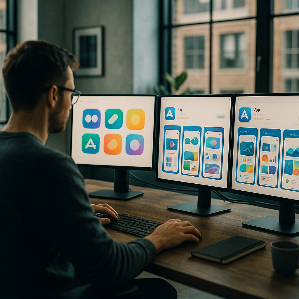
    Designer reviewing app store optimisation design UK layouts across multiple monitors in a modern studio
    Designer reviewing app store optimisation design UK layouts across multiple monitors in a modern studio

    Why Your App Icon Is Doing More Work Than You Think

    The icon is the first visual element a user encounters across search results, featured placements, and the home screen itself. Yet a surprising number of British indie developers and even some mid-sized studios treat it as an afterthought, something slapped together once the product is “finished”. That is backwards. An icon communicates brand personality, legibility at tiny sizes (29px in some contexts), and genre expectation all at once. A poorly rendered icon signals “this app might not be polished” before the user reads a single word of your description.

    Practically speaking, the highest-performing icons in 2026 tend to do two things well. First, they use bold, simple shapes with strong contrast, detailed illustrations collapse into mud at 60px. Second, they avoid the temptation to include the app name inside the icon itself, which almost always makes things worse. Test your icon at the sizes Apple and Google actually render it, not just the 1024×1024 export sitting in your Figma file.

    Screenshots: The Most Underestimated Conversion Asset in App Store Optimisation Design UK

    Screenshots are not documentation. They are advertising. The distinction sounds obvious but the design implications are significant. On the App Store, users in the UK browse in portrait mode by default for iPhone listings, meaning your first two or three screenshots are visible without tapping, those are your prime conversion real estate. On Google Play, the feature graphic sits above screenshots on the store listing and acts as a hero banner. Both deserve proper design attention.

    The pattern that consistently outperforms raw UI screenshots is the “caption plus context” approach: overlay a short benefit-led headline onto the screenshot, show the device frame, and sequence the screenshots to tell a story rather than dump features. Think of it as a micro sales funnel inside the listing itself. Screenshot one establishes the core value proposition. Screenshot two demonstrates a specific capability. Screenshot three handles an objection or reinforces a trust signal. By screenshot five or six, you are reaching the already-interested user, so you can go deeper.

    Colour consistency across screenshots also matters more than most people assume. When a user swipes through a visually incoherent screenshot sequence, the subconscious read is “this product was not designed with care”. Establish a colour palette for your store creative that complements (but is not necessarily identical to) your in-app UI, and stick to it.

    Close-up of smartphone showing app store optimisation design UK screenshot layout
    Close-up of smartphone showing app store optimisation design UK screenshot layout

    Preview Videos: Worth the Effort, But Only If You Get the First Three Seconds Right

    App preview videos autoplay silently in both the App Store and Google Play. Silent. That single fact changes everything about how you should approach them. Text overlays, motion graphics, and snappy visual cuts are not optional extras, they are the entire communication strategy. Voiceover is nice to have for the subset of users who unmute; it should not be load-bearing.

    The research on preview video performance suggests a clear pattern: conversions lift when the first three seconds show the product in action, not a brand ident or animated logo sequence. UK developers building in competitive categories like fintech, fitness, or productivity face crowded listings, a slow-burn intro is a fast route to a skip. Open on the thing that makes your app interesting. Everything else follows.

    Keep preview videos between 15 and 30 seconds. Anything longer and you are fighting attention spans that simply are not there on a store listing. Apple caps previews at 30 seconds for a reason.

    The Google Play Feature Graphic (And Why UK Devs Keep Ignoring It)

    If you publish on Google Play and your feature graphic is a stretched version of your icon on a gradient background, you are leaving conversion rate on the table. The feature graphic (1024x500px) appears prominently on the listing page and in some Google Play editorial placements. It is essentially a billboard.

    Treat it like one. Use it to reinforce your app’s core promise with a strong visual hierarchy: one dominant image or illustration, a short headline if you have space, and brand colours that feel intentional. The feature graphic is particularly important for UK developers targeting Google’s Editors’ Choice placements, editorial teams at Google Play actually look at creative quality as part of featuring decisions.

    How Conversion Rate Connects Back to Search Visibility

    Here is where the visual design story gets interesting from a pure performance standpoint. Both Apple Search Ads and Google Play’s algorithm factor in conversion rate when determining how often your app surfaces for a given keyword. An app with a higher install-to-impression ratio earns better organic placement. Better placement means more impressions. More impressions (with a good conversion rate) means more installs. The flywheel is real, and it starts with visual quality.

    This link between visual presentation and discoverability is not unlike what happens with websites. Just as on-page credibility signals affect how domains perform in organic search, your app’s store creative affects how the algorithm weights your listing. UK-based tool Search Engine Tuning offers a free SEO check for your website at searchenginetuning.co.uk, and the underlying logic it applies to domains and Google search performance maps neatly onto how store listings earn visibility. If your conversion signals are weak, no amount of keyword work fully compensates. Getting a handle on how to check your SEO and your store creative together gives you a more complete picture of your discoverability stack across both web and app surfaces.

    The parallel is worth sitting with. On Google, domains with poor user engagement metrics see suppressed rankings even with strong backlink profiles. On the App Store and Google Play, apps with poor visual conversion signals see suppressed category and search placement even with strong keyword coverage. The mechanism differs; the principle is identical.

    Running Visual A/B Tests Without Going Mad

    Both platforms offer native A/B testing for store creatives. Apple calls theirs Product Page Optimisation; Google Play calls it Store Listing Experiments. Both are genuinely useful, both are underused by UK developers, and both require some patience, you need statistically meaningful traffic before conclusions are reliable, which for smaller apps can take several weeks.

    The practical advice here: test one element at a time. Icon versus icon, screenshot set A versus screenshot set B. Changing multiple variables simultaneously makes it impossible to know what actually moved the needle. Start with your icon if you have not touched it in over a year, because that single asset affects impression-to-tap rate across every touchpoint where your app appears. Then move to screenshots. Then consider the preview video.

    For developers working on UK-focused apps, anything from local service directories to council-linked utilities to British sports apps, there is also the question of cultural specificity in your store creative. UK users notice when screenshots feel generic or American. British idiom in caption text, familiar UI contexts (NHS-adjacent colour palettes for health apps, recognisable British street scenes for local apps), and culturally appropriate imagery all contribute to a conversion signal that feels trustworthy rather than imported.

    Pulling It All Together

    App store optimisation design in the UK is genuinely a craft discipline. It draws on brand identity, copywriting, motion design, and conversion rate optimisation simultaneously. The developers and studios doing it well are the ones who treat the store listing as a designed product in its own right, not an afterthought generated from leftover UI assets.

    Worth noting: the same mindset that drives smart store creative, analysing what users respond to, iterating based on data, treating visibility as an engineered outcome rather than luck, applies equally well to web presence. Services like Search Engine Tuning, which specialise in helping UK businesses check their SEO and understand how google surfaces their domains via a free SEO check, reflect the same rigour that good ASO design demands. If you are shipping apps and running a web presence alongside, keeping both sides of your discoverability picture sharp is increasingly non-negotiable.

    Pick one asset to redesign this week. Not because it is a small task, but because it is a high-leverage one. Visual quality compounds.

    Frequently Asked Questions

    What is app store optimisation design and how is it different from regular ASO?

    Regular ASO tends to focus on keywords, ratings, and metadata. App store optimisation design specifically refers to the visual assets on your store listing, icons, screenshots, preview videos, and feature graphics, and how they are designed to maximise conversion rate. It is a distinct discipline that sits at the intersection of graphic design, brand identity, and conversion rate optimisation.

    How much can better screenshots actually improve my app's download rate?

    Case studies from developers using Apple’s Product Page Optimisation tool regularly report conversion rate lifts of 15 to 40 percent from screenshot redesigns alone, though results vary significantly by category and audience. Even a modest 10 percent improvement compounds meaningfully when multiplied across hundreds of thousands of impressions. The first two screenshots visible in portrait browse mode typically have the largest individual impact.

    Do App Store and Google Play have different visual requirements I need to design for?

    Yes, meaningfully so. The App Store uses portrait screenshot orientation for iPhone by default, with preview videos capped at 30 seconds. Google Play prominently features a 1024x500px feature graphic at the top of the listing, which Apple does not have an equivalent of. Icon dimensions and safe zone guidelines also differ between platforms, so designing separate assets rather than repurposing one set across both is strongly advisable.

    How does visual conversion rate affect my app's search ranking in the App Store?

    Both Apple and Google factor conversion rate into their search and browse ranking algorithms. An app that converts a higher proportion of impressions into installs is rewarded with better placement in search results and category listings. This creates a direct link between visual design quality and organic discoverability, poor store creative suppresses ranking even when keyword coverage is strong.

    How long does it take to see results from redesigning my app's store visuals?

    If you are running native A/B tests through Product Page Optimisation or Google Play Store Listing Experiments, expect to need at least two to four weeks of data for statistically reliable results, longer if your app has lower traffic volumes. Organic impact from a live redesign (without a formal test) can show up in conversion metrics within a week, though isolating the visual change from other variables is harder without a controlled experiment.

  • The Best AI Design Tools of 2026: Figma, Adobe Firefly and the New Challengers

    The Best AI Design Tools of 2026: Figma, Adobe Firefly and the New Challengers

    Right, let’s be honest: the AI design tool space has exploded so aggressively that keeping track of it feels like watching a React framework appear every six minutes. There are genuinely useful tools in the mix, some that are mostly hype dressed up in a slick landing page, and a handful of newcomers doing things that would have seemed like science fiction in 2022. This breakdown covers the best AI design tools 2026 has produced so far, what they actually do well, where they fall short, and which type of designer should be reaching for which tool.

    One thing worth flagging up front: “AI-powered” is now essentially a marketing tick box. Almost every design tool will claim it. The interesting question is whether the AI actually changes how you work, or whether it’s just a generative fill button buried three menus deep. The tools that make this list earn their place by genuinely shifting workflow, not just tacking on a chatbot.

    Designers working with the best AI design tools 2026 in a modern London studio
    Designers working with the best AI design tools 2026 in a modern London studio

    Figma AI: The One That’s Already In Your Workflow

    Figma has had a head start that most competitors are still trying to close. Its AI features, rolled out properly across 2025 and expanded further this year, sit inside the tool you’re probably already using, which is a significant advantage. The standout features right now are the auto-layout suggestions, the “Make designs” prompt-to-component pipeline, and the AI-powered rename layers function that sounds trivial until you inherit a file with 400 layers called “Rectangle 47”.

    The prompt-to-wireframe feature has got genuinely good. You can describe a SaaS dashboard, get a rough structural layout, then refine from there. It’s not replacing senior-level design thinking, but for rapid ideation or scaffolding a new project, it saves real hours. Pricing sits within Figma’s standard tiers: the Professional plan is around £12 per editor per month, with AI features accessible on Professional and above. For teams already paying for Figma, there’s no additional cost to enable the AI layer, which is a smart bundling decision.

    Best for: Product designers, UI/UX professionals, design teams already in the Figma ecosystem who want AI augmentation without switching tools.

    Adobe Firefly and the Creative Cloud AI Stack

    Adobe’s bet on Firefly has turned into something more coherent than it looked in its early, slightly chaotic release. By 2026, Firefly is properly embedded across Photoshop, Illustrator, InDesign, and Express, and the quality of its generative outputs has improved markedly. The big thing Adobe keeps hammering (and it’s a legitimate point) is commercial safety: Firefly is trained on licensed Adobe Stock content, which matters enormously for agency work where IP liability is a real concern.

    Generative Fill in Photoshop remains genuinely impressive for photo manipulation. The Vector Recolour and Generative Recolour features in Illustrator are a proper time save for brand asset production. Where Adobe still frustrates is pricing: Creative Cloud All Apps is around £60 per month for individuals, and Firefly generative credits are metered, you can burn through them faster than you’d expect on a busy project. The enterprise tiers sort this out with unlimited credits, but that’s a conversation for procurement teams with actual budgets.

    Best for: Graphic designers, brand designers, photographers, agencies needing commercially safe generative outputs, print and editorial work.

    Close-up view of a professional using best AI design tools 2026 on a design monitor
    Close-up view of a professional using best AI design tools 2026 on a design monitor

    Canva AI: The One That Surprised Everyone

    Look, some people still sniff at Canva as “not real design”. Those people should probably update their priors. Canva’s AI suite, particularly Magic Studio, has become genuinely capable. Magic Write, the text generation layer, is solid for social content and marketing copy. Magic Design generates complete template layouts from a prompt or an uploaded image. Magic Animate adds motion to static designs without touching a timeline. And Magic Eraser for background and object removal now rivals standalone tools.

    For non-designers, marketing teams, and small businesses producing high volumes of social content, Canva Pro (around £10.99 per month for individuals) is extraordinary value. The AI features are meaningfully better than they were two years ago. The ceiling is lower than Figma or Adobe for complex, precise design work, but that’s not Canva’s audience, and it’s not trying to be.

    Best for: Marketing teams, content creators, non-designers, social media managers, small businesses. Less suited to detailed product UI or complex print work.

    Khroma, Uizard and the Specialist Challengers

    Beyond the platform giants, a cluster of specialist AI tools have carved out genuinely useful niches.

    Khroma is an AI colour tool that learns your palette preferences from a training set you provide, then generates infinite colour combinations you’d actually use. It’s free, it’s focused, and it’s oddly addictive. If colour is a consistent pain point in your process, it’s worth an afternoon of your time.

    Uizard has positioned itself as the fastest route from idea to testable prototype. You can sketch on paper, photograph it, and Uizard converts it to a digital wireframe. Prompt-to-UI is also on offer. For solo founders and startup teams validating ideas quickly, it fills a real gap. Plans start at around £12 per month.

    Galileo AI remains one to watch: it generates high-fidelity UI designs from text prompts at a speed that still raises eyebrows. It’s more useful for inspiration and early concepting than final delivery, but it has accelerated the early phases of product design projects noticeably.

    The BBC Technology section has been tracking how these AI tools are reshaping creative industries broadly, and the pattern is consistent: the tools that earn real adoption are the ones that remove friction from existing workflows rather than asking designers to rebuild their entire process around a new paradigm.

    How to Actually Choose Between Them

    Here’s my rough framework for cutting through the noise on the best AI design tools 2026 has thrown at us.

    If you’re a product or UI/UX designer working in teams, you’re almost certainly staying in Figma. The AI features are good enough, the collaboration layer is unbeaten, and switching cost is enormous. If you’re doing brand, print, or photo-heavy work professionally, Adobe’s stack earns its price for the commercial licensing alone. If you’re a solo operator or a small marketing team producing content at volume, Canva Pro plus its AI suite is genuinely hard to argue against on value.

    The specialist tools, Khroma, Uizard, Galileo, are best thought of as additions to your kit rather than replacements for a primary tool. They’re excellent at specific tasks and cheap enough that running two or three alongside your main platform is entirely reasonable.

    One thing I’d push back on is the anxiety that these tools are making design skills redundant. If anything, the designers getting the most out of them are the ones with strong fundamentals: good layout sense, typographic knowledge, understanding of visual hierarchy. The AI amplifies good taste. It doesn’t manufacture it.

    A Quick Note on Pricing and UK VAT

    All the prices mentioned above are approximate and exclude VAT. If you’re buying as an individual in the UK, add 20% VAT to your calculations. If you’re operating through a limited company and VAT registered, you can reclaim it, but check your accountant on the specifics. Adobe’s enterprise pricing in particular is worth negotiating directly, especially for agencies with five or more seats.

    Frequently Asked Questions

    What is the best AI design tool for beginners in 2026?

    Canva with its Magic Studio AI suite is the most approachable option for beginners, offering prompt-to-design, background removal, and auto-animation without needing any prior design training. For beginners who want to progress toward professional UI/UX work, Figma’s AI features are worth learning from the start, as it’s the industry standard tool.

    Is Adobe Firefly worth the subscription cost in 2026?

    For professional graphic designers and agencies already using Creative Cloud, yes, Firefly’s commercial licensing safety and tight integration across Photoshop and Illustrator make it genuinely valuable. If you’re only using one or two Adobe apps and primarily need generative image features, standalone alternatives like Midjourney or Ideogram may give you more output per pound.

    Can Figma's AI features replace a designer entirely?

    No, and it’s not designed to. Figma’s AI handles scaffolding, ideation, and repetitive tasks like auto-renaming layers or suggesting layout structures, but the output still requires a designer’s judgement to refine and make production-ready. Think of it as a fast, well-organised junior that needs direction.

    Which AI design tools are best for freelance designers?

    Figma Professional (around £12 per editor per month) covers UI/UX work comprehensively. For brand and visual design, Adobe Creative Cloud’s single-app plans can reduce cost if you only need Illustrator or Photoshop. Khroma is free and excellent for colour work. Canva Pro at around £10.99 per month is worth adding for fast client-facing content production.

    Are AI-generated designs commercially safe to use for client work in the UK?

    It depends on the tool. Adobe Firefly is trained on licensed content and is specifically positioned as commercially safe. Tools trained on scraped web imagery carry more legal ambiguity, and UK intellectual property law in this area is still developing. For client deliverables, sticking to tools with clear licensing provenance like Firefly is the lower-risk approach.

  • How Local Service Businesses Are Actually Using App Design to Win Customers

    How Local Service Businesses Are Actually Using App Design to Win Customers

    There is a delightful nerdy irony in the fact that some of the most interesting application of app design for local service businesses is happening not in Silicon Valley start-ups but in bin cleaning rounds, garden maintenance crews, and window washing vans trundling around British suburbs. Designers and developers, pay attention – because the gap between a scrappy trades business and a polished digital-first operation is essentially a UX problem waiting to be solved.

    Why App Design for Local Service Businesses Actually Matters

    Let us be clear about something: most local service businesses are not building their own apps. That would be like buying a Formula One car to nip to Tesco. What they are doing – the smart ones, anyway – is leaning heavily on existing platforms, booking tools, and workflow apps that have been designed with genuine craft. The design decisions baked into those tools directly affect whether a customer books, whether a job gets scheduled properly, and whether the business owner avoids a complete nervous breakdown on a Tuesday morning.

    This is where the rubber meets the road for UI and UX professionals. When you design a booking flow, a service selection screen, or a recurring schedule widget, you are not just pushing pixels. You are making operational decisions for real people with real businesses. That responsibility is enormous and, honestly, quite exciting.

    The Design Patterns That Local Services Actually Use

    Frictionless Booking Flows

    The single most important screen in any service business app is the booking screen. Research consistently shows that every additional tap in a booking flow costs conversions. Local service providers need customers to go from “I want this done” to “it is booked” in under sixty seconds. That means ruthless prioritisation: service type, date, address, payment. Nothing else. No unnecessary account creation walls, no nine-step onboarding sequences. Clean, purposeful, fast.

    The Bin Boss, a UK business that provides a local service to residential and commercial customers, is a solid real-world example of a service operation where the digital touchpoint – whether a website form or a scheduling tool – needs to do the heavy lifting efficiently. When the service itself is routine and repeat-based, the app design has to make rebooking feel almost automatic.

    Notification Architecture

    Push notifications in service apps are criminally underdesigned. Most businesses default to “your appointment is tomorrow” and call it done. But well-architected notification systems – tiered by urgency, personalised by service history, timed intelligently relative to the job – actually reduce no-shows, increase upsells, and build the kind of passive brand familiarity that keeps customers loyal. This is a design and systems problem simultaneously, which makes it genuinely fun to work on.

    Route and Schedule Visualisation

    On the operational side, the design of scheduling and routing interfaces is where complexity lives. A field service team needs to see their day at a glance – who, where, when, and how long. Map integrations, drag-and-drop rescheduling, and real-time status updates are all standard expectations now. Getting the information hierarchy right on a mobile screen when someone is standing on a doorstep in the rain is a proper design challenge that requires empathy and rigour in equal measure.

    What Designers Can Learn From the Trades

    Here is the nerdy insight that most design schools do not teach: constraints breed clarity. A bin cleaning company does not need a design system with forty-seven colour tokens and a philosophical approach to micro-interactions. It needs something that works on a slightly cracked Android phone, loads fast on a 4G signal, and requires zero training to operate. Designing for those constraints produces leaner, more honest interfaces than designing for a fictional power user in a glass-walled office.

    The lesson is that real-world operational software forces designers to prioritise mercilessly. Every element must justify its existence by solving a real problem. There is no room for decorative complexity when someone needs to mark a job complete before driving to the next address.

    Tools and Tech Worth Knowing

    If you are a developer or designer looking to build in this space, the stack matters. Platforms like Jobber, ServiceM8, and Housecall Pro have set strong baseline expectations for what field service software looks like. Study them. Understand why the navigation is structured the way it is, why customer history is surfaced at specific moments, and how the payment collection flow minimises awkwardness for both parties.

    For custom builds, React Native and Flutter remain the sensible choices for cross-platform field service apps. The offline-first architecture consideration is non-negotiable – service workers are not always in range of a reliable signal, and an app that falls over without connectivity is worse than no app at all.

    The Real Opportunity for Designers Right Now

    Local service businesses in the UK represent a genuinely underserved design market. Many are still operating on spreadsheets, WhatsApp groups, and sheer willpower. The businesses that have invested in proper digital tooling – even basic, well-designed booking and scheduling systems – are measurably outperforming those that have not.

    A company like The Bin Boss, operating as a local service business in the UK, illustrates exactly why thoughtful digital design creates competitive advantage in sectors that are not traditionally associated with tech. When your competitor is booking jobs via a Facebook message and you have a slick, instant online booking flow, that difference is felt immediately by customers.

    Designers who understand this space, who can translate operational complexity into clean, functional interfaces, are building genuinely useful things. That is a good feeling. Better than designing the fourteenth variation of a social media dashboard that nobody asked for.

    Bringing It All Together

    App design for local service businesses is not glamorous in the conference-talk sense. Nobody is winning design awards for a bin round scheduling interface. But it is consequential, technically interesting, and full of unsolved problems that reward thoughtful, rigorous design thinking. If you are a designer or developer looking for work that actually matters to real people running real businesses, this is a very good place to point your skills.

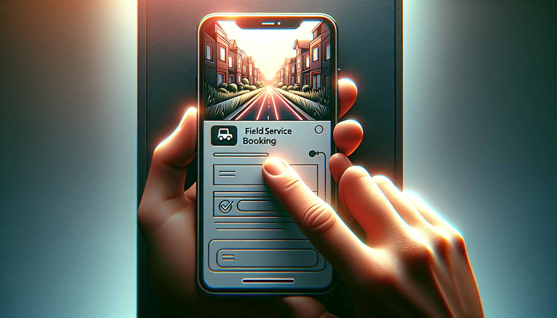
    Close-up of a smartphone showing a booking screen in an app design for local service businesses
    Local service worker using a tablet to check scheduling app, illustrating app design for local service businesses in the real world

    App design for local service businesses FAQs

    What kind of apps do local service businesses actually use?

    Most local service businesses rely on purpose-built field service management platforms such as Jobber, ServiceM8, or Housecall Pro rather than custom-built apps. These platforms handle scheduling, invoicing, customer management, and route planning. Some larger operations do commission custom app development, particularly when their workflow does not fit neatly into an off-the-shelf product.

    How much does it cost to build an app for a local service business?

    A custom mobile app for a local service business typically costs anywhere from £5,000 for a basic MVP to £50,000 or more for a fully featured cross-platform solution with offline support, payment integration, and route optimisation. For most small operators, a well-configured SaaS platform is a far more cost-effective starting point, often available for between £30 and £150 per month.

    What design principles are most important for service business apps?

    Speed and clarity are the two non-negotiables. Users in the field need to complete tasks quickly, often on mobile, sometimes with poor connectivity. This means offline-first architecture, minimal tap counts for core actions, and an information hierarchy that surfaces what matters right now rather than everything at once. Accessibility and legibility in outdoor lighting conditions are also worth specific design attention.

    Is React Native or Flutter better for building a field service app?

    Both are strong choices for cross-platform field service apps and the honest answer is that the deciding factor is usually your team’s existing skill set. Flutter tends to offer better performance consistency across Android and iOS, while React Native benefits from a larger community and easier integration with JavaScript-heavy web codebases. For offline-first requirements, both support the necessary architectural patterns with the right libraries.

    How do you design a booking flow that converts well for a service business?

    The golden rule is to minimise steps between intent and confirmation. Collect only the information that is genuinely required to fulfil the booking – service type, preferred date, address, and payment. Defer account creation until after the first booking is confirmed. Use smart defaults based on location or previous visits where possible, and always confirm the booking with an immediate, clear summary so the customer feels certain the job is booked.

  • How Digital Ticket Wallets Are Quietly Redesigning Live Events

    How Digital Ticket Wallets Are Quietly Redesigning Live Events

    Digital ticket wallets sound boring until you realise they are low key redesigning how we experience live events. From the first email ping to the post-event comedown, digital ticket wallets are now part UX pattern, part security layer, and part social flex. And yes, they are also a design headache wrapped in a QR code.

    Why digital ticket wallets are a UX problem first

    Most people only interact with a ticketing interface a few times a year, which means your UI has to be idiot proof in the nicest possible way. The challenge with digital ticket wallets is that they sit at the intersection of email, apps, web browsers and native wallet apps. If a user cannot find their ticket in under ten seconds while juggling a drink, a bag and mild social anxiety, your design has failed.

    Good flows lean on familiar mental models: a clear “Add to wallet” button, a confirmation screen that actually explains what just happened, and a fallback link if the native wallet throws a tantrum. Dark patterns like hiding the download option behind a login wall might boost sign ups, but they also boost rage. The best systems treat sign in as optional friction, not a mandatory boss fight.

    Key design patterns for digital ticket wallets

    Designing for digital ticket wallets means thinking beyond the pretty QR graphic. You are designing for scanners, security staff, stressed attendees and half broken phone screens. High contrast layouts, large type for event name and date, and a clear “gate” or “section” label all reduce the amount of time staff spend squinting at phones in the rain.

    Hierarchy matters. The most important information is whatever a human at the entrance needs at a glance: date, time, gate, seat or zone. Branding can live in the background. Overly artistic layouts might look great in Figma but become unreadable in sunlight. Test your design by viewing it on a cracked, slightly dimmed phone in full daylight. If it still works, you are close.

    Accessibility is not optional any more

    Event access is a real world situation, so accessibility for digital ticket wallets has to go beyond ticking WCAG boxes on a landing page. Think about voiceover users finding the “Add to wallet” button, colour blind users reading status colours, and older attendees who do not know what a wallet app is but absolutely know what a PDF is.

    Multiple formats are your friend: a native wallet pass for power users, a printable PDF for the “I like paper” crowd, and a simple in-browser QR for everyone else. Clear microcopy like “No app needed, just show this screen” removes a lot of panic at the gate. Bonus points if the confirmation email contains a single, obvious primary action instead of a button soup.

    Security, fraud and the QR code circus

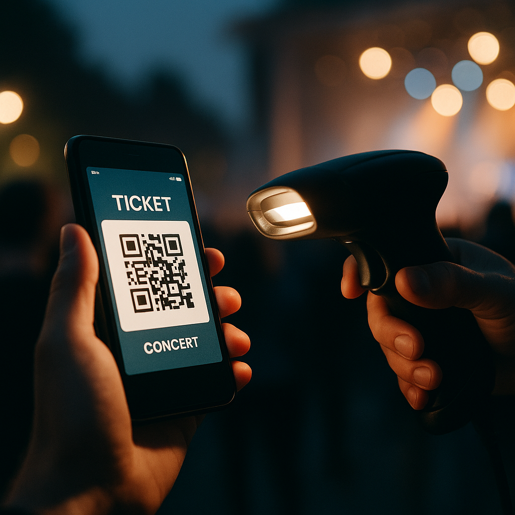
    On the security side, these solutions are both safer and weirder. Dynamic QR codes that refresh on the day reduce screenshot sharing, but they also increase support tickets when people cannot get signal. Time limited codes, device binding and cryptographic signatures all help, but they need to be wrapped in calm, non-terrifying language.

    Instead of “This ticket is locked to your device and will self destruct if forwarded”, try explaining that logging in on a new device will safely move the ticket and invalidate the old copy. Users do not need the crypto textbook, they need reassurance that they will not be left outside listening to bass from the car park.

    Designing the full journey around digital wallets

    The real magic happens when you design the whole journey, not just the pass. Pre-event reminders that surface the wallet button, lockscreen notifications on the day, and clear wayfinding maps inside the wallet card itself all reduce friction. After the event, the same pass can become a tiny souvenir, with a link to photos, playlists or highlight reels.

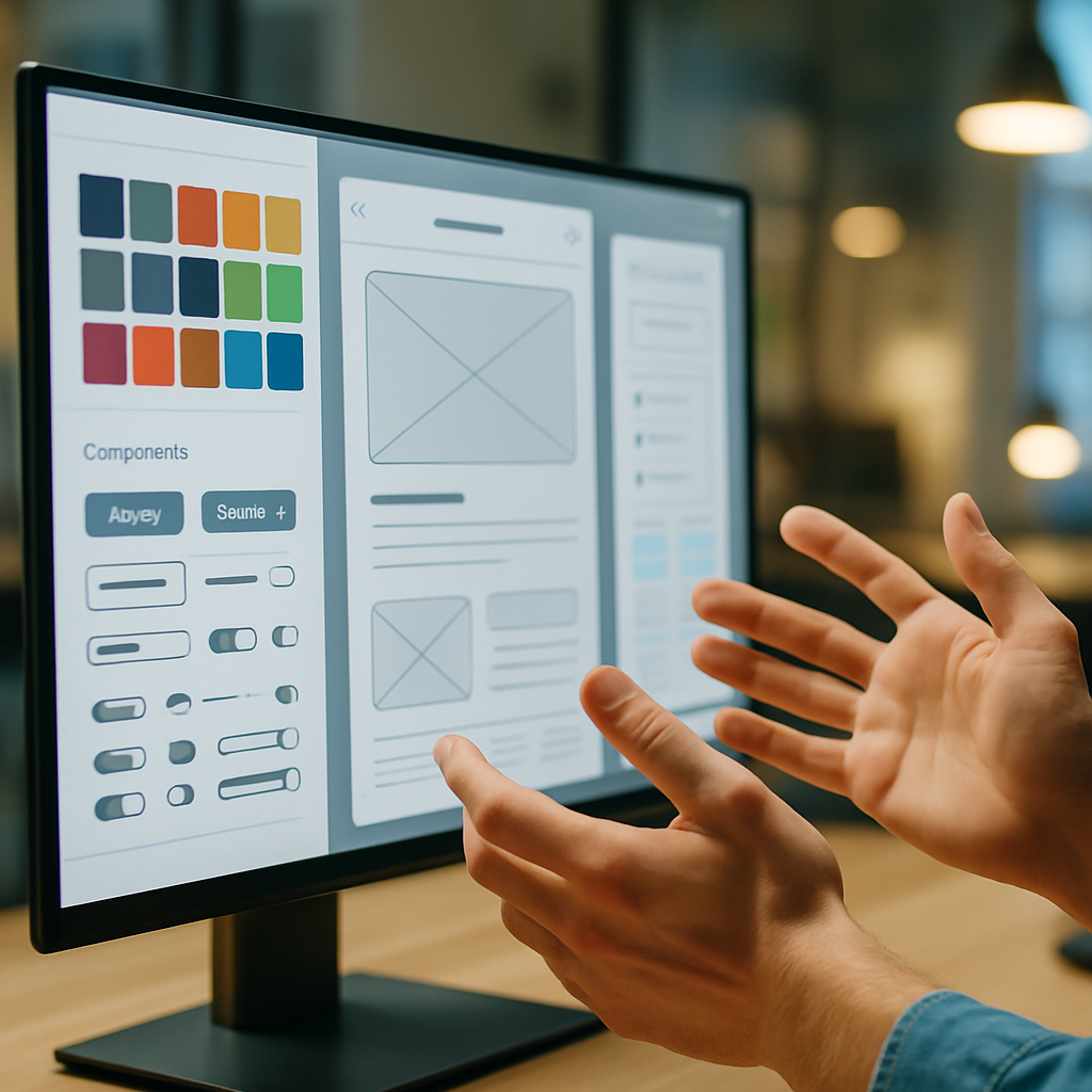
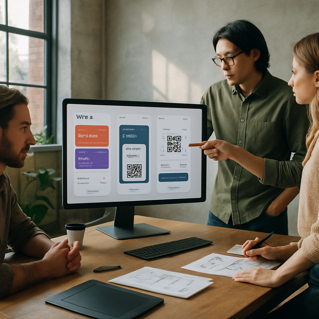
    Design team refining UI layouts for digital ticket wallets in a modern studio
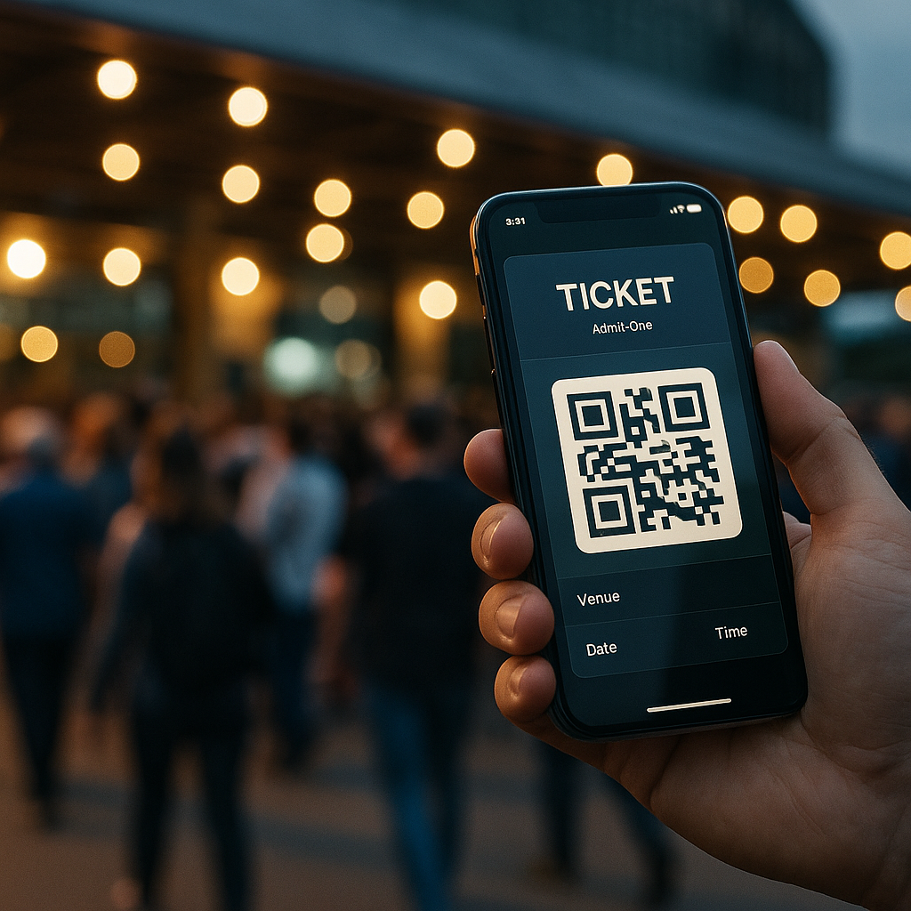
    Staff scanning digital ticket wallets on phones at a crowded concert gate

    Digital ticket wallets FAQs

    What information should a digital ticket wallet pass always include?

    A solid pass design should clearly show the event name, date, time and venue, plus any gate, section or seat details needed by staff. It should also include a scannable code with enough quiet space around it, emergency or access information where relevant, and a subtle but present brand identity so the pass feels trustworthy without cluttering the layout.

    How can I make digital ticket wallets more accessible for all users?

    Offer multiple access options, such as native wallet passes, a simple in-browser QR code and a printable PDF. Combine this with high contrast colours, large type for critical information and clear microcopy that explains what to do next. Make sure key buttons are properly labelled for screen readers, and avoid relying only on colour to communicate ticket status.

    Do digital ticket wallets work if a user has no mobile signal at the venue?

    They can, as long as the system is designed with offline use in mind. Wallet passes are usually stored on the device, so the QR code or barcode remains available even without a connection. Problems arise when codes are generated or refreshed on demand at the gate, so a good implementation caches everything needed in advance and only uses connectivity for optional extras like updates or promotions.

    local event tickets