Right, let’s settle this properly. The CSS Grid vs Flexbox 2026 debate still surfaces in Slack channels and code reviews on a daily basis, and honestly the confusion is understandable. Both layout systems are powerful. Both are now universally supported across modern browsers. And both, if you use them wrong, will leave you wrestling with alignment bugs at 11pm whilst questioning your career choices. The good news: there is a logical framework for choosing between them, and once it clicks, it genuinely changes how you architect layouts.
The short version: Flexbox is one-dimensional, Grid is two-dimensional. That single sentence contains about 80% of the decision tree. But the remaining 20% is where things get interesting, so let’s dig in properly.

What Flexbox Actually Does Well
Flexbox was designed to distribute space along a single axis, either horizontally or vertically. It excels at aligning items inside a container when you don’t know exactly how many items there will be or how big they’ll be. Navigation bars, button groups, card footers, centering a single element in its container, distributing tags in a pill list. These are all Flexbox’s natural habitat.
Here’s the classic pattern everyone has written at least forty times:
.nav {
  display: flex;
  align-items: center;
  gap: 1rem;
  justify-content: space-between;
}
Crisp, readable, does exactly what you expect. The gap property (finally at 97%+ browser support as of 2026, including all Edge versions) removes the old margin hack workarounds entirely. Flexbox is also incredibly intuitive for responsive component-level work because flex-wrap lets items gracefully collapse to the next line without you needing to define explicit breakpoints.
Where Flexbox starts to fight back is when you try to make it do two-dimensional work. Ever tried to keep card heights consistent across a row of flex children with varying content lengths? You end up reaching for align-items: stretch and then the footer inside each card refuses to pin to the bottom. You write more CSS to fix the fix. That’s a sign you’ve hit Flexbox’s ceiling.
Where CSS Grid Changes the Game
Grid thinks in rows and columns simultaneously. The moment you have a layout where both axes matter, Grid is the right call. Page-level structure, editorial layouts, dashboard panels, image galleries where items need to align both horizontally and vertically. Grid owns these.
The pattern that converts most Flexbox sceptics is grid-template-columns with repeat and auto-fill:
.gallery {
  display: grid;
  grid-template-columns: repeat(auto-fill, minmax(280px, 1fr));
  gap: 1.5rem;
}
That single declaration creates a fully responsive, self-organising grid. No media queries. No JavaScript. Items wrap onto new rows when the container shrinks, maintaining consistent column widths throughout. It’s genuinely magical the first time you see it work, and it would take a mess of Flexbox code to approximate the same result.
Subgrid, which landed in all major browsers by late 2023 and is now rock-solid in 2026, makes things even more compelling. It lets child elements participate in the parent grid’s track definitions, solving the card-footer-alignment problem that trips everyone up in Flexbox:
.card-grid {
  display: grid;
  grid-template-columns: repeat(3, 1fr);
  gap: 1rem;
}

.card {
  display: grid;
  grid-template-rows: subgrid;
  grid-row: span 3;
}
Now every card’s title, body, and footer align perfectly across the row without any height hacks. This is the kind of thing that used to require JavaScript and a ResizeObserver. Browser support for subgrid, according to data tracked on Can I Use, sits at over 93% globally as of early 2026, which is comfortably above the threshold most production codebases accept.
Browser Support in 2026: Is It Actually Safe?
Both systems are essentially safe to use without fallbacks in any project targeting modern browsers. Internet Explorer is gone. Legacy Edge is gone. The MDN compatibility tables show CSS Grid at 98%+ global support and Flexbox even higher. If you’re building for a corporate intranet that still runs IE11, first: I’m sorry. Second: you have bigger problems than layout systems.
The one nuance worth noting is that some newer Grid features, like masonry layout (the spec that would let Grid do Pinterest-style staggered layouts natively), are still experimental in 2026. Firefox has it behind a flag, Chrome is trialling it. Don’t ship it in production yet, but do keep an eye on it because when it lands properly, it will eliminate a whole category of JavaScript-dependent layout solutions.
The Decision Framework (Actual, Usable Advice)
Here’s how I think about it. Ask yourself one question first: does my layout need to control placement in both rows and columns at the same time? If yes, Grid. If you’re just aligning or distributing items along one direction, Flexbox.
More specifically:
- Use Flexbox for: navbars, toolbars, button rows, centring content vertically within a container, tag lists, form rows, media objects (image plus text side by side), any component where the number of items is dynamic and you want them to wrap naturally.
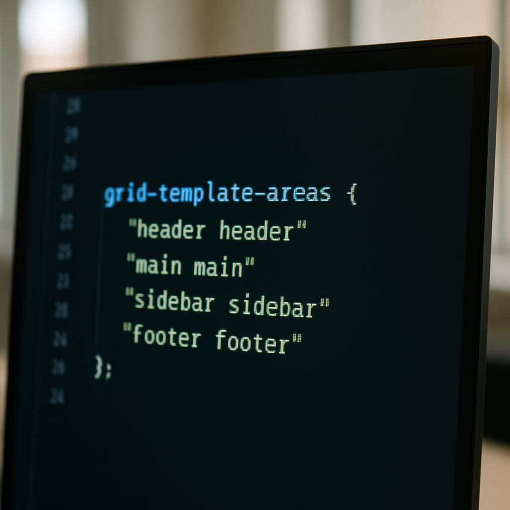
- Use Grid for: page-level layout structure, card grids, dashboard panel systems, any layout where you need items in different rows to align with each other, magazine or editorial layouts, anything with explicit named areas using
grid-template-areas.
The grid-template-areas syntax deserves a special mention because it’s one of the most readable pieces of CSS ever written:
.layout {
  display: grid;
  grid-template-areas:
    "header header"
    "sidebar main"
    "footer footer";
  grid-template-columns: 240px 1fr;
  grid-template-rows: auto 1fr auto;
  min-height: 100vh;
}

header { grid-area: header; }
aside  { grid-area: sidebar; }
main   { grid-area: main; }
footer { grid-area: footer; }
You can read that CSS like a diagram. A junior developer joining a project can understand the page structure before they’ve even opened a browser. That’s the kind of clarity that saves debugging hours down the line.
Can You Use Both at the Same Time?
Absolutely, and most well-built interfaces do. A common pattern in production codebases is Grid for the macro layout (the page skeleton) and Flexbox for the micro layout (the components within each area). Your Grid defines where the sidebar, main content, and header live. Flexbox handles how items inside the navigation bar are distributed. They’re not competitors; they’re collaborators operating at different scales.
The MDN Web Docs, maintained by Mozilla and consistently one of the most reliable references for front-end developers, has excellent interactive examples of both systems. Worth bookmarking the Grid layout documentation if you’re still getting comfortable with the more advanced features like subgrid and named lines.
The Bottom Line
The CSS Grid vs Flexbox 2026 conversation really shouldn’t be an either/or. It’s a question of matching the tool to the problem. Flexbox for one-dimensional, component-level distribution. Grid for two-dimensional, structural layouts. Both are mature, both are safe, and both, when used correctly, produce less CSS than any workaround you’d have needed before they existed. Stop picking a team. Use both. Your stylesheets will thank you.
Frequently Asked Questions
Is CSS Grid better than Flexbox in 2026?
Neither is objectively better; they solve different problems. Flexbox handles one-dimensional layouts (a single row or column), whilst Grid handles two-dimensional layouts where both rows and columns matter simultaneously. Most modern projects use both depending on the context.
When should I use Flexbox instead of Grid?
Use Flexbox when you’re distributing or aligning items along a single axis, such as navigation bars, button groups, centring an element in its container, or tag lists where the number of items is variable. It’s best suited for component-level layout rather than page-wide structure.
Is CSS subgrid safe to use in production in 2026?
Yes. Subgrid is supported in all major browsers, including Chrome, Firefox, Safari, and Edge, with global support sitting above 93% in early 2026. It’s particularly useful for aligning card contents, like titles and footers, across a row without JavaScript hacks.
Can you use CSS Grid and Flexbox together in the same project?
Absolutely, and most well-structured codebases do exactly this. A common approach is using Grid for the macro page structure (header, sidebar, main, footer) and Flexbox for micro-level component layouts within those areas. They complement each other rather than compete.
What is the browser support for CSS Grid in 2026?
CSS Grid has over 98% global browser support in 2026, covering all modern versions of Chrome, Firefox, Safari, and Edge. Internet Explorer support is no longer a practical concern for most projects, making Grid entirely safe to use in production without fallbacks.