Nobody wakes up thinking, “I fancy a deep dive into town centre design today.” And yet, here we are. Because if you look at a typical British high street through the eyes of a UX designer or a frontend developer, it is basically a live-action usability test – and most of it is failing spectacularly.
The High Street as a User Interface
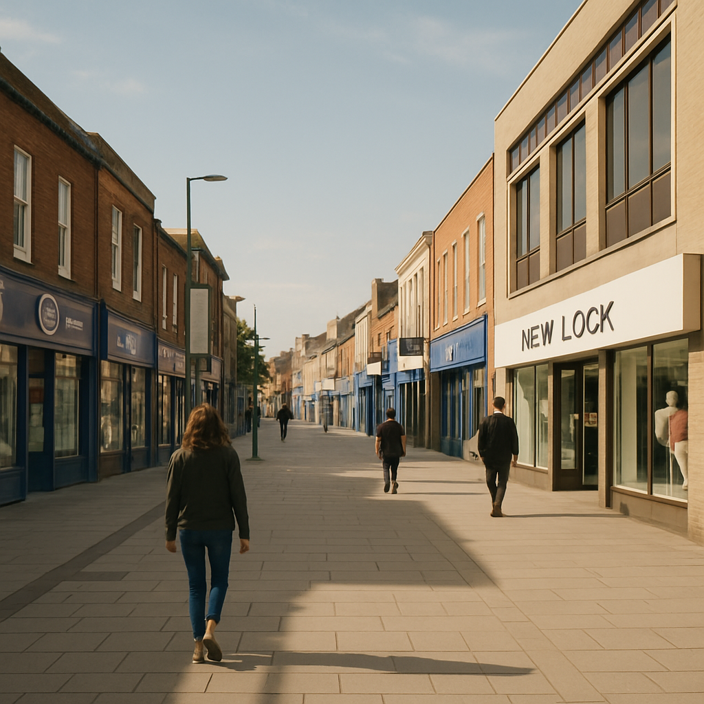
Think about it. A town centre is, fundamentally, an interface. People enter it with goals – buy a coffee, find a post office, locate that one bakery they half-remember from 2019. The physical layout, signage, and flow of a high street either supports those goals or completely undermines them. Sound familiar? That is exactly what happens when you hand a poorly planned website to an unsuspecting user.
Bad wayfinding in a town centre is the physical equivalent of hiding your navigation menu behind a mystery hamburger icon with no label. People just… wander. They look confused. They leave. In digital terms, that is your bounce rate doing a little jig.
What Town Centre Design Gets Surprisingly Right
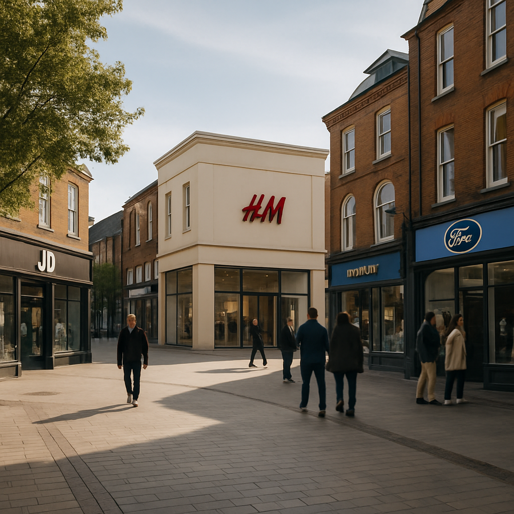
To be fair, not everything on the high street is a disaster. Anchor stores – your big department stores, your well-known supermarkets – function exactly like above-the-fold hero sections. They draw people in and create a visual hierarchy that smaller businesses benefit from simply by being nearby. This is proximity bias in action, and it works just as well in a CSS grid layout as it does in a pedestrianised shopping zone.
Town centre design also does something clever with density. A well-planned high street clusters complementary services together. Cafes near bookshops. Stationers near print shops. This is information architecture made physical, and it absolutely translates to how you should group features and content on any well-built web app.
Where It All Goes Horribly Wrong (and What to Learn From It)
Here is where the fun starts. Most town centres have accumulated decades of chaotic, unplanned additions – a pop-up here, a boarded-up unit there, signage from four different eras all competing for attention simultaneously. It is like looking at a codebase where seventeen different developers have left their mark and nobody ever refactored anything. You can smell the technical debt from the car park.
The lesson for designers and developers is this: consistency matters enormously. A town centre that uses five different typefaces across its wayfinding signs – yes, this genuinely happens – is committing the same sin as a design system with fourteen shades of blue and no token structure. It erodes trust. It creates cognitive load. It makes people tired before they have even found what they came for.
The Digital Twin Opportunity
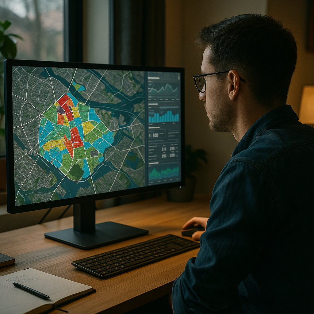
Here is where things get properly interesting for the tech crowd. The concept of a digital twin – a live, data-driven virtual model of a physical space – is being applied to town centres with increasing sophistication. Councils and planners are using interactive maps, footfall analytics, and even AR overlays to understand how people actually move through and interact with urban spaces.
From a design and development perspective, this is a goldmine. The same principles that make a great dashboard UX – clear data visualisation, intuitive filtering, responsive feedback – are exactly what makes a digital twin of a town centre useful rather than just impressive in a pitch deck. Town centre design is, quietly, becoming a seriously interesting domain for developers who want their work to have a tangible real-world impact.
The Takeaway (For the Nerds in the Room)
Next time you are struggling to explain information architecture, user flows, or visual hierarchy to a client who just does not get it, take them for a walk down their local high street. Point at the confusing signage. Point at the anchor stores. Point at the chaos. Town centre design is UX with bricks, and it is one of the best real-world classrooms a designer could ask for.
Town centre design FAQs
How does town centre design relate to UX design principles?
Town centre design mirrors UX design in several key ways – wayfinding corresponds to navigation, anchor stores reflect visual hierarchy, and the clustering of related shops mirrors good information architecture. Studying how people move through and interact with physical spaces offers genuinely useful insights for anyone designing digital interfaces.
What is a digital twin and how is it used in town centre planning?
A digital twin is a virtual, data-driven replica of a physical environment. In the context of town centre planning, it allows councils and urban designers to model footfall patterns, test layout changes, and visualise pedestrian behaviour in real time. From a tech perspective, building these systems requires strong data visualisation skills and thoughtful UX design to make the information genuinely actionable.
Can bad town centre design actually teach developers something useful?
Absolutely. Bad town centre design is a masterclass in what happens when consistency, hierarchy, and user flow are ignored over time. The chaotic signage, contradictory layouts, and confusing clustering you find on many high streets are direct physical analogies for poorly structured codebases and inconsistent design systems. Studying the failures is just as instructive as studying the successes.
Leave a Reply