There’s a moment when you tap the heart icon on a post and it bounces, pulses, and fills with colour. Takes maybe 300 milliseconds. You barely notice it consciously. But you felt something. That’s the magic of micro-interactions in UX design, and it’s the kind of detail that separates a product people love from one they merely tolerate.
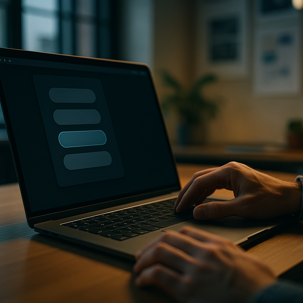
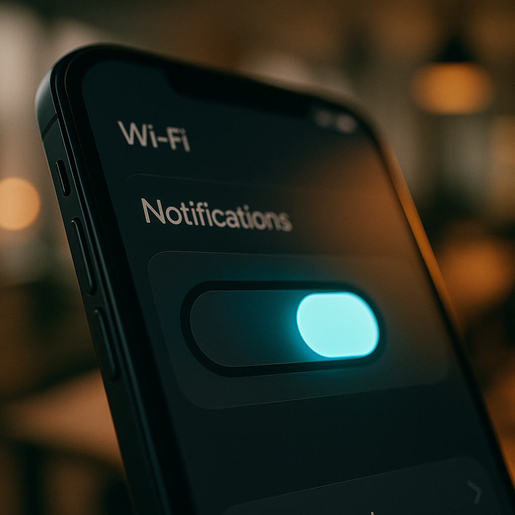
Micro-interactions are the tiny, single-purpose animations and feedback loops baked into interfaces. A toggle that slides smoothly. A loading bar that fills with personality. A form field that subtly shakes when you enter the wrong password. None of these are the main feature. All of them are load-bearing walls in the structure of user experience.
Why Micro-Interactions in UX Design Actually Matter
It’s tempting to dismiss them as decoration. They’re not. They do several measurable jobs simultaneously. They communicate system status (something happened, the thing worked), they guide behaviour (you did it right, or wrong), and they add emotional texture to an otherwise flat digital surface.
Research cited by the Nielsen Norman Group has long established that response times under 100ms feel instantaneous to users, while delays up to one second break the flow of thought. Micro-interactions live in that critical window. When an animation confirms an action within 200ms, the user’s brain registers cause and effect as seamless. When there’s nothing? Uncertainty creeps in. Did it work? Should I tap again?
Dan Saffer’s framework for micro-interactions, which has basically become the canonical reference, breaks each one into four components: a trigger, rules, feedback, and loops/modes. The trigger starts it (a hover, a click, a system condition). The rules define what happens. The feedback is what the user sees, hears, or feels. Loops determine whether it repeats. Simple framework. Wildly useful when you actually apply it.
Animation Timing: The Difference Between Slick and Sluggish
Timing is where most developers get micro-interactions wrong. Either too fast to register, or so slow they feel like the interface is wading through treacle. Getting this right is genuinely nerdy and I love it.
The general sweet spot for most UI feedback animations is between 150ms and 400ms. Shorter than that and human perception misses the feedback entirely. Longer than 500ms and it starts feeling like lag rather than intentional motion. For transitions that carry meaning (like a modal sliding in), 300ms with an ease-out curve tends to feel natural because it mirrors the physics of objects decelerating to rest.
In CSS, transition and animation properties give you this control directly. A basic hover micro-interaction might look like this:
.btn {
  transform: scale(1);
  transition: transform 200ms ease-out, box-shadow 200ms ease-out;
}

.btn:hover {
  transform: scale(1.05);
  box-shadow: 0 8px 24px rgba(0, 0, 0, 0.15);
}
That two-property transition costs essentially nothing in performance and immediately makes the button feel alive. Crucially, transform and opacity are the two CSS properties you should reach for first because they’re composited by the browser and don’t trigger layout recalculation. Animating width, height, or margin? That’s asking for jank.
Designing Micro-Interactions with Purpose: Core Principles
Not every pixel needs to dance. One of the more common mistakes I see in interface reviews is what I’d call micro-interaction soup: every element animated, every action celebrated, until the whole thing feels like a toddler’s birthday party rather than a professional product. Restraint is a skill.
A few principles that hold up well in practice:
Match energy to context
A banking app confirming a payment transfer should feel calm and reassuring, not exuberant. A creative tool or game can afford something more expressive. The animation should feel like it belongs to the brand and context, not like it was borrowed from a dribbble shot.
Use easing functions that feel physical
Linear motion looks robotic. CSS gives you ease, ease-in, ease-out, ease-in-out, and full cubic-bezier() control. For most UI interactions, ease-out (starts fast, decelerates) feels most natural because objects in the real world decelerate. Reserve ease-in (starts slow, accelerates) for elements exiting the screen.
Never hide information behind animation
The feedback loop must be clear. If a form submission fails, the micro-interaction should make that failure unmistakably obvious, not bury it in a pretty wiggle. Accessibility also matters here: users who have enabled prefers-reduced-motion in their operating system should get functional feedback without the motion. Always wrap animations in a media query check:
@media (prefers-reduced-motion: no-preference) {
  .icon {
    transition: transform 250ms ease-out;
  }
}
JavaScript-Powered Micro-Interactions: When CSS Isn’t Enough
CSS handles most standard micro-interactions cleanly, but some scenarios need JavaScript’s logic. Think: a like button that counts up, a progress indicator that responds to real upload speed, or a drag-and-drop interface that gives haptic-style visual feedback based on position.
The Web Animations API (WAAPI) is worth knowing if you’re doing anything complex. It gives you JavaScript control over animations with the performance benefits of CSS-level compositing. A simple implementation:
const button = document.querySelector('.like-btn');

button.addEventListener('click', () => {
  button.animate([
    { transform: 'scale(1)' },
    { transform: 'scale(1.3)' },
    { transform: 'scale(1)' }
  ], {
    duration: 300,
    easing: 'ease-out'
  });
});
For heavier animations involving scroll-triggered sequences or complex state transitions, libraries like GSAP remain the go-to in professional production environments. Framer Motion is the choice for React-based projects, with its whileHover and whileTap props making micro-interaction implementation almost embarrassingly simple.
Speaking of things that affect focus and performance: it’s a bit like comparing the precision engineering behind oxygen tanks to a garden hose. The underlying mechanism matters enormously, even when the visible output looks similar.
Real-World Implementation: Where to Start
If you’re auditing an existing product or starting a new one, prioritise micro-interactions at the highest-frequency touchpoints first. Buttons, form inputs, toggles, and loading states are touched hundreds of times per session. These are where well-crafted feedback compounds most rapidly into a perception of quality.
A practical starting checklist:
- Every interactive element should have a visible hover and active state.
- Form validation feedback should be immediate and clearly directional (green border for valid, red with a shake for invalid).
- Loading states should show progress, not just a spinner. A determinate progress bar is always more reassuring than indeterminate spinning.
- Success and error confirmations should use both colour and motion, never just colour alone (colour-blind users exist, and your UI should work for them).
- All animations should respect
prefers-reduced-motion.
The cumulative effect of getting these right is difficult to quantify precisely, but qualitative user research consistently shows that interfaces with cohesive micro-interactions are perceived as faster, more trustworthy, and more premium than technically equivalent interfaces without them. Users can’t always articulate why. They just feel the difference.
The Bottom Line
Micro-interactions in UX design are one of the highest-return-on-investment details you can invest time in. They don’t require huge engineering effort, they don’t require a visual overhaul, and they don’t require a design system rebuild. They require careful thought about timing, feedback, and purpose, applied consistently across the touchpoints that matter most. Get them right and your product starts to feel like it was made by people who genuinely cared about the experience. Which, presumably, you are.
Frequently Asked Questions
What are micro-interactions in UX design?
Micro-interactions are small, single-purpose animations or feedback mechanisms built into a user interface. They confirm actions, communicate system status, and add emotional texture to digital products. Examples include a button scaling slightly on hover, a toggle sliding smoothly, or a form field shaking when an incorrect value is entered.
How long should micro-interaction animations be?
Most UI micro-interaction animations should fall between 150ms and 400ms. Shorter than that and users won’t register the feedback; longer than 500ms and it starts to feel like lag. For transitions carrying meaning, such as modals or drawers, 300ms with an ease-out curve tends to feel most natural.
Which CSS properties are best for micro-interactions?
Use transform and opacity wherever possible because they are composited by the browser and don’t trigger layout recalculation, resulting in smooth, jank-free animations. Avoid animating properties like width, height, or margin, as these cause expensive layout reflows.
Do micro-interactions affect accessibility?
Yes, and this is important. Some users have vestibular disorders or motion sensitivity and enable the prefers-reduced-motion setting in their OS. Always wrap non-essential animations in a @media (prefers-reduced-motion: no-preference) query so those users receive functional feedback without the motion. Never rely on colour alone for feedback either.
Should I use CSS or JavaScript for micro-interactions?
CSS handles the majority of standard micro-interactions efficiently and is the right first choice. Use JavaScript (via the Web Animations API or libraries like GSAP or Framer Motion) when you need logic-driven animations, such as interactions that respond to dynamic data, scroll position, or complex state changes that CSS cannot manage on its own.