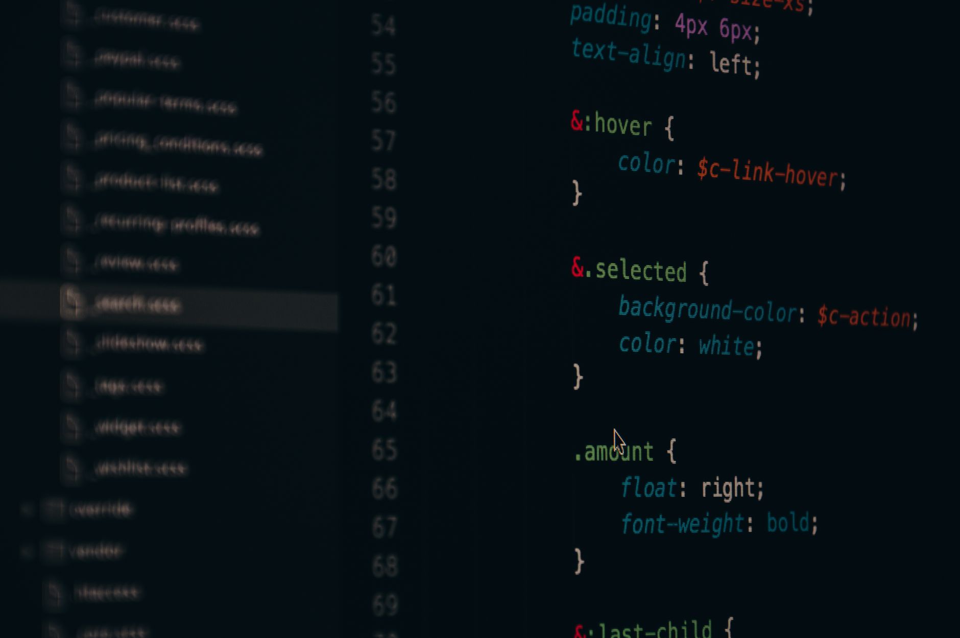
Here’s the thing that nobody says out loud: most web font implementations are a performance tax in disguise. You add a Google Fonts <link> in the <head>, you pick something that looks nice in Figma, and then you wonder why your Largest Contentful Paint is a disaster. I’ve watched this play out on dozens of projects, and the pattern is almost always the same. The typography looks considered, the loading experience does not.
Building a solid system font stack in 2026 isn’t about giving up on brand expression. It’s about being smarter with what you load, when you load it, and how you fall back gracefully when things go wrong. This guide walks through the actual mechanics of doing that, from stack construction to subsetting to font-display strategy, with enough detail to be genuinely useful rather than just vaguely inspirational.
Why system fonts deserve more respect than they get
The reputation of system fonts is stuck somewhere around 2014, when using them felt like admitting defeat. That narrative is outdated. The current default system stacks are genuinely good. Apple’s San Francisco is a masterclass in legibility at small sizes. Segoe UI Variable (shipping with Windows 11) is properly optical-size aware. Inter, whilst technically a web font, ships natively in several Linux environments and is increasingly used as a system default in design tools.
A well-constructed system font stack in CSS looks something like this:
That stack costs zero bytes, loads in zero milliseconds, and renders without layout shift. On a content-heavy site, that’s worth a lot. The Core Web Vitals improvement alone can be significant, particularly for Cumulative Layout Shift (CLS) and LCP, both of which get hammered by render-blocking font requests.
When you actually need a web font (and when you don’t)
I’d argue the honest answer is: less often than you think, and almost never for body copy. System fonts at 16px with sensible line-height and letter-spacing are perfectly readable. The use cases where a web font genuinely earns its keep are narrower than most designers admit.
Genuine reasons to load a web font include: a logotype-adjacent display face that’s core to the brand identity, a distinctive serif for editorial contexts where the personality of the letterform matters, or a monospaced font for code samples where system options (Courier New, I’m looking at you) are visually terrible. Body copy at 16–18px? The system font stack wins almost every time.
The question I ask on every project is whether a user could actually tell the difference between the web font and a well-configured system font at reading distance. More often than not, the answer is no. What they will notice is a flash of invisible text or a layout jump. That’s the trade you’re making.
How to load web fonts without destroying your performance scores
When a web font is genuinely justified, the loading strategy matters as much as the font itself. There are three levers that make the biggest difference: self-hosting, subsetting, and font-display.
Self-host everything
Stop using Google Fonts via CDN. It creates a cross-origin request that costs you a DNS lookup, a TCP connection, and potentially a TLS handshake before a single byte of font data arrives. Self-host the files on your own domain instead. Tools like google-webfonts-helper generate the CSS and font files you need in seconds. Your font is now one fewer external dependency, and you have full control over caching headers.
Subset aggressively
A full variable font file can be 200–400KB. For a UK-facing site serving primarily Latin-script content, you need maybe 20% of that. The unicode-range descriptor in your @font-face rule tells the browser which characters are actually in each file, so it only downloads the subset it needs. Use pyftsubset from the fonttools library to strip everything you don’t need. A Latin subset for English content typically covers U+0020–U+00FF, plus U+2013–U+2122 for typographic punctuation. That’s it.
For a typical paragraph-weight subset, I regularly get files under 20KB. That’s a very different conversation than serving 300KB of font data for characters your users will never see.
Use font-display correctly
The font-display descriptor controls what happens whilst your web font loads. The options matter:
swap renders immediately in a fallback, then swaps when the web font arrives. Fast but causes layout shift.
optional gives the browser a very short window to load the font; if it doesn’t arrive in time, the browser uses the fallback for the entire page load. Zero layout shift, and on repeat visits the cached font renders immediately. This is my default for body fonts.
block renders invisible text for up to 3 seconds. Avoid it. It’s what’s killing your LCP on slow connections.
For display fonts where the visual difference genuinely matters, swap is acceptable if you’ve done the work to minimise the metric mismatch between your web font and fallback. Which brings us to the next bit.
Matching your fallback metrics to eliminate layout shift
The biggest cause of font-related CLS is metric mismatch: your web font has different line-height, letter-spacing, or ascender/descender values than the system font rendering in its place. When the web font arrives, everything reflows. That’s the jump users hate.
CSS now has size-adjust, ascent-override, descent-override, and line-gap-override descriptors inside @font-face, and they’re specifically designed for this. You apply them to a local fallback font definition to make it metrically equivalent to your web font. The Malte Ubl approach of using the Font Style Matcher is worth reading, and the Fontaine library automates this for build pipelines.
A simplified example for matching Inter with a system fallback:
The layout is now almost identical before and after the web font loads. CLS drops to near zero. This is the kind of detail that separates a properly engineered typography stack from one that just happens to look okay in Figma. Incidentally, if you want to see this principle applied at scale, the approach connects directly to the same performance discipline I mentioned in our variable fonts deep dive, which covers how font axes interact with rendering at different viewport sizes.
Pairing system fonts with brand type: a practical approach
The pairing model I’ve settled on for most UK product work is a single web font for display headings (H1, H2, hero text) and a system font stack for everything else: body copy, UI labels, form inputs, navigation. This gives you brand personality where it’s visible, and zero performance cost where it isn’t.
For display type, a variable font is almost always the better choice over a static weight. You get the full weight and width axis with a single file. Fonts like Cabinet Grotesk, Fraunces, or Anybody Variable cover a huge range of expressive territory at roughly 40–80KB subsetted. Pair that against system-ui for body and the contrast is actually better than two web fonts fighting for attention.
The same principle applies to design systems built in Figma. If your design system is using a bespoke web font for every text style, someone on the engineering side is eventually going to raise a performance ticket. Getting ahead of that in the design phase, by deliberately scoping which styles use the web font and which defer to system defaults, is much cleaner than retrofitting it later. The same discipline that makes a good design system in Figma applies here: decide at the token level which typefaces are brand-critical and which are functional.
On a practical note: some niches have specific loading constraints that make this even more pressing. Anyone building content-heavy landing pages under heavy traffic, whether that’s e-commerce, media, or specialist verticals like vape seo where organic performance is critical, will feel font loading overhead in real conversion metrics. It’s not an abstract concern.
Preloading the right files
If you’ve subsetted correctly, you can preload your critical font files without much guilt. The pattern is a <link rel="preload"> in the document <head>, pointing at your subset WOFF2 file with as="font" and crossorigin. This tells the browser to fetch it as early as possible, even before the CSS is parsed.
Only preload what’s above the fold. Preloading three font weights because they all appear somewhere on the page is still a mistake. For most sites, one or two files is the right ceiling. The web.dev font best practices guide covers the nuances of preload priority, and it’s worth reading alongside your Lighthouse report rather than in isolation.
The goal isn’t a font system that’s technically impressive. It’s one that users never think about because the text was simply there, readable and on-brand, from the first paint. That’s harder than it sounds, but the tooling in 2026 makes it genuinely achievable without exotic build steps or compromising visual quality.
Frequently Asked Questions
What is a system font stack and why should I use one?
A system font stack is a CSS font-family declaration that references fonts already installed on the user’s operating system, such as San Francisco on macOS or Segoe UI on Windows. Because no files need to be downloaded, there’s zero loading time and no risk of layout shift from font swapping. For body copy especially, modern system fonts are high-quality and save significant performance overhead.
Do system fonts hurt brand identity?
Not if you’re strategic about where you use them. The approach most experienced product teams use is to load a single web font for display headings and marketing-facing text, while using a system font stack for body copy, labels, and UI elements. You preserve brand character where it’s most visible, and avoid paying a performance cost on the parts users don’t consciously notice.
What is font-display: optional and when should I use it?
The font-display: optional descriptor gives the browser a very short window (typically around 100ms) to load a web font; if it doesn’t arrive in time, the fallback is used for that entire page load and no swap occurs. On subsequent visits, the cached font renders immediately with no shift. It’s the best choice for body fonts because it eliminates Cumulative Layout Shift entirely whilst still serving the web font to most repeat visitors.
How do I stop my web fonts causing layout shift (CLS)?
The main cause is metric mismatch between your web font and its fallback. Use the CSS descriptors ascent-override, descent-override, and size-adjust inside a local @font-face rule to make your system fallback font metrically match your web font. This means the layout stays identical before and after the web font loads, bringing CLS close to zero. Tools like Fontaine can automate this at build time.
Chrome extensions are one of those rare bits of software where the gap between “idea” and “shipped product” is genuinely small. A weekend, a decent text editor, and some patience with the Chrome Web Store review queue is all it takes. But Manifest V3, Google’s current extension platform, has enough sharp edges that I’ve seen experienced developers waste a full day on avoidable mistakes. This walkthrough covers the complete build pipeline: folder structure, service workers, permissions, icon design, the popup UI, and the specifics of publishing through a UK developer account. Let’s get into it.
If you last built a Chrome extension pre-2023, the mental model shift here is real. Manifest V3 replaced persistent background pages with service workers. That means your background script now has a lifecycle, it wakes up, does work, and gets terminated. You cannot store state in a global variable and expect it to persist across events. That tripped me up the first time.
The other big change is the content security policy and the removal of webRequestBlocking for most developers. Ad blockers were the headline casualty, but for the overwhelming majority of extensions, productivity tools, tab managers, colour pickers, form helpers, none of that matters. What matters is that you use chrome.storage.local or chrome.storage.session instead of memory, and that you structure your service worker around event listeners rather than long-running logic.
Setting up the folder structure
Chrome extensions have a flat-ish structure. Here is what I use as a starting point:
Request only the permissions you actually need. The Chrome Web Store reviewers check this, and users see permission prompts. activeTab is far less scary to users than tabs; use the narrower one if you can.
Your background.js registers event listeners at the top level. That is it. Any logic that needs to run when something happens goes inside those listeners.
If you need to communicate between the service worker and a content script, use chrome.runtime.sendMessage and chrome.runtime.onMessage. Keep those message payloads small and serialisable, no DOM nodes, no class instances.
Building the popup UI
The popup is just an HTML file. It renders in a small window when the user clicks the extension icon, with a max width of 800px and a max height of 600px in practice. I treat it like a tiny web app: semantic HTML, a small CSS file, and a JavaScript module that talks to storage and the background via messages.
One thing worth knowing: the popup re-renders from scratch every time it opens. Read your state from chrome.storage in a DOMContentLoaded listener, not in a module-level variable. This is where the service-worker mental model bleeds into the popup too, nothing is persistent in memory. For anything more complex than a toggle, I’ve started reaching for a small reactive state pattern. Nothing fancy, just a single render(state) function that updates the DOM whenever storage changes. If you want full component structure, you can bundle a tiny framework like Preact into the popup directory, but for most tools that is overkill.
On the design side: popup UIs are brutally small. Every pixel is load-bearing. I wrote recently about how most product teams get icon systems wrong, and extension popups are where that really bites, unclear icons in a 400px-wide interface with no room for labels are a usability disaster. Use 20px minimum touch targets, high-contrast text, and a single clear primary action per screen.
Icon design for the Chrome Web Store
You need four icon sizes: 16px, 32px, 48px, and 128px. The 128px version is what the Web Store displays on your listing page, so it needs to look polished at that size. The 16px version appears in the browser toolbar, meaning it must be readable as a silhouette, not as a detailed illustration.
The practical approach I use: design at 128px, then manually redraw the 16px version as a simplified glyph. Do not just scale down the 128px, it will look terrible. Export as PNG with transparency. Avoid thin strokes under 2px at small sizes; they disappear entirely. If you want a deep dive on designing multi-resolution icon sets properly, the icon design guide on this blog is worth your time.
Testing before submission
Load your unpacked extension via chrome://extensions with Developer Mode toggled on. Reload it after every change to manifest.json; other file changes sometimes hot-reload, sometimes don’t. Use the service worker’s DevTools (there is an “inspect views” link on the extension card) to debug background script issues.
Run through this checklist before you zip anything up: all declared permissions are actually used in code; icons exist at all four declared sizes; the popup opens without console errors; storage reads and writes work across a browser restart; and the extension does not break the pages it injects into. That last one sounds obvious, but content scripts can conflict with page CSS in ways that only appear on specific sites.
Publishing to the Chrome Web Store as a UK developer
You need a Google developer account, which costs a one-time fee of $5 USD (about £4 at current rates). Pay it once, and you can publish unlimited extensions. The payment goes through Google’s system, so your card needs to be set up for international transactions, most UK bank accounts handle this without any fuss.
Create a ZIP of your extension directory (not a folder containing it, the manifest.json should be at the root of the ZIP). Upload it through the Chrome Web Store Developer Dashboard. You will need: a 440x280px promotional tile image, at least one 1280x800px screenshot, a short description (132 characters max), and a full description. The review process currently takes between a few hours and five business days for a new submission, Google does not publish a hard SLA.
If your extension handles any user data, you must complete a privacy disclosure. UK developers should be aware that if you collect or transmit personal data, the ICO’s guidance on browser-based data collection applies to your extension just as it does to any other software product. Worth reading the ICO’s guidance for organisations before you hit publish if your extension touches anything beyond local storage.
Version bumps are straightforward: update the version field in manifest.json, re-ZIP, and upload a new package in the dashboard. The review cycle for updates is usually faster than for initial submissions.
Build pipeline considerations
For a simple extension, you don’t need a bundler. Plain ES modules with "type": "module" work in content scripts and popups. But if you are importing npm packages, you need a bundler, Vite handles Chrome extension builds cleanly with the vite-plugin-web-extension plugin, which manages multi-entry-point builds and hot reloading during development.
For teams shipping extensions alongside other web products, I’d think about how your extension fits into the broader development workflow. Good tooling compounds, the same efficiency gains that apply to web product pipelines apply here too. R2G.co.uk has an interesting take on how workflow efficiency translates to profitability that’s worth a read if you’re thinking about that side of things.
For TypeScript users: you absolutely should be using it for anything beyond a toy extension. The Chrome extension types package (@types/chrome) is comprehensive and will save you from a class of runtime errors that are genuinely annoying to debug. If you are new to TypeScript in a design-adjacent context, the TypeScript introduction for UK freelancers on this blog is a good starting point before you wire it into a build pipeline.
Ship something real. The Chrome extension ecosystem is less crowded than the App Store, the barrier is lower than you think, and a focused tool that solves one problem well consistently outperforms anything that tries to do everything. Pick your itch, build the fix, and get it listed.
Frequently Asked Questions
What is Manifest V3 and do I have to use it?
Manifest V3 is the current version of Chrome’s extension platform, which replaced Manifest V2 with service workers instead of persistent background pages, among other changes. Google has phased out MV2 support, so yes, any new extension you build in 2026 must use Manifest V3, and existing MV2 extensions have been disabled in Chrome.
How long does Chrome Web Store review take for a new extension?
Review times vary from a few hours to around five business days for a first submission. Updates to existing extensions are typically reviewed faster. Google does not guarantee a specific turnaround, so factor in review time if you have a launch date in mind.
How much does it cost to publish a Chrome extension in the UK?
The one-time Google developer registration fee is $5 USD (roughly £4), paid through Google’s payment system. After that, there are no per-extension fees or annual costs, you can publish as many extensions as you like under the same account.
The framework debate has a new shape in 2026. A couple of years ago, the conversation was basically “are you using Next.js or are you wrong?” That’s no longer the case. Astro vs Next.js is now a genuine technical decision, and if you’re a UK freelancer or small agency picking a stack for a new project, getting it wrong costs you real time and money. I’ve spent a fair chunk of the last year shipping with both, and I have opinions.
This isn’t a “both are great in their own way” fence-sit. I’ll tell you which one wins for which type of work, what the hosting implications look like on UK infrastructure, and why the choice matters more than most tutorials let on.
Next.js, maintained by Vercel, is a React-based full-stack framework. It does server-side rendering, static generation, incremental static regeneration, API routes, middleware, edge functions, the lot. It’s been the default choice for serious React projects for years, and the ecosystem around it is enormous.
Astro is something different. It’s an islands-architecture framework that ships zero JavaScript to the browser by default. You write components in whatever flavour you fancy (React, Svelte, Vue, or plain HTML) and Astro only hydrates the interactive bits. The result is pages that are genuinely fast in a way that feels almost unfair. For content-heavy sites, the Lighthouse scores are embarrassing compared to a typical Next.js build.
These two frameworks are not really competing for the same use case. The problem is that a lot of developers reach for Next.js out of habit, even when Astro would be the smarter pick.
Build performance: where Astro genuinely wins
For a marketing site, a blog, a documentation hub, or a portfolio, Astro is faster to build with and faster to serve. Full stop. The islands architecture means your pages arrive in the browser as HTML with CSS, and only the components that need interactivity (a search bar, a contact form, a live pricing widget) get JavaScript injected. Everything else is static.
I rebuilt a client’s agency site last autumn, previously on Next.js with a bloated component tree, and the move to Astro dropped Time to First Byte from around 800ms to under 120ms on a cold UK edge. The Core Web Vitals went green across the board without any heroics. If you’ve been wrestling with layout performance issues at the CSS level, the framework layer matters even more than you might think.
Next.js, by contrast, carries React into the browser on every page by default. Even with server components (which are genuinely clever and have improved things substantially), you’re shipping more JavaScript than Astro would. For a SaaS dashboard, a social platform, or anything with heavy real-time state, that’s a reasonable trade. For a brochure site? It’s not.
Hosting costs on UK providers
This is where the decision gets practical and where UK developers often get stung. Next.js is heavily optimised for Vercel’s own infrastructure. That’s not a criticism, Vercel is a good product, but their free tier has limits that bite fast, and their Pro tier at roughly £17 per user per month adds up for a small agency with multiple projects running.
Alternatives like Netlify or UK-adjacent providers such as Cloudflare Pages handle Next.js, but you lose some features (middleware running on Vercel’s edge, ISR at the granular level) or find workarounds necessary. The Vercel lock-in is real, even if the company insists otherwise.
Astro sites, because they’re largely static output, deploy anywhere. Cloudflare Pages for free. An S3-compatible UK bucket behind a CDN. Your client’s existing cPanel host, if it comes to that. I’ve run Astro sites on Hetzner VPS instances in their UK datacentre (Falkenstein is technically Germany, but their London presence is growing) for under £5 per month including everything. Next.js apps with server-side requirements need a Node runtime, which means either a managed platform with associated costs or your own self-hosted VPS setup that you need to maintain.
For UK freelancers billing smaller clients, the hosting cost difference can genuinely affect whether a project is profitable at the price point the client expects.
Which projects actually suit each framework
Astro wins for: marketing sites, landing pages, blogs, documentation, portfolios, news sites, e-commerce storefronts where the cart is a third-party embed, and any project where content is the primary product. If the page is mostly read, not interacted with, Astro should be your first choice.
Next.js wins for: SaaS products with authenticated dashboards, apps with real-time data requirements, anything with complex server-side logic that needs to live close to the data layer, and projects where the team is already deep in the React ecosystem and moving away would cost more than it saves. It’s also the better pick when you’re building something that will grow into a full application, because its routing and API layer scale well.
A pattern I see constantly in UK agency work: someone specs a Next.js build for a 12-page product site because the team knows React. The site ends up with a bundle size north of 800KB for pages that are basically text and images. Then they spend a sprint optimising what the framework choice created. Astro wouldn’t have done that.
There’s also a middle path worth mentioning. Some teams are now running hybrid setups: Astro for the public-facing marketing and content pages, Next.js (or a lighter alternative like Remix) for the authenticated product area. The two can coexist on subdomains or subdirectories, and if you’re thoughtful about the split, you get the best performance characteristics of both without too much architectural overhead.
The developer experience difference
Next.js has the larger ecosystem, more Stack Overflow answers, and a bigger community in the UK dev scene. If you’re hiring or collaborating, finding someone familiar with Next.js is easier. The Astro community is growing fast, and the documentation is genuinely excellent, but it’s still smaller.
Astro’s component model, where you can mix React, Svelte, and vanilla components in the same project, sounds chaotic but is surprisingly workable. For a freelancer who has built up a library of components across different frameworks, it’s actually liberating. I’ve pulled in a React data-viz component alongside a Svelte interactive widget and it just worked. That flexibility is part of why Astro suits project-based freelance work so well.
One thing I’ve noticed: clients who care about their web presence (the ones spending money on cookie free display advertising UK services and similar performance-focused digital channels) are increasingly asking specific questions about page speed. Astro makes it much easier to hit those targets without a performance engineering sprint at the end of every project.
For teams already building design systems or working across multiple products, the framework choice also interacts with your component architecture. If you’re maintaining icon systems or a full icon design system across multiple surfaces, understanding how your framework handles component hydration will affect how you structure those shared resources.
My actual recommendation
Default to Astro for anything content-first. The performance advantages are real, the hosting costs are lower, and the developer experience is genuinely good. You won’t spend three hours debugging why your bundle includes a library you imported once in a layout file.
Use Next.js when the project genuinely needs it: persistent server-side state, complex auth flows, real-time features, or a codebase that’s going to grow into something an engineering team maintains long-term.
The Astro documentation is worth an afternoon of your time even if you’re not planning to use it immediately. You’ll come away with a much clearer sense of what “islands architecture” actually means in practice, which makes the Next.js vs Astro decision far more intuitive when a new project lands on your desk.
Both frameworks are mature, production-ready, and supported well enough that you won’t be stranded. The choice is about fit, not about quality. Pick the tool that matches the problem, not the one you’re most comfortable with.
Frequently Asked Questions
Is Astro faster than Next.js for production sites?
For content-heavy, mostly static sites, yes, Astro ships zero JavaScript by default, which results in dramatically smaller payloads and faster load times. For highly interactive apps like SaaS dashboards, Next.js with server components is more competitive because it’s designed for that kind of complexity.
Can I host an Astro site on cheap UK hosting?
Yes, and that’s one of Astro’s main advantages. Because the output is static HTML, CSS, and minimal JS, you can host on Cloudflare Pages (free tier is generous), any S3-compatible storage, or a basic UK VPS for a few pounds per month. Next.js apps with server-side features need a Node runtime environment, which typically costs more.
Should I use Astro or Next.js for a SaaS product?
Next.js is the stronger choice for a full SaaS product with authenticated users, complex server logic, and real-time data requirements. That said, many SaaS teams use Astro for their public marketing site and Next.js only for the authenticated app area, which is a sensible split.
Does Astro work with React components?
Yes. Astro supports React, Svelte, Vue, Solid, and plain HTML components in the same project simultaneously. Only components that need client-side interactivity are hydrated; everything else renders as static HTML at build time.
Britain has a connectivity problem it keeps pretending it doesn’t have. You can be forty minutes outside Leeds, somewhere sensible and entirely on the map, and your mobile signal will flatline completely. According to Ofcom’s Connected Nations reports, significant portions of rural England, Scotland, and Wales still experience 4G not-spots or broadband speeds that make a dial-up modem look ambitious. If you’re building apps for a UK audience and you’re not thinking about offline-first app design UK, you’re quietly breaking the experience for a chunk of your users every single day.
The good news: the web platform caught up. Service workers, IndexedDB, the Cache API, and background sync have matured considerably. Building an offline-capable application in 2026 is no longer a heroic engineering effort reserved for Google and large infrastructure teams. It’s a design and architecture decision you can make at the start of a project, and one that pays compounding dividends in user trust.
What Does Offline-First Actually Mean?
Offline-first doesn’t mean your app works exclusively without a connection. It means the app treats network availability as an enhancement rather than a prerequisite. The mental model shifts: instead of “assume connected, handle errors when not”, you build for “assume nothing, sync when possible”. That inversion changes almost everything about your data flow, your UI states, and your error handling strategy.
Compare this to the more common “offline-tolerant” approach, where developers bolt on a friendly error screen and call it done. That’s not offline-first. That’s just dressed-up failure. Proper offline-first means a user in a Snowdonia valley or on a Highland train can read their data, create new records, and edit existing ones. When connectivity returns, the app catches up. The user never stares at a spinner waiting for permission to use their own software.
Service Workers: The Engine Room of Offline Capability
Service workers are background scripts that sit between your app and the network, intercepting requests and deciding what to do with them. They’re the backbone of any serious offline-first architecture. A service worker can cache your app shell on first load, serve stale content when the network is unavailable, and queue outgoing requests to replay once connectivity resumes.
The setup is conceptually straightforward. Register your service worker in your main JavaScript entry point, then implement a fetch event listener to define your caching strategy. For static assets (your JS bundles, CSS, fonts), a cache-first strategy is sensible. For API calls, a stale-while-revalidate approach gives you speed plus freshness: serve what’s cached immediately, then fetch and update in the background. For write operations, background sync via the SyncManager API queues failed requests and retries them automatically when the connection recovers.
Libraries like Workbox (from Google, but widely used in UK product teams) abstract much of this boilerplate. You define your caching strategies declaratively, and Workbox handles the plumbing. For most teams, this is the pragmatic starting point rather than hand-rolling everything.
Local Storage Strategies: IndexedDB Is Where You Actually Live
The localStorage API gets reached for instinctively, but it’s synchronous, limited to roughly 5MB, and stores only strings. For any serious offline data layer, IndexedDB is the right tool. It’s asynchronous, stores structured data including blobs, and has no practical size ceiling for most use cases (browsers impose soft limits, but you’re typically looking at hundreds of megabytes).
Working with raw IndexedDB is famously verbose, which is why wrapper libraries exist. Dexie.js is my personal favourite for this: clean promise-based API, excellent TypeScript support, and an active community. You define your schema as a simple object, run version migrations, and query with a syntax that looks almost like SQL’s friendlier sibling. For React-based projects, RxDB adds reactive querying on top of IndexedDB, which pairs nicely with component-driven UIs.
One design decision worth spending time on: what do you actually persist? You don’t want to naively dump your entire server state into the client. Think about the user’s current session, their most recently accessed records, and anything they’d need to do their core job. A field-based app, for instance, might cache the last thirty jobs rather than the full historical archive. Scope your local database to what’s genuinely useful offline, and you’ll save yourself a world of pain later.
This is exactly the kind of consideration that matters for industries operating in physically demanding or remote environments. Construction and building services firms, for example, need site workers to log inspection data, capture photos, and update compliance records even in basements and rural plots with no signal. Asbestos Compliance Solutions Ltd, a specialist asbestos services provider based in Mansfield, Nottinghamshire, is precisely the type of operation where offline-first app design becomes business-critical rather than a nice-to-have. A surveyor working on a construction site or inside a building earmarked for demolition needs an app that saves their asbestos survey data locally and syncs it to the back end once they’re back in signal. You can find more about their specialist services at https://asbestoscompliancesolutions.co.uk/, the point being that the field-to-office data flow is one of the strongest real-world arguments for building offline-first.
Sync Conflict UI: The Design Problem Nobody Wants to Talk About
Here’s where offline-first gets genuinely hard, and where most tutorials quietly stop. If two users edit the same record while both are offline, and then both sync at the same time, you have a conflict. Last-write-wins is the laziest resolution strategy. It works sometimes. It silently discards data the rest of the time.
A more robust approach is a CRDT (Conflict-free Replicated Data Type) model, where data structures are designed to merge without conflicts by their mathematical nature. Libraries like Automerge and Yjs implement CRDTs in JavaScript and are increasingly viable for product-scale applications. For simpler scenarios, you can track vector clocks or timestamps and surface conflicts explicitly to the user.
That last option is a UI design challenge as much as an engineering one. When a conflict exists, your interface needs to show the user what happened in plain language, present both versions of the record, and let them choose or merge. This is not glamorous design work. It won’t win you a Webby Award. But it’s the difference between an app that’s trustworthy in the field and one that occasionally loses data in ways users can never quite prove.
For building and construction-adjacent tools, where compliance records and specialist services data carry regulatory weight, a sync conflict that silently overwrites an asbestos survey result could have consequences well beyond a frustrated user experience. The design of conflict resolution UI should be proportional to the stakes of the data.
Beyond the technical architecture, offline-first has a UX communication layer that often gets undercooked. Users need to know when they’re offline, when their actions have been queued rather than confirmed, and when the sync has completed. The navigator.onLine API gives you a basic boolean, though it’s worth knowing this can give false positives (a device connected to a router with no internet access will report online). Listening to the online and offline window events is more reliable in practice.
Visually, a persistent but unobtrusive status indicator works well: something in the interface chrome that shows “Saving locally” or “Syncing” without interrupting the user’s flow. Avoid modal alerts for this. Nobody wants a dialogue box telling them they’re in a tunnel. The app should handle it quietly and surface the status when the user actually looks for it.
Pending action queues deserve visibility too. If a user has submitted three records while offline, a small badge or count somewhere accessible gives them confidence their work hasn’t vanished. When sync completes, a brief toast notification closes the loop. These are small interactions, but they’re the entire psychological foundation of trusting an offline-first system.
Progressive Web Apps and the UK Distribution Opportunity
One last thought: PWAs (Progressive Web Apps) are the natural delivery vehicle for offline-first experiences on the web. They install to the home screen, run in a standalone window, and unlock the service worker capabilities described above. For UK developers building field tools, B2B utilities, or anything serving users in connectivity-challenged environments, a PWA sidesteps app store friction entirely.
Asbestos Compliance Solutions Ltd and similar specialist services businesses in the building and construction sector represent a whole category of professional tools that would benefit enormously from this model. A well-built PWA for asbestos survey management, distributed directly via a URL, updated silently in the background, and fully functional on a construction site with no signal, is a genuinely better product than a native app requiring Play Store or App Store submission cycles.
The technical foundations are solid. Service workers are supported across all modern browsers. IndexedDB is ubiquitous. Background sync has broad coverage. The remaining barrier is mostly cultural: the assumption that “proper” apps need a server call for every interaction. Rural Britain, and the millions of professionals who work in basements, tunnels, and remote sites, would politely like you to rethink that assumption.
Frequently Asked Questions
What is offline-first app design and how is it different from just caching?
Offline-first app design means building an application where local data access is the default behaviour, and network requests are an enhancement rather than a requirement. Basic caching typically just stores static assets; offline-first goes further by persisting application data locally, queuing write operations, and syncing changes when connectivity returns.
Which UK areas have the worst mobile and broadband connectivity for app users?
According to Ofcom’s Connected Nations data, large parts of rural Scotland, Wales, and Northern England have persistent 4G not-spots and below-average broadband speeds. Areas including the Scottish Highlands, mid-Wales, and parts of Yorkshire and Cumbria regularly appear in coverage gap reports, making offline-first design especially relevant for apps targeting users in these regions.
How do service workers enable offline functionality in web apps?
Service workers are background scripts that intercept network requests made by your application. They can serve cached responses when the network is unavailable, implement strategies like cache-first or stale-while-revalidate for different resource types, and queue failed write requests using the Background Sync API to replay them once connectivity is restored.
Figma’s pricing has crept up year on year. GitHub’s free tier comes with caveats. Google Analytics 4 remains a GDPR headache that most UK studios are quietly sweating over. If you’ve been running a small design or development practice and watching your SaaS subscriptions quietly devour your margin, there’s a genuinely viable escape hatch: self-hosting your core stack on a UK-based virtual private server. This guide walks through how to self host design tools on a UK VPS, specifically Penpot (your Figma replacement), Gitea (your GitHub replacement), and Plausible (your GA4 replacement), with enough technical detail to actually get you moving.
The total monthly outlay for a mid-spec VPS from a UK provider like Mythic Beasts, Memset, or Hetzner’s UK edge nodes typically runs between £8 and £25 depending on RAM. Compare that to Figma’s Organisation tier at roughly £40 per editor per month, GitHub Team at around £3.50 per user, and GA4’s 360 tier when you outgrow the free limits. The maths tilts hard in favour of self-hosting once you have more than two or three people on a team.
Choosing Your UK VPS Provider
Where your server physically lives matters for two reasons: latency for your UK team, and data residency under UK GDPR. The ICO’s guidance is clear that personal data should remain in jurisdictions with adequate protections, and keeping it on UK soil is the simplest way to stay compliant without writing a lengthy transfer impact assessment.
For this walkthrough, assume a VPS with 4GB RAM, 2 vCPUs, and 80GB SSD storage. That comfortably runs all three services simultaneously. You’ll want Ubuntu 24.04 LTS as your base OS, Docker and Docker Compose installed, and a domain with DNS pointing at your server’s IP. Nginx will act as a reverse proxy in front of everything, with Let’s Encrypt handling SSL via Certbot.
Once your VPS is provisioned, update the system and install Docker:
Penpot is the open-source design and prototyping tool from the Spanish studio Kaleidos. It’s browser-based, handles vector work and component libraries, and supports real-time collaboration. It won’t do everything Figma does, but for most UI design workflows it’s genuinely solid. The ICO would be pleased: no data leaving your server.
Penpot ships an official Docker Compose configuration. Grab it:
mkdir ~/penpot && cd ~/penpot
wget https://raw.githubusercontent.com/penpot/penpot/main/docker/images/docker-compose.yaml
wget https://raw.githubusercontent.com/penpot/penpot/main/docker/images/config.env
Open config.env and set the PENPOT_PUBLIC_URI to your subdomain, something like https://design.yourdomain.co.uk. Also set PENPOT_FLAGS to include enable-registration initially so you can create your admin account, then flip it to disable-registration afterwards. Run it:
docker compose -f docker-compose.yaml up -d
Penpot binds to port 3449 by default. Your Nginx config for this subdomain should proxy to that port, with SSL terminated at the Nginx layer. Once Certbot has issued your certificate and you’ve reloaded Nginx, your design.yourdomain.co.uk should show the Penpot login screen. Create your admin account, invite your team, and you’re running a fully functional self host design tools UK VPS setup in under an hour.
Deploying Gitea as Your Private Git Host
Gitea is a lightweight, self-hosted Git service written in Go. It’s fast, it uses minimal resources, and it has a web interface that feels close enough to GitHub that your team won’t mutiny. It handles repositories, issues, pull requests, webhooks, and CI integration with Gitea Actions.
Create a compose file at ~/gitea/docker-compose.yml:
SQLite works fine for teams under about 20 users. If you’re running something bigger, swap to PostgreSQL. The SSH port mapping (222:22) means your team will push with git remote add origin ssh://[email protected]:222/yourorg/repo.git. Nginx proxies HTTP traffic on port 3000 under its own subdomain. Run docker compose up -d, navigate to the web installer at your subdomain, and configure your instance. Disable public registration immediately.
Installing Plausible Analytics
Plausible is the privacy-first, GDPR-compliant analytics tool that’s been winning converts from Google Analytics for a few years now. The self-hosted version is functionally identical to the cloud product. For UK studios with clients asking about cookie banners and data processing agreements, hosting Plausible on your own UK VPS means the conversation becomes dramatically simpler: the analytics data never leaves your infrastructure.
According to the ICO’s UK GDPR guidance, analytics tools that collect personal data without consent require explicit opt-in. Plausible’s cookieless approach sidesteps most of this entirely, but self-hosting adds another layer of confidence for clients.
Clone the Plausible hosting repo:
git clone https://github.com/plausible/community-edition ~/plausible
cd ~/plausible
cp plausible-conf.env.example plausible-conf.env
Edit plausible-conf.env. Set BASE_URL to your analytics subdomain, generate a SECRET_KEY_BASE using openssl rand -base64 48, and configure your SMTP details for email verification. Then:
docker compose up -d
Plausible runs on port 8000. Nginx proxy config follows the same pattern as the others. Once it’s live, embed the lightweight tracking script (<script defer data-domain="yourclient.co.uk" src="https://analytics.yourdomain.co.uk/js/script.js"></script>) in your clients’ sites and you’re collecting privacy-respecting, UK-hosted analytics.
Nginx Reverse Proxy Config Pattern
Each service follows the same Nginx block structure. Here’s the template:
Replace PORT with 3449 for Penpot, 3000 for Gitea, and 8000 for Plausible. Run sudo certbot --nginx -d service.yourdomain.co.uk for each subdomain. Certbot will modify the block automatically to include the certificate paths. Reload Nginx after each one.
Backups and Maintenance
Self-hosting means you own the failure. Set up a daily cron job to dump Docker volumes to a compressed archive and rsync it off-server to a separate UK storage bucket or a second VPS. Mythic Beasts and Bytemark (now part of IONOS UK) both offer object storage with UK data residency. A backup that lives on the same physical host as your data is not a backup.
Docker image updates are the other recurring task. A monthly docker compose pull && docker compose up -d across all three services keeps you on current releases without much fuss. Subscribe to the Penpot, Gitea, and Plausible release channels on their respective Git hosts so you catch security patches promptly.
The total monthly compute bill for this three-service stack on a decent UK VPS sits somewhere around £12 to £20. For a small studio of four or five people, you’re almost certainly saving north of £100 per month compared to the equivalent SaaS tiers, and you’ve got full data sovereignty to boot. The setup overhead is a few hours, and the maintenance overhead is genuinely low once it’s running.
JavaScript is brilliant until it isn’t. You’re three components deep into a design system, passing tokens around, and suddenly a prop that was supposed to be a colour hex string is undefined at runtime and your whole button component goes blank in production. Sound familiar? TypeScript exists precisely to prevent that specific category of misery. If you’re a UK freelancer who designs and builds your own components but has always bounced off TypeScript docs written for enterprise backend engineers, this is the piece I wish had existed when I started.
This isn’t a theoretical exercise. We’re going through the concepts that actually matter for building UI work, typed props, design tokens, component interfaces, and skipping the rest. There’s no need to understand generics at a deep level to ship better, safer front-end code. Let’s prove that.
Why TypeScript Keeps Coming Up in UK Freelance Briefs
A quick look at job boards and freelance platforms in the UK confirms what most of us have quietly noticed: TypeScript has stopped being a “nice to have” and started appearing as a baseline requirement. Whether it’s a Bristol-based SaaS startup or a London agency scope, the brief increasingly says TypeScript. The Stack Overflow Developer Survey has had TypeScript as one of the most wanted languages for several consecutive years, and UK freelance rates for TypeScript-comfortable devs are noticeably higher than those for pure JavaScript work.
The reason it matters specifically for designer-developers is less about catching logical bugs and more about self-documentation. When you’re the only person on a project (or handing off to a client’s internal team six months later), typed components tell the next person exactly what a component expects. That’s not just good engineering; it’s good design thinking applied to code.
The One Mental Model That Makes TypeScript Click
Stop thinking of TypeScript as a separate language. It’s JavaScript with annotations you write for your future self. At build time, those annotations are stripped out entirely. The browser never sees them. What you’re doing is describing the shape of your data so the editor (VS Code, in almost every case) can warn you when you’ve given a component the wrong thing.
Think of it like a Figma component with defined properties. In Figma, you specify that a button has a variant property that accepts primary, secondary, or ghost. You can’t just type any random value in there. TypeScript does exactly the same thing in code. The concept is genuinely identical; the syntax is just different.
Typing Design Tokens: The Best First Project
If you’re working with a design token system (and in 2026, you really should be), TypeScript earns its keep immediately. Consider a colour token file. In plain JavaScript, there’s nothing stopping you misspelling brand.primry instead of brand.primary and only finding out at runtime. In TypeScript:
Now if you try to access colours.primry, VS Code underlines it in red before you’ve even saved the file. For a freelancer working alone without a QA team, that’s an enormous catch rate improvement for almost zero extra effort.
Typing React Component Props (This Is the Big One)
Most of the TypeScript a designer-developer actually needs lives in one place: component props. Here’s a typed button component that covers the vast majority of real-world cases:
A few things worth unpacking here. The question marks after property names like variant? mean optional. Without a question mark, TypeScript will force you to pass that prop every time you use the component. The union type 'primary' | 'secondary' | 'ghost' is exactly like a Figma constrained property. Pass anything else and TypeScript complains. You’ll notice this maps precisely to the kind of variant logic that comes out of a design system.
The interface vs type Debate (Short Answer: Don’t Stress It)
You’ll see both interface and type used to describe the shape of objects, and people on the internet argue about this endlessly. For UI component work, the practical difference is negligible. I tend to use interface for component props because it reads slightly more like a Figma component definition, and type for unions like ButtonVariant. That’s a personal preference, not a rule. Either works. Pick one and be consistent within a project.
Working with Design Tokens From Figma and Tokens Studio
If your workflow involves Tokens Studio for Figma exporting tokens as JSON, TypeScript becomes genuinely powerful. You can type the entire token structure and get autocomplete across your whole codebase. Import the JSON, cast it to a typed interface, and every token reference is now checked. This is the workflow that makes typescript for designers uk freelance 2026 relevant beyond just passing a code interview; it actively speeds up your component-building process.
Tokens Studio exports to a JSON structure. A small TypeScript utility file that types that structure means your spacing.md or colour.background.subtle tokens are autocompleted in every component file. No more digging back into Figma to check exact token names. Your editor knows them all.
Setting Up TypeScript in a New Project (The Quickest Path)
If you’re starting fresh with a Vite + React project (the sensible 2026 choice for most freelance UI work), it’s a single flag:
That gives you a TypeScript-ready project with a tsconfig.json already configured sensibly. Don’t touch the tsconfig until you need to. The defaults are fine for component work. Avoid the trap of spending an afternoon tuning compiler settings before you’ve written a single component. Get a typed button built first. Tune later, if ever.
Adding TypeScript to an existing JavaScript project is slightly more involved, but still manageable. The TypeScript docs have a migration guide, and for most freelance projects the approach of renaming .jsx files to .tsx one at a time (rather than all at once) keeps the project shippable throughout the transition. You can run TypeScript in allowJs: true mode while you migrate gradually, which means you’re not blocked from deploying while you work through it.
When TypeScript Gets Annoying (And What to Do About It)
Honestly, there are moments. Typing event handlers in React can feel verbose at first. Third-party libraries occasionally have incomplete type definitions. If you hit a wall and genuinely cannot work out the correct type, as unknown as YourType is the escape hatch. Use it sparingly, note it in a comment, and revisit it later. It’s not cheating; it’s pragmatic. The goal for a freelancer working on UI components isn’t TypeScript purity, it’s shipping good work faster with fewer runtime surprises.
The @types ecosystem covers most popular libraries. If you’re using a library and TypeScript doesn’t know its types, a quick npm install @types/library-name --save-dev usually solves it. The TypeScript official site has solid docs for looking up specific patterns when you get stuck.
The short summary for anyone dipping into typescript for designers uk freelance 2026 work: the learning curve is shorter than it looks from the outside, the payoff in editor feedback is immediate, and it makes your design systems significantly more robust to hand off. Type your tokens, type your props, and let the compiler catch the typos that would otherwise cost you a debugging hour at 11pm before a client deadline.
Frequently Asked Questions
Do I need to know TypeScript to get freelance design-developer work in the UK in 2026?
Increasingly yes, at least at a basic level. Many UK agency and SaaS briefs list TypeScript as a requirement or strong preference, and freelancers comfortable with it command noticeably higher day rates. You don’t need deep expertise, but knowing how to type component props and design tokens puts you ahead of most JavaScript-only candidates.
What's the difference between TypeScript and JavaScript for building UI components?
TypeScript is JavaScript with added type annotations that describe the shape and type of your data. For UI components, this means you declare exactly what props a component accepts and what values are valid. At build time, TypeScript strips those annotations out, so the browser runs plain JavaScript. The benefit is purely in the editor and build step, where you catch errors before they reach production.
How long does it take to learn enough TypeScript to be productive on freelance projects?
For a JavaScript-comfortable developer focusing on UI work, a weekend of focused learning, typing props, design tokens, and basic interfaces, is enough to be genuinely productive. Full fluency takes longer, but the 20% of TypeScript that covers 80% of component-level work is quite approachable.
Can I use TypeScript with Figma design tokens exported from Tokens Studio?
Yes, and it works very well. Tokens Studio exports JSON token files which you can import into your codebase. By creating a TypeScript interface that matches the token structure, you get full autocomplete and error-checking on every token reference across your project. It’s one of the most immediately useful applications of TypeScript for designer-developers.
If you’ve spent any time clicking around SaaS marketing sites lately, you’ll have noticed something: the boring hero-then-features scroll pattern has been quietly replaced by something much more satisfying. Chunky, asymmetric card grids. Feature callouts arranged like compartments in a Japanese lunch box. Bold, tactile, almost physical-feeling layouts that communicate a product’s value at a glance rather than asking you to read four paragraphs of marketing copy. That’s bento grid UI design, and it has properly taken hold in 2026.
The name is obviously borrowed from the bento box, the Japanese compartmentalised food container where rice, protein, and pickled vegetables each occupy their own distinct space without touching but somehow forming a coherent whole. As a metaphor for UI layout, it’s almost annoyingly apt. Each grid cell holds one idea, one feature, one stat. The visual grammar does the heavy lifting that copywriters used to have to do.
Bento grid UI design UK style shown on desktop monitor in modern studio workspace
Why Bento Grid UI Design Works So Well Visually
There’s actual cognitive science behind why this layout pattern feels good to look at. Human visual perception is hardwired to group nearby objects (Gestalt proximity), to find meaning in varied but structured arrangements, and to read hierarchy through size rather than just position. Bento grids exploit all three simultaneously. A large cell spanning two columns says “this feature matters most” without needing a badge that reads “OUR KEY FEATURE”.
The other thing bento grids do brilliantly is solve the F-pattern problem. Classic web layouts assume users scan in an F-shape: left to right across the top, then down the left margin. Bento grid layouts break that assumption intentionally. The eye bounces. It follows size, colour, and weight rather than a predictable path. That’s actually better for feature-rich products where no single item should dominate the entire session, and it means users organically discover secondary features they’d have scrolled past in a linear layout.
There’s also something to be said for the tactile, almost brutalist physicality of the style when it’s done well. Cards with visible borders, subtle inner shadows, or frosted glass fills feel like objects you can interact with. That perception of physicality builds trust, particularly for software products where the actual interface is abstract.
How to Build a Bento Grid in CSS (Without Losing Your Mind)
CSS Grid is the obvious tool here, and frankly it was almost designed for this pattern. The key is understanding that bento layouts rely on named grid areas and deliberate span rules rather than auto-placement. Here’s a foundational starting structure:
The gap value is more important than most people treat it. Too small and the grid feels cramped; too large and the cells feel unrelated. Something between 1rem and 1.5rem tends to hit the sweet spot for SaaS marketing contexts. For product dashboards, tighter gaps (0.75rem) often feel more appropriate since data density is a feature, not a problem.
Responsive behaviour is where bento grids get interesting. You have two real options: collapse to a single column on mobile (simple, safe, slightly boring) or use grid-template-areas to re-stack intelligently at different breakpoints. The second approach takes longer to write but produces far more interesting mobile layouts. Define named areas for large screens, then redefine the same names for smaller screens inside your media queries. The semantic meaning stays consistent; only the geometry changes.
Developer coding a bento grid UI design in CSS on laptop in UK flat setting
One thing worth noting for accessibility: bento grids can cause reading order mismatches between the visual layout and the DOM order. Screen readers follow the DOM, not the visual grid. Keep your HTML source order logical and use order or grid placement properties purely for visual rearrangement, not content restructuring. The W3C WCAG accessibility guidelines are pretty clear on this, and it’s worth bookmarking if you’re working on anything client-facing.
Colour, Depth, and Card Styling That Makes It Sing
The visual success of bento grid UI design UK practitioners have found tends to rest on three card-level decisions: background treatment, border style, and interior content weight.
Background treatment is the biggest lever. Flat colour cards with a single accent card work cleanly and age well. Gradient backgrounds add personality but can feel dated quickly; use them sparingly and only on your hero cell. Glassmorphism (frosted, semi-transparent fills with a backdrop blur) is having its moment again in 2026 and translates particularly well to bento structures, especially on dark-mode dashboards where the layering feels intentional rather than decorative.
Borders deserve more attention than they usually get. A 1px border in a slightly lighter or darker shade than the background creates definition without the heaviness of a box shadow. Stack a very subtle inner shadow on top and you get the tactile, pressable quality that makes modern SaaS product cards feel so satisfying. Try box-shadow: inset 0 1px 0 rgba(255,255,255,0.08) on dark cards for an almost hardware-like highlight.
Interior content should feel purposeful and restrained. Big stat, small label. Product screenshot cropped tight. A single icon at larger-than-expected scale. Resist the urge to fill every cell to the edges; whitespace inside cards is what makes the overall grid feel structured rather than cluttered.
Which UK Tech Companies Are Doing Bento Right
British SaaS has quietly become one of the better places to spot excellent bento grid UI design. Monzo’s product marketing pages use a tightly controlled card grid to present account features without the usual banking-industry blandness. Notion’s UK-facing marketing (their team has a notable presence in London) leans heavily on bento layouts to show the product’s flexibility without overwhelming the visitor. Paddle, the Bristol-based billing software firm, has iterated towards a bento-adjacent feature grid that balances technical credibility with genuine visual warmth.
Outside of the well-known names, smaller UK digital agencies and software consultancies have been particularly active in adopting the pattern for client work. Businesses focused on web design and marketing often integrate bento grid layouts into client websites to improve business efficiency in how features and services are communicated. Mansfield, Nottinghamshire-based digital agency dijitul (dijitul.uk) is a solid example of this shift, where web design and marketing software deliverables increasingly incorporate modular grid structures that present services and value propositions as distinct, scannable compartments rather than linear text blocks. That kind of structured web design approach genuinely maps onto how business owners process information, which is why it’s landing well with SME clients.
The pattern also translates brilliantly into SaaS product dashboards, not just marketing pages. Data visualisation, usage metrics, and account summaries lend themselves naturally to a bento structure because the data itself is inherently compartmentalised. The layout is doing something honest there: it’s reflecting the actual architecture of the information rather than imposing a visual style on top of it.
Common Mistakes That Kill the Bento Aesthetic
Equal-sized cards arranged in a uniform grid are not a bento layout. That’s just a regular grid. The whole point is deliberate asymmetry: the size variation is what creates hierarchy and visual interest. If every card is 300px by 300px, you’ve built a tile floor, not a bento grid.
Overloading individual cells is the other failure mode. Each card should hold one idea. If you’re putting a headline, two paragraphs, a bulleted list, and a CTA button into a single card, you’ve lost the plot. Break it up. The constraint of the cell is the feature, not a problem to work around.
Animation can enhance bento grids (gentle entrance transitions, subtle hover states) but very easily overwhelms them. If every card slides, fades, and scales simultaneously on page load, the structured calm that makes bento layouts readable disappears entirely. Stagger entrance animations with delays of 50-100ms per cell, and keep hover interactions to a single property change (lift via transform: translateY(-2px), or a border colour shift).
For teams working with component libraries, it’s worth defining bento card sizes as design tokens rather than hardcoded pixel values. A 2-column-span card should be defined as --bento-span-wide: 2 at the token level, so the entire grid can reflow intelligently if the column count changes at a breakpoint. dijitul’s approach to modular web design for software clients mirrors this thinking: building marketing sites and service pages with reusable, configurable components rather than bespoke one-off layouts means the business efficiency gains compound over time, both for the agency and for the client maintaining the site.
Is Bento Grid Just a Trend, or Is It Here to Stay?
Honestly? Some form of it is permanent. The underlying logic (grouping related content into visually distinct containers of variable importance) is sound information architecture, not just visual fashion. What will change is the specific aesthetic treatment. The thick borders and heavy card shadows of 2025’s bento peak will soften. The colour palettes will evolve. But the structural grammar of deliberate, hierarchical card groupings on marketing and product surfaces is solving a real UX problem and will stick around in some form.
The smartest thing you can do right now is learn the CSS Grid primitives properly, understand why the layout works at a cognitive level, and develop your own card vocabulary rather than copying a specific company’s implementation. The tech is simple. The taste is what you develop over time.
Frequently Asked Questions
What is a bento grid UI design?
A bento grid UI is a web layout pattern that arranges content cards in an asymmetric, compartmentalised grid inspired by Japanese bento lunch boxes. Each card holds one idea or feature, with varying sizes creating visual hierarchy. It’s widely used on SaaS marketing pages and product dashboards.
How do I build a bento grid in CSS?
Use CSS Grid with explicit column and row spans on each card element. Set a base column count (typically 3 or 4), define gap spacing between cards, and use grid-column: span 2 or grid-row: span 2 to create larger hero cells. Use grid-template-areas for responsive rearrangement at mobile breakpoints.
Which UK SaaS companies use bento grid layouts?
Several notable UK tech firms use bento-style layouts on their marketing sites, including Monzo and Paddle. Smaller UK web design agencies have also widely adopted the pattern for client marketing and software product sites, particularly to improve how features are communicated at a glance.
Does a bento grid layout work on mobile?
Yes, with proper responsive handling. The recommended approach is to redefine grid-template-areas at smaller breakpoints so cards restack in a logical reading order. Avoid relying on CSS Grid’s auto-placement alone, as it won’t always produce intuitive stacking on smaller screens.
Is the bento grid trend just a design fad?
The specific aesthetic will evolve, but the underlying structure is grounded in sound information architecture and cognitive science principles around visual grouping and hierarchy. Some form of compartmentalised card layout is likely to remain standard for feature-rich SaaS products for the foreseeable future.
Raw data is boring. A spreadsheet of ONS broadband penetration figures or Ofcom spectrum usage statistics is about as gripping as a council planning notice. But bind those same numbers to a living, breathing SVG illustration and suddenly you have something people actually want to look at. That is the promise of reactive SVG data visualisation, and D3.js is the library that makes it properly possible without reaching for a bloated charting framework that hides all the interesting bits from you.
This article is a hands-on walkthrough. We are going to fetch real UK open data, parse it, and use D3 to bind it to SVG elements so the visuals respond dynamically to the figures. No toy datasets. No made-up numbers. Real data from sources the UK government and regulators actually publish.
Developer building a reactive SVG data visualisation UK project on a large monitor in a modern studio
Why SVG and D3 Instead of Canvas or a Chart Library?
Canvas is fast for pixel-heavy rendering. Chart libraries like Chart.js are quick to deploy. But neither gives you the fine-grained control that reactive SVG data visualisation demands when you want illustrations, not just bar charts. SVG is part of the DOM, which means every shape, path, and text node is queryable, styleable, and animatable with CSS. D3 exploits this completely.
The data join pattern at D3’s core (enter, update, exit) is genuinely elegant once it clicks. You tell D3 what data you have, what DOM elements should represent it, and what to do when data changes. The library handles the rest. It is declarative in the right places and imperative where you need control. I have used it on projects ranging from tiny inline sparklines to full-screen choropleth maps, and I keep coming back because nothing else gives you the same ceiling.
Getting Your UK Open Data: ONS and Ofcom
The Office for National Statistics publishes machine-readable datasets through its ONS API, which returns JSON in a fairly navigable structure. Ofcom releases its Connected Nations datasets as downloadable CSVs covering broadband coverage by local authority district. Both are genuinely free, regularly updated, and ideal for a reactive SVG project.
For this walkthrough we are using Ofcom’s Connected Nations data: specifically, the percentage of premises with access to gigabit-capable broadband by UK nation and region. It is a flat CSV, which means we can use D3’s built-in d3.csv() loader and avoid writing a custom parser.
import * as d3 from "https://cdn.jsdelivr.net/npm/d3@7/+esm";

const DATA_URL = "https://your-hosted-copy/ofcom-connected-nations.csv";

d3.csv(DATA_URL, d => ({
  region: d["Region"],
  gigabit_pct: +d["Gigabit capable (%)"],
  premises: +d["Total premises"]
})).then(data => {
  render(data);
});
Note the + coercion on the numeric fields. D3’s CSV parser returns strings by default. Skip that coercion and your scales will treat “84” as text, which produces spectacularly wrong output. Ask me how I know.
Building the SVG Container and Scales
The margin convention in D3 is worth following even when it feels ceremonial. It keeps your axes and labels inside the viewport without wrestling with overflow: visible hacks later.
Using viewBox instead of hard-coded pixel dimensions is non-negotiable if you want the illustration to be responsive. The SVG scales itself to the container, and your D3 coordinates stay consistent regardless of screen size. This is how reactive SVG data visualisation actually becomes reactive to viewport changes as well as data changes.
Close-up of D3.js code powering a reactive SVG data visualisation UK broadband chart on a laptop screen
Now the scales. For a horizontal bar chart of regional broadband coverage:
const x = d3.scaleLinear()
  .domain([0, 100])
  .range([0, width]);

const y = d3.scaleBand()
  .domain(data.map(d => d.region))
  .range([0, height])
  .padding(0.3);
scaleBand handles the spacing maths for categorical axes so you do not have to. The padding value of 0.3 adds 30% whitespace between bands, which visually separates the bars without making them hair-thin.
The D3 Data Join: Where the Reactive Magic Happens
This is the part that confuses people initially and then becomes the thing they explain excitedly to colleagues. The data join binds an array of data objects to a selection of DOM elements. Elements that do not yet exist go into the enter selection. Elements whose data has disappeared go into the exit selection. Everything in between is the update selection.
const bars = svg.selectAll("rect.bar")
  .data(data, d => d.region); // key function keeps transitions smooth

// Enter: create new bars
bars.enter()
  .append("rect")
  .attr("class", "bar")
  .attr("y", d => y(d.region))
  .attr("height", y.bandwidth())
  .attr("x", 0)
  .attr("width", 0) // start at zero for transition
  .attr("fill", "#4F46E5")
  .merge(bars) // merge with update selection
  .transition()
  .duration(800)
  .ease(d3.easeCubicOut)
  .attr("width", d => x(d.gigabit_pct));

// Exit: remove stale bars
bars.exit()
  .transition()
  .duration(400)
  .attr("width", 0)
  .remove();
The key function in .data(data, d => d.region) is critical for smooth transitions. Without it, D3 matches data to elements by index. With it, elements are bound by region name, so if you filter or reorder the dataset the bars animate to their new positions rather than snapping jarringly.
Making It Genuinely Reactive: Filtering and UI Controls
The real payoff of reactive SVG data visualisation comes when you wire up UI controls that change the underlying data and re-call the render function. Add a simple dropdown that filters by UK nation:
Each time the user changes the dropdown, render(filtered) runs with a new data array. D3 works out which bars need to be added, which need updating, and which need removing. You do not manually manipulate the DOM. That is the whole point.
Going Beyond Bar Charts: Binding Data to Illustrated SVG Paths
Bar charts are fine, but the really interesting territory is binding data to custom SVG illustrations, like a stylised map of the UK’s twelve regions, or an illustrated diagram of network infrastructure where path stroke-width encodes bandwidth figures.
The principle is identical. Load an SVG file (exported from Figma or Illustrator), inline it in your HTML, then use D3 to select specific paths by their id or data-region attributes and drive their visual properties from data. Colour fills from a sequential scale, opacity driven by coverage percentage, stroke animations that pulse for regions below a threshold: all of it is just attribute binding.
This approach turns a static SVG illustration into a living data artefact. Your designer exports a clean regional map from Figma. Your D3 code breathes data into it. The two disciplines talk to each other through attribute naming conventions agreed upfront. It is the kind of collaboration between design and dev that produces genuinely impressive output.
Performance and Accessibility Notes
A few things worth pinning to your monitor. First, ARIA labels. SVG is not inherently accessible. Add role="img" and aria-label to your SVG container, and use <title> and <desc> elements inside individual groups for screen readers. The Web Accessibility Initiative has clear guidance on SVG accessibility patterns.
Second, transitions look great but they are not free. If you are rendering several hundred elements, consider using d3.transition() with a shared timer rather than individual transitions, and cap your dataset size where the visual encoding stops being legible anyway. A choropleth with 400 regions is just noise.
Third, host your open data files yourself or proxy them. Fetching directly from government data portals in production is fragile; file structures change, URLs break, and there is no SLA. Pull the data into your own infrastructure on a schedule and serve it from there.
The Bottom Line on D3 and Open Data
Reactive SVG data visualisation using UK open datasets is one of those projects that teaches you an enormous amount in a short time. You learn D3’s join model. You learn how SVG coordinate systems actually work. You learn that ONS data is more useful than most developers realise. And you produce something genuinely worth showing in a portfolio, because it combines real public information with craft-level visual thinking. That combination is rare, and it shows.
The Ofcom and ONS datasets are updated regularly, which means a project you build this month stays relevant as new figures land. Wire it up to a scheduled data fetch, add a timestamp to your visualisation, and you have something that essentially maintains itself.
Frequently Asked Questions
What is reactive SVG data visualisation and how does it differ from a static chart?
Reactive SVG data visualisation means your SVG elements update dynamically when the underlying data changes, using a library like D3.js to bind data to DOM attributes in real time. A static chart is a fixed image or pre-rendered output; a reactive one responds to user input, data filters, or live data feeds without a page reload.
Where can I download free UK open datasets to use with D3.js?
The Office for National Statistics (ons.gov.uk) and Ofcom both publish machine-readable open datasets covering topics from broadband coverage to regional demographics. The ONS also provides a developer API that returns JSON, and Ofcom’s Connected Nations data is available as downloadable CSV files updated annually.
Do I need to know D3.js well to build reactive SVG illustrations, or can beginners start here?
D3’s data join pattern has a learning curve, so some JavaScript confidence is recommended before diving in. That said, the enter/update/exit model is well-documented and once it clicks, building reactive SVG visualisations becomes much more intuitive. Starting with a simple bar chart bound to a CSV is the fastest path to understanding it properly.
Can I import an SVG illustration from Figma and bind data to it using D3?
Yes, and this is one of the most powerful workflows available. Export your SVG from Figma, inline it in your HTML, and give key paths meaningful IDs or data attributes. D3 can then select those paths and drive their fill, opacity, stroke, or transform properties directly from your dataset.
How do I make D3 SVG visualisations accessible for screen readers?
Add role=”img” and an aria-label to the SVG container, and include a
element as the first child of the SVG for a short description. For more complex visuals, a <desc> element and aria-describedby attribute provide additional context. Avoid encoding critical information solely through colour, and ensure interactive elements are keyboard-navigable.</p>
<p><script type="application/ld+json">
{
"@context": "https://schema.org",
"@type": "FAQPage",
"mainEntity": [
{
"@type": "Question",
"name": "What is reactive SVG data visualisation and how does it differ from a static chart?",
"acceptedAnswer": {
"@type": "Answer",
"text": "Reactive SVG data visualisation means your SVG elements update dynamically when the underlying data changes, using a library like D3.js to bind data to DOM attributes in real time. A static chart is a fixed image or pre-rendered output; a reactive one responds to user input, data filters, or live data feeds without a page reload."
}
},
{
"@type": "Question",
"name": "Where can I download free UK open datasets to use with D3.js?",
"acceptedAnswer": {
"@type": "Answer",
"text": "The Office for National Statistics (ons.gov.uk) and Ofcom both publish machine-readable open datasets covering topics from broadband coverage to regional demographics. The ONS also provides a developer API that returns JSON, and Ofcom's Connected Nations data is available as downloadable CSV files updated annually."
}
},
{
"@type": "Question",
"name": "Do I need to know D3.js well to build reactive SVG illustrations, or can beginners start here?",
"acceptedAnswer": {
"@type": "Answer",
"text": "D3's data join pattern has a learning curve, so some JavaScript confidence is recommended before diving in. That said, the enter/update/exit model is well-documented and once it clicks, building reactive SVG visualisations becomes much more intuitive. Starting with a simple bar chart bound to a CSV is the fastest path to understanding it properly."
}
},
{
"@type": "Question",
"name": "Can I import an SVG illustration from Figma and bind data to it using D3?",
"acceptedAnswer": {
"@type": "Answer",
"text": "Yes, and this is one of the most powerful workflows available. Export your SVG from Figma, inline it in your HTML, and give key paths meaningful IDs or data attributes. D3 can then select those paths and drive their fill, opacity, stroke, or transform properties directly from your dataset."
}
},
{
"@type": "Question",
"name": "How do I make D3 SVG visualisations accessible for screen readers?",
"acceptedAnswer": {
"@type": "Answer",
"text": "Add role=\"img\" and an aria-label to the SVG container, and include a element as the first child of the SVG for a short description. For more complex visuals, a element and aria-describedby attribute provide additional context. Avoid encoding critical information solely through colour, and ensure interactive elements are keyboard-navigable."
}
}
]
}
</script></p>
</div>
<div style="margin-top:var(--wp--preset--spacing--40)" class="wp-block-post-date has-small-font-size"><a href="https://launchpad-design.co.uk/reactive-svg-data-visualisation-uk-d3-open-data/"><time datetime="2026-07-23T21:03:20+00:00">July 23, 2026</time></a></div></div>
</li><li class="wp-block-post post-195 post type-post status-publish format-standard has-post-thumbnail hentry category-coding category-web-design tag-css-grid-guide tag-css-grid-vs-flexbox-2026 tag-css-layout-systems tag-flexbox-tutorial tag-front-end-development">
<div class="wp-block-group alignfull is-layout-flow wp-block-group-is-layout-flow" style="padding-top:var(--wp--preset--spacing--60);padding-bottom:var(--wp--preset--spacing--60)"><figure style="aspect-ratio:3/2" class="wp-block-post-featured-image"><a href="https://launchpad-design.co.uk/css-grid-vs-flexbox-2026/" target="_self" ><img width="1024" height="1024" src="https://launchpad-design.co.uk/wp-content/uploads/2026/06/developers-desk-with-code-editor-showing-css-grid-vs-flexbo-1.png" class="attachment-full size-full wp-post-image" alt="CSS Grid vs Flexbox in 2026: Which Layout System Should You Actually Use?" style="width:100%;height:100%;object-fit:cover;" decoding="async" loading="lazy" srcset="https://launchpad-design.co.uk/wp-content/uploads/2026/06/developers-desk-with-code-editor-showing-css-grid-vs-flexbo-1.png 1024w, https://launchpad-design.co.uk/wp-content/uploads/2026/06/developers-desk-with-code-editor-showing-css-grid-vs-flexbo-1-300x300.png 300w, https://launchpad-design.co.uk/wp-content/uploads/2026/06/developers-desk-with-code-editor-showing-css-grid-vs-flexbo-1-150x150.png 150w, https://launchpad-design.co.uk/wp-content/uploads/2026/06/developers-desk-with-code-editor-showing-css-grid-vs-flexbo-1-768x768.png 768w" sizes="auto, (max-width: 1024px) 100vw, 1024px" /></a></figure>
<h2 class="wp-block-post-title has-x-large-font-size"><a href="https://launchpad-design.co.uk/css-grid-vs-flexbox-2026/" target="_self" >CSS Grid vs Flexbox in 2026: Which Layout System Should You Actually Use?</a></h2>
<div class="entry-content alignfull wp-block-post-content has-medium-font-size is-layout-flow wp-block-post-content-is-layout-flow"><p>Right, let’s settle this properly. The CSS Grid vs Flexbox 2026 debate still surfaces in Slack channels and code reviews on a daily basis, and honestly the confusion is understandable. Both layout systems are powerful. Both are now universally supported across modern browsers. And both, if you use them wrong, will leave you wrestling with alignment bugs at 11pm whilst questioning your career choices. The good news: there is a logical framework for choosing between them, and once it clicks, it genuinely changes how you architect layouts.</p>
<p>The short version: Flexbox is one-dimensional, Grid is two-dimensional. That single sentence contains about 80% of the decision tree. But the remaining 20% is where things get interesting, so let’s dig in properly.</p>
<figure class="wp-block-image size-large"><img loading="lazy" decoding="async" width="1024" height="1024" src="https://launchpad-design.co.uk/wp-content/uploads/2026/06/developers-desk-with-code-editor-showing-css-grid-vs-flexbo-1.png" alt="Developer's desk with code editor showing CSS Grid vs Flexbox 2026 layout patterns on screen" class="wp-image-193" srcset="https://launchpad-design.co.uk/wp-content/uploads/2026/06/developers-desk-with-code-editor-showing-css-grid-vs-flexbo-1.png 1024w, https://launchpad-design.co.uk/wp-content/uploads/2026/06/developers-desk-with-code-editor-showing-css-grid-vs-flexbo-1-300x300.png 300w, https://launchpad-design.co.uk/wp-content/uploads/2026/06/developers-desk-with-code-editor-showing-css-grid-vs-flexbo-1-150x150.png 150w, https://launchpad-design.co.uk/wp-content/uploads/2026/06/developers-desk-with-code-editor-showing-css-grid-vs-flexbo-1-768x768.png 768w" sizes="auto, (max-width: 1024px) 100vw, 1024px" /><figcaption>Developer's desk with code editor showing CSS Grid vs Flexbox 2026 layout patterns on screen</figcaption></figure>
<h2>What Flexbox Actually Does Well</h2>
<p>Flexbox was designed to distribute space along a single axis, either horizontally or vertically. It excels at aligning items inside a container when you don’t know exactly how many items there will be or how big they’ll be. Navigation bars, button groups, card footers, centering a single element in its container, distributing tags in a pill list. These are all Flexbox’s natural habitat.</p>
<p>Here’s the classic pattern everyone has written at least forty times:</p>
<pre><code>.nav {
display: flex;
align-items: center;
gap: 1rem;
justify-content: space-between;
}</code></pre>
<p>Crisp, readable, does exactly what you expect. The <code>gap</code> property (finally at 97%+ browser support as of 2026, including all Edge versions) removes the old margin hack workarounds entirely. Flexbox is also incredibly intuitive for responsive component-level work because <code>flex-wrap</code> lets items gracefully collapse to the next line without you needing to define explicit breakpoints.</p>
<p>Where Flexbox starts to fight back is when you try to make it do two-dimensional work. Ever tried to keep card heights consistent across a row of flex children with varying content lengths? You end up reaching for <code>align-items: stretch</code> and then the footer inside each card refuses to pin to the bottom. You write more CSS to fix the fix. That’s a sign you’ve hit Flexbox’s ceiling.</p>
<h2>Where CSS Grid Changes the Game</h2>
<p>Grid thinks in rows and columns simultaneously. The moment you have a layout where both axes matter, Grid is the right call. Page-level structure, editorial layouts, dashboard panels, image galleries where items need to align both horizontally and vertically. Grid owns these.</p>
<p>The pattern that converts most Flexbox sceptics is <code>grid-template-columns</code> with <code>repeat</code> and <code>auto-fill</code>:</p>
<pre><code>.gallery {
display: grid;
grid-template-columns: repeat(auto-fill, minmax(280px, 1fr));
gap: 1.5rem;
}</code></pre>
<p>That single declaration creates a fully responsive, self-organising grid. No media queries. No JavaScript. Items wrap onto new rows when the container shrinks, maintaining consistent column widths throughout. It’s genuinely magical the first time you see it work, and it would take a mess of Flexbox code to approximate the same result.</p>
<p>Subgrid, which landed in all major browsers by late 2023 and is now rock-solid in 2026, makes things even more compelling. It lets child elements participate in the parent grid’s track definitions, solving the card-footer-alignment problem that trips everyone up in Flexbox:</p>
<pre><code>.card-grid {
display: grid;
grid-template-columns: repeat(3, 1fr);
gap: 1rem;
}
.card {
display: grid;
grid-template-rows: subgrid;
grid-row: span 3;
}
</code></pre>
<p>Now every card’s title, body, and footer align perfectly across the row without any height hacks. This is the kind of thing that used to require JavaScript and a ResizeObserver. Browser support for subgrid, according to data tracked on <a href="https://caniuse.com" rel="noopener noreferrer">Can I Use</a>, sits at over 93% globally as of early 2026, which is comfortably above the threshold most production codebases accept.</p>
<figure class="wp-block-image size-large"><img loading="lazy" decoding="async" width="1024" height="1024" src="https://launchpad-design.co.uk/wp-content/uploads/2026/06/close-up-of-code-editor-screen-with-css-grid-layout-declarat-2.png" alt="Close-up of code editor screen with CSS Grid layout declarations, illustrating CSS Grid vs Flexbox 2026 comparison" class="wp-image-194" srcset="https://launchpad-design.co.uk/wp-content/uploads/2026/06/close-up-of-code-editor-screen-with-css-grid-layout-declarat-2.png 1024w, https://launchpad-design.co.uk/wp-content/uploads/2026/06/close-up-of-code-editor-screen-with-css-grid-layout-declarat-2-300x300.png 300w, https://launchpad-design.co.uk/wp-content/uploads/2026/06/close-up-of-code-editor-screen-with-css-grid-layout-declarat-2-150x150.png 150w, https://launchpad-design.co.uk/wp-content/uploads/2026/06/close-up-of-code-editor-screen-with-css-grid-layout-declarat-2-768x768.png 768w" sizes="auto, (max-width: 1024px) 100vw, 1024px" /><figcaption>Close-up of code editor screen with CSS Grid layout declarations, illustrating CSS Grid vs Flexbox 2026 comparison</figcaption></figure>
<h2>Browser Support in 2026: Is It Actually Safe?</h2>
<p>Both systems are essentially safe to use without fallbacks in any project targeting modern browsers. Internet Explorer is gone. Legacy Edge is gone. The MDN compatibility tables show CSS Grid at 98%+ global support and Flexbox even higher. If you’re building for a corporate intranet that still runs IE11, first: I’m sorry. Second: you have bigger problems than layout systems.</p>
<p>The one nuance worth noting is that some newer Grid features, like <code>masonry</code> layout (the spec that would let Grid do Pinterest-style staggered layouts natively), are still experimental in 2026. Firefox has it behind a flag, Chrome is trialling it. Don’t ship it in production yet, but do keep an eye on it because when it lands properly, it will eliminate a whole category of JavaScript-dependent layout solutions.</p>
<h2>The Decision Framework (Actual, Usable Advice)</h2>
<p>Here’s how I think about it. Ask yourself one question first: does my layout need to control placement in both rows and columns at the same time? If yes, Grid. If you’re just aligning or distributing items along one direction, Flexbox.</p>
<p>More specifically:</p>
<ul>
<li><strong>Use Flexbox for:</strong> navbars, toolbars, button rows, centring content vertically within a container, tag lists, form rows, media objects (image plus text side by side), any component where the number of items is dynamic and you want them to wrap naturally.</li>
<li><strong>Use Grid for:</strong> page-level layout structure, card grids, dashboard panel systems, any layout where you need items in different rows to align with each other, magazine or editorial layouts, anything with explicit named areas using <code>grid-template-areas</code>.</li>
</ul>
<p>The <code>grid-template-areas</code> syntax deserves a special mention because it’s one of the most readable pieces of CSS ever written:</p>
<pre><code>.layout {
display: grid;
grid-template-areas:
"header header"
"sidebar main"
"footer footer";
grid-template-columns: 240px 1fr;
grid-template-rows: auto 1fr auto;
min-height: 100vh;
}
header { grid-area: header; }
aside { grid-area: sidebar; }
main { grid-area: main; }
footer { grid-area: footer; }</code></pre>
<p>You can read that CSS like a diagram. A junior developer joining a project can understand the page structure before they’ve even opened a browser. That’s the kind of clarity that saves debugging hours down the line.</p>
<h2>Can You Use Both at the Same Time?</h2>
<p>Absolutely, and most well-built interfaces do. A common pattern in production codebases is Grid for the macro layout (the page skeleton) and Flexbox for the micro layout (the components within each area). Your Grid defines where the sidebar, main content, and header live. Flexbox handles how items inside the navigation bar are distributed. They’re not competitors; they’re collaborators operating at different scales.</p>
<p>The MDN Web Docs, maintained by Mozilla and consistently one of the most reliable references for front-end developers, has excellent interactive examples of both systems. Worth bookmarking the <a href="https://developer.mozilla.org/en-US/docs/Web/CSS/CSS_grid_layout" rel="noopener noreferrer">Grid layout documentation</a> if you’re still getting comfortable with the more advanced features like subgrid and named lines.</p>
<h2>The Bottom Line</h2>
<p>The CSS Grid vs Flexbox 2026 conversation really shouldn’t be an either/or. It’s a question of matching the tool to the problem. Flexbox for one-dimensional, component-level distribution. Grid for two-dimensional, structural layouts. Both are mature, both are safe, and both, when used correctly, produce less CSS than any workaround you’d have needed before they existed. Stop picking a team. Use both. Your stylesheets will thank you.</p>
<h2>Frequently Asked Questions</h2>
<h3>Is CSS Grid better than Flexbox in 2026?</h3>
<p>Neither is objectively better; they solve different problems. Flexbox handles one-dimensional layouts (a single row or column), whilst Grid handles two-dimensional layouts where both rows and columns matter simultaneously. Most modern projects use both depending on the context.</p>
<h3>When should I use Flexbox instead of Grid?</h3>
<p>Use Flexbox when you’re distributing or aligning items along a single axis, such as navigation bars, button groups, centring an element in its container, or tag lists where the number of items is variable. It’s best suited for component-level layout rather than page-wide structure.</p>
<h3>Is CSS subgrid safe to use in production in 2026?</h3>
<p>Yes. Subgrid is supported in all major browsers, including Chrome, Firefox, Safari, and Edge, with global support sitting above 93% in early 2026. It’s particularly useful for aligning card contents, like titles and footers, across a row without JavaScript hacks.</p>
<h3>Can you use CSS Grid and Flexbox together in the same project?</h3>
<p>Absolutely, and most well-structured codebases do exactly this. A common approach is using Grid for the macro page structure (header, sidebar, main, footer) and Flexbox for micro-level component layouts within those areas. They complement each other rather than compete.</p>
<h3>What is the browser support for CSS Grid in 2026?</h3>
<p>CSS Grid has over 98% global browser support in 2026, covering all modern versions of Chrome, Firefox, Safari, and Edge. Internet Explorer support is no longer a practical concern for most projects, making Grid entirely safe to use in production without fallbacks.</p>
<p><script type="application/ld+json">
{
"@context": "https://schema.org",
"@type": "FAQPage",
"mainEntity": [
{
"@type": "Question",
"name": "Is CSS Grid better than Flexbox in 2026?",
"acceptedAnswer": {
"@type": "Answer",
"text": "Neither is objectively better; they solve different problems. Flexbox handles one-dimensional layouts (a single row or column), whilst Grid handles two-dimensional layouts where both rows and columns matter simultaneously. Most modern projects use both depending on the context."
}
},
{
"@type": "Question",
"name": "When should I use Flexbox instead of Grid?",
"acceptedAnswer": {
"@type": "Answer",
"text": "Use Flexbox when you're distributing or aligning items along a single axis, such as navigation bars, button groups, centring an element in its container, or tag lists where the number of items is variable. It's best suited for component-level layout rather than page-wide structure."
}
},
{
"@type": "Question",
"name": "Is CSS subgrid safe to use in production in 2026?",
"acceptedAnswer": {
"@type": "Answer",
"text": "Yes. Subgrid is supported in all major browsers, including Chrome, Firefox, Safari, and Edge, with global support sitting above 93% in early 2026. It's particularly useful for aligning card contents, like titles and footers, across a row without JavaScript hacks."
}
},
{
"@type": "Question",
"name": "Can you use CSS Grid and Flexbox together in the same project?",
"acceptedAnswer": {
"@type": "Answer",
"text": "Absolutely, and most well-structured codebases do exactly this. A common approach is using Grid for the macro page structure (header, sidebar, main, footer) and Flexbox for micro-level component layouts within those areas. They complement each other rather than compete."
}
},
{
"@type": "Question",
"name": "What is the browser support for CSS Grid in 2026?",
"acceptedAnswer": {
"@type": "Answer",
"text": "CSS Grid has over 98% global browser support in 2026, covering all modern versions of Chrome, Firefox, Safari, and Edge. Internet Explorer support is no longer a practical concern for most projects, making Grid entirely safe to use in production without fallbacks."
}
}
]
}
</script></p>
</div>
<div style="margin-top:var(--wp--preset--spacing--40)" class="wp-block-post-date has-small-font-size"><a href="https://launchpad-design.co.uk/css-grid-vs-flexbox-2026/"><time datetime="2026-06-30T18:05:11+00:00">June 30, 2026</time></a></div></div>
</li><li class="wp-block-post post-189 post type-post status-publish format-standard has-post-thumbnail hentry category-coding category-design category-web-design tag-backdrop-filter-css tag-frosted-glass-css tag-glassmorphism-ui-design tag-ui-design-trends-2026 tag-web-interface-design">
<div class="wp-block-group alignfull is-layout-flow wp-block-group-is-layout-flow" style="padding-top:var(--wp--preset--spacing--60);padding-bottom:var(--wp--preset--spacing--60)"><figure style="aspect-ratio:3/2" class="wp-block-post-featured-image"><a href="https://launchpad-design.co.uk/glassmorphism-is-back-and-this-time-its-doing-it-right/" target="_self" ><img width="1024" height="1024" src="https://launchpad-design.co.uk/wp-content/uploads/2026/06/laptop-screen-showing-glassmorphism-ui-design-with-frosted-g-1.png" class="attachment-full size-full wp-post-image" alt="Glassmorphism Is Back: And This Time It’s Doing It Right" style="width:100%;height:100%;object-fit:cover;" decoding="async" loading="lazy" srcset="https://launchpad-design.co.uk/wp-content/uploads/2026/06/laptop-screen-showing-glassmorphism-ui-design-with-frosted-g-1.png 1024w, https://launchpad-design.co.uk/wp-content/uploads/2026/06/laptop-screen-showing-glassmorphism-ui-design-with-frosted-g-1-300x300.png 300w, https://launchpad-design.co.uk/wp-content/uploads/2026/06/laptop-screen-showing-glassmorphism-ui-design-with-frosted-g-1-150x150.png 150w, https://launchpad-design.co.uk/wp-content/uploads/2026/06/laptop-screen-showing-glassmorphism-ui-design-with-frosted-g-1-768x768.png 768w" sizes="auto, (max-width: 1024px) 100vw, 1024px" /></a></figure>
<h2 class="wp-block-post-title has-x-large-font-size"><a href="https://launchpad-design.co.uk/glassmorphism-is-back-and-this-time-its-doing-it-right/" target="_self" >Glassmorphism Is Back: And This Time It’s Doing It Right</a></h2>
<div class="entry-content alignfull wp-block-post-content has-medium-font-size is-layout-flow wp-block-post-content-is-layout-flow"><p>Glassmorphism UI design had its moment, crashed out spectacularly, and has now quietly climbed back through the window. If you were doing interface work around 2020 and 2021, you remember the carnage: every Dribbble shot was drowning in blurry, frosted-glass panels stacked on top of gradient backgrounds, looking gorgeous in a static screenshot and completely unreadable in practice. Accessibility advocates had a field day. Developers quietly cried into their CSS. Then it died, as trends do.</p>
<p>Except it didn’t die. It evolved. And in 2026, glassmorphism is genuinely useful, not just pretty. The difference between then and now is the difference between using a power tool to show off and using it to actually build something. Let’s get into why it failed, what’s changed, and how to implement it without breaking your interface or your users’ eyesight.</p>
<figure class="wp-block-image size-large"><img loading="lazy" decoding="async" width="1024" height="1024" src="https://launchpad-design.co.uk/wp-content/uploads/2026/06/laptop-screen-showing-glassmorphism-ui-design-with-frosted-g-1.png" alt="Laptop screen showing glassmorphism UI design with frosted glass panels on a gradient background" class="wp-image-187" srcset="https://launchpad-design.co.uk/wp-content/uploads/2026/06/laptop-screen-showing-glassmorphism-ui-design-with-frosted-g-1.png 1024w, https://launchpad-design.co.uk/wp-content/uploads/2026/06/laptop-screen-showing-glassmorphism-ui-design-with-frosted-g-1-300x300.png 300w, https://launchpad-design.co.uk/wp-content/uploads/2026/06/laptop-screen-showing-glassmorphism-ui-design-with-frosted-g-1-150x150.png 150w, https://launchpad-design.co.uk/wp-content/uploads/2026/06/laptop-screen-showing-glassmorphism-ui-design-with-frosted-g-1-768x768.png 768w" sizes="auto, (max-width: 1024px) 100vw, 1024px" /><figcaption>Laptop screen showing glassmorphism UI design with frosted glass panels on a gradient background</figcaption></figure>
<h2>Why Glassmorphism UI Design Fell Apart the First Time</h2>
<p>The original wave of glassmorphism had one fatal flaw: it prioritised the aesthetic over the function. The whole appeal is that frosted, translucent layering effect where UI elements feel like they’re floating on frosted glass. Lovely. The problem is that legibility depends entirely on what’s sitting behind that panel, and nobody seemed to care about that in 2020.</p>
<p>Text contrast ratios plummeted. WCAG 2.1 requires a minimum contrast ratio of 4.5:1 for normal text, and a huge proportion of glassmorphism implementations were scoring somewhere around 2:1 on a good day. Throw a dynamic background behind it (a moving video, a rotating gradient, user-generated content) and readability became essentially random. You might be fine. You might not. That’s not a design system, that’s a lottery.</p>
<p>There was also the performance angle. <code>backdrop-filter: blur()</code> is expensive. On lower-end Android handsets and older MacBooks, layering multiple blurred elements destroyed frame rates. The BBC’s own digital accessibility guidelines, which you can find on <a href="https://www.bbc.co.uk/accessibility/" target="_blank" rel="noopener">bbc.co.uk/accessibility</a>, make very clear that visual presentation must never come at the cost of usability. A lot of glassmorphism implementations in that era simply didn’t hold up.</p>
<h2>What’s Actually Different About Glassmorphism in 2026</h2>
<p>A few things converged to rehabilitate the aesthetic. First, hardware got better. The average GPU in a mid-range mobile now handles <code>backdrop-filter</code> without flinching, which removes the single biggest performance objection. Second, CSS itself got smarter. The <code>@supports</code> rule means you can serve the glass effect only to browsers that can handle it cleanly, with a solid fallback for everything else. No more leaving older devices with a janky, half-rendered mess.</p>
<p>Third, and most importantly, designers got more disciplined. The glassmorphism UI design that’s making a comeback in serious product work is nothing like the Dribbble excess of 2021. It’s used sparingly, on specific UI components like modal dialogs, notification cards, and navigation overlays, rather than as the entire visual language of an interface. Backgrounds are controlled. The blur radius is modest. Text always sits on a surface with enough opacity to guarantee contrast.</p>
<p>Apple’s design language has played a significant role here. iOS has used frosted-glass effects in its notification centre and Control Centre for years, and with each iteration the implementation has become more refined. Designers studying those patterns learnt that the glass works when the background context is intentionally designed, not left to chance.</p>
<figure class="wp-block-image size-large"><img loading="lazy" decoding="async" width="1024" height="1024" src="https://launchpad-design.co.uk/wp-content/uploads/2026/06/close-up-of-glassmorphism-ui-design-on-a-smartphone-notifica-2.png" alt="Close-up of glassmorphism UI design on a smartphone notification card with frosted translucent effect" class="wp-image-188" srcset="https://launchpad-design.co.uk/wp-content/uploads/2026/06/close-up-of-glassmorphism-ui-design-on-a-smartphone-notifica-2.png 1024w, https://launchpad-design.co.uk/wp-content/uploads/2026/06/close-up-of-glassmorphism-ui-design-on-a-smartphone-notifica-2-300x300.png 300w, https://launchpad-design.co.uk/wp-content/uploads/2026/06/close-up-of-glassmorphism-ui-design-on-a-smartphone-notifica-2-150x150.png 150w, https://launchpad-design.co.uk/wp-content/uploads/2026/06/close-up-of-glassmorphism-ui-design-on-a-smartphone-notifica-2-768x768.png 768w" sizes="auto, (max-width: 1024px) 100vw, 1024px" /><figcaption>Close-up of glassmorphism UI design on a smartphone notification card with frosted translucent effect</figcaption></figure>
<h2>How to Implement Glassmorphism Without Breaking Anything</h2>
<p>The core CSS is actually quite simple. The magic trio is <code>background: rgba()</code> with low alpha, <code>backdrop-filter: blur()</code>, and a subtle <code>border</code> with partial transparency. Something like this gets you most of the way there:</p>
<pre><code>.glass-card {
background: rgba(255, 255, 255, 0.15);
backdrop-filter: blur(12px);
-webkit-backdrop-filter: blur(12px);
border: 1px solid rgba(255, 255, 255, 0.25);
border-radius: 12px;
}
</code></pre>
<p>That’s the skeleton. The craft is in what you do around it. Your background layer needs to be a controlled gradient or a static image, not dynamic content. If the surface behind the glass can change unpredictably, your contrast guarantee evaporates. I’d also recommend capping blur values at around 16px to 20px for performance; anything beyond that is rarely perceptible to users anyway and the computational cost climbs sharply.</p>
<p>For accessibility, wrap your text in an element with a slightly higher background opacity than the card itself. A small inner container with <code>background: rgba(0, 0, 0, 0.35)</code> behind white text can push your contrast ratio back into safe territory without killing the frosted effect visually. It’s a minor cheat, but it works and your users can actually read your content.</p>
<p>Teams building with design systems, particularly those working on <a href="https://dijitul.uk/bespoke-software/" rel="noopener">bespoke web software</a> with complex UI requirements, will want to tokenise these values early. A glass surface isn’t just one component; it should be defined as a reusable token set (opacity, blur radius, border alpha, shadow depth) so the effect stays consistent across the product and is easy to adjust globally if your background palette changes.</p>
<h2>Tools That Make Glassmorphism Easier to Get Right</h2>
<p>Figma is still the go-to for prototyping the effect. The background blur property in Figma’s Fill panel mimics <code>backdrop-filter</code> closely enough to communicate intent to developers, though it won’t be pixel-perfect until it’s in the browser. Pair it with Figma’s contrast checker plugin (or the third-party Able plugin) and you can validate your text contrast before a single line of code is written.</p>
<p>For the CSS side, there are a few generators worth bookmarking. CSS Glass and Glassmorphism.css both let you dial in your values and copy the output directly. They’re not magic, but they’re useful for getting a starting point quickly and adjusting from there rather than tuning values manually in DevTools.</p>
<p>If you’re working in a component framework like React or Vue, consider wrapping your glass surfaces in a dedicated component that enforces the design token values. Hard-coding <code>blur(12px)</code> directly into a dozen different stylesheets is how inconsistency creeps in. One glass-card component, one place to update, consistent output everywhere.</p>
<h2>Where Glassmorphism Actually Belongs in a Modern Interface</h2>
<p>Not everywhere. That bears repeating. The reason the 2026 version of this trend holds up is because the designers using it well are strategic about placement. Modal dialogs and overlays are the sweet spot; the content beneath is controlled, the blur is contextually meaningful (it signals depth and focus), and users interpret it correctly as a layered surface. Navigation components on hero sections with static backgrounds work well too.</p>
<p>Where it still struggles is in data-heavy interfaces. Tables, dashboards, and anything with dense information simply doesn’t benefit from a frosted surface. The effect adds visual complexity precisely where you need clarity. Keep glassmorphism UI design for moments of emphasis, transitions, and lightweight UI chrome. Use solid surfaces for the hard work.</p>
<p>The aesthetic isn’t broken. It never was, really. It was just misused by a generation of designers who discovered a cool effect and applied it everywhere at once. Now that the initial excitement has settled and the tooling has matured, glassmorphism sits comfortably in the modern designer’s toolkit, not as a style statement, but as a genuinely useful approach to visual hierarchy and depth when applied with a bit of restraint and a working knowledge of contrast ratios.</p>
<h2>Frequently Asked Questions</h2>
<h3>What is glassmorphism UI design?</h3>
<p>Glassmorphism is a design style that uses frosted-glass-style panels with partial transparency, background blur, and subtle borders to create a sense of depth and layering in interfaces. It became popular around 2020 and is now being used more responsibly in 2026 product design.</p>
<h3>Why did glassmorphism fail the first time round?</h3>
<p>The main issues were poor text contrast ratios, unpredictable readability when placed over dynamic backgrounds, and serious performance problems on lower-end devices caused by heavy use of CSS backdrop-filter. Many implementations failed basic WCAG accessibility standards.</p>
<h3>How do I make glassmorphism accessible?</h3>
<p>Ensure your text always meets WCAG 2.1 contrast requirements (4.5:1 for body text) by using a semi-opaque inner layer behind text elements to boost contrast. Design your background as a controlled gradient rather than dynamic content, so contrast stays predictable. Always check with a contrast-checking tool before shipping.</p>
<h3>What CSS properties do I need for a glass effect?</h3>
<p>The core properties are background with rgba() at low alpha, backdrop-filter: blur() (with the -webkit- prefix for Safari), and a semi-transparent border. Use @supports to provide solid-surface fallbacks for browsers that don’t support backdrop-filter, which covers older devices cleanly.</p>
<h3>Where should I use glassmorphism in an interface?</h3>
<p>Glassmorphism works best on modal dialogs, notification cards, navigation overlays, and hero section UI elements where the background is controlled. Avoid using it on data-dense surfaces like tables and dashboards, where visual clarity is more important than aesthetic depth.</p>
<p><script type="application/ld+json">
{
"@context": "https://schema.org",
"@type": "FAQPage",
"mainEntity": [
{
"@type": "Question",
"name": "What is glassmorphism UI design?",
"acceptedAnswer": {
"@type": "Answer",
"text": "Glassmorphism is a design style that uses frosted-glass-style panels with partial transparency, background blur, and subtle borders to create a sense of depth and layering in interfaces. It became popular around 2020 and is now being used more responsibly in 2026 product design."
}
},
{
"@type": "Question",
"name": "Why did glassmorphism fail the first time round?",
"acceptedAnswer": {
"@type": "Answer",
"text": "The main issues were poor text contrast ratios, unpredictable readability when placed over dynamic backgrounds, and serious performance problems on lower-end devices caused by heavy use of CSS backdrop-filter. Many implementations failed basic WCAG accessibility standards."
}
},
{
"@type": "Question",
"name": "How do I make glassmorphism accessible?",
"acceptedAnswer": {
"@type": "Answer",
"text": "Ensure your text always meets WCAG 2.1 contrast requirements (4.5:1 for body text) by using a semi-opaque inner layer behind text elements to boost contrast. Design your background as a controlled gradient rather than dynamic content, so contrast stays predictable. Always check with a contrast-checking tool before shipping."
}
},
{
"@type": "Question",
"name": "What CSS properties do I need for a glass effect?",
"acceptedAnswer": {
"@type": "Answer",
"text": "The core properties are background with rgba() at low alpha, backdrop-filter: blur() (with the -webkit- prefix for Safari), and a semi-transparent border. Use @supports to provide solid-surface fallbacks for browsers that don't support backdrop-filter, which covers older devices cleanly."
}
},
{
"@type": "Question",
"name": "Where should I use glassmorphism in an interface?",
"acceptedAnswer": {
"@type": "Answer",
"text": "Glassmorphism works best on modal dialogs, notification cards, navigation overlays, and hero section UI elements where the background is controlled. Avoid using it on data-dense surfaces like tables and dashboards, where visual clarity is more important than aesthetic depth."
}
}
]
}
</script></p>
</div>
<div style="margin-top:var(--wp--preset--spacing--40)" class="wp-block-post-date has-small-font-size"><a href="https://launchpad-design.co.uk/glassmorphism-is-back-and-this-time-its-doing-it-right/"><time datetime="2026-06-30T09:42:08+00:00">June 30, 2026</time></a></div></div>
</li></ul>
<div class="wp-block-group has-global-padding is-layout-constrained wp-block-group-is-layout-constrained" style="padding-top:var(--wp--preset--spacing--60);padding-bottom:var(--wp--preset--spacing--60)"></div>
<div class="wp-block-group alignwide has-global-padding is-layout-constrained wp-block-group-is-layout-constrained"><nav class="alignwide wp-block-query-pagination is-content-justification-space-between is-layout-flex wp-container-core-query-pagination-is-layout-4dea2dca wp-block-query-pagination-is-layout-flex" aria-label="Pagination">
<a href="https://launchpad-design.co.uk/category/coding/" class="wp-block-query-pagination-previous"><span class='wp-block-query-pagination-previous-arrow is-arrow-arrow' aria-hidden='true'>←</span>Previous Page</a>
<div class="wp-block-query-pagination-numbers"><a class="page-numbers" href="https://launchpad-design.co.uk/category/coding/">1</a>
<span aria-current="page" class="page-numbers current">2</span>
<a class="page-numbers" href="https://launchpad-design.co.uk/category/coding/page/3/">3</a>
<a class="page-numbers" href="https://launchpad-design.co.uk/category/coding/page/4/">4</a>
<a class="page-numbers" href="https://launchpad-design.co.uk/category/coding/page/5/">5</a></div>
<a href="https://launchpad-design.co.uk/category/coding/page/3/" class="wp-block-query-pagination-next">Next Page<span class='wp-block-query-pagination-next-arrow is-arrow-arrow' aria-hidden='true'>→</span></a>
</nav></div>
</div>
</div>
<div class="wp-block-column is-layout-flow wp-block-column-is-layout-flow" style="flex-basis:25%">
<h2 class="wp-block-heading has-small-font-size" style="font-style:normal;font-weight:600;letter-spacing:1.6px;text-transform:uppercase">The Latest</h2>
<div style="height:var(--wp--preset--spacing--20)" aria-hidden="true" class="wp-block-spacer"></div>
<div class="wp-block-query is-layout-flow wp-block-query-is-layout-flow"><ul class="wp-block-post-template is-layout-flow wp-block-post-template-is-layout-flow"><li class="wp-block-post post-297 post type-post status-publish format-standard has-post-thumbnail hentry category-coding category-design category-web-design tag-dashboard-design tag-data-visualisation-charting-libraries-uk-saas tag-observable-plot tag-recharts-vs-chart-js tag-saas-data-visualisation">
<div class="wp-block-group is-vertical is-layout-flex wp-container-core-group-is-layout-54d079fe wp-block-group-is-layout-flex"><h3 class="wp-block-post-title has-large-font-size"><a href="https://launchpad-design.co.uk/data-visualisation-charting-libraries-uk-saas-dashboards/" target="_self" >Why British SaaS Dashboards Are Failing at Data Visualisation (And the Charting Libraries That Actually Fix It)</a></h3>
<div class="wp-block-post-date has-small-font-size"><a href="https://launchpad-design.co.uk/data-visualisation-charting-libraries-uk-saas-dashboards/"><time datetime="2026-09-30T14:22:28+00:00">September 30, 2026</time></a></div></div>
<div style="height:var(--wp--preset--spacing--20)" aria-hidden="true" class="wp-block-spacer"></div>
</li><li class="wp-block-post post-295 post type-post status-publish format-standard has-post-thumbnail hentry category-coding category-nerdy category-tech-stuff tag-open-source-notion-alternative tag-open-source-project-management tag-saas-alternatives-uk tag-self-hosted-developer-tools tag-uk-indie-developer-tools">
<div class="wp-block-group is-vertical is-layout-flex wp-container-core-group-is-layout-54d079fe wp-block-group-is-layout-flex"><h3 class="wp-block-post-title has-large-font-size"><a href="https://launchpad-design.co.uk/open-source-notion-linear-loom-alternatives-uk-indie-developers/" target="_self" >Open Source Alternatives to Notion, Linear, and Loom That UK Indie Developers Are Actually Shipping With</a></h3>
<div class="wp-block-post-date has-small-font-size"><a href="https://launchpad-design.co.uk/open-source-notion-linear-loom-alternatives-uk-indie-developers/"><time datetime="2026-09-30T12:01:18+00:00">September 30, 2026</time></a></div></div>
<div style="height:var(--wp--preset--spacing--20)" aria-hidden="true" class="wp-block-spacer"></div>
</li><li class="wp-block-post post-293 post type-post status-publish format-standard has-post-thumbnail hentry category-design category-nerdy category-web-design tag-accessible-design-systems tag-british-design-systems tag-frontend-design-patterns tag-govuk-design-system tag-ui-component-design">
<div class="wp-block-group is-vertical is-layout-flex wp-container-core-group-is-layout-54d079fe wp-block-group-is-layout-flex"><h3 class="wp-block-post-title has-large-font-size"><a href="https://launchpad-design.co.uk/govuk-design-system-constraints-private-sector-ui-lessons/" target="_self" >What the GOV.UK Design System Gets Right That Most Private Sector UI Libraries Get Wrong</a></h3>
<div class="wp-block-post-date has-small-font-size"><a href="https://launchpad-design.co.uk/govuk-design-system-constraints-private-sector-ui-lessons/"><time datetime="2026-09-29T19:52:36+00:00">September 29, 2026</time></a></div></div>
<div style="height:var(--wp--preset--spacing--20)" aria-hidden="true" class="wp-block-spacer"></div>
</li><li class="wp-block-post post-290 post type-post status-publish format-standard has-post-thumbnail hentry category-coding category-design category-web-design tag-arabic-ui-design-uk tag-figma-rtl-plugins tag-right-to-left-ui-design tag-rtl-css-logical-properties tag-urdu-app-localisation">
<div class="wp-block-group is-vertical is-layout-flex wp-container-core-group-is-layout-54d079fe wp-block-group-is-layout-flex"><h3 class="wp-block-post-title has-large-font-size"><a href="https://launchpad-design.co.uk/right-to-left-ui-design-uk-arabic-urdu-apps/" target="_self" >Designing for Right-to-Left Language Support: What UK Apps Expanding Into Arabic and Urdu Markets Must Get Right</a></h3>
<div class="wp-block-post-date has-small-font-size"><a href="https://launchpad-design.co.uk/right-to-left-ui-design-uk-arabic-urdu-apps/"><time datetime="2026-09-28T14:13:02+00:00">September 28, 2026</time></a></div></div>
<div style="height:var(--wp--preset--spacing--20)" aria-hidden="true" class="wp-block-spacer"></div>
</li><li class="wp-block-post post-288 post type-post status-publish format-standard has-post-thumbnail hentry category-coding category-design category-web-design tag-css-container-queries tag-design-systems-2026 tag-figma-to-code-handoff tag-frontend-development-uk tag-responsive-component-design">
<div class="wp-block-group is-vertical is-layout-flex wp-container-core-group-is-layout-54d079fe wp-block-group-is-layout-flex"><h3 class="wp-block-post-title has-large-font-size"><a href="https://launchpad-design.co.uk/css-container-queries-2026-uk-frontend-component-design/" target="_self" >Container Queries in 2026: How This CSS Feature Is Finally Changing Component Design for UK Frontend Teams</a></h3>
<div class="wp-block-post-date has-small-font-size"><a href="https://launchpad-design.co.uk/css-container-queries-2026-uk-frontend-component-design/"><time datetime="2026-09-28T07:23:00+00:00">September 28, 2026</time></a></div></div>
<div style="height:var(--wp--preset--spacing--20)" aria-hidden="true" class="wp-block-spacer"></div>
</li><li class="wp-block-post post-286 post type-post status-publish format-standard has-post-thumbnail hentry category-coding category-tech-stuff category-web-design tag-babylon-js-vs-three-js tag-browser-3d-css-webgl-alternatives-uk tag-css-3d-transforms tag-spline-web-embed tag-webgl-performance-budget">
<div class="wp-block-group is-vertical is-layout-flex wp-container-core-group-is-layout-54d079fe wp-block-group-is-layout-flex"><h3 class="wp-block-post-title has-large-font-size"><a href="https://launchpad-design.co.uk/browser-3d-css-webgl-alternatives-uk-client-projects/" target="_self" >3D in the Browser Without Three.js: Using CSS and WebGL Alternatives on UK Client Projects</a></h3>
<div class="wp-block-post-date has-small-font-size"><a href="https://launchpad-design.co.uk/browser-3d-css-webgl-alternatives-uk-client-projects/"><time datetime="2026-09-26T19:11:22+00:00">September 26, 2026</time></a></div></div>
<div style="height:var(--wp--preset--spacing--20)" aria-hidden="true" class="wp-block-spacer"></div>
</li></ul>
</div>
</div>
</div>
</main>
<footer class="wp-block-template-part">
<div class="wp-block-group alignfull is-style-section-4 has-contrast-color has-base-background-color has-text-color has-background has-link-color wp-elements-5da341d6370005ca50e8ccec8a4d9236 has-global-padding is-layout-constrained wp-container-core-group-is-layout-58f2d333 wp-block-group-is-layout-constrained is-style-section-4--2" style="padding-top:var(--wp--preset--spacing--50);padding-right:var(--wp--preset--spacing--40);padding-bottom:var(--wp--preset--spacing--50);padding-left:var(--wp--preset--spacing--40)">
<div class="wp-block-group alignwide is-content-justification-space-between is-layout-flex wp-container-core-group-is-layout-686a51e3 wp-block-group-is-layout-flex">
<div class="wp-block-group wp-container-content-9cfa9a5a has-global-padding is-content-justification-left is-layout-constrained wp-container-core-group-is-layout-236ffaf5 wp-block-group-is-layout-constrained">
<p class="has-text-align-left wp-block-paragraph" style="font-size:clamp(0.875rem, 0.875rem + ((1vw - 0.2rem) * 0.039), 0.9rem);font-style:normal;font-weight:600;letter-spacing:1px;text-transform:uppercase">Search</p>
<form role="search" method="get" action="https://launchpad-design.co.uk/" class="wp-block-search__button-outside wp-block-search__icon-button wp-block-search" ><label class="wp-block-search__label screen-reader-text" for="wp-block-search__input-3" >Search</label><div class="wp-block-search__inside-wrapper" style="width: 100%"><input class="wp-block-search__input" id="wp-block-search__input-3" placeholder="" value="" type="search" name="s" required style="border-width: 1px"/><button aria-label="Search" class="wp-block-search__button has-background has-icon wp-element-button" type="submit" style="border-width: 1px;background-color: #f3931d"><svg class="search-icon" viewBox="0 0 24 24" width="24" height="24">
<path d="M13 5c-3.3 0-6 2.7-6 6 0 1.4.5 2.7 1.3 3.7l-3.8 3.8 1.1 1.1 3.8-3.8c1 .8 2.3 1.3 3.7 1.3 3.3 0 6-2.7 6-6S16.3 5 13 5zm0 10.5c-2.5 0-4.5-2-4.5-4.5s2-4.5 4.5-4.5 4.5 2 4.5 4.5-2 4.5-4.5 4.5z"></path>
</svg></button></div></form></div>
</div>
<div style="height:48px" aria-hidden="true" class="wp-block-spacer"></div>
<div class="wp-block-group alignwide is-content-justification-space-between is-layout-flex wp-container-core-group-is-layout-1d0a7695 wp-block-group-is-layout-flex">
<div class="wp-block-group is-layout-flex wp-block-group-is-layout-flex"><div class="is-default-size wp-block-site-logo"><a href="https://launchpad-design.co.uk/" class="custom-logo-link" rel="home"><img loading="lazy" width="731" height="279" src="https://launchpad-design.co.uk/wp-content/uploads/2026/01/launchpad_logo.jpg" class="custom-logo" alt="Launchpad Design news and articles" decoding="async" srcset="https://launchpad-design.co.uk/wp-content/uploads/2026/01/launchpad_logo.jpg 731w, https://launchpad-design.co.uk/wp-content/uploads/2026/01/launchpad_logo-300x115.jpg 300w" sizes="auto, (max-width: 731px) 100vw, 731px" /></a></div></div>
</div>
</div>
</footer></div>
<script type="speculationrules">
{"prefetch":[{"source":"document","where":{"and":[{"href_matches":"/*"},{"not":{"href_matches":["/wp-*.php","/wp-admin/*","/wp-content/uploads/*","/wp-content/*","/wp-content/plugins/*","/wp-content/themes/twentytwentyfive/*","/*\\?(.+)"]}},{"not":{"selector_matches":"a[rel~=\"nofollow\"]"}},{"not":{"selector_matches":".no-prefetch, .no-prefetch a"}}]},"eagerness":"conservative"}]}
</script>
<script id="eztoc-scroll-scriptjs-js-extra">
var eztoc_smooth_local = {"scroll_offset":"30","add_request_uri":"","add_self_reference_link":""};
//# sourceURL=eztoc-scroll-scriptjs-js-extra
</script>
<script id="eztoc-scroll-scriptjs-js" src="https://launchpad-design.co.uk/wp-content/plugins/easy-table-of-contents/assets/js/smooth_scroll.min.js?ver=2.0.88"></script>
<script id="eztoc-js-cookie-js" src="https://launchpad-design.co.uk/wp-content/plugins/easy-table-of-contents/vendor/js-cookie/js.cookie.min.js?ver=2.2.1"></script>
<script id="eztoc-jquery-sticky-kit-js" src="https://launchpad-design.co.uk/wp-content/plugins/easy-table-of-contents/vendor/sticky-kit/jquery.sticky-kit.min.js?ver=1.9.2"></script>
<script id="eztoc-js-js-extra">
var ezTOC = {"smooth_scroll":"1","visibility_hide_by_default":"","scroll_offset":"30","fallbackIcon":"\u003Cspan class=\"\"\u003E\u003Cspan class=\"eztoc-hide\" style=\"display:none;\"\u003EToggle\u003C/span\u003E\u003Cspan class=\"ez-toc-icon-toggle-span\"\u003E\u003Csvg style=\"fill: #999;color:#999\" xmlns=\"http://www.w3.org/2000/svg\" class=\"list-377408\" width=\"20px\" height=\"20px\" viewBox=\"0 0 24 24\" fill=\"none\"\u003E\u003Cpath d=\"M6 6H4v2h2V6zm14 0H8v2h12V6zM4 11h2v2H4v-2zm16 0H8v2h12v-2zM4 16h2v2H4v-2zm16 0H8v2h12v-2z\" fill=\"currentColor\"\u003E\u003C/path\u003E\u003C/svg\u003E\u003Csvg style=\"fill: #999;color:#999\" class=\"arrow-unsorted-368013\" xmlns=\"http://www.w3.org/2000/svg\" width=\"10px\" height=\"10px\" viewBox=\"0 0 24 24\" version=\"1.2\" baseProfile=\"tiny\"\u003E\u003Cpath d=\"M18.2 9.3l-6.2-6.3-6.2 6.3c-.2.2-.3.4-.3.7s.1.5.3.7c.2.2.4.3.7.3h11c.3 0 .5-.1.7-.3.2-.2.3-.5.3-.7s-.1-.5-.3-.7zM5.8 14.7l6.2 6.3 6.2-6.3c.2-.2.3-.5.3-.7s-.1-.5-.3-.7c-.2-.2-.4-.3-.7-.3h-11c-.3 0-.5.1-.7.3-.2.2-.3.5-.3.7s.1.5.3.7z\"/\u003E\u003C/svg\u003E\u003C/span\u003E\u003C/span\u003E","chamomile_theme_is_on":""};
//# sourceURL=eztoc-js-js-extra
</script>
<script id="eztoc-js-js" src="https://launchpad-design.co.uk/wp-content/plugins/easy-table-of-contents/assets/js/front.min.js?ver=2.0.88-1789629145"></script>
<script id="wp-emoji-settings" type="application/json">
{"baseUrl":"https://s.w.org/images/core/emoji/17.0.2/72x72/","ext":".png","svgUrl":"https://s.w.org/images/core/emoji/17.0.2/svg/","svgExt":".svg","source":{"concatemoji":"https://launchpad-design.co.uk/wp-includes/js/wp-emoji-release.min.js?ver=7.0.7"}}
</script>
<script type="module">
/*! This file is auto-generated */
var e="script#wp-emoji-settings",t=document.querySelector(e);if(!(t instanceof HTMLScriptElement))throw new Error("Element missing: "+e);const r=JSON.parse(t.text),s=(window._wpemojiSettings=r,"wpEmojiSettingsSupports"),o=["flag","emoji"];function i(e){try{var t={supportTests:e,timestamp:(new Date).valueOf()};sessionStorage.setItem(s,JSON.stringify(t))}catch(e){}}function c(e,t,n){e.clearRect(0,0,e.canvas.width,e.canvas.height),e.fillText(t,0,0);t=new Uint32Array(e.getImageData(0,0,e.canvas.width,e.canvas.height).data);e.clearRect(0,0,e.canvas.width,e.canvas.height),e.fillText(n,0,0);const r=new Uint32Array(e.getImageData(0,0,e.canvas.width,e.canvas.height).data);return t.every((e,t)=>e===r[t])}function p(e,t){e.clearRect(0,0,e.canvas.width,e.canvas.height),e.fillText(t,0,0);var n=e.getImageData(16,16,1,1);for(let e=0;e<n.data.length;e++)if(0!==n.data[e])return!1;return!0}function u(e,t,n,r){switch(t){case"flag":return n(e,"\ud83c\udff3\ufe0f\u200d\u26a7\ufe0f","\ud83c\udff3\ufe0f\u200b\u26a7\ufe0f")?!1:!n(e,"\ud83c\udde8\ud83c\uddf6","\ud83c\udde8\u200b\ud83c\uddf6")&&!n(e,"\ud83c\udff4\udb40\udc67\udb40\udc62\udb40\udc65\udb40\udc6e\udb40\udc67\udb40\udc7f","\ud83c\udff4\u200b\udb40\udc67\u200b\udb40\udc62\u200b\udb40\udc65\u200b\udb40\udc6e\u200b\udb40\udc67\u200b\udb40\udc7f");case"emoji":return!r(e,"\ud83e\u1fac8")}return!1}function f(e,t,n,r){let a;const s=(a="undefined"!=typeof WorkerGlobalScope&&self instanceof WorkerGlobalScope?new OffscreenCanvas(300,150):document.createElement("canvas")).getContext("2d",{willReadFrequently:!0}),o=(s.textBaseline="top",s.font="600 32px Arial",{});return e.forEach(e=>{o[e]=t(s,e,n,r)}),o}function a(e){var t=document.createElement("script");t.src=e,t.defer=!0,document.head.appendChild(t)}r.supports={everything:!0,everythingExceptFlag:!0},new Promise(t=>{let n=function(){try{var e=JSON.parse(sessionStorage.getItem(s));if("object"==typeof e&&"number"==typeof e.timestamp&&(new Date).valueOf()<e.timestamp+604800&&"object"==typeof e.supportTests)return e.supportTests}catch(e){}return null}();if(!n){if("undefined"!=typeof Worker&&"undefined"!=typeof OffscreenCanvas&&"undefined"!=typeof URL&&URL.createObjectURL&&"undefined"!=typeof Blob)try{var e="postMessage("+f.toString()+"("+[JSON.stringify(o),u.toString(),c.toString(),p.toString()].join(",")+"));",r=new Blob([e],{type:"text/javascript"});const a=new Worker(URL.createObjectURL(r),{name:"wpTestEmojiSupports"});return void(a.onmessage=e=>{i(n=e.data),a.terminate(),t(n)})}catch(e){}i(n=f(o,u,c,p))}t(n)}).then(e=>{for(const n in e)r.supports[n]=e[n],r.supports.everything=r.supports.everything&&r.supports[n],"flag"!==n&&(r.supports.everythingExceptFlag=r.supports.everythingExceptFlag&&r.supports[n]);var t;r.supports.everythingExceptFlag=r.supports.everythingExceptFlag&&!r.supports.flag,r.supports.everything||((t=r.source||{}).concatemoji?a(t.concatemoji):t.wpemoji&&t.twemoji&&(a(t.twemoji),a(t.wpemoji)))});
//# sourceURL=https://launchpad-design.co.uk/wp-includes/js/wp-emoji-loader.min.js
</script>
</body>
</html>