Author: Alex Mason

  • How AI Is Quietly Rewriting UX Design (And Your Job Description)

    How AI Is Quietly Rewriting UX Design (And Your Job Description)

    AI in UX design used to sound like a buzzword you would hear at a conference right before the free pastries. Now it is baked into the tools we use every day, quietly rewriting workflows, expectations and, yes, job descriptions.
    What AI in UX design actually looks like in real tools

    The interesting thing about AI in UX design is that it rarely shows up as a big red “AI” button. It sneaks in as “suggested layout”, “smart content” or “auto label”. Design tools analyse your past projects, common patterns across millions of interfaces, and user behaviour data to nudge you towards layouts that actually work.

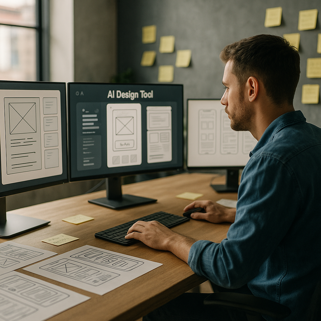
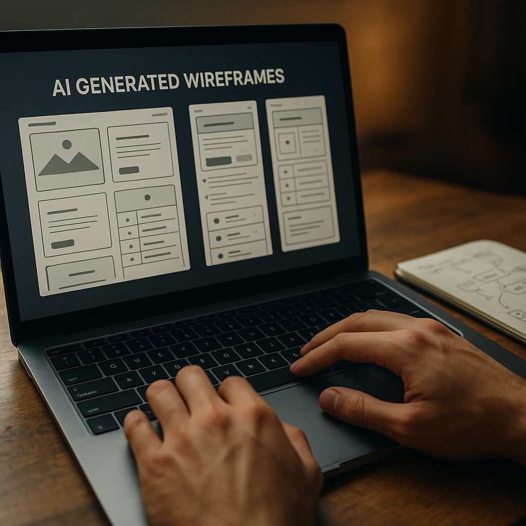
    Wireframing tools can now generate starter screens from a plain language prompt. Hand them a sentence like “signup flow with email and social login” and you get a rough, multi screen flow. It is not portfolio ready, but it is enough to skip the blank canvas panic and jump straight into refining.

    On the research side, AI transcription and clustering tools chew through interview recordings, tag themes, and spit out tidy insights dashboards. Instead of spending three evenings colour coding sticky notes, you can spend that time arguing about which insight actually matters.

    Where AI shines and where humans are still annoyingly necessary

    The sweet spot for AI in UX design is repetitive, pattern heavy work. Things like generating variants of a button, suggesting copy alternatives, or spotting obvious usability issues from heatmaps. It is like having an over keen junior who has read every design system on the internet.

    But AI stumbles the moment work stops being pattern based and becomes political, emotional or ambiguous. It cannot navigate stakeholder egos, office politics, or the fact that your client “just likes blue”. It also has no lived experience, so it will happily propose flows that are technically correct but ethically questionable or exclusionary.

    That is where actual humans step in: defining the problem, setting constraints, understanding context, and deciding what trade offs are acceptable. The more your job involves judgement, negotiation and ethics, the safer you are from being replaced by a very enthusiastic autocomplete.

    New workflows: from prompt to prototype

    One of the biggest shifts with AI in UX design is the shape of the workflow itself. Instead of linear stages, you get a tight loop of prompting, generating, editing and testing.

    A typical loop might look like this:

    • Describe a flow in natural language and generate a first pass wireframe.
    • Ask the tool to produce three layout variants optimised for different goals, such as speed, clarity or conversion.
    • Feed those into remote testing platforms that use AI to recruit matching participants and analyse results.
    • Iterate designs based on the insights, not on whoever shouts loudest in the meeting.

    Developers are pulled into this loop earlier too. Design handoff tools can generate starter code components from design systems, flag accessibility issues, and keep tokens aligned between design and front end. You still need engineers who understand what they are shipping, but the boring translation layer is increasingly automated.

    Skills designers should actually learn (instead of panicking)

    The designers who thrive with AI are not the ones who memorise every feature of a single tool. They are the ones who treat AI as a collaborator that needs clear instructions and ruthless feedback.

    Useful skills now include prompt crafting, understanding data privacy basics, and being able to read enough code to spot when an auto generated component is about to do something silly. Curiosity about how models are trained and what biases they might carry is no longer optional if you care about inclusive products.

    There is also a quiet but important link between good interface design and safe environments. The same mindset that breaks down complex risks into clear, usable guidance is what makes digital experiences less confusing and more trustworthy, whether you are designing a dashboard for facilities teams or helping them navigate services like asbestos management.

    What all this means for your future projects

    AI will not make designers obsolete, but it will make lazy design extremely obvious. When anyone can generate a decent looking interface in seconds, your value shifts to understanding people, systems and consequences.

    Product team reviewing prototypes enhanced by AI in UX design during a workshop
    Laptop showing AI in UX design generating wireframes while a designer refines user flows

    AI in UX design FAQs

    Will AI replace UX designers completely?

    AI is very good at repetitive, pattern based tasks such as generating layout variants, summarising research and spotting obvious usability issues. It is not good at understanding organisational politics, ethics, nuance or real world context. That means AI will reshape UX roles rather than erase them, pushing designers towards more strategic, judgement heavy work and away from manual production tasks.

    How can I start using AI in my UX design workflow?

    Begin with low risk, repetitive tasks. Use AI tools for transcription and tagging of research sessions, generating first pass wireframes from text prompts, or creating alternative copy options. Treat the outputs as rough drafts, not final answers. Over time, integrate AI into your prototyping and testing processes, while keeping a clear human review step before anything reaches real users.

    What are the risks of relying on AI in UX design?

    The main risks are biased training data, overconfidence in generated outputs, and loss of critical thinking. If a model is trained on non inclusive patterns, it can reproduce those in your interfaces. Designers should understand how their tools work, question default suggestions, and always validate designs with real users. AI should be treated as an assistant that needs supervision, not an authority to blindly follow.

  • Designing AI dashboards that humans can actually use

    Designing AI dashboards that humans can actually use

    AI dashboard design has become the new battleground between data scientists, designers and the poor users caught in the middle. Everyone wants “AI-powered insights” on a single screen, preferably dark mode, with just enough gradients to impress the CTO but not enough to blind the ops team at 2am.

    Why AI dashboard design is its own special kind of chaos

    Traditional dashboards mostly show what has happened. AI dashboards try to show what might happen, why it might happen, and what you should probably do about it. That is a lot of cognitive load to cram into a 1440 x 900 rectangle.

    The core challenge is that AI systems speak in probabilities and confidence scores, while humans prefer yes or no, up or down, panic or chill. Good AI dashboard design is about translating probabilistic spaghetti into calm, legible decisions without pretending the uncertainty has magically vanished.

    Start with decisions, not data

    Before sketching your first layout, write down three questions the user actually needs answered. For example:

    • Is anything on fire right now?
    • What will probably be on fire soon?
    • What can I do about it before it is on fire?

    Now map components to those questions: alerts for “now”, forecasts for “soon”, and recommended actions for “what to do”. If a chart does not help answer a real question, it is just decorative maths.

    Designing AI outputs that are not black boxes

    Explainability is not a nice-to-have. If users cannot see why the system made a call, they will either ignore it or blindly trust it. Both are bad.

    Simple patterns that help:

    • Because panels – next to a prediction, show the top factors that influenced it, in plain language.
    • Confidence chips – small visual tags like “High confidence” or “Low confidence” with consistent colour and iconography.
    • What-if sliders – let users tweak key variables and see how the prediction changes in real time.

    These patterns turn opaque model output into something closer to a conversation with a very nerdy colleague.

    Layout patterns that keep the chaos under control

    Most effective AI dashboards follow a three-layer structure:

    1. Top strip – global status, key KPIs, and any critical alerts.
    2. Middle canvas – forecasts, trends and segment breakdowns.
    3. Bottom or side rail – recommended actions, logs, and filters.

    Keep the number of simultaneous visualisations low. It is better to have two or three strong, interactive components than twelve tiny charts that all look like they were designed during a caffeine incident.

    Visual hierarchy for probabilistic data

    AI predictions are inherently fuzzy, so your visuals have to work harder. A few guidelines:

    • Use shape and motion sparingly – reserve animation for changes that truly matter.
    • Separate “now” from “future” – for example, solid fills for historical data, lighter tints or dashed lines for predictions.
    • Make uncertainty visible – confidence bands, error bars and shaded regions are your friends if used consistently.

    The goal is not to hide uncertainty but to make it legible at a glance.

    Interaction design: from insight to action

    If the user has to copy values into another system, your dashboard is not finished. Good AI dashboard design bakes the next step directly into the UI.

    Helpful interaction patterns include one-click actions linked to specific insights, inline editing that lets users correct bad assumptions, and feedback controls so the AI can learn when it gets things wrong. The best systems feel like a loop: observe, understand, act, refine.

    Designing for different levels of nerd

    Not everyone wants to see feature importance graphs before breakfast. Build layered detail:

    • Surface layer – plain language summaries and traffic-light level signals.
    • Analyst layer – filters, segment breakdowns and confidence details.
    • Expert layer – model diagnostics, raw scores, and advanced controls.

    Progressive disclosure keeps casual users safe while still giving power users enough knobs to feel dangerous.

    Real-time, streaming and the illusion of control

    Many AI tools now stream updates in near real time. That does not mean every number should twitch constantly. Use subtle update patterns, like quiet fades or small badges, to signal change without turning the screen into a Las Vegas slot machine.

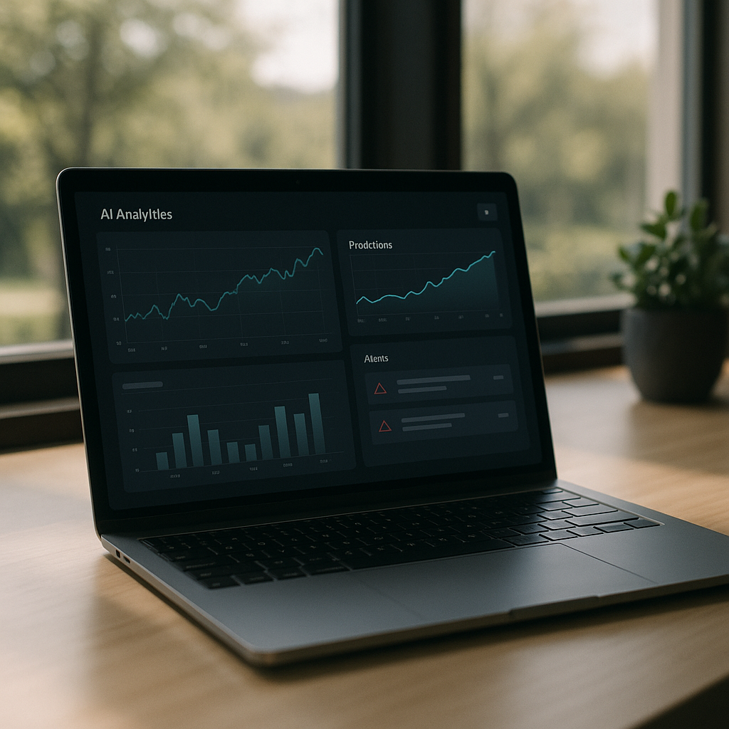
    Laptop on desk displaying an interface that demonstrates thoughtful AI dashboard design for predictions and alerts
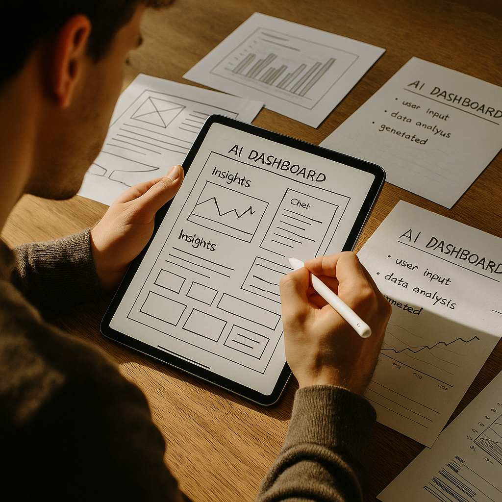
    Product designer sketching wireframes that map out AI dashboard design components and layouts

    AI dashboard design FAQs

    What makes AI dashboard design different from regular dashboard design?

    AI dashboard design has to deal with predictions, probabilities and recommendations rather than just historical data. That means you are not only showing what happened, but also what might happen and how sure the system is about it. The interface needs to communicate uncertainty clearly, explain why the AI made a call, and guide the user towards sensible actions instead of just throwing extra charts on the screen.

    How do I show AI confidence without confusing users?

    Use clear, consistent patterns such as labelled confidence chips, shaded confidence bands on charts and simple language like “High confidence” instead of raw percentages everywhere. Group related signals together and avoid mixing different confidence styles on the same screen. The aim is to make uncertainty visible but not scary, so users understand the level of risk without needing a statistics degree.

    How many charts should an AI dashboard have?

    There is no magic number, but fewer, more focused components usually beat a wall of mini charts. Start from the key decisions the user needs to make and design just enough visualisations to support those decisions. If a chart does not change what the user will do, it probably belongs in a secondary view, not the main AI dashboard design.