AI dashboard design has become the new battleground between data scientists, designers and the poor users caught in the middle. Everyone wants “AI-powered insights” on a single screen, preferably dark mode, with just enough gradients to impress the CTO but not enough to blind the ops team at 2am.

Why AI dashboard design is its own special kind of chaos
Traditional dashboards mostly show what has happened. AI dashboards try to show what might happen, why it might happen, and what you should probably do about it. That is a lot of cognitive load to cram into a 1440 x 900 rectangle.
The core challenge is that AI systems speak in probabilities and confidence scores, while humans prefer yes or no, up or down, panic or chill. Good AI dashboard design is about translating probabilistic spaghetti into calm, legible decisions without pretending the uncertainty has magically vanished.
Start with decisions, not data
Before sketching your first layout, write down three questions the user actually needs answered. For example:
- Is anything on fire right now?
- What will probably be on fire soon?
- What can I do about it before it is on fire?
Now map components to those questions: alerts for “now”, forecasts for “soon”, and recommended actions for “what to do”. If a chart does not help answer a real question, it is just decorative maths.
Designing AI outputs that are not black boxes
Explainability is not a nice-to-have. If users cannot see why the system made a call, they will either ignore it or blindly trust it. Both are bad.
Simple patterns that help:
- Because panels – next to a prediction, show the top factors that influenced it, in plain language.
- Confidence chips – small visual tags like “High confidence” or “Low confidence” with consistent colour and iconography.
- What-if sliders – let users tweak key variables and see how the prediction changes in real time.
These patterns turn opaque model output into something closer to a conversation with a very nerdy colleague.
Layout patterns that keep the chaos under control
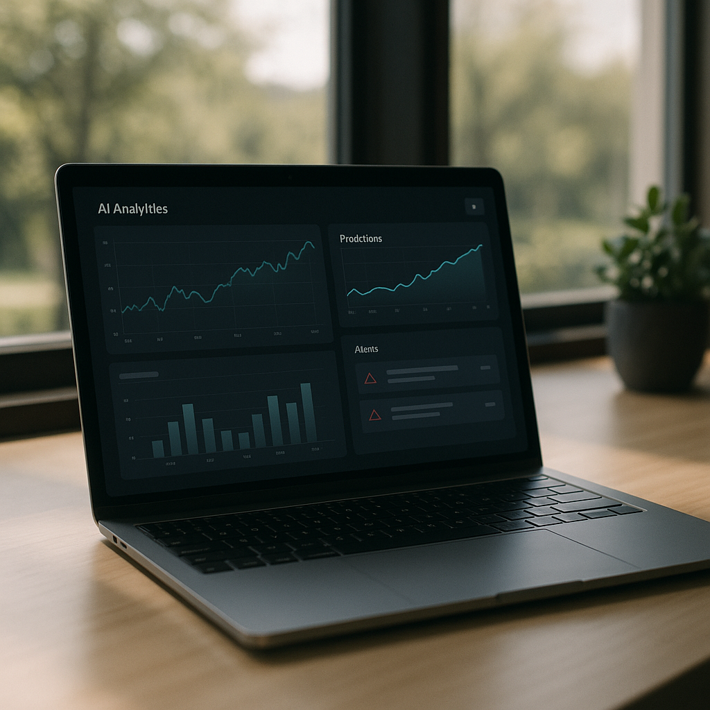
Most effective AI dashboards follow a three-layer structure:
- Top strip – global status, key KPIs, and any critical alerts.
- Middle canvas – forecasts, trends and segment breakdowns.
- Bottom or side rail – recommended actions, logs, and filters.
Keep the number of simultaneous visualisations low. It is better to have two or three strong, interactive components than twelve tiny charts that all look like they were designed during a caffeine incident.
Visual hierarchy for probabilistic data
AI predictions are inherently fuzzy, so your visuals have to work harder. A few guidelines:
- Use shape and motion sparingly – reserve animation for changes that truly matter.
- Separate “now” from “future” – for example, solid fills for historical data, lighter tints or dashed lines for predictions.
- Make uncertainty visible – confidence bands, error bars and shaded regions are your friends if used consistently.
The goal is not to hide uncertainty but to make it legible at a glance.
Interaction design: from insight to action
If the user has to copy values into another system, your dashboard is not finished. Good AI dashboard design bakes the next step directly into the UI.
Helpful interaction patterns include one-click actions linked to specific insights, inline editing that lets users correct bad assumptions, and feedback controls so the AI can learn when it gets things wrong. The best systems feel like a loop: observe, understand, act, refine.
Designing for different levels of nerd
Not everyone wants to see feature importance graphs before breakfast. Build layered detail:
- Surface layer – plain language summaries and traffic-light level signals.
- Analyst layer – filters, segment breakdowns and confidence details.
- Expert layer – model diagnostics, raw scores, and advanced controls.
Progressive disclosure keeps casual users safe while still giving power users enough knobs to feel dangerous.
Real-time, streaming and the illusion of control
Many AI tools now stream updates in near real time. That does not mean every number should twitch constantly. Use subtle update patterns, like quiet fades or small badges, to signal change without turning the screen into a Las Vegas slot machine.

AI dashboard design FAQs
What makes AI dashboard design different from regular dashboard design?
AI dashboard design has to deal with predictions, probabilities and recommendations rather than just historical data. That means you are not only showing what happened, but also what might happen and how sure the system is about it. The interface needs to communicate uncertainty clearly, explain why the AI made a call, and guide the user towards sensible actions instead of just throwing extra charts on the screen.
How do I show AI confidence without confusing users?
Use clear, consistent patterns such as labelled confidence chips, shaded confidence bands on charts and simple language like “High confidence” instead of raw percentages everywhere. Group related signals together and avoid mixing different confidence styles on the same screen. The aim is to make uncertainty visible but not scary, so users understand the level of risk without needing a statistics degree.
How many charts should an AI dashboard have?
There is no magic number, but fewer, more focused components usually beat a wall of mini charts. Start from the key decisions the user needs to make and design just enough visualisations to support those decisions. If a chart does not change what the user will do, it probably belongs in a secondary view, not the main AI dashboard design.
Leave a Reply