Category: Nerdy

  • How Local Service Businesses Are Actually Using App Design to Win Customers

    How Local Service Businesses Are Actually Using App Design to Win Customers

    There is a delightful nerdy irony in the fact that some of the most interesting application of app design for local service businesses is happening not in Silicon Valley start-ups but in bin cleaning rounds, garden maintenance crews, and window washing vans trundling around British suburbs. Designers and developers, pay attention – because the gap between a scrappy trades business and a polished digital-first operation is essentially a UX problem waiting to be solved.

    Why App Design for Local Service Businesses Actually Matters

    Let us be clear about something: most local service businesses are not building their own apps. That would be like buying a Formula One car to nip to Tesco. What they are doing – the smart ones, anyway – is leaning heavily on existing platforms, booking tools, and workflow apps that have been designed with genuine craft. The design decisions baked into those tools directly affect whether a customer books, whether a job gets scheduled properly, and whether the business owner avoids a complete nervous breakdown on a Tuesday morning.

    This is where the rubber meets the road for UI and UX professionals. When you design a booking flow, a service selection screen, or a recurring schedule widget, you are not just pushing pixels. You are making operational decisions for real people with real businesses. That responsibility is enormous and, honestly, quite exciting.

    The Design Patterns That Local Services Actually Use

    Frictionless Booking Flows

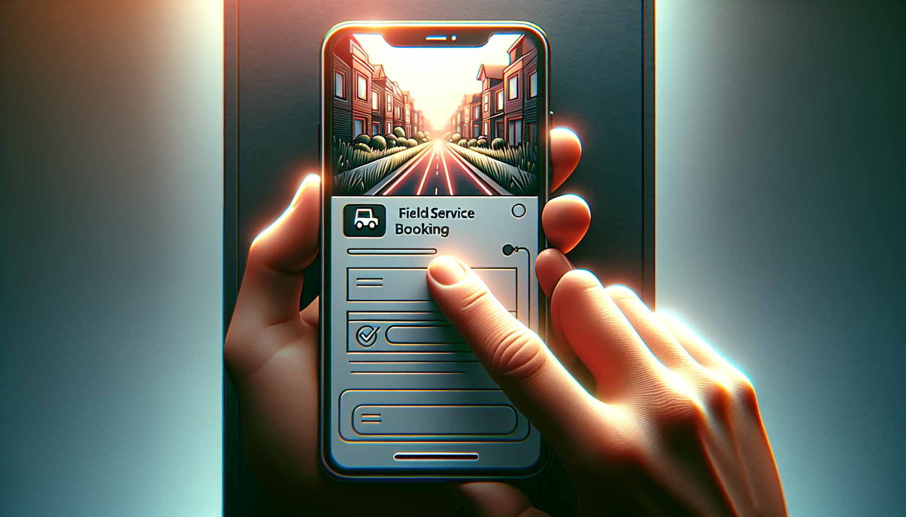
    The single most important screen in any service business app is the booking screen. Research consistently shows that every additional tap in a booking flow costs conversions. Local service providers need customers to go from “I want this done” to “it is booked” in under sixty seconds. That means ruthless prioritisation: service type, date, address, payment. Nothing else. No unnecessary account creation walls, no nine-step onboarding sequences. Clean, purposeful, fast.

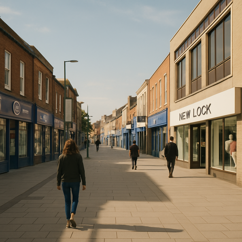
    The Bin Boss, a UK business that provides a local service to residential and commercial customers, is a solid real-world example of a service operation where the digital touchpoint – whether a website form or a scheduling tool – needs to do the heavy lifting efficiently. When the service itself is routine and repeat-based, the app design has to make rebooking feel almost automatic.

    Notification Architecture

    Push notifications in service apps are criminally underdesigned. Most businesses default to “your appointment is tomorrow” and call it done. But well-architected notification systems – tiered by urgency, personalised by service history, timed intelligently relative to the job – actually reduce no-shows, increase upsells, and build the kind of passive brand familiarity that keeps customers loyal. This is a design and systems problem simultaneously, which makes it genuinely fun to work on.

    Route and Schedule Visualisation

    On the operational side, the design of scheduling and routing interfaces is where complexity lives. A field service team needs to see their day at a glance – who, where, when, and how long. Map integrations, drag-and-drop rescheduling, and real-time status updates are all standard expectations now. Getting the information hierarchy right on a mobile screen when someone is standing on a doorstep in the rain is a proper design challenge that requires empathy and rigour in equal measure.

    What Designers Can Learn From the Trades

    Here is the nerdy insight that most design schools do not teach: constraints breed clarity. A bin cleaning company does not need a design system with forty-seven colour tokens and a philosophical approach to micro-interactions. It needs something that works on a slightly cracked Android phone, loads fast on a 4G signal, and requires zero training to operate. Designing for those constraints produces leaner, more honest interfaces than designing for a fictional power user in a glass-walled office.

    The lesson is that real-world operational software forces designers to prioritise mercilessly. Every element must justify its existence by solving a real problem. There is no room for decorative complexity when someone needs to mark a job complete before driving to the next address.

    Tools and Tech Worth Knowing

    If you are a developer or designer looking to build in this space, the stack matters. Platforms like Jobber, ServiceM8, and Housecall Pro have set strong baseline expectations for what field service software looks like. Study them. Understand why the navigation is structured the way it is, why customer history is surfaced at specific moments, and how the payment collection flow minimises awkwardness for both parties.

    For custom builds, React Native and Flutter remain the sensible choices for cross-platform field service apps. The offline-first architecture consideration is non-negotiable – service workers are not always in range of a reliable signal, and an app that falls over without connectivity is worse than no app at all.

    The Real Opportunity for Designers Right Now

    Local service businesses in the UK represent a genuinely underserved design market. Many are still operating on spreadsheets, WhatsApp groups, and sheer willpower. The businesses that have invested in proper digital tooling – even basic, well-designed booking and scheduling systems – are measurably outperforming those that have not.

    A company like The Bin Boss, operating as a local service business in the UK, illustrates exactly why thoughtful digital design creates competitive advantage in sectors that are not traditionally associated with tech. When your competitor is booking jobs via a Facebook message and you have a slick, instant online booking flow, that difference is felt immediately by customers.

    Designers who understand this space, who can translate operational complexity into clean, functional interfaces, are building genuinely useful things. That is a good feeling. Better than designing the fourteenth variation of a social media dashboard that nobody asked for.

    Bringing It All Together

    App design for local service businesses is not glamorous in the conference-talk sense. Nobody is winning design awards for a bin round scheduling interface. But it is consequential, technically interesting, and full of unsolved problems that reward thoughtful, rigorous design thinking. If you are a designer or developer looking for work that actually matters to real people running real businesses, this is a very good place to point your skills.

    Close-up of a smartphone showing a booking screen in an app design for local service businesses
    Local service worker using a tablet to check scheduling app, illustrating app design for local service businesses in the real world

    App design for local service businesses FAQs

    What kind of apps do local service businesses actually use?

    Most local service businesses rely on purpose-built field service management platforms such as Jobber, ServiceM8, or Housecall Pro rather than custom-built apps. These platforms handle scheduling, invoicing, customer management, and route planning. Some larger operations do commission custom app development, particularly when their workflow does not fit neatly into an off-the-shelf product.

    How much does it cost to build an app for a local service business?

    A custom mobile app for a local service business typically costs anywhere from £5,000 for a basic MVP to £50,000 or more for a fully featured cross-platform solution with offline support, payment integration, and route optimisation. For most small operators, a well-configured SaaS platform is a far more cost-effective starting point, often available for between £30 and £150 per month.

    What design principles are most important for service business apps?

    Speed and clarity are the two non-negotiables. Users in the field need to complete tasks quickly, often on mobile, sometimes with poor connectivity. This means offline-first architecture, minimal tap counts for core actions, and an information hierarchy that surfaces what matters right now rather than everything at once. Accessibility and legibility in outdoor lighting conditions are also worth specific design attention.

    Is React Native or Flutter better for building a field service app?

    Both are strong choices for cross-platform field service apps and the honest answer is that the deciding factor is usually your team’s existing skill set. Flutter tends to offer better performance consistency across Android and iOS, while React Native benefits from a larger community and easier integration with JavaScript-heavy web codebases. For offline-first requirements, both support the necessary architectural patterns with the right libraries.

    How do you design a booking flow that converts well for a service business?

    The golden rule is to minimise steps between intent and confirmation. Collect only the information that is genuinely required to fulfil the booking – service type, preferred date, address, and payment. Defer account creation until after the first booking is confirmed. Use smart defaults based on location or previous visits where possible, and always confirm the booking with an immediate, clear summary so the customer feels certain the job is booked.

  • Why Town Centre Retail Is the Perfect UX Case Study Nobody Asked For

    Why Town Centre Retail Is the Perfect UX Case Study Nobody Asked For

    Nobody wakes up thinking, “I fancy a deep dive into town centre design today.” And yet, here we are. Because if you look at a typical British high street through the eyes of a UX designer or a frontend developer, it is basically a live-action usability test – and most of it is failing spectacularly.

    The High Street as a User Interface

    Think about it. A town centre is, fundamentally, an interface. People enter it with goals – buy a coffee, find a post office, locate that one bakery they half-remember from 2019. The physical layout, signage, and flow of a high street either supports those goals or completely undermines them. Sound familiar? That is exactly what happens when you hand a poorly planned website to an unsuspecting user.

    Bad wayfinding in a town centre is the physical equivalent of hiding your navigation menu behind a mystery hamburger icon with no label. People just… wander. They look confused. They leave. In digital terms, that is your bounce rate doing a little jig.

    What Town Centre Design Gets Surprisingly Right

    To be fair, not everything on the high street is a disaster. Anchor stores – your big department stores, your well-known supermarkets – function exactly like above-the-fold hero sections. They draw people in and create a visual hierarchy that smaller businesses benefit from simply by being nearby. This is proximity bias in action, and it works just as well in a CSS grid layout as it does in a pedestrianised shopping zone.

    Town centre design also does something clever with density. A well-planned high street clusters complementary services together. Cafes near bookshops. Stationers near print shops. This is information architecture made physical, and it absolutely translates to how you should group features and content on any well-built web app.

    Where It All Goes Horribly Wrong (and What to Learn From It)

    Here is where the fun starts. Most town centres have accumulated decades of chaotic, unplanned additions – a pop-up here, a boarded-up unit there, signage from four different eras all competing for attention simultaneously. It is like looking at a codebase where seventeen different developers have left their mark and nobody ever refactored anything. You can smell the technical debt from the car park.

    The lesson for designers and developers is this: consistency matters enormously. A town centre that uses five different typefaces across its wayfinding signs – yes, this genuinely happens – is committing the same sin as a design system with fourteen shades of blue and no token structure. It erodes trust. It creates cognitive load. It makes people tired before they have even found what they came for.

    The Digital Twin Opportunity

    Here is where things get properly interesting for the tech crowd. The concept of a digital twin – a live, data-driven virtual model of a physical space – is being applied to town centres with increasing sophistication. Councils and planners are using interactive maps, footfall analytics, and even AR overlays to understand how people actually move through and interact with urban spaces.

    From a design and development perspective, this is a goldmine. The same principles that make a great dashboard UX – clear data visualisation, intuitive filtering, responsive feedback – are exactly what makes a digital twin of a town centre useful rather than just impressive in a pitch deck. Town centre design is, quietly, becoming a seriously interesting domain for developers who want their work to have a tangible real-world impact.

    The Takeaway (For the Nerds in the Room)

    Next time you are struggling to explain information architecture, user flows, or visual hierarchy to a client who just does not get it, take them for a walk down their local high street. Point at the confusing signage. Point at the anchor stores. Point at the chaos. Town centre design is UX with bricks, and it is one of the best real-world classrooms a designer could ask for.

    UX designer analysing a digital map inspired by town centre design and wayfinding data
    Pedestrianised town centre design showing competing signage styles and user navigation challenges

    Town centre design FAQs

    How does town centre design relate to UX design principles?

    Town centre design mirrors UX design in several key ways – wayfinding corresponds to navigation, anchor stores reflect visual hierarchy, and the clustering of related shops mirrors good information architecture. Studying how people move through and interact with physical spaces offers genuinely useful insights for anyone designing digital interfaces.

    What is a digital twin and how is it used in town centre planning?

    A digital twin is a virtual, data-driven replica of a physical environment. In the context of town centre planning, it allows councils and urban designers to model footfall patterns, test layout changes, and visualise pedestrian behaviour in real time. From a tech perspective, building these systems requires strong data visualisation skills and thoughtful UX design to make the information genuinely actionable.

    Can bad town centre design actually teach developers something useful?

    Absolutely. Bad town centre design is a masterclass in what happens when consistency, hierarchy, and user flow are ignored over time. The chaotic signage, contradictory layouts, and confusing clustering you find on many high streets are direct physical analogies for poorly structured codebases and inconsistent design systems. Studying the failures is just as instructive as studying the successes.

  • The Future Of Print Design In A Screen-First World

    The Future Of Print Design In A Screen-First World

    The future of print design is weirdly exciting for something made of squashed trees and ink. Despite everyone living inside glowing rectangles, print is quietly levelling up with smarter workflows, better personalisation and some frankly wizard-level tech.

    Why the future of print design is not actually dead

    Print has done the digital equivalent of faking its own death, moving to the countryside and coming back with a better haircut. Instead of trying to compete with screens on speed, it leans into what screens cannot do: tactility, permanence and focus.

    People still trust printed material more than random pixels. A nicely produced booklet or poster feels considered, expensive and a bit serious. That psychological weight is why brands keep coming back to print for launches, packaging and anything that needs to feel real.

    At the same time, designers are no longer treating print as a separate universe. Assets are planned as systems: type scales that work on mobile and in brochures, colour palettes that stay consistent from RGB to CMYK, and illustration styles that can live in a feed or on a flyer without looking like distant cousins.

    Key trends shaping the future of print design

    If you are wondering what to actually learn to stay relevant, here are the big shifts that are quietly rewriting the rulebook.

    1. Variable data and hyper personalisation

    Modern print workflows let you personalise at scale. Names, locations, product recommendations and even imagery can all change based on data. Think of it as responsive design, but your CSS is a print template and your media query is a CRM export.

    Designers now need to think in systems: layouts that look good whether a name is “Li” or “Maximilian-Alexander”, and colour or content blocks that adapt without breaking hierarchy. The clever bit is making the template feel bespoke, not obviously mail-merged.

    2. Sustainability as a design constraint

    Eco concerns are no longer a footnote at the end of a brief. Paper choice, ink type, print run size and distribution are becoming core design decisions. Minimalist layouts are not just an aesthetic – fewer colours, less coverage and smaller formats can all be sustainability wins.

    Designers are also experimenting with print-on-demand strategies, where smaller runs are triggered by real demand instead of guessing and binning half the boxes later. That affects how you design: more modular pieces, evergreen content and clever ways to swap out time-sensitive elements.

    3. Print that talks to digital

    The future of print design is hybrid. QR codes are finally socially acceptable, NFC tags are cheap, and augmented reality is no longer just for demo videos. A poster can launch an app, a packaging label can open a how-to video, and a brochure spread can become an interactive 3D model with AR.

    This means you design journeys, not just pages. Where does the user go after they scan? Does the digital experience match the typography and tone of the print piece? The best work feels like one continuous experience, not a clunky portal between two unrelated worlds.

    4. Smarter tools and automated workflows

    Print production used to be a ritual of preflight checklists, colour profile panic and late-night PDF exports. Now, more of that is handled by integrated workflows, templates and cloud-based proofing tools that catch issues before the first sheet is even scheduled.

    Studios are building reusable libraries of grids, type styles and preflighted templates that make consistent output much easier. Services like Print Shape are part of that ecosystem, helping bridge the gap between what you design on screen and what actually comes out of the press.

    Skills designers need for the future of print design

    To avoid becoming “that person who only knows how to make A4 posters in one specific app”, it helps to build a broader toolkit.

    First, get comfortable with colour management. Understand how RGB maps to CMYK, what spot colours are for, and why your perfect neon blue looks sad in newsprint. Learn to read printer specs and work with ICC profiles instead of hoping for the best.

    Modern brochure with QR code illustrating the hybrid future of print design connecting to digital experiences
    Design studio workspace exploring materials and colour for the future of print design

    Future of print design FAQs

    Is there still a career in print design?

    Yes. Print has become more specialised, but it is far from dead. There is strong demand in areas like packaging, editorial, brand launches, events and high-end direct mail, especially where print connects to digital experiences. Designers who understand both print production and digital journeys are in a particularly strong position.

    What software should I learn for modern print workflows?

    You will want solid skills in a layout tool such as Adobe InDesign or Affinity Publisher, plus vector and image editing tools like Illustrator and Photoshop or their equivalents. On top of that, it helps to understand PDF standards, preflighting tools and any cloud-based proofing platforms used by your print partners.

    How can I make my print designs more sustainable?

    Start with paper choice and print volume. Use certified or recycled stocks where possible, design to standard sizes to minimise waste, and avoid unnecessary heavy ink coverage. Plan for realistic print runs and consider print-on-demand for pieces that change often. Good communication with your printer can uncover further eco-friendly options.