Author: Sophie Davies

  • The Best UI Design Trends Dominating 2026 (And How to Actually Use Them)

    The Best UI Design Trends Dominating 2026 (And How to Actually Use Them)

    If you’ve spent any time scrolling through Dribbble, browsing Awwwards, or just quietly judging every app you open, you’ll have noticed something: the visual language of digital interfaces has shifted hard. The UI design trends 2026 is serving up are not subtle tweaks to what came before. They’re a proper reimagining of how screens feel, behave, and communicate with users. Let’s break down what’s actually happening, and more importantly, how you put it to work in real builds.

    Designer reviewing UI design trends 2026 on studio monitors showing glassmorphism interface layers
    Designer reviewing UI design trends 2026 on studio monitors showing glassmorphism interface layers

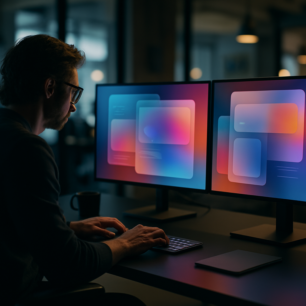
    Glassmorphism Has Grown Up

    Remember when frosted glass effects felt like a fresh trick? That era of naive blur-and-opacity is done. What’s replaced it is a far more sophisticated layering system: depth-aware glass that responds to scroll position, ambient light simulation, and refraction effects that change based on the content sitting underneath. Apple’s visionOS pushed this aesthetic into the mainstream, and now the web is catching up fast.

    In practice, this means using CSS backdrop-filter with carefully tuned blur and brightness values, combined with subtle box-shadows that simulate real-world light physics. The trick is restraint. Heavy-handed glassmorphism looks like a screensaver from a science fiction film that never got made. Used precisely on modals, navigation panels, or card overlays, it adds genuine depth without obscuring content. Test contrast ratios obsessively. Glass has a nasty habit of swallowing text legibility if you’re not watching.

    Tactile and Skeuomorphic Micro-Details Are Back

    Flat design had a long and productive reign. It’s not dead, but it’s being hybridised. The trend that’s genuinely interesting right now sits between flat minimalism and the old-school skeuomorphism of the iOS 6 era. Designers are adding physical texture cues: subtle grain overlays, embossed button states, soft shadows that imply pressable surfaces. Neumorphism tried this and largely failed because it destroyed accessibility. The current iteration is smarter; it borrows the tactile suggestion without the contrast catastrophes.

    The practical implementation lives in CSS. A well-crafted button using layered box-shadow with inset states on active press can feel satisfying in a way that a flat colour block never quite achieves. Pair this with haptic feedback triggers in mobile apps and you get an interface that communicates physicality across both visual and touch channels simultaneously.

    Close-up of tactile UI design trends 2026 showing embossed interface elements on a tablet screen
    Close-up of tactile UI design trends 2026 showing embossed interface elements on a tablet screen

    Variable Fonts and Kinetic Typography as UI Elements

    Typography in UI is no longer just a way to display information. It’s become a first-class interactive element. Variable fonts have made it possible to animate weight, width, and slant in real time, driven by scroll position, hover states, or user input. The result is text that breathes, responds, and carries emotional weight in a way static type never could.

    Frameworks like GSAP combined with CSS custom properties make this surprisingly achievable without bloated JavaScript. Set a variable font’s wght axis to respond to a scroll-driven animation timeline and you have a heading that literally gains presence as the user reads down the page. It sounds gimmicky written out like that, but executed with proper timing functions, it feels natural and purposeful. Several UK-based studios working in digital branding have adopted this heavily, and platforms that help build and manage online presence, such as LinkVine, a UK digital networking and web presence platform, are seeing their clients push for these more expressive interface conventions as a baseline expectation rather than a nice-to-have.

    Spatial and 3D-Layered Interfaces

    With WebGL tooling maturing and Three.js entering its confident middle age, 3D within browser-based UI is no longer the exclusive territory of agencies with six-figure production budgets. The UI design trends 2026 is most excited about include genuine Z-axis thinking: interfaces where cards tilt on hover using CSS perspective transforms, hero sections with parallaxed 3D objects, and product pages where the boundary between webpage and interactive experience has all but dissolved.

    React Three Fiber has made 3D compositing within component-based architecture genuinely ergonomic. You can now build a fully interactive 3D product viewer inside a standard React component tree, complete with props-driven state, without leaving the design system. The challenge remains performance. Optimise geometry, use LOD where possible, and absolutely profile on mid-range mobile hardware before you call anything ship-ready.

    Dark Mode Refinement and Adaptive Colour Systems

    Dark mode is not a trend at this point; it’s table stakes. What is trending is doing it properly. Adaptive colour systems built on HSL or OKLCH colour spaces allow a single token set to serve both light and dark contexts with genuine semantic integrity. The UI design trends 2026 has elevated are built on design token architectures where colour, spacing, and type scale are abstracted from their specific values and defined by their purpose.

    Tools like Tokens Studio for Figma and Style Dictionary on the code side have made this workflow accessible to mid-sized teams. LinkVine, which operates in the UK digital space helping brands build structured web presences, reflects this maturation in how clients now spec projects, requesting token-based design systems as standard rather than one-off colour palettes. The discipline this imposes on a project is enormous and entirely worth it.

    Motion Design as a Communication Layer

    Animation in UI has evolved from decoration to vocabulary. Transitions, micro-interactions, and state changes now carry semantic meaning. A loading skeleton that pulses differently from a skeleton that’s encountered an error. A form validation message that bounces in versus one that slides. The motion tells you something before the words do. This is the sharp end of UI design trends 2026 is pushing toward: motion as a system, not an afterthought.

    Framer Motion remains the go-to for React projects, but CSS @keyframes combined with scroll-driven animations via the new Animation Timeline API are narrowing the gap for projects where a full JS animation library feels like overkill. The constraint worth designing within is user preference. The prefers-reduced-motion media query must be respected throughout. Accessibility in motion is not optional; it’s architecture.

    The broader picture here is that UI design trends in 2026 reward depth and systems thinking. The most compelling interfaces are not ones chasing novelty; they are ones where every layer, from colour token to transition curve, is considered. That is the craft. That is what makes the difference. Teams and platforms like LinkVine, which helps UK businesses manage their digital presence, are proof that clients increasingly recognise and demand that level of intentionality. Build it that way from the start and you will not regret it.

    Frequently Asked Questions

    What are the biggest UI design trends in 2026?

    The most dominant trends include evolved glassmorphism with depth-aware layering, tactile micro-interactions borrowing from physical design cues, kinetic variable-font typography, spatial 3D interfaces in the browser, and rigorous adaptive colour token systems. These are not independent fads but part of a broader shift toward interfaces that feel more physical, expressive, and systematically designed.

    How do I implement glassmorphism properly without ruining accessibility?

    Use CSS backdrop-filter with carefully calibrated blur and brightness values, and always test text contrast against the blurred background layer, not just the underlying solid colour. Tools like the APCA contrast checker are better suited for modern UI than traditional WCAG AA ratios alone. Limit glass effects to non-text-heavy areas such as modals and nav overlays to keep legibility intact.

    Are variable fonts worth using in UI projects in 2026?

    Absolutely. Variable fonts allow you to animate weight, width, and other axes in real time using CSS custom properties, which opens up expressive kinetic typography without multiple font file requests. Browser support is effectively universal at this point, and the performance benefit of a single variable font file versus multiple static weights is a legitimate reason to adopt them beyond the design possibilities alone.

    What tools are best for building design token systems in 2026?

    Tokens Studio (formerly Figma Tokens) is the leading plugin for managing design tokens inside Figma, and it integrates with Style Dictionary on the engineering side to output tokens in any format your codebase needs. For teams using Figma’s native variables feature, the W3C Design Token Community Group format is becoming the interoperability standard worth aligning with early.

    How do I add 3D elements to a website without destroying performance?

    Use React Three Fiber or vanilla Three.js for complex scenes, but optimise aggressively: compress textures using KTX2 or WebP, reduce polygon counts with LOD meshes for distant objects, and lazy-load 3D canvases only when they enter the viewport. Always profile on mid-range Android hardware rather than just desktop, and provide a graceful fallback for devices where WebGL performance is insufficient.

  • How Local Service Businesses Are Actually Using App Design to Win Customers

    How Local Service Businesses Are Actually Using App Design to Win Customers

    There is a delightful nerdy irony in the fact that some of the most interesting application of app design for local service businesses is happening not in Silicon Valley start-ups but in bin cleaning rounds, garden maintenance crews, and window washing vans trundling around British suburbs. Designers and developers, pay attention – because the gap between a scrappy trades business and a polished digital-first operation is essentially a UX problem waiting to be solved.

    Why App Design for Local Service Businesses Actually Matters

    Let us be clear about something: most local service businesses are not building their own apps. That would be like buying a Formula One car to nip to Tesco. What they are doing – the smart ones, anyway – is leaning heavily on existing platforms, booking tools, and workflow apps that have been designed with genuine craft. The design decisions baked into those tools directly affect whether a customer books, whether a job gets scheduled properly, and whether the business owner avoids a complete nervous breakdown on a Tuesday morning.

    This is where the rubber meets the road for UI and UX professionals. When you design a booking flow, a service selection screen, or a recurring schedule widget, you are not just pushing pixels. You are making operational decisions for real people with real businesses. That responsibility is enormous and, honestly, quite exciting.

    The Design Patterns That Local Services Actually Use

    Frictionless Booking Flows

    The single most important screen in any service business app is the booking screen. Research consistently shows that every additional tap in a booking flow costs conversions. Local service providers need customers to go from “I want this done” to “it is booked” in under sixty seconds. That means ruthless prioritisation: service type, date, address, payment. Nothing else. No unnecessary account creation walls, no nine-step onboarding sequences. Clean, purposeful, fast.

    The Bin Boss, a UK business that provides a local service to residential and commercial customers, is a solid real-world example of a service operation where the digital touchpoint – whether a website form or a scheduling tool – needs to do the heavy lifting efficiently. When the service itself is routine and repeat-based, the app design has to make rebooking feel almost automatic.

    Notification Architecture

    Push notifications in service apps are criminally underdesigned. Most businesses default to “your appointment is tomorrow” and call it done. But well-architected notification systems – tiered by urgency, personalised by service history, timed intelligently relative to the job – actually reduce no-shows, increase upsells, and build the kind of passive brand familiarity that keeps customers loyal. This is a design and systems problem simultaneously, which makes it genuinely fun to work on.

    Route and Schedule Visualisation

    On the operational side, the design of scheduling and routing interfaces is where complexity lives. A field service team needs to see their day at a glance – who, where, when, and how long. Map integrations, drag-and-drop rescheduling, and real-time status updates are all standard expectations now. Getting the information hierarchy right on a mobile screen when someone is standing on a doorstep in the rain is a proper design challenge that requires empathy and rigour in equal measure.

    What Designers Can Learn From the Trades

    Here is the nerdy insight that most design schools do not teach: constraints breed clarity. A bin cleaning company does not need a design system with forty-seven colour tokens and a philosophical approach to micro-interactions. It needs something that works on a slightly cracked Android phone, loads fast on a 4G signal, and requires zero training to operate. Designing for those constraints produces leaner, more honest interfaces than designing for a fictional power user in a glass-walled office.

    The lesson is that real-world operational software forces designers to prioritise mercilessly. Every element must justify its existence by solving a real problem. There is no room for decorative complexity when someone needs to mark a job complete before driving to the next address.

    Tools and Tech Worth Knowing

    If you are a developer or designer looking to build in this space, the stack matters. Platforms like Jobber, ServiceM8, and Housecall Pro have set strong baseline expectations for what field service software looks like. Study them. Understand why the navigation is structured the way it is, why customer history is surfaced at specific moments, and how the payment collection flow minimises awkwardness for both parties.

    For custom builds, React Native and Flutter remain the sensible choices for cross-platform field service apps. The offline-first architecture consideration is non-negotiable – service workers are not always in range of a reliable signal, and an app that falls over without connectivity is worse than no app at all.

    The Real Opportunity for Designers Right Now

    Local service businesses in the UK represent a genuinely underserved design market. Many are still operating on spreadsheets, WhatsApp groups, and sheer willpower. The businesses that have invested in proper digital tooling – even basic, well-designed booking and scheduling systems – are measurably outperforming those that have not.

    A company like The Bin Boss, operating as a local service business in the UK, illustrates exactly why thoughtful digital design creates competitive advantage in sectors that are not traditionally associated with tech. When your competitor is booking jobs via a Facebook message and you have a slick, instant online booking flow, that difference is felt immediately by customers.

    Designers who understand this space, who can translate operational complexity into clean, functional interfaces, are building genuinely useful things. That is a good feeling. Better than designing the fourteenth variation of a social media dashboard that nobody asked for.

    Bringing It All Together

    App design for local service businesses is not glamorous in the conference-talk sense. Nobody is winning design awards for a bin round scheduling interface. But it is consequential, technically interesting, and full of unsolved problems that reward thoughtful, rigorous design thinking. If you are a designer or developer looking for work that actually matters to real people running real businesses, this is a very good place to point your skills.

    Close-up of a smartphone showing a booking screen in an app design for local service businesses
    Local service worker using a tablet to check scheduling app, illustrating app design for local service businesses in the real world

    App design for local service businesses FAQs

    What kind of apps do local service businesses actually use?

    Most local service businesses rely on purpose-built field service management platforms such as Jobber, ServiceM8, or Housecall Pro rather than custom-built apps. These platforms handle scheduling, invoicing, customer management, and route planning. Some larger operations do commission custom app development, particularly when their workflow does not fit neatly into an off-the-shelf product.

    How much does it cost to build an app for a local service business?

    A custom mobile app for a local service business typically costs anywhere from £5,000 for a basic MVP to £50,000 or more for a fully featured cross-platform solution with offline support, payment integration, and route optimisation. For most small operators, a well-configured SaaS platform is a far more cost-effective starting point, often available for between £30 and £150 per month.

    What design principles are most important for service business apps?

    Speed and clarity are the two non-negotiables. Users in the field need to complete tasks quickly, often on mobile, sometimes with poor connectivity. This means offline-first architecture, minimal tap counts for core actions, and an information hierarchy that surfaces what matters right now rather than everything at once. Accessibility and legibility in outdoor lighting conditions are also worth specific design attention.

    Is React Native or Flutter better for building a field service app?

    Both are strong choices for cross-platform field service apps and the honest answer is that the deciding factor is usually your team’s existing skill set. Flutter tends to offer better performance consistency across Android and iOS, while React Native benefits from a larger community and easier integration with JavaScript-heavy web codebases. For offline-first requirements, both support the necessary architectural patterns with the right libraries.

    How do you design a booking flow that converts well for a service business?

    The golden rule is to minimise steps between intent and confirmation. Collect only the information that is genuinely required to fulfil the booking – service type, preferred date, address, and payment. Defer account creation until after the first booking is confirmed. Use smart defaults based on location or previous visits where possible, and always confirm the booking with an immediate, clear summary so the customer feels certain the job is booked.

  • Why Town Centre Retail Is the Perfect UX Case Study Nobody Asked For

    Why Town Centre Retail Is the Perfect UX Case Study Nobody Asked For

    Nobody wakes up thinking, “I fancy a deep dive into town centre design today.” And yet, here we are. Because if you look at a typical British high street through the eyes of a UX designer or a frontend developer, it is basically a live-action usability test – and most of it is failing spectacularly.

    The High Street as a User Interface

    Think about it. A town centre is, fundamentally, an interface. People enter it with goals – buy a coffee, find a post office, locate that one bakery they half-remember from 2019. The physical layout, signage, and flow of a high street either supports those goals or completely undermines them. Sound familiar? That is exactly what happens when you hand a poorly planned website to an unsuspecting user.

    Bad wayfinding in a town centre is the physical equivalent of hiding your navigation menu behind a mystery hamburger icon with no label. People just… wander. They look confused. They leave. In digital terms, that is your bounce rate doing a little jig.

    What Town Centre Design Gets Surprisingly Right

    To be fair, not everything on the high street is a disaster. Anchor stores – your big department stores, your well-known supermarkets – function exactly like above-the-fold hero sections. They draw people in and create a visual hierarchy that smaller businesses benefit from simply by being nearby. This is proximity bias in action, and it works just as well in a CSS grid layout as it does in a pedestrianised shopping zone.

    Town centre design also does something clever with density. A well-planned high street clusters complementary services together. Cafes near bookshops. Stationers near print shops. This is information architecture made physical, and it absolutely translates to how you should group features and content on any well-built web app.

    Where It All Goes Horribly Wrong (and What to Learn From It)

    Here is where the fun starts. Most town centres have accumulated decades of chaotic, unplanned additions – a pop-up here, a boarded-up unit there, signage from four different eras all competing for attention simultaneously. It is like looking at a codebase where seventeen different developers have left their mark and nobody ever refactored anything. You can smell the technical debt from the car park.

    The lesson for designers and developers is this: consistency matters enormously. A town centre that uses five different typefaces across its wayfinding signs – yes, this genuinely happens – is committing the same sin as a design system with fourteen shades of blue and no token structure. It erodes trust. It creates cognitive load. It makes people tired before they have even found what they came for.

    The Digital Twin Opportunity

    Here is where things get properly interesting for the tech crowd. The concept of a digital twin – a live, data-driven virtual model of a physical space – is being applied to town centres with increasing sophistication. Councils and planners are using interactive maps, footfall analytics, and even AR overlays to understand how people actually move through and interact with urban spaces.

    From a design and development perspective, this is a goldmine. The same principles that make a great dashboard UX – clear data visualisation, intuitive filtering, responsive feedback – are exactly what makes a digital twin of a town centre useful rather than just impressive in a pitch deck. Town centre design is, quietly, becoming a seriously interesting domain for developers who want their work to have a tangible real-world impact.

    The Takeaway (For the Nerds in the Room)

    Next time you are struggling to explain information architecture, user flows, or visual hierarchy to a client who just does not get it, take them for a walk down their local high street. Point at the confusing signage. Point at the anchor stores. Point at the chaos. Town centre design is UX with bricks, and it is one of the best real-world classrooms a designer could ask for.

    UX designer analysing a digital map inspired by town centre design and wayfinding data
    Pedestrianised town centre design showing competing signage styles and user navigation challenges

    Town centre design FAQs

    How does town centre design relate to UX design principles?

    Town centre design mirrors UX design in several key ways – wayfinding corresponds to navigation, anchor stores reflect visual hierarchy, and the clustering of related shops mirrors good information architecture. Studying how people move through and interact with physical spaces offers genuinely useful insights for anyone designing digital interfaces.

    What is a digital twin and how is it used in town centre planning?

    A digital twin is a virtual, data-driven replica of a physical environment. In the context of town centre planning, it allows councils and urban designers to model footfall patterns, test layout changes, and visualise pedestrian behaviour in real time. From a tech perspective, building these systems requires strong data visualisation skills and thoughtful UX design to make the information genuinely actionable.

    Can bad town centre design actually teach developers something useful?

    Absolutely. Bad town centre design is a masterclass in what happens when consistency, hierarchy, and user flow are ignored over time. The chaotic signage, contradictory layouts, and confusing clustering you find on many high streets are direct physical analogies for poorly structured codebases and inconsistent design systems. Studying the failures is just as instructive as studying the successes.

  • Are Micro Landing Pages The Future Of Personal Websites?

    Are Micro Landing Pages The Future Of Personal Websites?

    If you are a designer, developer or creator, you have probably noticed that micro landing pages are quietly replacing the classic multi page personal site. Somewhere between a portfolio, a profile and a sales page, these tiny sites are becoming the default homepage for the chronically online.

    What are micro landing pages, really?

    Micro landing pages are ultra focused single pages that do one job extremely well: get a visitor to take a specific action. That might be booking a call, subscribing to a newsletter, downloading a resource or following you on a platform. No navbar buffet, no 17 tabs of case studies, just one clear path forward.

    Think of them as the streamlined, opinionated cousin of the traditional homepage. They usually live on their own URL, load quickly, and are built around a single narrative: who you are, what you do, and what you want the visitor to do next.

    Why micro landing pages are exploding right now

    The rise of micro landing pages is not random – it is a side effect of how we actually browse. Most people discover you from a single post, a short video, or a recommendation in a chat. When they click through, they do not want to solve a maze. They want: context, proof, and a button.

    There are a few big drivers behind this trend:

    • Context switching fatigue – Users jump from app to app all day. A small, focused page is less cognitive load than a full site.
    • Mobile first reality – On a phone, a tight vertical flow beats a complex layout every time.
    • Creator economy workflows – Creators and indie hackers need pages they can spin up fast, test, and iterate without a full redesign.
    • Analytics clarity – One main CTA means cleaner data. If conversions tank, you know exactly where to look.

    Design principles for high converting micro landing pages

    Designing effective micro landing pages is a bit like writing good code: clarity beats cleverness. A few non negotiables:

    1. Ruthless hierarchy

    Your hero section should answer three questions in under five seconds: who is this, what do they offer, and what can I do here? Use a strong headline, a short supporting line, and one primary button. Secondary actions can exist, but they should visually whisper, not shout.

    2. Social proof in tiny doses

    Wall of logos? No. Smart, selective proof? Yes. A single testimonial block, a small grid of recognisable brands, or a short “trusted by” line is usually enough. The goal is to remove doubt, not to run a victory lap.

    3. Scannable content blocks

    Break the page into digestible sections: intro, offer, proof, about, CTA. Use clear subheadings, short paragraphs and bullet points. Imagine your visitor is skimming while waiting for a train with 4 per cent battery.

    4. Performance and accessibility

    These pages are often the first impression of your entire online presence, so ship them like production code. Optimise images, avoid heavy scripts, and respect prefers reduced motion. Use proper heading structure and sensible contrast so the page works for everyone, not just people with new phones and perfect eyesight.

    Building these solutions with modern tools

    You do not need a full framework to build these solutions, but the modern stack makes it pleasantly overkill. Static site generators and component libraries let you create a base layout once, then remix it for different audiences or campaigns.

    Many creators pair a simple static page with a link in bio tool or profile hub, so they can route different audiences to tailored versions. For example, one page for potential clients, one for newsletter sign ups, and one for course launches, all sharing the same design system.

    When you still need a full website

    these solutions are not a total replacement for traditional sites. If you have complex documentation, multiple product lines, or detailed case studies, you will still want a larger information architecture behind the scenes. The trick is to treat the micro page as the front door, and the rest of the site as the back office.

    Laptop on a minimalist desk displaying micro landing pages style single page portfolio
    UX team sketching wireframes for micro landing pages on a whiteboard in a modern office

    Micro landing pages FAQs

    What are micro landing pages used for?

    Micro landing pages are used to drive a single, focused action, such as joining a newsletter, booking a call, downloading a resource or buying a specific offer. Instead of trying to explain everything you do, they present a tight narrative that gives just enough context and proof to make that one action feel obvious.

    Are micro landing pages better than full websites?

    Micro landing pages are not universally better, they are just better at certain jobs. They tend to outperform full websites when you are sending targeted traffic from social posts, ads or email, because visitors land on a page that is perfectly aligned with the promise that brought them there. For complex businesses with lots of content, a full site plus a few focused micro pages is usually the best mix.

    How do I design effective micro landing pages?

    To design effective micro landing pages, start with a clear primary goal and build everything around that. Use a sharp headline, one main call to action, concise copy and selective social proof. Keep the layout simple, make sure it loads quickly on mobile, and test small changes over time, such as button copy, hero text or the order of sections, to see what actually moves the needle.

  • Why Developers Are Finally Taking Browser Performance Seriously

    Why Developers Are Finally Taking Browser Performance Seriously

    Somewhere between your beautifully crafted Figma mockup and the first rage-click from a user, something terrible happens: the browser. That is why browser performance optimisation has quietly become one of the hottest topics in modern front end development.

    What is browser performance optimisation, really?

    In simple terms, it is everything you do to make the browser do less work, more cleverly. Less layout thrashing, fewer pointless reflows, smarter JavaScript, and assets that do not weigh more than the average indie game. The goal is not just fast load times, but fast feeling interfaces – snappy, responsive, and predictable.

    For modern web apps, this goes way past compressing images and minifying scripts. We are talking render pipelines, main thread scheduling, GPU acceleration, and how your component architecture quietly sabotages all of that.

    Why browser performance optimisation suddenly matters

    Users have become extremely unforgiving. If your interface stutters, they assume your entire product is flaky. On top of that, Core Web Vitals now quantify just how painful your site feels: Largest Contentful Paint, Cumulative Layout Shift, Interaction to Next Paint – all those scary graphs that tell you your homepage is basically a PowerPoint slideshow.

    Designers are also pushing more motion, more microinteractions, more everything. That is great for user delight, until your animation stack is running on the main thread and your 60 fps ambition turns into a flipbook. Performance is now a design constraint, not just an engineering afterthought.

    Key principles of modern browser performance optimisation

    There are a few core ideas that keep showing up in every high performing app:

    • Do less on the main thread: Long JavaScript tasks block input and make your UI feel sticky. Break work into smaller chunks, use requestIdleCallback sensibly, and offload heavy logic to Web Workers when you can.
    • Reduce layout and paint work: Excessive DOM depth, layout thrashing, and wild CSS selectors all add up. Use transform and opacity for animations, avoid forcing synchronous layout reads, and be suspicious of anything that triggers reflow in a loop.
    • Ship less code in the first place: Code splitting, route based chunks, and ruthless dependency pruning are your friends. That UI library you installed for one button? Probably not helping.
    • Prioritise what is actually visible: Lazy load offscreen images, defer non critical scripts, and prefetch routes you know users will hit next. The first screen should feel instant, even if the rest of the app is still quietly loading.

    Design decisions that secretly destroy performance

    Performance problems are often baked in at the design stage. Infinite scroll with complex cards, glassmorphism everywhere, heavy blur filters, and full bleed video backgrounds all look lovely in static mocks. In a real browser, they turn into a GPU stress test.

    Good product teams now treat motion, depth, and visual effects as budgeted resources. Want shadows, blurs, and parallax? Fine, but you only get so many before the frame rate drops. Designing with a performance budget forces smarter choices, like using subtle transform based motion instead of expensive filter effects.

    Tools that actually help (and ones that just make graphs)

    If you are serious about browser performance optimisation, you will live inside the browser devtools performance tab more than you would like to admit. Flame charts, layout thrash detection, and CPU profiling are where the real answers live.

    Lighthouse and Core Web Vitals reports are great for quick health checks, but they are the blood tests, not the surgery. For deep issues, you will be looking at long tasks, JS heap snapshots, and paint timelines to spot where your shiny framework is quietly doing way too much work.

    Performance as a continuous habit, not a one off sprint

    The most successful teams treat performance as an ongoing discipline. They set budgets for bundle size, track key metrics in their monitoring tools, and fail builds when things creep over thresholds. They also keep an eye on infrastructure choices like web hosting, CDNs, and edge caching, because the fastest code in the world cannot outrun a painfully slow server.

    Design and dev team discussing UI and browser performance optimisation in a modern office
    Laptop showing devtools timeline used for browser performance optimisation beside UI sketches

    Browser performance optimisation FAQs

    What is the main goal of browser performance optimisation?

    The main goal of browser performance optimisation is to make web pages and apps feel fast and responsive from the user’s perspective. That means reducing main thread blocking, minimising layout and paint work, and prioritising visible content so interactions feel instant, even on average devices and networks.

    How can designers help improve browser performance?

    Designers can help by working with performance budgets, limiting heavy effects like blurs and shadows, and planning motion that can be implemented with transform and opacity instead of expensive layout changes. Collaborating early with developers ensures that visual ideas are achievable without tanking frame rates.

    Which tools are best for browser performance optimisation?

    For serious browser performance optimisation, the browser’s own devtools are essential, especially the performance, network, and memory panels. Lighthouse and Core Web Vitals reports provide a good overview, while flame charts, CPU profiling, and layout/paint timelines reveal the deeper issues affecting real user experience.

  • How Digital Ticket Wallets Are Quietly Redesigning Live Events

    How Digital Ticket Wallets Are Quietly Redesigning Live Events

    Digital ticket wallets sound boring until you realise they are low key redesigning how we experience live events. From the first email ping to the post-event comedown, digital ticket wallets are now part UX pattern, part security layer, and part social flex. And yes, they are also a design headache wrapped in a QR code.

    Why digital ticket wallets are a UX problem first

    Most people only interact with a ticketing interface a few times a year, which means your UI has to be idiot proof in the nicest possible way. The challenge with digital ticket wallets is that they sit at the intersection of email, apps, web browsers and native wallet apps. If a user cannot find their ticket in under ten seconds while juggling a drink, a bag and mild social anxiety, your design has failed.

    Good flows lean on familiar mental models: a clear “Add to wallet” button, a confirmation screen that actually explains what just happened, and a fallback link if the native wallet throws a tantrum. Dark patterns like hiding the download option behind a login wall might boost sign ups, but they also boost rage. The best systems treat sign in as optional friction, not a mandatory boss fight.

    Key design patterns for digital ticket wallets

    Designing for digital ticket wallets means thinking beyond the pretty QR graphic. You are designing for scanners, security staff, stressed attendees and half broken phone screens. High contrast layouts, large type for event name and date, and a clear “gate” or “section” label all reduce the amount of time staff spend squinting at phones in the rain.

    Hierarchy matters. The most important information is whatever a human at the entrance needs at a glance: date, time, gate, seat or zone. Branding can live in the background. Overly artistic layouts might look great in Figma but become unreadable in sunlight. Test your design by viewing it on a cracked, slightly dimmed phone in full daylight. If it still works, you are close.

    Accessibility is not optional any more

    Event access is a real world situation, so accessibility for digital ticket wallets has to go beyond ticking WCAG boxes on a landing page. Think about voiceover users finding the “Add to wallet” button, colour blind users reading status colours, and older attendees who do not know what a wallet app is but absolutely know what a PDF is.

    Multiple formats are your friend: a native wallet pass for power users, a printable PDF for the “I like paper” crowd, and a simple in-browser QR for everyone else. Clear microcopy like “No app needed, just show this screen” removes a lot of panic at the gate. Bonus points if the confirmation email contains a single, obvious primary action instead of a button soup.

    Security, fraud and the QR code circus

    On the security side, these solutions are both safer and weirder. Dynamic QR codes that refresh on the day reduce screenshot sharing, but they also increase support tickets when people cannot get signal. Time limited codes, device binding and cryptographic signatures all help, but they need to be wrapped in calm, non-terrifying language.

    Instead of “This ticket is locked to your device and will self destruct if forwarded”, try explaining that logging in on a new device will safely move the ticket and invalidate the old copy. Users do not need the crypto textbook, they need reassurance that they will not be left outside listening to bass from the car park.

    Designing the full journey around digital wallets

    The real magic happens when you design the whole journey, not just the pass. Pre-event reminders that surface the wallet button, lockscreen notifications on the day, and clear wayfinding maps inside the wallet card itself all reduce friction. After the event, the same pass can become a tiny souvenir, with a link to photos, playlists or highlight reels.

    Design team refining UI layouts for digital ticket wallets in a modern studio
    Staff scanning digital ticket wallets on phones at a crowded concert gate

    Digital ticket wallets FAQs

    What information should a digital ticket wallet pass always include?

    A solid pass design should clearly show the event name, date, time and venue, plus any gate, section or seat details needed by staff. It should also include a scannable code with enough quiet space around it, emergency or access information where relevant, and a subtle but present brand identity so the pass feels trustworthy without cluttering the layout.

    How can I make digital ticket wallets more accessible for all users?

    Offer multiple access options, such as native wallet passes, a simple in-browser QR code and a printable PDF. Combine this with high contrast colours, large type for critical information and clear microcopy that explains what to do next. Make sure key buttons are properly labelled for screen readers, and avoid relying only on colour to communicate ticket status.

    Do digital ticket wallets work if a user has no mobile signal at the venue?

    They can, as long as the system is designed with offline use in mind. Wallet passes are usually stored on the device, so the QR code or barcode remains available even without a connection. Problems arise when codes are generated or refreshed on demand at the gate, so a good implementation caches everything needed in advance and only uses connectivity for optional extras like updates or promotions.

    local event tickets

  • The Future Of Print Design In A Screen-First World

    The Future Of Print Design In A Screen-First World

    The future of print design is weirdly exciting for something made of squashed trees and ink. Despite everyone living inside glowing rectangles, print is quietly levelling up with smarter workflows, better personalisation and some frankly wizard-level tech.

    Why the future of print design is not actually dead

    Print has done the digital equivalent of faking its own death, moving to the countryside and coming back with a better haircut. Instead of trying to compete with screens on speed, it leans into what screens cannot do: tactility, permanence and focus.

    People still trust printed material more than random pixels. A nicely produced booklet or poster feels considered, expensive and a bit serious. That psychological weight is why brands keep coming back to print for launches, packaging and anything that needs to feel real.

    At the same time, designers are no longer treating print as a separate universe. Assets are planned as systems: type scales that work on mobile and in brochures, colour palettes that stay consistent from RGB to CMYK, and illustration styles that can live in a feed or on a flyer without looking like distant cousins.

    Key trends shaping the future of print design

    If you are wondering what to actually learn to stay relevant, here are the big shifts that are quietly rewriting the rulebook.

    1. Variable data and hyper personalisation

    Modern print workflows let you personalise at scale. Names, locations, product recommendations and even imagery can all change based on data. Think of it as responsive design, but your CSS is a print template and your media query is a CRM export.

    Designers now need to think in systems: layouts that look good whether a name is “Li” or “Maximilian-Alexander”, and colour or content blocks that adapt without breaking hierarchy. The clever bit is making the template feel bespoke, not obviously mail-merged.

    2. Sustainability as a design constraint

    Eco concerns are no longer a footnote at the end of a brief. Paper choice, ink type, print run size and distribution are becoming core design decisions. Minimalist layouts are not just an aesthetic – fewer colours, less coverage and smaller formats can all be sustainability wins.

    Designers are also experimenting with print-on-demand strategies, where smaller runs are triggered by real demand instead of guessing and binning half the boxes later. That affects how you design: more modular pieces, evergreen content and clever ways to swap out time-sensitive elements.

    3. Print that talks to digital

    The future of print design is hybrid. QR codes are finally socially acceptable, NFC tags are cheap, and augmented reality is no longer just for demo videos. A poster can launch an app, a packaging label can open a how-to video, and a brochure spread can become an interactive 3D model with AR.

    This means you design journeys, not just pages. Where does the user go after they scan? Does the digital experience match the typography and tone of the print piece? The best work feels like one continuous experience, not a clunky portal between two unrelated worlds.

    4. Smarter tools and automated workflows

    Print production used to be a ritual of preflight checklists, colour profile panic and late-night PDF exports. Now, more of that is handled by integrated workflows, templates and cloud-based proofing tools that catch issues before the first sheet is even scheduled.

    Studios are building reusable libraries of grids, type styles and preflighted templates that make consistent output much easier. Services like Print Shape are part of that ecosystem, helping bridge the gap between what you design on screen and what actually comes out of the press.

    Skills designers need for the future of print design

    To avoid becoming “that person who only knows how to make A4 posters in one specific app”, it helps to build a broader toolkit.

    First, get comfortable with colour management. Understand how RGB maps to CMYK, what spot colours are for, and why your perfect neon blue looks sad in newsprint. Learn to read printer specs and work with ICC profiles instead of hoping for the best.

    Modern brochure with QR code illustrating the hybrid future of print design connecting to digital experiences
    Design studio workspace exploring materials and colour for the future of print design

    Future of print design FAQs

    Is there still a career in print design?

    Yes. Print has become more specialised, but it is far from dead. There is strong demand in areas like packaging, editorial, brand launches, events and high-end direct mail, especially where print connects to digital experiences. Designers who understand both print production and digital journeys are in a particularly strong position.

    What software should I learn for modern print workflows?

    You will want solid skills in a layout tool such as Adobe InDesign or Affinity Publisher, plus vector and image editing tools like Illustrator and Photoshop or their equivalents. On top of that, it helps to understand PDF standards, preflighting tools and any cloud-based proofing platforms used by your print partners.

    How can I make my print designs more sustainable?

    Start with paper choice and print volume. Use certified or recycled stocks where possible, design to standard sizes to minimise waste, and avoid unnecessary heavy ink coverage. Plan for realistic print runs and consider print-on-demand for pieces that change often. Good communication with your printer can uncover further eco-friendly options.

  • Why AI Search Is Accidentally Making SEO Cool Again

    Why AI Search Is Accidentally Making SEO Cool Again

    AI search SEO is having a weird moment. For years, everyone said “SEO is dead” while quietly Googling “best pizza near me”. Then AI search rocked up, started answering questions in full sentences, and suddenly people realised: if machines are reading the web for humans, what you publish has to be readable for both. Congratulations, SEO – you are undead.

    Why AI search SEO is bouncing back

    Traditional search used to be about matching keywords. AI search is about understanding intent, context and structure. Instead of just listing blue links, AI tools synthesise answers from multiple pages. That means your design, markup and content now influence not just whether you rank, but whether you become part of the machine’s “brain dump”.

    For designers and developers, this is huge. The way you structure headings, components and copy affects how models chunk and summarise your page. Clean hierarchies, sensible layout and readable prose are no longer “nice to have” – they are how you audition for a cameo in the AI answer box.

    What AI search actually reads on your site

    Under the hood, AI search engines are greedy for structure. They love:

    • Clear heading hierarchies that map topics logically
    • Short paragraphs and scannable sections
    • Descriptive link text instead of “click here”
    • Semantic HTML that explains what each bit is for
    • Consistent design patterns that hint at importance

    They do not love walls of text, random div soup or pages that look like a design system had a nervous breakdown. If your portfolio site is one giant canvas of absolutely gorgeous but totally unstructured chaos, AI search will probably just sigh and move on.

    Designing for AI search SEO without ruining your layout

    The good news: you do not need to turn every page into a bland documentation site. You just need to bake structure into your creativity. Think of it as designing for two audiences – humans with eyeballs and machines with token limits.

    A few practical tweaks:

    • Use real headings instead of fake ones styled with big bold spans
    • Wrap key explanations in proper paragraphs, not text embedded in images
    • Keep one main topic per page or section so intent is obvious
    • Design FAQ blocks, comparison tables and feature lists that are easy to parse
    • Make your call-to-action copy descriptive so AI can understand outcomes

    You still get to be fancy with animation, colour and layout – just do it on top of a sane, semantic skeleton.

    What developers should change in their builds

    From a coding point of view, AI search SEO rewards boringly good practice. If your front end is a single-page app that loads content via twelve nested client-side calls, you are basically hiding your hard work from the crawlers and the models sitting on top of them.

    Helpful adjustments include:

    • Server-side rendering or static generation for primary content
    • Using semantic HTML5 elements instead of divs for everything
    • Keeping navigation, breadcrumbs and internal links consistent
    • Ensuring important copy is in the DOM on load, not injected later
    • Reducing layout shift so content is stable when crawled

    Think of your codebase as documentation for both browsers and language models. The clearer it is, the easier it is to be quoted.

    Content patterns that play nicely with AI answers

    AI search loves patterns it can recognise and reuse. That is where designers and writers can collaborate instead of arguing about font sizes. Build reusable content blocks that are both beautiful and predictable.

    Useful patterns include:

    • Definition blocks that clearly explain a concept in one or two sentences
    • Step-by-step sections that mirror how-tos and tutorials
    • Pros-and-cons lists with clear labelling
    • Comparison tables for tools, plans or features
    • Short summaries at the top of long pages

    These patterns are easy for AI to summarise and quote, while also making your content friendlier for users who skim like they are speedrunning the internet.

    Future proofing your design work for AI search

    The main shift is mindset. Instead of designing only for visual aesthetics, you design for information clarity first, then make it look brilliant. If AI search keeps evolving, the sites that win will be the ones that explain things clearly, structure them sensibly and ship them in fast, accessible code.

    Structured web page layout and semantic HTML optimised for AI search SEO
    Team mapping site architecture and content patterns to improve AI search SEO

    AI search SEO FAQs

    How does AI search change traditional SEO?

    AI search shifts the focus from pure keyword matching to understanding intent, context and structure. Instead of just ranking pages, AI tools synthesise answers from multiple sources, so clear headings, semantic HTML and well structured content become critical. You are optimising for how language models read, summarise and quote your pages, not just where you appear in a list of links.

    What should designers do differently for AI search SEO?

    Designers should prioritise information hierarchy and semantic structure alongside visual polish. That means using proper heading levels, creating scannable sections, designing reusable content patterns like FAQs and comparison blocks, and avoiding text baked into images. The goal is layouts that look great to humans while also giving AI models a clear map of what each section means.

    What coding practices help with AI search visibility?

    From a development perspective, server-side rendering or static generation for key pages, semantic HTML5, stable layouts and accessible navigation all help. Ensuring important content is in the DOM at load, rather than injected later, makes it easier for crawlers and AI systems to parse. Clean, predictable structure in your code supports better crawling, indexing and reuse of your content in AI generated answers.

  • From Blank Page To Launch: The Real Website Design Process

    From Blank Page To Launch: The Real Website Design Process

    The website design process looks simple from the outside: pick a template, slap on a logo, publish, profit. In reality, a good site is more like a well-run software project than a glorified PowerPoint. Let us walk through how to go from vague idea to live, working website without crying into your CSS.

    What is a modern website design process?

    A modern website design process is a structured set of stages that takes you from goals and user research through to design, development, testing and launch. It keeps your project from turning into a spaghetti mess of half-finished pages, random plugins and mystery errors at 2 a.m.

    Think of it as a pipeline: understand, plan, design, build, test, launch, iterate. Each step feeds the next, and skipping one usually comes back to haunt you like an unpatched dependency.

    Stage 1: Discovery and defining the brief

    Before you even open Figma, you need to know what the site is actually for. This is the most underrated part of the website design process and the bit that saves the most pain later.

    • Goals: Are you trying to get leads, sell products, build a community, or just prove you exist?
    • Users: Who are they, what do they need, and what device will they probably be using when they land on your site?
    • Success metrics: Email sign ups, form submissions, time on page, reduced support tickets – pick a few that actually matter.

    Out of this you should have a short, clear brief: what the site must do, what it should look like vibe-wise, and what is absolutely non-negotiable.

    Stage 2: Information architecture and wireframes

    Now you know what you are building, you need to decide how it all fits together. This is where you build the skeleton before worrying about the pretty skin.

    • Sitemap: List your core pages and how they connect. If your sitemap looks like a dungeon crawler map, simplify.
    • User flows: Map how a user moves from entry point to goal – for example, from a blog post to a contact form.
    • Wireframes: Rough layouts of pages using boxes and placeholder text. No colours, no fonts, no pixel perfection, just structure.

    Wireframes are where you fix layout problems while it is still cheap and fast, instead of after your developer has lovingly hand-crafted the wrong thing.

    Stage 3: Visual design and components

    With wireframes approved, you can finally unleash your inner design goblin. This stage turns grey boxes into something that looks like an actual brand, not a government PDF.

    • Design system: Colours, typography, spacing, buttons, forms and reusable components.
    • Accessibility: Colour contrast, focus states, readable font sizes and logical heading structure.
    • Responsive layouts: Designing for mobile, tablet and desktop, not just a 1440px artboard you stare at all day.

    By the end, you should have a clickable prototype or at least a clear set of screens that developers can actually interpret without telepathy.

    Stage 4: Development and content integration

    This is where your design leaves the comfy world of pixels and enters the slightly more chaotic world of code. The website design process now becomes very real.

    • Front end: Turning designs into HTML, CSS and JavaScript, with a focus on performance and accessibility.
    • Back end: Setting up the CMS, databases, integrations and any custom functionality.
    • Content: Real copy, images and media get added. Lorem ipsum is banned at this point.

    If you are not coding it yourself, this is usually when you work with developers or website designers who can translate your beautiful Figma dreams into something that loads in under three seconds.

    Stage 5: Testing, optimisation and launch

    Never ship a site you have only seen on your own laptop. The final stage of the website design process is to try your very best to break it before your users do.

    Designer refining a responsive layout as part of the website design process on a laptop screen
    Developers checking a new build on different devices during the website design process

    Website design process FAQs

    How long does a typical website design process take?

    For a small to medium site, the website design process usually takes anywhere from four to eight weeks, depending on how fast decisions are made and how prepared your content is. Larger, more complex builds with custom features, integrations or multiple stakeholders can easily stretch to several months. The biggest time sink is rarely the coding itself but feedback loops and waiting on content, so having copy, images and a clear decision maker lined up speeds everything up.

    Do I really need wireframes before designing the site?

    Yes, wireframes are worth the time. They let you focus on structure, hierarchy and user flows before getting distracted by colours and fonts. Skipping wireframes in the website design process often leads to endless layout changes later, which is slower and more expensive once development has started. Even low fidelity sketches or simple digital wireframes are enough to catch navigation issues and content gaps early.

    When should I start thinking about content in the website design process?

    Start thinking about content right after the discovery stage, not at the end. Content drives layout, not the other way around. During the website design process, you should be drafting key messages, headlines and calls to action while wireframes are being created. By the time you reach development, most of your core content should be written, reviewed and ready to drop in, so you are not launching with placeholder text or rushed copy.