Glassmorphism UI design had its moment, crashed out spectacularly, and has now quietly climbed back through the window. If you were doing interface work around 2020 and 2021, you remember the carnage: every Dribbble shot was drowning in blurry, frosted-glass panels stacked on top of gradient backgrounds, looking gorgeous in a static screenshot and completely unreadable in practice. Accessibility advocates had a field day. Developers quietly cried into their CSS. Then it died, as trends do.
Except it didn’t die. It evolved. And in 2026, glassmorphism is genuinely useful, not just pretty. The difference between then and now is the difference between using a power tool to show off and using it to actually build something. Let’s get into why it failed, what’s changed, and how to implement it without breaking your interface or your users’ eyesight.

Why Glassmorphism UI Design Fell Apart the First Time
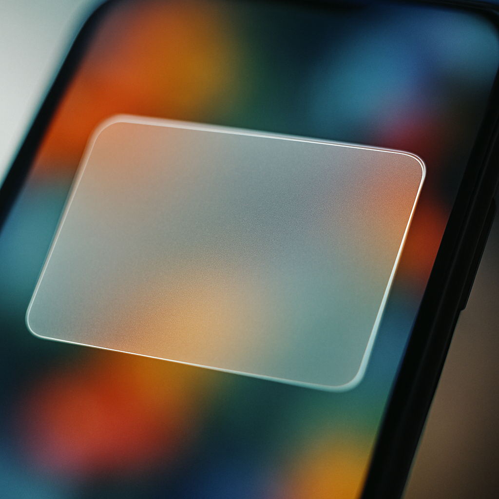
The original wave of glassmorphism had one fatal flaw: it prioritised the aesthetic over the function. The whole appeal is that frosted, translucent layering effect where UI elements feel like they’re floating on frosted glass. Lovely. The problem is that legibility depends entirely on what’s sitting behind that panel, and nobody seemed to care about that in 2020.
Text contrast ratios plummeted. WCAG 2.1 requires a minimum contrast ratio of 4.5:1 for normal text, and a huge proportion of glassmorphism implementations were scoring somewhere around 2:1 on a good day. Throw a dynamic background behind it (a moving video, a rotating gradient, user-generated content) and readability became essentially random. You might be fine. You might not. That’s not a design system, that’s a lottery.
There was also the performance angle. backdrop-filter: blur() is expensive. On lower-end Android handsets and older MacBooks, layering multiple blurred elements destroyed frame rates. The BBC’s own digital accessibility guidelines, which you can find on bbc.co.uk/accessibility, make very clear that visual presentation must never come at the cost of usability. A lot of glassmorphism implementations in that era simply didn’t hold up.
What’s Actually Different About Glassmorphism in 2026
A few things converged to rehabilitate the aesthetic. First, hardware got better. The average GPU in a mid-range mobile now handles backdrop-filter without flinching, which removes the single biggest performance objection. Second, CSS itself got smarter. The @supports rule means you can serve the glass effect only to browsers that can handle it cleanly, with a solid fallback for everything else. No more leaving older devices with a janky, half-rendered mess.
Third, and most importantly, designers got more disciplined. The glassmorphism UI design that’s making a comeback in serious product work is nothing like the Dribbble excess of 2021. It’s used sparingly, on specific UI components like modal dialogs, notification cards, and navigation overlays, rather than as the entire visual language of an interface. Backgrounds are controlled. The blur radius is modest. Text always sits on a surface with enough opacity to guarantee contrast.
Apple’s design language has played a significant role here. iOS has used frosted-glass effects in its notification centre and Control Centre for years, and with each iteration the implementation has become more refined. Designers studying those patterns learnt that the glass works when the background context is intentionally designed, not left to chance.
How to Implement Glassmorphism Without Breaking Anything
The core CSS is actually quite simple. The magic trio is background: rgba() with low alpha, backdrop-filter: blur(), and a subtle border with partial transparency. Something like this gets you most of the way there:
.glass-card {
  background: rgba(255, 255, 255, 0.15);
  backdrop-filter: blur(12px);
  -webkit-backdrop-filter: blur(12px);
  border: 1px solid rgba(255, 255, 255, 0.25);
  border-radius: 12px;
}
That’s the skeleton. The craft is in what you do around it. Your background layer needs to be a controlled gradient or a static image, not dynamic content. If the surface behind the glass can change unpredictably, your contrast guarantee evaporates. I’d also recommend capping blur values at around 16px to 20px for performance; anything beyond that is rarely perceptible to users anyway and the computational cost climbs sharply.
For accessibility, wrap your text in an element with a slightly higher background opacity than the card itself. A small inner container with background: rgba(0, 0, 0, 0.35) behind white text can push your contrast ratio back into safe territory without killing the frosted effect visually. It’s a minor cheat, but it works and your users can actually read your content.
Teams building with design systems, particularly those working on bespoke web software with complex UI requirements, will want to tokenise these values early. A glass surface isn’t just one component; it should be defined as a reusable token set (opacity, blur radius, border alpha, shadow depth) so the effect stays consistent across the product and is easy to adjust globally if your background palette changes.
Tools That Make Glassmorphism Easier to Get Right
Figma is still the go-to for prototyping the effect. The background blur property in Figma’s Fill panel mimics backdrop-filter closely enough to communicate intent to developers, though it won’t be pixel-perfect until it’s in the browser. Pair it with Figma’s contrast checker plugin (or the third-party Able plugin) and you can validate your text contrast before a single line of code is written.
For the CSS side, there are a few generators worth bookmarking. CSS Glass and Glassmorphism.css both let you dial in your values and copy the output directly. They’re not magic, but they’re useful for getting a starting point quickly and adjusting from there rather than tuning values manually in DevTools.
If you’re working in a component framework like React or Vue, consider wrapping your glass surfaces in a dedicated component that enforces the design token values. Hard-coding blur(12px) directly into a dozen different stylesheets is how inconsistency creeps in. One glass-card component, one place to update, consistent output everywhere.
Where Glassmorphism Actually Belongs in a Modern Interface
Not everywhere. That bears repeating. The reason the 2026 version of this trend holds up is because the designers using it well are strategic about placement. Modal dialogs and overlays are the sweet spot; the content beneath is controlled, the blur is contextually meaningful (it signals depth and focus), and users interpret it correctly as a layered surface. Navigation components on hero sections with static backgrounds work well too.
Where it still struggles is in data-heavy interfaces. Tables, dashboards, and anything with dense information simply doesn’t benefit from a frosted surface. The effect adds visual complexity precisely where you need clarity. Keep glassmorphism UI design for moments of emphasis, transitions, and lightweight UI chrome. Use solid surfaces for the hard work.
The aesthetic isn’t broken. It never was, really. It was just misused by a generation of designers who discovered a cool effect and applied it everywhere at once. Now that the initial excitement has settled and the tooling has matured, glassmorphism sits comfortably in the modern designer’s toolkit, not as a style statement, but as a genuinely useful approach to visual hierarchy and depth when applied with a bit of restraint and a working knowledge of contrast ratios.
Frequently Asked Questions
What is glassmorphism UI design?
Glassmorphism is a design style that uses frosted-glass-style panels with partial transparency, background blur, and subtle borders to create a sense of depth and layering in interfaces. It became popular around 2020 and is now being used more responsibly in 2026 product design.
Why did glassmorphism fail the first time round?
The main issues were poor text contrast ratios, unpredictable readability when placed over dynamic backgrounds, and serious performance problems on lower-end devices caused by heavy use of CSS backdrop-filter. Many implementations failed basic WCAG accessibility standards.
How do I make glassmorphism accessible?
Ensure your text always meets WCAG 2.1 contrast requirements (4.5:1 for body text) by using a semi-opaque inner layer behind text elements to boost contrast. Design your background as a controlled gradient rather than dynamic content, so contrast stays predictable. Always check with a contrast-checking tool before shipping.
What CSS properties do I need for a glass effect?
The core properties are background with rgba() at low alpha, backdrop-filter: blur() (with the -webkit- prefix for Safari), and a semi-transparent border. Use @supports to provide solid-surface fallbacks for browsers that don’t support backdrop-filter, which covers older devices cleanly.
Where should I use glassmorphism in an interface?
Glassmorphism works best on modal dialogs, notification cards, navigation overlays, and hero section UI elements where the background is controlled. Avoid using it on data-dense surfaces like tables and dashboards, where visual clarity is more important than aesthetic depth.
Leave a Reply