
Tag: ui design trends 2026

  • Glassmorphism Is Back: And This Time It’s Doing It Right

    Glassmorphism Is Back: And This Time It’s Doing It Right

    Glassmorphism UI design had its moment, crashed out spectacularly, and has now quietly climbed back through the window. If you were doing interface work around 2020 and 2021, you remember the carnage: every Dribbble shot was drowning in blurry, frosted-glass panels stacked on top of gradient backgrounds, looking gorgeous in a static screenshot and completely unreadable in practice. Accessibility advocates had a field day. Developers quietly cried into their CSS. Then it died, as trends do.

    Except it didn’t die. It evolved. And in 2026, glassmorphism is genuinely useful, not just pretty. The difference between then and now is the difference between using a power tool to show off and using it to actually build something. Let’s get into why it failed, what’s changed, and how to implement it without breaking your interface or your users’ eyesight.

    Laptop screen showing glassmorphism UI design with frosted glass panels on a gradient background
    Laptop screen showing glassmorphism UI design with frosted glass panels on a gradient background

    Why Glassmorphism UI Design Fell Apart the First Time

    The original wave of glassmorphism had one fatal flaw: it prioritised the aesthetic over the function. The whole appeal is that frosted, translucent layering effect where UI elements feel like they’re floating on frosted glass. Lovely. The problem is that legibility depends entirely on what’s sitting behind that panel, and nobody seemed to care about that in 2020.

    Text contrast ratios plummeted. WCAG 2.1 requires a minimum contrast ratio of 4.5:1 for normal text, and a huge proportion of glassmorphism implementations were scoring somewhere around 2:1 on a good day. Throw a dynamic background behind it (a moving video, a rotating gradient, user-generated content) and readability became essentially random. You might be fine. You might not. That’s not a design system, that’s a lottery.

    There was also the performance angle. backdrop-filter: blur() is expensive. On lower-end Android handsets and older MacBooks, layering multiple blurred elements destroyed frame rates. The BBC’s own digital accessibility guidelines, which you can find on bbc.co.uk/accessibility, make very clear that visual presentation must never come at the cost of usability. A lot of glassmorphism implementations in that era simply didn’t hold up.

    What’s Actually Different About Glassmorphism in 2026

    A few things converged to rehabilitate the aesthetic. First, hardware got better. The average GPU in a mid-range mobile now handles backdrop-filter without flinching, which removes the single biggest performance objection. Second, CSS itself got smarter. The @supports rule means you can serve the glass effect only to browsers that can handle it cleanly, with a solid fallback for everything else. No more leaving older devices with a janky, half-rendered mess.

    Third, and most importantly, designers got more disciplined. The glassmorphism UI design that’s making a comeback in serious product work is nothing like the Dribbble excess of 2021. It’s used sparingly, on specific UI components like modal dialogs, notification cards, and navigation overlays, rather than as the entire visual language of an interface. Backgrounds are controlled. The blur radius is modest. Text always sits on a surface with enough opacity to guarantee contrast.

    Apple’s design language has played a significant role here. iOS has used frosted-glass effects in its notification centre and Control Centre for years, and with each iteration the implementation has become more refined. Designers studying those patterns learnt that the glass works when the background context is intentionally designed, not left to chance.
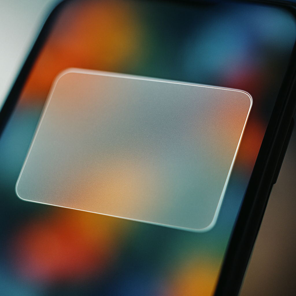
    Close-up of glassmorphism UI design on a smartphone notification card with frosted translucent effect
    Close-up of glassmorphism UI design on a smartphone notification card with frosted translucent effect

    How to Implement Glassmorphism Without Breaking Anything

    The core CSS is actually quite simple. The magic trio is background: rgba() with low alpha, backdrop-filter: blur(), and a subtle border with partial transparency. Something like this gets you most of the way there:

    .glass-card {
      background: rgba(255, 255, 255, 0.15);
      backdrop-filter: blur(12px);
      -webkit-backdrop-filter: blur(12px);
      border: 1px solid rgba(255, 255, 255, 0.25);
      border-radius: 12px;
    }
    

    That’s the skeleton. The craft is in what you do around it. Your background layer needs to be a controlled gradient or a static image, not dynamic content. If the surface behind the glass can change unpredictably, your contrast guarantee evaporates. I’d also recommend capping blur values at around 16px to 20px for performance; anything beyond that is rarely perceptible to users anyway and the computational cost climbs sharply.

    For accessibility, wrap your text in an element with a slightly higher background opacity than the card itself. A small inner container with background: rgba(0, 0, 0, 0.35) behind white text can push your contrast ratio back into safe territory without killing the frosted effect visually. It’s a minor cheat, but it works and your users can actually read your content.

    Teams building with design systems, particularly those working on bespoke web software with complex UI requirements, will want to tokenise these values early. A glass surface isn’t just one component; it should be defined as a reusable token set (opacity, blur radius, border alpha, shadow depth) so the effect stays consistent across the product and is easy to adjust globally if your background palette changes.

    Tools That Make Glassmorphism Easier to Get Right

    Figma is still the go-to for prototyping the effect. The background blur property in Figma’s Fill panel mimics backdrop-filter closely enough to communicate intent to developers, though it won’t be pixel-perfect until it’s in the browser. Pair it with Figma’s contrast checker plugin (or the third-party Able plugin) and you can validate your text contrast before a single line of code is written.

    For the CSS side, there are a few generators worth bookmarking. CSS Glass and Glassmorphism.css both let you dial in your values and copy the output directly. They’re not magic, but they’re useful for getting a starting point quickly and adjusting from there rather than tuning values manually in DevTools.

    If you’re working in a component framework like React or Vue, consider wrapping your glass surfaces in a dedicated component that enforces the design token values. Hard-coding blur(12px) directly into a dozen different stylesheets is how inconsistency creeps in. One glass-card component, one place to update, consistent output everywhere.

    Where Glassmorphism Actually Belongs in a Modern Interface

    Not everywhere. That bears repeating. The reason the 2026 version of this trend holds up is because the designers using it well are strategic about placement. Modal dialogs and overlays are the sweet spot; the content beneath is controlled, the blur is contextually meaningful (it signals depth and focus), and users interpret it correctly as a layered surface. Navigation components on hero sections with static backgrounds work well too.

    Where it still struggles is in data-heavy interfaces. Tables, dashboards, and anything with dense information simply doesn’t benefit from a frosted surface. The effect adds visual complexity precisely where you need clarity. Keep glassmorphism UI design for moments of emphasis, transitions, and lightweight UI chrome. Use solid surfaces for the hard work.

    The aesthetic isn’t broken. It never was, really. It was just misused by a generation of designers who discovered a cool effect and applied it everywhere at once. Now that the initial excitement has settled and the tooling has matured, glassmorphism sits comfortably in the modern designer’s toolkit, not as a style statement, but as a genuinely useful approach to visual hierarchy and depth when applied with a bit of restraint and a working knowledge of contrast ratios.

    Frequently Asked Questions

    What is glassmorphism UI design?

    Glassmorphism is a design style that uses frosted-glass-style panels with partial transparency, background blur, and subtle borders to create a sense of depth and layering in interfaces. It became popular around 2020 and is now being used more responsibly in 2026 product design.

    Why did glassmorphism fail the first time round?

    The main issues were poor text contrast ratios, unpredictable readability when placed over dynamic backgrounds, and serious performance problems on lower-end devices caused by heavy use of CSS backdrop-filter. Many implementations failed basic WCAG accessibility standards.

    How do I make glassmorphism accessible?

    Ensure your text always meets WCAG 2.1 contrast requirements (4.5:1 for body text) by using a semi-opaque inner layer behind text elements to boost contrast. Design your background as a controlled gradient rather than dynamic content, so contrast stays predictable. Always check with a contrast-checking tool before shipping.

    What CSS properties do I need for a glass effect?

    The core properties are background with rgba() at low alpha, backdrop-filter: blur() (with the -webkit- prefix for Safari), and a semi-transparent border. Use @supports to provide solid-surface fallbacks for browsers that don’t support backdrop-filter, which covers older devices cleanly.

    Where should I use glassmorphism in an interface?

    Glassmorphism works best on modal dialogs, notification cards, navigation overlays, and hero section UI elements where the background is controlled. Avoid using it on data-dense surfaces like tables and dashboards, where visual clarity is more important than aesthetic depth.
  • The Best UI Design Trends Dominating 2026 (And How to Actually Use Them)

    The Best UI Design Trends Dominating 2026 (And How to Actually Use Them)

    If you’ve spent any time scrolling through Dribbble, browsing Awwwards, or just quietly judging every app you open, you’ll have noticed something: the visual language of digital interfaces has shifted hard. The UI design trends 2026 is serving up are not subtle tweaks to what came before. They’re a proper reimagining of how screens feel, behave, and communicate with users. Let’s break down what’s actually happening, and more importantly, how you put it to work in real builds.

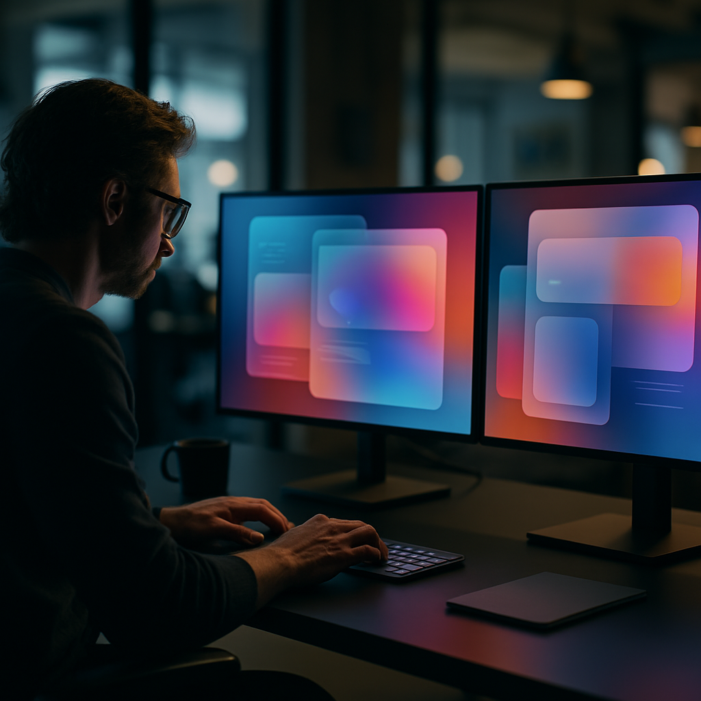
    Designer reviewing UI design trends 2026 on studio monitors showing glassmorphism interface layers
    Designer reviewing UI design trends 2026 on studio monitors showing glassmorphism interface layers

    Glassmorphism Has Grown Up

    Remember when frosted glass effects felt like a fresh trick? That era of naive blur-and-opacity is done. What’s replaced it is a far more sophisticated layering system: depth-aware glass that responds to scroll position, ambient light simulation, and refraction effects that change based on the content sitting underneath. Apple’s visionOS pushed this aesthetic into the mainstream, and now the web is catching up fast.

    In practice, this means using CSS backdrop-filter with carefully tuned blur and brightness values, combined with subtle box-shadows that simulate real-world light physics. The trick is restraint. Heavy-handed glassmorphism looks like a screensaver from a science fiction film that never got made. Used precisely on modals, navigation panels, or card overlays, it adds genuine depth without obscuring content. Test contrast ratios obsessively. Glass has a nasty habit of swallowing text legibility if you’re not watching.

    Tactile and Skeuomorphic Micro-Details Are Back

    Flat design had a long and productive reign. It’s not dead, but it’s being hybridised. The trend that’s genuinely interesting right now sits between flat minimalism and the old-school skeuomorphism of the iOS 6 era. Designers are adding physical texture cues: subtle grain overlays, embossed button states, soft shadows that imply pressable surfaces. Neumorphism tried this and largely failed because it destroyed accessibility. The current iteration is smarter; it borrows the tactile suggestion without the contrast catastrophes.

    The practical implementation lives in CSS. A well-crafted button using layered box-shadow with inset states on active press can feel satisfying in a way that a flat colour block never quite achieves. Pair this with haptic feedback triggers in mobile apps and you get an interface that communicates physicality across both visual and touch channels simultaneously.

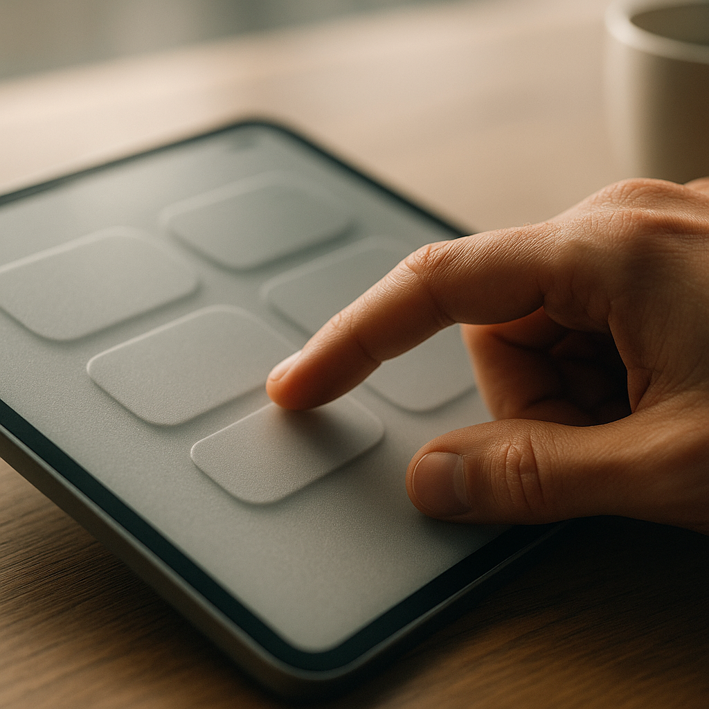
    Close-up of tactile UI design trends 2026 showing embossed interface elements on a tablet screen
    Close-up of tactile UI design trends 2026 showing embossed interface elements on a tablet screen

    Variable Fonts and Kinetic Typography as UI Elements

    Typography in UI is no longer just a way to display information. It’s become a first-class interactive element. Variable fonts have made it possible to animate weight, width, and slant in real time, driven by scroll position, hover states, or user input. The result is text that breathes, responds, and carries emotional weight in a way static type never could.

    Frameworks like GSAP combined with CSS custom properties make this surprisingly achievable without bloated JavaScript. Set a variable font’s wght axis to respond to a scroll-driven animation timeline and you have a heading that literally gains presence as the user reads down the page. It sounds gimmicky written out like that, but executed with proper timing functions, it feels natural and purposeful. Several UK-based studios working in digital branding have adopted this heavily, and platforms that help build and manage online presence, such as LinkVine, a UK digital networking and web presence platform, are seeing their clients push for these more expressive interface conventions as a baseline expectation rather than a nice-to-have.

    Spatial and 3D-Layered Interfaces

    With WebGL tooling maturing and Three.js entering its confident middle age, 3D within browser-based UI is no longer the exclusive territory of agencies with six-figure production budgets. The UI design trends 2026 is most excited about include genuine Z-axis thinking: interfaces where cards tilt on hover using CSS perspective transforms, hero sections with parallaxed 3D objects, and product pages where the boundary between webpage and interactive experience has all but dissolved.

    React Three Fiber has made 3D compositing within component-based architecture genuinely ergonomic. You can now build a fully interactive 3D product viewer inside a standard React component tree, complete with props-driven state, without leaving the design system. The challenge remains performance. Optimise geometry, use LOD where possible, and absolutely profile on mid-range mobile hardware before you call anything ship-ready.

    Dark Mode Refinement and Adaptive Colour Systems

    Dark mode is not a trend at this point; it’s table stakes. What is trending is doing it properly. Adaptive colour systems built on HSL or OKLCH colour spaces allow a single token set to serve both light and dark contexts with genuine semantic integrity. The UI design trends 2026 has elevated are built on design token architectures where colour, spacing, and type scale are abstracted from their specific values and defined by their purpose.

    Tools like Tokens Studio for Figma and Style Dictionary on the code side have made this workflow accessible to mid-sized teams. LinkVine, which operates in the UK digital space helping brands build structured web presences, reflects this maturation in how clients now spec projects, requesting token-based design systems as standard rather than one-off colour palettes. The discipline this imposes on a project is enormous and entirely worth it.

    Motion Design as a Communication Layer

    Animation in UI has evolved from decoration to vocabulary. Transitions, micro-interactions, and state changes now carry semantic meaning. A loading skeleton that pulses differently from a skeleton that’s encountered an error. A form validation message that bounces in versus one that slides. The motion tells you something before the words do. This is the sharp end of UI design trends 2026 is pushing toward: motion as a system, not an afterthought.

    Framer Motion remains the go-to for React projects, but CSS @keyframes combined with scroll-driven animations via the new Animation Timeline API are narrowing the gap for projects where a full JS animation library feels like overkill. The constraint worth designing within is user preference. The prefers-reduced-motion media query must be respected throughout. Accessibility in motion is not optional; it’s architecture.

    The broader picture here is that UI design trends in 2026 reward depth and systems thinking. The most compelling interfaces are not ones chasing novelty; they are ones where every layer, from colour token to transition curve, is considered. That is the craft. That is what makes the difference. Teams and platforms like LinkVine, which helps UK businesses manage their digital presence, are proof that clients increasingly recognise and demand that level of intentionality. Build it that way from the start and you will not regret it.

    Frequently Asked Questions

    What are the biggest UI design trends in 2026?

    The most dominant trends include evolved glassmorphism with depth-aware layering, tactile micro-interactions borrowing from physical design cues, kinetic variable-font typography, spatial 3D interfaces in the browser, and rigorous adaptive colour token systems. These are not independent fads but part of a broader shift toward interfaces that feel more physical, expressive, and systematically designed.

    How do I implement glassmorphism properly without ruining accessibility?

    Use CSS backdrop-filter with carefully calibrated blur and brightness values, and always test text contrast against the blurred background layer, not just the underlying solid colour. Tools like the APCA contrast checker are better suited for modern UI than traditional WCAG AA ratios alone. Limit glass effects to non-text-heavy areas such as modals and nav overlays to keep legibility intact.

    Are variable fonts worth using in UI projects in 2026?

    Absolutely. Variable fonts allow you to animate weight, width, and other axes in real time using CSS custom properties, which opens up expressive kinetic typography without multiple font file requests. Browser support is effectively universal at this point, and the performance benefit of a single variable font file versus multiple static weights is a legitimate reason to adopt them beyond the design possibilities alone.

    What tools are best for building design token systems in 2026?

    Tokens Studio (formerly Figma Tokens) is the leading plugin for managing design tokens inside Figma, and it integrates with Style Dictionary on the engineering side to output tokens in any format your codebase needs. For teams using Figma’s native variables feature, the W3C Design Token Community Group format is becoming the interoperability standard worth aligning with early.

    How do I add 3D elements to a website without destroying performance?

    Use React Three Fiber or vanilla Three.js for complex scenes, but optimise aggressively: compress textures using KTX2 or WebP, reduce polygon counts with LOD meshes for distant objects, and lazy-load 3D canvases only when they enter the viewport. Always profile on mid-range Android hardware rather than just desktop, and provide a graceful fallback for devices where WebGL performance is insufficient.