Category: Web Design

  • The Principles Behind BBC iPlayer’s UI: What Every British Product Designer Can Learn From It

    The Principles Behind BBC iPlayer’s UI: What Every British Product Designer Can Learn From It

    I’ve spent more time than is professionally advisable picking apart how the BBC iPlayer interface works. Not watching content on it, mind you. Actually staring at hover states, tab-order behaviour, loading skeletons, and the way the navigation rail collapses on a 40-inch telly versus a 320px mobile viewport. The BBC iPlayer UI design principles UK product teams should be studying are genuinely embedded in every screen of that product, and I want to drag them out properly.

    This is a teardown, not a fan letter. Where iPlayer does something brilliantly, I’ll say so. Where there’s a head-scratching inconsistency, that’s going in too. Either way, there’s a stack of transferable thinking here that most UK product teams would benefit from nicking.

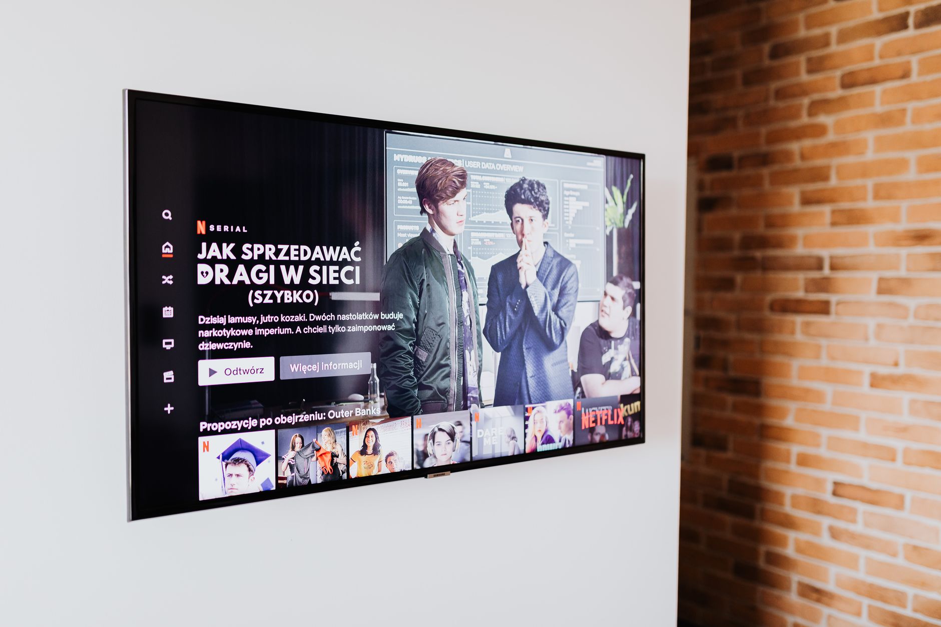
    Television screen showing a streaming content grid, illustrating BBC iPlayer UI design principles UK product teams can learn from
    Photo by https://kaboompics.com/ on Pexels

    How iPlayer handles content discovery without overwhelming you

    Content discovery is probably the hardest design problem in streaming. You have thousands of titles, a user with forty-five seconds of patience, and a recommendation system that may or may not know them well yet. iPlayer’s solution is surprisingly restrained given the scale of the BBC’s catalogue.

    The homepage is structured as a progressive hierarchy. The hero slot anchors attention, but it’s not auto-advancing like Netflix’s carousel assault on your focus. Below it, content rows are labelled with actual editorial intent: “Catch Up”, “Recommended for You”, “New Arrivals”. These are not clever algorithmic names. They’re plain English labels that tell you immediately what logic organised them. That’s a design decision, not a default.

    I’d argue the most important part of the discovery UI is what iPlayer refuses to do. There are no autoplay trailers on hover in the web interface. There’s no “you have 5 seconds before the next episode starts” pressure mechanic unless you’ve opted into it. That restraint lowers cognitive load measurably, and it respects the fact that a significant portion of the BBC’s audience, covered thoroughly in the over-55 audience design piece on this blog, find high-density motion interfaces actively hostile.

    Accessibility as a structural decision, not a retrofit

    The BBC publishes its own accessibility standards, the BBC Accessibility Standards and Guidelines, which sit alongside WCAG 2.2. That’s not marketing copy. You can see the results of it directly in iPlayer’s codebase: focus states that are actually visible (not that 1px dashed outline browsers default to), semantic HTML that makes keyboard navigation feel deliberate rather than accidental, and live subtitle rendering that works across every surface including smart TVs where most streaming services just… don’t bother.

    The subtitle implementation is worth a short paragraph on its own. iPlayer’s subtitles render as HTML text overlaid on the video container rather than burned into the video stream. That means font size, colour, and background opacity are all user-adjustable. It also means the subtitle DOM is accessible to screen readers in certain configurations. That’s technically more complex to implement than a static .vtt file being displayed, and the BBC chose to do it anyway. That’s what “accessibility as infrastructure” looks like rather than accessibility as checkbox.

    If your product team is still treating accessibility annotations as a final design-handoff step, iPlayer is a case study in why that approach breaks down. The accessibility behaviour here is inseparable from the component architecture. You can’t retrofit it cleanly. Build it in or spend twice the effort later. This connects to the same reasoning I wrote about in the icon design system teardown, where icon meaning and accessibility labelling need to be decided at the system level, not icon by icon.

    Multi-device consistency and where it gets complicated

    iPlayer runs on an extraordinary range of surfaces. A 2013 Samsung smart TV, a current-gen PlayStation, a 320px Android handset, a desktop browser, and an iPad all need to present the same content catalogue through fundamentally different interaction paradigms. That is an engineering and design problem most product teams never encounter at this scale, but the principles iPlayer uses to solve it are still directly applicable.

    The key move is abstracting the design system away from the input model. The layout responds not just to screen size but to inferred input type: pointer (mouse/trackpad), touch, or remote/d-pad. The navigation rail behaviour changes meaningfully between these modes. On a remote-controlled TV interface, every interactive element needs to be reachable via directional navigation without any pointer. iPlayer’s focus management logic handles this without the user ever thinking about it.

    For most product teams the relevant principle is this: design for your secondary device first. iPlayer’s constraints from TV remote navigation have made the whole interface more keyboard-accessible by necessity. That’s a good trade. If you’re building a web app and keyboard navigation is an afterthought, try designing the component interaction model for a d-pad first and then add pointer support on top. The resulting component will be cleaner.

    Performance design and the perception of speed

    iPlayer’s actual page performance is not perfect. Run it through WebPageTest on a throttled 4G connection and you’ll see a real-world LCP that could be sharper. But the perceived performance is well managed, and that distinction matters more to users than a 100/100 Lighthouse score.

    The loading skeleton UI is implemented with care. Skeletons match the aspect ratios of the content cards they’re replacing, including the 16:9 thumbnail, the title line, and the metadata line. When content loads, there’s no layout shift. The skeleton was drawn to the correct dimensions. This is a WCAG-adjacent win but also just good engineering; it prevents the cascading reflows that trash Core Web Vitals scores and make pages feel broken to users even when the content eventually renders correctly.

    Image delivery on iPlayer also uses responsive sizing properly. The BBC’s image service appends dimension parameters to thumbnail URLs so the browser receives an image at the correct resolution for the current viewport. I’ve seen mid-sized UK product teams serving 1200px wide thumbnails inside 240px card slots. That’s not just a performance problem; it’s a data usage problem for mobile users on capped plans, which the Ofcom Connected Nations report consistently shows is still a significant real-world concern in the UK outside major city centres.

    The design system thinking underneath it all

    The BBC’s GEL (Global Experience Language) design system is public, and it’s worth reading even if you’re not building a product that touches the BBC at all. GEL is the spine of iPlayer’s consistency. Components are defined with explicit spacing, type scales, and interaction states at the system level. Individual feature teams don’t design new card components from scratch; they pull from GEL.

    That’s the transferable bit. The specific components in GEL don’t matter to your product. The structure of the thinking does. When a design decision is made once at the system level and then pulled into features rather than reinvented per screen, you ship faster, the product feels more coherent, and edge cases (like that 320px viewport on a cheap Android handset) get solved once and inherited everywhere.

    If your team is still at the stage of building a design system, the TypeScript for designers piece is worth reading alongside this one, because codifying your tokens and component contracts in a typed system is what prevents GEL-style consistency from decaying over time as teams grow.

    The BBC iPlayer UI design principles UK teams should extract aren’t magic. They’re the result of treating design constraints as opportunities, building accessibility into architecture, and refusing to optimise for engagement metrics that make interfaces worse. That combination is rarer than it should be, and iPlayer is one of the cleaner examples of it on any screen in the country.

  • How to Build a Freelance Design Portfolio That Ranks on Google in 2026: A UK-Specific SEO Breakdown

    How to Build a Freelance Design Portfolio That Ranks on Google in 2026: A UK-Specific SEO Breakdown

    Most freelance design portfolios are beautiful and invisible. The designer has spent weeks obsessing over the grid, the typeface, the hover states, and the case study photography, and then published it to a domain that Google has essentially never heard of. I’ve seen this pattern so many times it’s almost a genre. The portfolio exists; it just doesn’t rank. And if it doesn’t rank, UK clients pitching briefs into Google, which most of them are, will never find it.

    This guide is a proper technical walkthrough for getting your freelance design portfolio to show up in organic search in 2026. Not vague advice about “posting on LinkedIn”. Actual site architecture decisions, Core Web Vitals targets, schema markup you can implement today, and the local signals that genuinely differentiate you for UK clients. Let’s get into it.

    Freelance designer's workspace with portfolio site on screen, relevant to freelance design portfolio SEO UK 2026
    Photo by ready made on Pexels

    Why freelance design portfolio SEO UK 2026 is a different problem to generic SEO

    Portfolio SEO has a structural problem that most tutorials skip. You’re not an e-commerce site with thousands of product pages, and you’re not a blog with 200 posts. You have maybe six case studies, an about page, a contact page, and a services page if you’re organised. That’s a thin site, and Google treats thin sites with suspicion unless you compensate with strong signals elsewhere.

    The UK angle compounds this. If you’re a UX designer in Bristol or a brand identity designer in Leeds, you’re not trying to rank globally. You want to appear when someone in your target geography types “freelance UX designer Bristol” or “brand designer for fintech startups UK”. That’s local SEO intersecting with professional services SEO, and the signals that matter are slightly different from what a generic content-farm guide will tell you.

    The good news: the competition is weak. The overwhelming majority of freelance portfolios have no structured data, poor Core Web Vitals, zero local signals, and a flat site structure. Doing the basics well puts you ahead of most of the field.

    Site architecture: stop building a single-page portfolio

    Single-page portfolios are a death sentence for organic search. If everything lives on one URL, you have one chance to rank, and that one page has to fight for attention across every keyword simultaneously. Google can’t index what it can’t differentiate.

    The architecture I’d recommend is simple but specific. Give each major service its own page. If you do brand identity, UX design, and motion graphics, those are three pages with three distinct keyword opportunities. Give each case study its own URL, not a modal or a lightbox. Give your about page real content, not two sentences. And if you serve specific geographies or industries, build pages for those too: “UI design for fintech” or “brand identity for London startups” are genuinely searchable.

    Internal linking matters here. Each case study should link to the relevant service page. Your service pages should link to each other where they’re related. This is the same logic I covered in the piece on bento grid layouts for SaaS product pages, where the content hierarchy directly affects how users (and crawlers) understand what you do.

    Core Web Vitals targets for 2026

    Core Web Vitals are a confirmed ranking signal, and portfolio sites have an ironic tendency to fail them badly because designers love large images and JavaScript-heavy animations. Google’s PageSpeed Insights tool is free, takes thirty seconds, and will tell you exactly where you’re losing points. Run it on your homepage and every case study page.

    The three metrics to hit: Largest Contentful Paint (LCP) under 2.5 seconds, Cumulative Layout Shift (CLS) under 0.1, and Interaction to Next Paint (INP) under 200 milliseconds. LCP is usually your biggest problem because hero images and full-bleed case study photography are heavy. Fix it by serving images in WebP format, using loading="lazy" on below-the-fold images, and using fetchpriority="high" on your actual LCP element. CLS failures almost always come from images without explicit width and height attributes or from web fonts loading late and shifting text. Fix the first with explicit dimensions; fix the second with font-display: swap and preloading your critical fonts.

    INP is newer and measures responsiveness. If you’re running a React or Next.js portfolio (which many developers do after reading our Astro vs Next.js breakdown), watch your JavaScript bundle size. Unnecessary client-side hydration is the usual culprit. Astro’s partial hydration model is genuinely excellent for portfolio sites for exactly this reason.

    Schema markup that actually moves the needle

    Almost no freelance portfolios implement structured data. This is a free win.

    For a freelance design portfolio, three schema types are genuinely useful. First, Person schema on your about page: name, job title, description, and crucially sameAs linking to your LinkedIn, GitHub, Dribbble, and any other authoritative profiles. This helps Google build a knowledge graph entity around you as a professional, which strengthens trust signals across your whole site.

    Second, LocalBusiness schema if you work with local clients. Yes, you can use this as a freelancer. Include your city, your service area, and your contact details. Make sure these match exactly what you have on your Google Business Profile. Consistency between your schema and your GBP listing is a genuine local ranking signal.

    Third, CreativeWork or WebPage schema on case study pages, with author referencing your Person entity. This connects your work back to you as the creator in a machine-readable way. None of this is technically difficult: it’s JSON-LD you drop into a <script> tag in the <head>, and Google’s Rich Results Test will validate it in seconds.

    Local SEO signals for British designers

    If you want to rank for location-specific queries, which you absolutely should if you’re pitching to UK clients, you need to treat your portfolio like a local business online. Set up a Google Business Profile under your name or your trading name, categorised as “Graphic Designer” or “Web Designer”. Add your city to your page titles, your H1s, and your meta descriptions. Not stuffed; just present. “Freelance brand designer, Manchester” in your title tag is perfectly natural.

    Get citations. In the UK, the useful ones are Yell.com, Bark.com, Clutch.co (which has a strong UK presence), and FreeIndex. These are directories that Google actually pays attention to for local professional services. Your name, trading name, and contact details need to be consistent across all of them. Use the same format every time: same spelling, same phone number format, same postcode.

    Reviews matter more than most designers think. Even five genuine Google reviews from past clients will give you star ratings in local search results. Ask clients directly after a project wraps. Most won’t think to do it unprompted, but most are happy to write one if you send them a direct link.

    Content that supports your portfolio without bloating it

    A small blog or insights section can do serious work for your portfolio’s organic visibility without requiring you to become a content machine. The trick is to write for the intersection of what you know and what your target clients are searching for. A post about “how to brief a brand designer” written from a designer’s perspective will rank for searches that UK marketing managers and founders actually type. A post about your process for UX audits will attract clients who already know they need one.

    This is also where you can build topical authority. If your case studies are all fintech work, a few posts about designing for financial services, FCA compliance in UI, or what good fintech onboarding looks like will cluster your site around that niche. Google’s understanding of what your site is about is built from the whole, not just the homepage. I’d keep each post genuinely useful: 600 words of real expertise beats 1,500 words of padding every time. And if you’re the kind of designer who also codes, pieces like our TypeScript introduction for UK designer-developers suggest the territory worth covering, where technical specificity is the differentiator.

    The technical checklist before you publish

    A few things to verify before you consider the site ready. Your robots.txt should allow crawling; it sounds obvious but I’ve seen portfolios inadvertently blocking Googlebot from staging configs carried over to production. Submit an XML sitemap via Google Search Console and verify your domain there: both the www and non-www versions if you haven’t explicitly chosen one and set a canonical. Make sure your HTTPS is properly configured with no mixed content warnings, since Google has treated HTTPS as a lightweight ranking signal for years. Check that your canonical tags point to the right URLs and that you’re not accidentally indexing paginated or filtered views that duplicate content.

    Run Screaming Frog on your domain (the free version handles up to 500 URLs, which is plenty for a portfolio) to catch broken links, missing meta descriptions, and duplicate title tags. Fix those before you build links or push for rankings. The foundation has to be solid or the rest of the work is wasted.

    Freelance design portfolio SEO in the UK isn’t glamorous work. It’s structured data in a text editor, image compression, and directory submissions. But it compounds. The designer who does this in January and publishes two genuinely useful blog posts a quarter will be fielding inbound enquiries by the end of the year from clients they never had to cold-pitch. That’s the whole point.

    Frequently Asked Questions

    How long does it take for a freelance design portfolio to rank on Google?

    For a new domain with good technical foundations, expect three to six months before meaningful organic traffic appears. If you’re targeting low-competition local queries like “freelance designer [UK city]”, you can sometimes see results faster, particularly if you have a complete Google Business Profile and a handful of citations from UK directories.

    Do I need a blog on my portfolio to rank in UK search results?

    Not strictly, but it helps significantly. A blog lets you target informational keywords that your target clients search for, and it builds topical authority around your niche. Even four to six well-written posts per year can meaningfully expand the number of queries your portfolio ranks for.

    What's the best platform for building a portfolio that ranks well?

    Anything that gives you full control over your HTML, meta tags, and structured data. WordPress with a lightweight theme, Astro, or Framer (which now has solid SEO controls) are all solid choices. Avoid platforms that lock your content behind JavaScript rendering without server-side rendering, as Googlebot can struggle with purely client-rendered content.

    Does my Google Business Profile matter if I work remotely with clients across the UK?

    Yes. Even remote freelancers benefit from a GBP listing because it gives you visibility in local pack results when clients search in your city. Set your service area to the regions you actually serve. You don’t have to list a physical address publicly if you work from home.

    How many case studies do I need for good SEO on a freelance portfolio?

    Quality beats quantity. Three to five detailed case studies, each on its own URL with a proper description of the brief, your process, and the outcome, will outperform ten brief project thumbnails on a single page. Give each case study page a unique title tag and meta description targeting the specific type of work it represents.

  • Designing for Older Users: What UK Product Teams Get Wrong About the Over-55 Audience Online

    Designing for Older Users: What UK Product Teams Get Wrong About the Over-55 Audience Online

    Ofcom’s 2024 Online Nation report put a number to something most product teams already suspect but rarely act on: the over-55 demographic is one of the fastest-growing online cohorts in the UK. Not just growing. Growing fast. And yet, if you spend an afternoon watching someone in that age group try to use a typical SaaS product or a government-adjacent web app, you will feel genuine embarrassment at the assumptions baked into our interfaces. I’ve sat in enough usability sessions to know that the gap between what designers think older users can handle and what actually happens on screen is enormous.

    This isn’t an accessibility checkbox article. It’s about the specific, recurring design decisions that make products hostile to people over 55, and what switching those decisions actually looks like in practice. The fix is almost never a separate “accessibility mode”. It’s just better design.

    Older woman using a tablet at home, relevant to designing for older users UK accessibility
    Photo by Marcus Aurelius on Pexels

    Why the over-55 audience is not who you think it is

    The lazy mental model of an older user is someone confused by technology. That model is outdated and statistically wrong. Many people in the 55-75 bracket have been using the internet since the late 1990s. They have more disposable income than younger demographics, they shop online, they bank digitally, they stream. According to Ofcom’s internet use research, broadband penetration among over-65s in the UK has risen significantly year on year. These are not digital novices. They are experienced users dealing with interfaces built by people who did not design with them in mind.

    The actual challenges are specific. Contrast sensitivity changes with age. Motor precision decreases. Reading speed slows when type is small or poorly spaced. Working memory means multi-step flows with no persistent progress information are genuinely harder to complete. None of these things mean someone is bad at technology. They mean the technology is bad at accommodating normal human variation.

    The contrast and type size failures that are everywhere

    Grey text on a white background is the single most common UI failure I see when looking at products aimed at a general UK audience. Designers use it because it looks refined. WCAG 2.1 AA requires a contrast ratio of at least 4.5:1 for normal text. The trendy light-grey placeholder text in form fields routinely fails this. The secondary text on pricing pages fails this. The fine print on checkout screens absolutely fails this.

    Type size is the other obvious one. A base font size of 14px or 15px might render acceptably on a 27-inch monitor at your desk. On a tablet held at arm’s length by someone whose near vision has shifted, it is punishment. Sixteen pixels should be the floor. Eighteen is more honest for body copy. Line height below 1.5 compounds the problem by collapsing the space between lines that lets the eye track correctly.

    If you’ve been reading my earlier piece on choosing and pairing system fonts for the web, you’ll know that system fonts carry genuine legibility advantages at body size, particularly because they’ve been hinted and rendered for the OS they live on. That advantage matters more for older users than it does for anyone else.

    Touch targets and motor precision

    A 24px icon button that expands a menu is fine when you’re 29 and have the fine motor control of someone who grew up texting on a glass screen. It’s a genuine barrier when your hands are less precise. Apple’s Human Interface Guidelines recommend a minimum touch target of 44 by 44 points. Google’s Material Design says 48 by 48dp. Most production UIs I audit for clients are hitting 32 by 32 on interactive elements, sometimes less.

    The fix is not complicated. Add padding. Use larger hit areas than the visible icon. Space interactive elements so that missing one doesn’t accidentally trigger another. These are also excellent improvements for mobile users on a bumpy train, so they help everyone. Good accessibility decisions usually do.

    Related to this: hover states that only appear on desktop are not a navigation strategy. Dropdown menus that require hovering and then moving precisely into a sub-menu without the menu disappearing are a known usability failure for everyone, but disproportionately so for users with slower or less precise cursor movement. The solution is click-to-open behaviour or a transition delay on the menu close.

    Cognitive load and the multi-step flow problem

    The pattern I see causing the most drop-off with older UK users in usability research is multi-step flows with no persistent progress indicator and no ability to go back without losing state. Checkout flows. Application forms. Account setup wizards. The assumption is that a user will hold the full mental model of where they are in the process. That assumption is wrong for many users, and increasingly wrong as the complexity of the task increases.

    Persistent breadcrumbs on long forms. Clear step indicators that say “Step 3 of 5”. Save and return later functionality for longer forms. Autofill that actually works correctly with UK address formats. These are table stakes that many products have not implemented.

    Error messages deserve their own mention. Generic messages like “An error occurred” or “Invalid input” with a red border and no further context are genuinely useless. Precise errors that say “Your sort code should be six digits with no spaces” or “Your date of birth should be in DD/MM/YYYY format” are what accessibility looks like in practice.

    The icon-only interface trap

    Icon-only navigation has been creeping into UK product design for years. It looks clean in Figma mockups at 100% zoom. It is confusing in practice for a significant portion of users. My piece on how product teams are getting their icon systems wrong covers this at length, but the short version is: icons without labels are only clear when the iconography is universal and learnt. Most product icons are neither. Older users who didn’t grow up with a particular design language’s conventions find ambiguous icons significantly harder to decode. Add labels. Combine the icon with text. It adds a few pixels of height to your nav and it eliminates a major source of confusion.

    Designing for older users UK accessibility in real product decisions

    The design decisions that actually fix these issues are not a separate track from good design. They’re the same decisions. High contrast ratios look more professional, not less. Larger text with good line height reads better for everyone. Clear error messages reduce support tickets. Persistent progress indicators reduce abandonment. These are all wins on metrics that product teams already care about.

    If your team hasn’t done usability testing with participants over 55, do it. Recruit through local community organisations, Age UK, or digital inclusion programmes. Watch what happens. I guarantee you will find at least three things to fix before the session ends, and you will fix them faster than any other research you’ve done, because the problems are visible and the solutions are concrete.

    One practical first step: run your existing UI through a contrast checker (there are browser extensions for this) and sort the failures by page priority. Fix the worst offenders on your homepage and primary conversion flows first. That alone will move your accessibility score and your conversion numbers simultaneously.

    The broader point is that designing for older users in the UK isn’t a niche concern or an edge case. It’s designing for a large, growing, and financially significant audience that is currently being failed by most of the interfaces they encounter. Fix the contrast. Fix the type size. Fix the touch targets. Fix the error messages. Then actually test with the people you’re designing for. The rest follows from there.

  • The Typography Stack in 2026: How to Choose and Pair System Fonts Without Looking Cheap

    The Typography Stack in 2026: How to Choose and Pair System Fonts Without Looking Cheap

    Here’s the thing that nobody says out loud: most web font implementations are a performance tax in disguise. You add a Google Fonts <link> in the <head>, you pick something that looks nice in Figma, and then you wonder why your Largest Contentful Paint is a disaster. I’ve watched this play out on dozens of projects, and the pattern is almost always the same. The typography looks considered, the loading experience does not.

    Building a solid system font stack in 2026 isn’t about giving up on brand expression. It’s about being smarter with what you load, when you load it, and how you fall back gracefully when things go wrong. This guide walks through the actual mechanics of doing that, from stack construction to subsetting to font-display strategy, with enough detail to be genuinely useful rather than just vaguely inspirational.

    Designer reviewing a system font stack layout on a widescreen monitor
    Photo by Miguel Á. Padriñán on Pexels

    Why system fonts deserve more respect than they get

    The reputation of system fonts is stuck somewhere around 2014, when using them felt like admitting defeat. That narrative is outdated. The current default system stacks are genuinely good. Apple’s San Francisco is a masterclass in legibility at small sizes. Segoe UI Variable (shipping with Windows 11) is properly optical-size aware. Inter, whilst technically a web font, ships natively in several Linux environments and is increasingly used as a system default in design tools.

    A well-constructed system font stack in CSS looks something like this:

    font-family:
      system-ui,
      -apple-system,
      BlinkMacSystemFont,
      'Segoe UI Variable',
      'Segoe UI',
      Roboto,
      Oxygen,
      Ubuntu,
      sans-serif;

    That stack costs zero bytes, loads in zero milliseconds, and renders without layout shift. On a content-heavy site, that’s worth a lot. The Core Web Vitals improvement alone can be significant, particularly for Cumulative Layout Shift (CLS) and LCP, both of which get hammered by render-blocking font requests.

    When you actually need a web font (and when you don’t)

    I’d argue the honest answer is: less often than you think, and almost never for body copy. System fonts at 16px with sensible line-height and letter-spacing are perfectly readable. The use cases where a web font genuinely earns its keep are narrower than most designers admit.

    Genuine reasons to load a web font include: a logotype-adjacent display face that’s core to the brand identity, a distinctive serif for editorial contexts where the personality of the letterform matters, or a monospaced font for code samples where system options (Courier New, I’m looking at you) are visually terrible. Body copy at 16–18px? The system font stack wins almost every time.

    The question I ask on every project is whether a user could actually tell the difference between the web font and a well-configured system font at reading distance. More often than not, the answer is no. What they will notice is a flash of invisible text or a layout jump. That’s the trade you’re making.

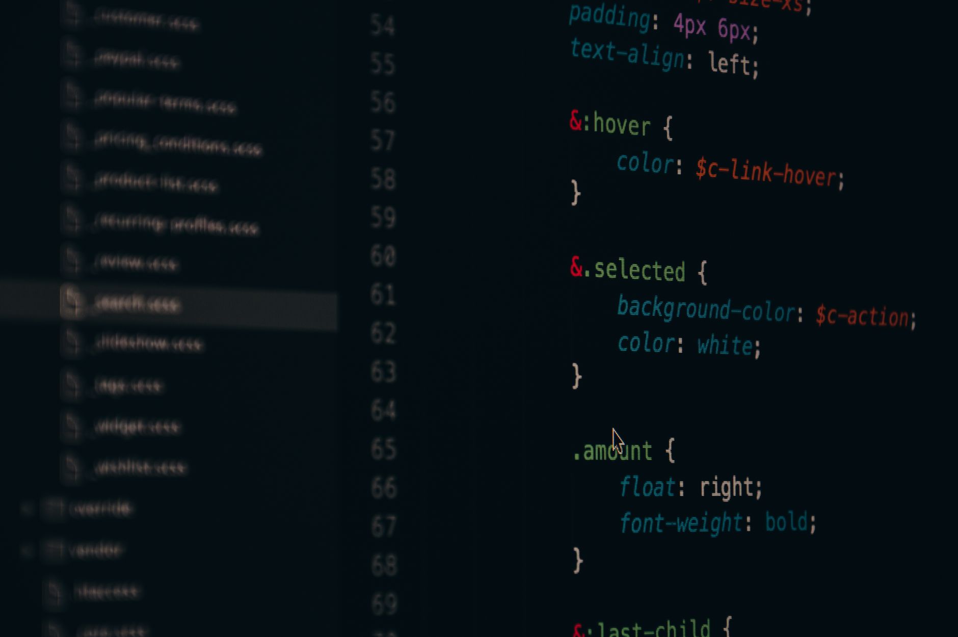
    CSS code showing a system font stack configuration in a dark-theme editor
    Photo by Pixabay on Pexels

    How to load web fonts without destroying your performance scores

    When a web font is genuinely justified, the loading strategy matters as much as the font itself. There are three levers that make the biggest difference: self-hosting, subsetting, and font-display.

    Self-host everything

    Stop using Google Fonts via CDN. It creates a cross-origin request that costs you a DNS lookup, a TCP connection, and potentially a TLS handshake before a single byte of font data arrives. Self-host the files on your own domain instead. Tools like google-webfonts-helper generate the CSS and font files you need in seconds. Your font is now one fewer external dependency, and you have full control over caching headers.

    Subset aggressively

    A full variable font file can be 200–400KB. For a UK-facing site serving primarily Latin-script content, you need maybe 20% of that. The unicode-range descriptor in your @font-face rule tells the browser which characters are actually in each file, so it only downloads the subset it needs. Use pyftsubset from the fonttools library to strip everything you don’t need. A Latin subset for English content typically covers U+0020–U+00FF, plus U+2013–U+2122 for typographic punctuation. That’s it.

    For a typical paragraph-weight subset, I regularly get files under 20KB. That’s a very different conversation than serving 300KB of font data for characters your users will never see.

    Use font-display correctly

    The font-display descriptor controls what happens whilst your web font loads. The options matter:

    • swap renders immediately in a fallback, then swaps when the web font arrives. Fast but causes layout shift.
    • optional gives the browser a very short window to load the font; if it doesn’t arrive in time, the browser uses the fallback for the entire page load. Zero layout shift, and on repeat visits the cached font renders immediately. This is my default for body fonts.
    • block renders invisible text for up to 3 seconds. Avoid it. It’s what’s killing your LCP on slow connections.

    For display fonts where the visual difference genuinely matters, swap is acceptable if you’ve done the work to minimise the metric mismatch between your web font and fallback. Which brings us to the next bit.

    Matching your fallback metrics to eliminate layout shift

    The biggest cause of font-related CLS is metric mismatch: your web font has different line-height, letter-spacing, or ascender/descender values than the system font rendering in its place. When the web font arrives, everything reflows. That’s the jump users hate.

    CSS now has size-adjust, ascent-override, descent-override, and line-gap-override descriptors inside @font-face, and they’re specifically designed for this. You apply them to a local fallback font definition to make it metrically equivalent to your web font. The Malte Ubl approach of using the Font Style Matcher is worth reading, and the Fontaine library automates this for build pipelines.

    A simplified example for matching Inter with a system fallback:

    @font-face {
      font-family: 'Inter Fallback';
      src: local('Arial');
      ascent-override: 90.2%;
      descent-override: 22.48%;
      line-gap-override: 0%;
      size-adjust: 107.4%;
    }
    
    body {
      font-family: 'Inter', 'Inter Fallback', system-ui, sans-serif;
    }

    The layout is now almost identical before and after the web font loads. CLS drops to near zero. This is the kind of detail that separates a properly engineered typography stack from one that just happens to look okay in Figma. Incidentally, if you want to see this principle applied at scale, the approach connects directly to the same performance discipline I mentioned in our variable fonts deep dive, which covers how font axes interact with rendering at different viewport sizes.

    Pairing system fonts with brand type: a practical approach

    The pairing model I’ve settled on for most UK product work is a single web font for display headings (H1, H2, hero text) and a system font stack for everything else: body copy, UI labels, form inputs, navigation. This gives you brand personality where it’s visible, and zero performance cost where it isn’t.

    For display type, a variable font is almost always the better choice over a static weight. You get the full weight and width axis with a single file. Fonts like Cabinet Grotesk, Fraunces, or Anybody Variable cover a huge range of expressive territory at roughly 40–80KB subsetted. Pair that against system-ui for body and the contrast is actually better than two web fonts fighting for attention.

    The same principle applies to design systems built in Figma. If your design system is using a bespoke web font for every text style, someone on the engineering side is eventually going to raise a performance ticket. Getting ahead of that in the design phase, by deliberately scoping which styles use the web font and which defer to system defaults, is much cleaner than retrofitting it later. The same discipline that makes a good design system in Figma applies here: decide at the token level which typefaces are brand-critical and which are functional.

    On a practical note: some niches have specific loading constraints that make this even more pressing. Anyone building content-heavy landing pages under heavy traffic, whether that’s e-commerce, media, or specialist verticals like vape seo where organic performance is critical, will feel font loading overhead in real conversion metrics. It’s not an abstract concern.

    Preloading the right files

    If you’ve subsetted correctly, you can preload your critical font files without much guilt. The pattern is a <link rel="preload"> in the document <head>, pointing at your subset WOFF2 file with as="font" and crossorigin. This tells the browser to fetch it as early as possible, even before the CSS is parsed.

    Only preload what’s above the fold. Preloading three font weights because they all appear somewhere on the page is still a mistake. For most sites, one or two files is the right ceiling. The web.dev font best practices guide covers the nuances of preload priority, and it’s worth reading alongside your Lighthouse report rather than in isolation.

    The goal isn’t a font system that’s technically impressive. It’s one that users never think about because the text was simply there, readable and on-brand, from the first paint. That’s harder than it sounds, but the tooling in 2026 makes it genuinely achievable without exotic build steps or compromising visual quality.

    Frequently Asked Questions

    What is a system font stack and why should I use one?

    A system font stack is a CSS font-family declaration that references fonts already installed on the user’s operating system, such as San Francisco on macOS or Segoe UI on Windows. Because no files need to be downloaded, there’s zero loading time and no risk of layout shift from font swapping. For body copy especially, modern system fonts are high-quality and save significant performance overhead.

    Do system fonts hurt brand identity?

    Not if you’re strategic about where you use them. The approach most experienced product teams use is to load a single web font for display headings and marketing-facing text, while using a system font stack for body copy, labels, and UI elements. You preserve brand character where it’s most visible, and avoid paying a performance cost on the parts users don’t consciously notice.

    What is font-display: optional and when should I use it?

    The font-display: optional descriptor gives the browser a very short window (typically around 100ms) to load a web font; if it doesn’t arrive in time, the fallback is used for that entire page load and no swap occurs. On subsequent visits, the cached font renders immediately with no shift. It’s the best choice for body fonts because it eliminates Cumulative Layout Shift entirely whilst still serving the web font to most repeat visitors.

    How do I stop my web fonts causing layout shift (CLS)?

    The main cause is metric mismatch between your web font and its fallback. Use the CSS descriptors ascent-override, descent-override, and size-adjust inside a local @font-face rule to make your system fallback font metrically match your web font. This means the layout stays identical before and after the web font loads, bringing CLS close to zero. Tools like Fontaine can automate this at build time.

  • Astro vs Next.js in 2026: Which Framework Should UK Web Developers Actually Build With?

    Astro vs Next.js in 2026: Which Framework Should UK Web Developers Actually Build With?

    The framework debate has a new shape in 2026. A couple of years ago, the conversation was basically “are you using Next.js or are you wrong?” That’s no longer the case. Astro vs Next.js is now a genuine technical decision, and if you’re a UK freelancer or small agency picking a stack for a new project, getting it wrong costs you real time and money. I’ve spent a fair chunk of the last year shipping with both, and I have opinions.

    This isn’t a “both are great in their own way” fence-sit. I’ll tell you which one wins for which type of work, what the hosting implications look like on UK infrastructure, and why the choice matters more than most tutorials let on.

    Web developer comparing Astro vs Next.js framework code on dual monitors
    Photo by Alicia Christin Gerald on Pexels

    What each framework actually is

    Next.js, maintained by Vercel, is a React-based full-stack framework. It does server-side rendering, static generation, incremental static regeneration, API routes, middleware, edge functions, the lot. It’s been the default choice for serious React projects for years, and the ecosystem around it is enormous.

    Astro is something different. It’s an islands-architecture framework that ships zero JavaScript to the browser by default. You write components in whatever flavour you fancy (React, Svelte, Vue, or plain HTML) and Astro only hydrates the interactive bits. The result is pages that are genuinely fast in a way that feels almost unfair. For content-heavy sites, the Lighthouse scores are embarrassing compared to a typical Next.js build.

    These two frameworks are not really competing for the same use case. The problem is that a lot of developers reach for Next.js out of habit, even when Astro would be the smarter pick.

    Build performance: where Astro genuinely wins

    For a marketing site, a blog, a documentation hub, or a portfolio, Astro is faster to build with and faster to serve. Full stop. The islands architecture means your pages arrive in the browser as HTML with CSS, and only the components that need interactivity (a search bar, a contact form, a live pricing widget) get JavaScript injected. Everything else is static.

    I rebuilt a client’s agency site last autumn, previously on Next.js with a bloated component tree, and the move to Astro dropped Time to First Byte from around 800ms to under 120ms on a cold UK edge. The Core Web Vitals went green across the board without any heroics. If you’ve been wrestling with layout performance issues at the CSS level, the framework layer matters even more than you might think.

    Next.js, by contrast, carries React into the browser on every page by default. Even with server components (which are genuinely clever and have improved things substantially), you’re shipping more JavaScript than Astro would. For a SaaS dashboard, a social platform, or anything with heavy real-time state, that’s a reasonable trade. For a brochure site? It’s not.

    Hosting costs on UK providers

    This is where the decision gets practical and where UK developers often get stung. Next.js is heavily optimised for Vercel’s own infrastructure. That’s not a criticism, Vercel is a good product, but their free tier has limits that bite fast, and their Pro tier at roughly £17 per user per month adds up for a small agency with multiple projects running.

    Alternatives like Netlify or UK-adjacent providers such as Cloudflare Pages handle Next.js, but you lose some features (middleware running on Vercel’s edge, ISR at the granular level) or find workarounds necessary. The Vercel lock-in is real, even if the company insists otherwise.

    Astro sites, because they’re largely static output, deploy anywhere. Cloudflare Pages for free. An S3-compatible UK bucket behind a CDN. Your client’s existing cPanel host, if it comes to that. I’ve run Astro sites on Hetzner VPS instances in their UK datacentre (Falkenstein is technically Germany, but their London presence is growing) for under £5 per month including everything. Next.js apps with server-side requirements need a Node runtime, which means either a managed platform with associated costs or your own self-hosted VPS setup that you need to maintain.

    For UK freelancers billing smaller clients, the hosting cost difference can genuinely affect whether a project is profitable at the price point the client expects.

    Which projects actually suit each framework

    Astro wins for: marketing sites, landing pages, blogs, documentation, portfolios, news sites, e-commerce storefronts where the cart is a third-party embed, and any project where content is the primary product. If the page is mostly read, not interacted with, Astro should be your first choice.

    Next.js wins for: SaaS products with authenticated dashboards, apps with real-time data requirements, anything with complex server-side logic that needs to live close to the data layer, and projects where the team is already deep in the React ecosystem and moving away would cost more than it saves. It’s also the better pick when you’re building something that will grow into a full application, because its routing and API layer scale well.

    A pattern I see constantly in UK agency work: someone specs a Next.js build for a 12-page product site because the team knows React. The site ends up with a bundle size north of 800KB for pages that are basically text and images. Then they spend a sprint optimising what the framework choice created. Astro wouldn’t have done that.

    There’s also a middle path worth mentioning. Some teams are now running hybrid setups: Astro for the public-facing marketing and content pages, Next.js (or a lighter alternative like Remix) for the authenticated product area. The two can coexist on subdomains or subdirectories, and if you’re thoughtful about the split, you get the best performance characteristics of both without too much architectural overhead.

    The developer experience difference

    Next.js has the larger ecosystem, more Stack Overflow answers, and a bigger community in the UK dev scene. If you’re hiring or collaborating, finding someone familiar with Next.js is easier. The Astro community is growing fast, and the documentation is genuinely excellent, but it’s still smaller.

    Astro’s component model, where you can mix React, Svelte, and vanilla components in the same project, sounds chaotic but is surprisingly workable. For a freelancer who has built up a library of components across different frameworks, it’s actually liberating. I’ve pulled in a React data-viz component alongside a Svelte interactive widget and it just worked. That flexibility is part of why Astro suits project-based freelance work so well.

    One thing I’ve noticed: clients who care about their web presence (the ones spending money on cookie free display advertising UK services and similar performance-focused digital channels) are increasingly asking specific questions about page speed. Astro makes it much easier to hit those targets without a performance engineering sprint at the end of every project.

    For teams already building design systems or working across multiple products, the framework choice also interacts with your component architecture. If you’re maintaining icon systems or a full icon design system across multiple surfaces, understanding how your framework handles component hydration will affect how you structure those shared resources.

    My actual recommendation

    Default to Astro for anything content-first. The performance advantages are real, the hosting costs are lower, and the developer experience is genuinely good. You won’t spend three hours debugging why your bundle includes a library you imported once in a layout file.

    Use Next.js when the project genuinely needs it: persistent server-side state, complex auth flows, real-time features, or a codebase that’s going to grow into something an engineering team maintains long-term.

    The Astro documentation is worth an afternoon of your time even if you’re not planning to use it immediately. You’ll come away with a much clearer sense of what “islands architecture” actually means in practice, which makes the Next.js vs Astro decision far more intuitive when a new project lands on your desk.

    Both frameworks are mature, production-ready, and supported well enough that you won’t be stranded. The choice is about fit, not about quality. Pick the tool that matches the problem, not the one you’re most comfortable with.

    Frequently Asked Questions

    Is Astro faster than Next.js for production sites?

    For content-heavy, mostly static sites, yes, Astro ships zero JavaScript by default, which results in dramatically smaller payloads and faster load times. For highly interactive apps like SaaS dashboards, Next.js with server components is more competitive because it’s designed for that kind of complexity.

    Can I host an Astro site on cheap UK hosting?

    Yes, and that’s one of Astro’s main advantages. Because the output is static HTML, CSS, and minimal JS, you can host on Cloudflare Pages (free tier is generous), any S3-compatible storage, or a basic UK VPS for a few pounds per month. Next.js apps with server-side features need a Node runtime environment, which typically costs more.

    Should I use Astro or Next.js for a SaaS product?

    Next.js is the stronger choice for a full SaaS product with authenticated users, complex server logic, and real-time data requirements. That said, many SaaS teams use Astro for their public marketing site and Next.js only for the authenticated app area, which is a sensible split.

    Does Astro work with React components?

    Yes. Astro supports React, Svelte, Vue, Solid, and plain HTML components in the same project simultaneously. Only components that need client-side interactivity are hydrated; everything else renders as static HTML at build time.

  • Designing Offline-First Apps: Why UK Developers Should Be Building for Patchy Connectivity

    Designing Offline-First Apps: Why UK Developers Should Be Building for Patchy Connectivity

    Britain has a connectivity problem it keeps pretending it doesn’t have. You can be forty minutes outside Leeds, somewhere sensible and entirely on the map, and your mobile signal will flatline completely. According to Ofcom’s Connected Nations reports, significant portions of rural England, Scotland, and Wales still experience 4G not-spots or broadband speeds that make a dial-up modem look ambitious. If you’re building apps for a UK audience and you’re not thinking about offline-first app design UK, you’re quietly breaking the experience for a chunk of your users every single day.

    The good news: the web platform caught up. Service workers, IndexedDB, the Cache API, and background sync have matured considerably. Building an offline-capable application in 2026 is no longer a heroic engineering effort reserved for Google and large infrastructure teams. It’s a design and architecture decision you can make at the start of a project, and one that pays compounding dividends in user trust.

    Construction worker using a tablet on a UK building site, illustrating offline-first app design UK for field use

    What Does Offline-First Actually Mean?

    Offline-first doesn’t mean your app works exclusively without a connection. It means the app treats network availability as an enhancement rather than a prerequisite. The mental model shifts: instead of “assume connected, handle errors when not”, you build for “assume nothing, sync when possible”. That inversion changes almost everything about your data flow, your UI states, and your error handling strategy.

    Compare this to the more common “offline-tolerant” approach, where developers bolt on a friendly error screen and call it done. That’s not offline-first. That’s just dressed-up failure. Proper offline-first means a user in a Snowdonia valley or on a Highland train can read their data, create new records, and edit existing ones. When connectivity returns, the app catches up. The user never stares at a spinner waiting for permission to use their own software.

    Service Workers: The Engine Room of Offline Capability

    Service workers are background scripts that sit between your app and the network, intercepting requests and deciding what to do with them. They’re the backbone of any serious offline-first architecture. A service worker can cache your app shell on first load, serve stale content when the network is unavailable, and queue outgoing requests to replay once connectivity resumes.

    The setup is conceptually straightforward. Register your service worker in your main JavaScript entry point, then implement a fetch event listener to define your caching strategy. For static assets (your JS bundles, CSS, fonts), a cache-first strategy is sensible. For API calls, a stale-while-revalidate approach gives you speed plus freshness: serve what’s cached immediately, then fetch and update in the background. For write operations, background sync via the SyncManager API queues failed requests and retries them automatically when the connection recovers.

    Libraries like Workbox (from Google, but widely used in UK product teams) abstract much of this boilerplate. You define your caching strategies declaratively, and Workbox handles the plumbing. For most teams, this is the pragmatic starting point rather than hand-rolling everything.

    Local Storage Strategies: IndexedDB Is Where You Actually Live

    The localStorage API gets reached for instinctively, but it’s synchronous, limited to roughly 5MB, and stores only strings. For any serious offline data layer, IndexedDB is the right tool. It’s asynchronous, stores structured data including blobs, and has no practical size ceiling for most use cases (browsers impose soft limits, but you’re typically looking at hundreds of megabytes).

    Developer inspecting service worker and IndexedDB data in browser devtools as part of offline-first app design UK

    Working with raw IndexedDB is famously verbose, which is why wrapper libraries exist. Dexie.js is my personal favourite for this: clean promise-based API, excellent TypeScript support, and an active community. You define your schema as a simple object, run version migrations, and query with a syntax that looks almost like SQL’s friendlier sibling. For React-based projects, RxDB adds reactive querying on top of IndexedDB, which pairs nicely with component-driven UIs.

    One design decision worth spending time on: what do you actually persist? You don’t want to naively dump your entire server state into the client. Think about the user’s current session, their most recently accessed records, and anything they’d need to do their core job. A field-based app, for instance, might cache the last thirty jobs rather than the full historical archive. Scope your local database to what’s genuinely useful offline, and you’ll save yourself a world of pain later.

    This is exactly the kind of consideration that matters for industries operating in physically demanding or remote environments. Construction and building services firms, for example, need site workers to log inspection data, capture photos, and update compliance records even in basements and rural plots with no signal. Asbestos Compliance Solutions Ltd, a specialist asbestos services provider based in Mansfield, Nottinghamshire, is precisely the type of operation where offline-first app design becomes business-critical rather than a nice-to-have. A surveyor working on a construction site or inside a building earmarked for demolition needs an app that saves their asbestos survey data locally and syncs it to the back end once they’re back in signal. You can find more about their specialist services at https://asbestoscompliancesolutions.co.uk/, the point being that the field-to-office data flow is one of the strongest real-world arguments for building offline-first.

    Sync Conflict UI: The Design Problem Nobody Wants to Talk About

    Here’s where offline-first gets genuinely hard, and where most tutorials quietly stop. If two users edit the same record while both are offline, and then both sync at the same time, you have a conflict. Last-write-wins is the laziest resolution strategy. It works sometimes. It silently discards data the rest of the time.

    A more robust approach is a CRDT (Conflict-free Replicated Data Type) model, where data structures are designed to merge without conflicts by their mathematical nature. Libraries like Automerge and Yjs implement CRDTs in JavaScript and are increasingly viable for product-scale applications. For simpler scenarios, you can track vector clocks or timestamps and surface conflicts explicitly to the user.

    That last option is a UI design challenge as much as an engineering one. When a conflict exists, your interface needs to show the user what happened in plain language, present both versions of the record, and let them choose or merge. This is not glamorous design work. It won’t win you a Webby Award. But it’s the difference between an app that’s trustworthy in the field and one that occasionally loses data in ways users can never quite prove.

    For building and construction-adjacent tools, where compliance records and specialist services data carry regulatory weight, a sync conflict that silently overwrites an asbestos survey result could have consequences well beyond a frustrated user experience. The design of conflict resolution UI should be proportional to the stakes of the data.

    Offline UX Signals: Telling Users What’s Actually Happening

    Beyond the technical architecture, offline-first has a UX communication layer that often gets undercooked. Users need to know when they’re offline, when their actions have been queued rather than confirmed, and when the sync has completed. The navigator.onLine API gives you a basic boolean, though it’s worth knowing this can give false positives (a device connected to a router with no internet access will report online). Listening to the online and offline window events is more reliable in practice.

    Visually, a persistent but unobtrusive status indicator works well: something in the interface chrome that shows “Saving locally” or “Syncing” without interrupting the user’s flow. Avoid modal alerts for this. Nobody wants a dialogue box telling them they’re in a tunnel. The app should handle it quietly and surface the status when the user actually looks for it.

    Pending action queues deserve visibility too. If a user has submitted three records while offline, a small badge or count somewhere accessible gives them confidence their work hasn’t vanished. When sync completes, a brief toast notification closes the loop. These are small interactions, but they’re the entire psychological foundation of trusting an offline-first system.

    Progressive Web Apps and the UK Distribution Opportunity

    One last thought: PWAs (Progressive Web Apps) are the natural delivery vehicle for offline-first experiences on the web. They install to the home screen, run in a standalone window, and unlock the service worker capabilities described above. For UK developers building field tools, B2B utilities, or anything serving users in connectivity-challenged environments, a PWA sidesteps app store friction entirely.

    Asbestos Compliance Solutions Ltd and similar specialist services businesses in the building and construction sector represent a whole category of professional tools that would benefit enormously from this model. A well-built PWA for asbestos survey management, distributed directly via a URL, updated silently in the background, and fully functional on a construction site with no signal, is a genuinely better product than a native app requiring Play Store or App Store submission cycles.

    The technical foundations are solid. Service workers are supported across all modern browsers. IndexedDB is ubiquitous. Background sync has broad coverage. The remaining barrier is mostly cultural: the assumption that “proper” apps need a server call for every interaction. Rural Britain, and the millions of professionals who work in basements, tunnels, and remote sites, would politely like you to rethink that assumption.

    Frequently Asked Questions

    What is offline-first app design and how is it different from just caching?

    Offline-first app design means building an application where local data access is the default behaviour, and network requests are an enhancement rather than a requirement. Basic caching typically just stores static assets; offline-first goes further by persisting application data locally, queuing write operations, and syncing changes when connectivity returns.

    Which UK areas have the worst mobile and broadband connectivity for app users?

    According to Ofcom’s Connected Nations data, large parts of rural Scotland, Wales, and Northern England have persistent 4G not-spots and below-average broadband speeds. Areas including the Scottish Highlands, mid-Wales, and parts of Yorkshire and Cumbria regularly appear in coverage gap reports, making offline-first design especially relevant for apps targeting users in these regions.

    How do service workers enable offline functionality in web apps?

    Service workers are background scripts that intercept network requests made by your application. They can serve cached responses when the network is unavailable, implement strategies like cache-first or stale-while-revalidate for different resource types, and queue failed write requests using the Background Sync API to replay them once connectivity is restored.

  • Icon Design in 2026: Why Most UK Product Teams Are Getting Their Icon Systems Completely Wrong

    Icon Design in 2026: Why Most UK Product Teams Are Getting Their Icon Systems Completely Wrong

    There is a particular kind of design debt that nobody talks about in sprint retros. It lives in your Figma file, buried three pages deep. It is inconsistent stroke widths, a random mix of filled and outlined icons, one set from Heroicons, another ripped from Material Design, and a couple of bespoke ones drawn by a contractor in 2022 who has long since moved on. This is the state of icon design in a depressing number of British SaaS and fintech products right now, and it matters far more than most teams acknowledge.

    Across the UK’s product landscape, from challenger banks to B2B SaaS tools built in Leeds and Edinburgh, the icon layer is treated as an afterthought. And that is a serious problem, because icons are the nervous system of any interface. They carry meaning at a glance, reduce cognitive load, and signal whether a product feels polished or patched together. When your icon system is incoherent, users feel it even if they cannot name it. The trust erodes quietly.

    Product designer reviewing an icon design system in Figma, relevant to UK product design in 2026

    Why Lazy Icon Choices Are So Common

    The root cause is almost always speed. A team picks a free icon library early in the product’s life because something needs to ship. Heroicons is solid. Lucide is solid. Phosphor is genuinely excellent. The problem is not the library itself; the problem is never graduating beyond it. Products grow, brand guidelines get written, a design system gets built, and the icon layer just… never gets revisited.

    Then there is the “bespoke one-off” problem. A product manager wants a specific icon for a new feature that does not exist in the library. A designer draws it quickly. Now you have 80 icons from Phosphor at 1.5px stroke and one custom icon at 2px stroke with rounded joins, sitting right next to each other in your nav bar. Nobody notices until a sharp-eyed user or a new senior designer joins and immediately clocks it.

    Fintech interfaces in particular suffer from a third issue: regulatory screen clutter. FCA-compliant products often carry a lot of required information and iconography for warnings, risk levels, and disclosures. Teams bolt icons onto these elements ad hoc, sourced from wherever is convenient, which means the most legally sensitive parts of your interface often have the most visually chaotic iconography. That is a branding and a trust problem wrapped in a compliance wrapper.

    What a Coherent Icon Design System Actually Looks Like

    Building a proper icon design system for UK product design in 2026 is not as complex as some teams fear, but it does require deliberate decisions made up front. Here is the framework I find most useful.

    Step 1: Define Your Icon Grammar

    Before you draw a single icon, you need a written grammar. This means committing to: a single stroke weight (1.5px or 2px, not both), corner radius (sharp, slightly rounded, or fully rounded), fill style (outlined only, filled only, or a deliberate mixed system with semantic rules), and a grid (typically 24×24 with a 2px inner padding creating a 20×20 optical field). Monochrome or two-tone? That decision needs to happen now, not mid-sprint.

    The grammar is your constraint document. Without it, every new icon becomes a judgment call. With it, a new designer can add an icon six months from now and have it look like it belonged from day one.

    Step 2: Audit and Cull Your Existing Set

    Run a full audit. Export every icon currently in your product, lay them side by side, and apply your new grammar as a filter. Some will pass. Some will need redrawing. Some need removing entirely because the feature they represent was deprecated in 2024 and the icon is still floating around in three screens. Yes, this actually happens.

    Tools like Figma’s component analytics (available via the Org and Enterprise plans) can surface how many times a component is used, which makes this audit dramatically faster. If an icon has zero instances, archive it. If it has 400 instances and does not match your grammar, it goes into the redraw queue.

    Step 3: Build in Figma With Dark Mode Baked In From the Start

    This is where a lot of teams make a costly mistake. They build their icon system for light mode, then try to adapt it for dark mode later using colour overrides. By then, some icons have hard-coded fill colours, some use current colour correctly, and the whole thing becomes a maintenance nightmare.

    The correct approach: all icons should use currentColor as their fill or stroke value from the beginning. In Figma, this maps to “Use as mask” or, more precisely, building icons as fully monochromatic components where the colour is inherited from the parent frame or a semantic colour token. If you are using Tokens Studio (which pairs beautifully with Figma), your icon colour tokens can reference your semantic palette, so icon/primary resolves to #1A1A1A in light mode and #F5F5F5 in dark mode automatically. No overrides, no separate dark mode icon set required.

    Step 4: Scalability Means Naming Conventions Matter

    A naming convention sounds boring. It is actually the difference between a system that scales and one that collapses under its own weight eighteen months later. Use a consistent taxonomy: [category]/[name]/[variant]. So action/download/outline, status/warning/filled, navigation/home/outline. Every icon findable by category. Every variant predictably named.

    This also feeds directly into your front-end implementation. If you are exporting to SVG sprites or using a tool like SVGR to generate React components, a consistent naming convention means your component names are predictable too. <IconActionDownload /> is infinitely more maintainable than <DownloadIcon2New />, which is a real component name I have seen in production code.

    Step 5: Document Intent, Not Just Appearance

    The icon design system for UK product design in 2026 needs to go beyond a grid of icons in a Figma page. Each icon, or at minimum each category, needs usage notes. What is the difference between status/warning and status/error? When do you use the filled variant versus the outline? Are there contexts where icons should never appear without a text label (hint: for accessibility, the answer is almost always yes).

    The UK government’s accessibility requirements for public sector websites and apps are instructive here even if you are building a private SaaS product. WCAG 2.1 AA is the benchmark, and icons that carry meaning without a text alternative fail it. Documenting which icons are decorative and which are informational, and what the accessible label should be, is part of the system.

    The Brand Alignment Layer

    A coherent icon design system should feel like an extension of your brand, not a neutral utility grafted onto it. If your brand uses geometric, modernist typography and sharp angles, your icons should share that character. Soft, rounded icons in a brand that communicates precision and authority create a subconscious mismatch that users pick up on, even if they cannot articulate why something feels slightly off.

    This is why picking an off-the-shelf library and calling it done is always a partial solution at best. Libraries like Phosphor or Lucide are excellent starting points and perfectly valid for early-stage products. But a mature product with a defined brand identity, especially one competing in UK fintech where trust signals are everything, should have icons that were either drawn to the brand’s geometric character or significantly adapted from a base library.

    The practical route for most teams: start with a base library that is closest to your brand’s visual character, establish your grammar document, and then redraw any icons that deviate or that your product requires specifically. Over time, the bespoke set grows and the dependency on the base library shrinks. That is a healthy progression.

    Consistency as a Product Value

    Here is the thing that is easy to miss when you are deep in delivery cycles: icon consistency is not a nice-to-have design detail. It is a product quality signal. Users who encounter a polished, coherent icon set are building a subconscious model that this product was made carefully, by people who sweat the details. That trust compounds. It affects retention, it affects willingness to enter payment information, and in regulated sectors like fintech, it affects whether a user completes onboarding or bounces at the first moment of uncertainty.

    A proper icon design system for UK product design in 2026 is not about aesthetics for aesthetics’ sake. It is about building a product that communicates competence at every pixel.

  • How to Self-Host Your Design Stack on a UK VPS: Penpot, Gitea, and Plausible Without the SaaS Bill

    How to Self-Host Your Design Stack on a UK VPS: Penpot, Gitea, and Plausible Without the SaaS Bill

    Figma’s pricing has crept up year on year. GitHub’s free tier comes with caveats. Google Analytics 4 remains a GDPR headache that most UK studios are quietly sweating over. If you’ve been running a small design or development practice and watching your SaaS subscriptions quietly devour your margin, there’s a genuinely viable escape hatch: self-hosting your core stack on a UK-based virtual private server. This guide walks through how to self host design tools on a UK VPS, specifically Penpot (your Figma replacement), Gitea (your GitHub replacement), and Plausible (your GA4 replacement), with enough technical detail to actually get you moving.

    The total monthly outlay for a mid-spec VPS from a UK provider like Mythic Beasts, Memset, or Hetzner’s UK edge nodes typically runs between £8 and £25 depending on RAM. Compare that to Figma’s Organisation tier at roughly £40 per editor per month, GitHub Team at around £3.50 per user, and GA4’s 360 tier when you outgrow the free limits. The maths tilts hard in favour of self-hosting once you have more than two or three people on a team.

    Developer setting up self host design tools on UK VPS with Penpot in a London office

    Choosing Your UK VPS Provider

    Where your server physically lives matters for two reasons: latency for your UK team, and data residency under UK GDPR. The ICO’s guidance is clear that personal data should remain in jurisdictions with adequate protections, and keeping it on UK soil is the simplest way to stay compliant without writing a lengthy transfer impact assessment.

    For this walkthrough, assume a VPS with 4GB RAM, 2 vCPUs, and 80GB SSD storage. That comfortably runs all three services simultaneously. You’ll want Ubuntu 24.04 LTS as your base OS, Docker and Docker Compose installed, and a domain with DNS pointing at your server’s IP. Nginx will act as a reverse proxy in front of everything, with Let’s Encrypt handling SSL via Certbot.

    Once your VPS is provisioned, update the system and install Docker:

    sudo apt update && sudo apt upgrade -y
    sudo apt install -y docker.io docker-compose-v2 nginx certbot python3-certbot-nginx
    sudo systemctl enable docker
    sudo usermod -aG docker $USER

    Setting Up Penpot on Your VPS

    Penpot is the open-source design and prototyping tool from the Spanish studio Kaleidos. It’s browser-based, handles vector work and component libraries, and supports real-time collaboration. It won’t do everything Figma does, but for most UI design workflows it’s genuinely solid. The ICO would be pleased: no data leaving your server.

    Penpot ships an official Docker Compose configuration. Grab it:

    mkdir ~/penpot && cd ~/penpot
    wget https://raw.githubusercontent.com/penpot/penpot/main/docker/images/docker-compose.yaml
    wget https://raw.githubusercontent.com/penpot/penpot/main/docker/images/config.env

    Open config.env and set the PENPOT_PUBLIC_URI to your subdomain, something like https://design.yourdomain.co.uk. Also set PENPOT_FLAGS to include enable-registration initially so you can create your admin account, then flip it to disable-registration afterwards. Run it:

    docker compose -f docker-compose.yaml up -d

    Penpot binds to port 3449 by default. Your Nginx config for this subdomain should proxy to that port, with SSL terminated at the Nginx layer. Once Certbot has issued your certificate and you’ve reloaded Nginx, your design.yourdomain.co.uk should show the Penpot login screen. Create your admin account, invite your team, and you’re running a fully functional self host design tools UK VPS setup in under an hour.

    Deploying Gitea as Your Private Git Host

    Gitea is a lightweight, self-hosted Git service written in Go. It’s fast, it uses minimal resources, and it has a web interface that feels close enough to GitHub that your team won’t mutiny. It handles repositories, issues, pull requests, webhooks, and CI integration with Gitea Actions.

    Create a compose file at ~/gitea/docker-compose.yml:

    version: "3"
    services:
      gitea:
        image: gitea/gitea:latest
        environment:
          - USER_UID=1000
          - USER_GID=1000
          - GITEA__database__DB_TYPE=sqlite3
        volumes:
          - ./data:/data
        ports:
          - "3000:3000"
          - "222:22"
        restart: always

    SQLite works fine for teams under about 20 users. If you’re running something bigger, swap to PostgreSQL. The SSH port mapping (222:22) means your team will push with git remote add origin ssh://[email protected]:222/yourorg/repo.git. Nginx proxies HTTP traffic on port 3000 under its own subdomain. Run docker compose up -d, navigate to the web installer at your subdomain, and configure your instance. Disable public registration immediately.

    Installing Plausible Analytics

    Plausible is the privacy-first, GDPR-compliant analytics tool that’s been winning converts from Google Analytics for a few years now. The self-hosted version is functionally identical to the cloud product. For UK studios with clients asking about cookie banners and data processing agreements, hosting Plausible on your own UK VPS means the conversation becomes dramatically simpler: the analytics data never leaves your infrastructure.

    According to the ICO’s UK GDPR guidance, analytics tools that collect personal data without consent require explicit opt-in. Plausible’s cookieless approach sidesteps most of this entirely, but self-hosting adds another layer of confidence for clients.

    Clone the Plausible hosting repo:

    git clone https://github.com/plausible/community-edition ~/plausible
    cd ~/plausible
    cp plausible-conf.env.example plausible-conf.env

    Edit plausible-conf.env. Set BASE_URL to your analytics subdomain, generate a SECRET_KEY_BASE using openssl rand -base64 48, and configure your SMTP details for email verification. Then:

    docker compose up -d

    Plausible runs on port 8000. Nginx proxy config follows the same pattern as the others. Once it’s live, embed the lightweight tracking script (<script defer data-domain="yourclient.co.uk" src="https://analytics.yourdomain.co.uk/js/script.js"></script>) in your clients’ sites and you’re collecting privacy-respecting, UK-hosted analytics.

    Nginx Reverse Proxy Config Pattern

    Each service follows the same Nginx block structure. Here’s the template:

    server {
        listen 443 ssl;
        server_name service.yourdomain.co.uk;
    
        ssl_certificate /etc/letsencrypt/live/service.yourdomain.co.uk/fullchain.pem;
        ssl_certificate_key /etc/letsencrypt/live/service.yourdomain.co.uk/privkey.pem;
    
        location / {
            proxy_pass http://localhost:PORT;
            proxy_set_header Host $host;
            proxy_set_header X-Real-IP $remote_addr;
            proxy_set_header X-Forwarded-For $proxy_add_x_forwarded_for;
            proxy_set_header X-Forwarded-Proto $scheme;
        }
    }
    
    server {
        listen 80;
        server_name service.yourdomain.co.uk;
        return 301 https://$host$request_uri;
    }

    Replace PORT with 3449 for Penpot, 3000 for Gitea, and 8000 for Plausible. Run sudo certbot --nginx -d service.yourdomain.co.uk for each subdomain. Certbot will modify the block automatically to include the certificate paths. Reload Nginx after each one.

    Backups and Maintenance

    Self-hosting means you own the failure. Set up a daily cron job to dump Docker volumes to a compressed archive and rsync it off-server to a separate UK storage bucket or a second VPS. Mythic Beasts and Bytemark (now part of IONOS UK) both offer object storage with UK data residency. A backup that lives on the same physical host as your data is not a backup.

    Docker image updates are the other recurring task. A monthly docker compose pull && docker compose up -d across all three services keeps you on current releases without much fuss. Subscribe to the Penpot, Gitea, and Plausible release channels on their respective Git hosts so you catch security patches promptly.

    The total monthly compute bill for this three-service stack on a decent UK VPS sits somewhere around £12 to £20. For a small studio of four or five people, you’re almost certainly saving north of £100 per month compared to the equivalent SaaS tiers, and you’ve got full data sovereignty to boot. The setup overhead is a few hours, and the maintenance overhead is genuinely low once it’s running.

  • What the ONS Data Design Team Gets Right (And What the Rest of Us Should Steal)

    What the ONS Data Design Team Gets Right (And What the Rest of Us Should Steal)

    The Office for National Statistics is not a design studio. Nobody working there is chasing a Awwwards nomination or obsessing over whether their typeface feels “premium”. And yet, if you spend time actually reading through ONS data visualisations, you start to notice something genuinely impressive: these charts communicate extraordinarily well. They are sober, functional, and designed with a discipline that most commercial dashboard teams never achieve. That is worth pulling apart.

    This is not a fan letter. There are real weaknesses in the ONS approach, and I’ll get to them. But the core methodology behind their data visualisation design is a masterclass in restraint, and restraint is the hardest thing to teach a designer who has spent three years in Figma making things look beautiful.

    Data analyst reviewing data visualisation design UK ONS charts on multiple monitors in a British office

    Why the ONS chart style is so readable (even when the data is horrible)

    The first thing you notice looking at ONS charts is the absence of noise. No gradients. No 3D extrusions. No decorative gridlines. The chart area is clean to the point of feeling almost spartan, and that is not an accident. Their house style explicitly prioritises clarity over aesthetics, which sounds obvious but is remarkably rare in practice.

    Their bar charts use a restrained palette: typically one primary colour for the main data series, with muted secondary tones for comparison series. The ONS colour set leans heavily on accessible combinations. They use a mid-blue as a workhorse colour, which sits well on both white and off-white backgrounds, and has solid contrast ratios for users with colour-vision deficiency. A lot of commercial dashboards still use red-green pairings for comparison metrics. The ONS almost never does this, because a meaningful percentage of the population cannot distinguish those colours reliably.

    The typography choice is equally deliberate. Their publications use a clean sans-serif across chart labels, axis annotations, and source attributions. The hierarchy is strict: title at the top, subtitle directly beneath it, axis labels smaller and lighter, source line at the bottom in a noticeably reduced size. There is never any ambiguity about what you are supposed to read first. That reading order matters enormously when the data is genuinely complex, like age-stratified mortality statistics or regional employment breakdowns.

    The colour palette decisions that data visualisation design uk ons charts gets right

    Colour in data visualisation is one of those areas where designers consistently over-engineer things. The temptation is to build a ten-colour categorical palette because it feels comprehensive. The ONS approach keeps categorical colours to a sensible minimum, typically no more than six distinct values on a single chart, and when the data requires more categories than that, they restructure the chart rather than add more colours.

    This is actually the correct answer, and most teams reach it too late, after building a twelve-colour legend that nobody can parse at a glance.

    Their sequential palettes for choropleth maps (the regional breakdown maps you see for things like median household income or broadband coverage) use single-hue progressions, typically moving from a pale tint to a saturated anchor. This is textbook perceptual uniformity. The human visual system processes luminance gradients more reliably than hue shifts, so a light-to-dark single colour reads as a continuous scale far more intuitively than a rainbow palette. The ONS gets this right by default. A huge number of Local Authority and NHS data dashboards still use rainbow gradients in 2026, which is genuinely baffling.

    Where the ONS approach has genuine gaps

    Right. Enough praise. There are real criticisms to make.

    Interactivity is sparse. The static chart approach works brilliantly for published reports and press releases, but the ONS digital presence has been slow to adopt genuinely exploratory visualisation. Their datasets are enormous and often the most interesting insights live in the sub-groups: age cohorts, regional splits, occupational categories. A well-built interactive chart could surface those without requiring a user to download a 40MB Excel spreadsheet. Tools like Observable Plot or D3.js could handle this elegantly. Some ONS pages now include simple chart builders, but the experience still feels like an afterthought compared to, say, what the Financial Times graphics team produces.

    Responsiveness is another weak point. Many ONS chart embeds were designed for desktop screens and degrade awkwardly on mobile. Given that mobile accounts for a substantial share of web traffic across the board, a chart whose axis labels overlap at 375px width is simply not finished. This is a common problem across government digital estates, but it matters more for the ONS because their data is genuinely in the public interest.

    And annotation. The ONS occasionally adds annotation to charts for major events (a shaded region for the pandemic period, a labelled inflection point for a policy change), but this is inconsistent. Annotation is arguably the most powerful tool in data storytelling. Telling the reader why a spike exists turns a confusing chart into a coherent argument.

    What to actually steal for your own UK data dashboard

    If you are building a dashboard for a UK public sector client, a fintech, or any product that has to make complex data legible to non-specialists, here is what I would take directly from the ONS playbook.

    First: commit to a maximum of five categorical colours. Pick them based on contrast ratios and colour-vision accessibility, not because they match your brand guidelines. Your brand team will survive.

    Second: use a strict typographic hierarchy with no more than three size levels across a chart. Title, axis labels, and source attribution. If you need a fourth level, the chart is probably too complicated.

    Third: strip the gridlines back to horizontal-only for bar and line charts. Vertical gridlines rarely add information and almost always add visual weight. The ONS rarely uses them, and their charts are better for it.

    Fourth: when your data has a natural comparison period (pre-pandemic vs post-pandemic, pre-Brexit vs post-Brexit trade figures), use a subtle background band to mark that period rather than relying on the user to cross-reference dates. The ONS does this consistently and it genuinely aids comprehension.

    Fifth, and this is the big one: design for the worst-case reader, not the best-case reader. The ONS writes for a journalist filing a story at speed, a policy analyst who has fifty tabs open, and a curious member of the public who has never read a statistics bulletin before. All three need to extract the key finding within about ten seconds. If your dashboard only works for someone who already understands the domain, it is not doing its job.

    The practical upshot for designers working with data

    There is a quiet revolution happening in UK product teams around data literacy. More designers are expected to understand chart types, know when a line chart is wrong for the data they have, or recognise that a pie chart with seven segments is functionally useless. The ONS charts, for all their limitations, are a free masterclass in applied data visualisation design. They are public documents, they cover every chart type in common use, and they have been iterated over decades with a clear mandate to communicate reliably rather than impress.

    Go look at them properly. Not to screenshot something pretty, but to study why something works. Then bring that rigour back to whatever dashboard you are building, and watch how much cleaner it gets when you stop trying to make it look clever.

    Frequently Asked Questions

    What chart types does the ONS use most often in their data visualisations?

    The ONS relies heavily on line charts for time-series data, bar charts for categorical comparisons, and choropleth maps for regional breakdowns. They tend to avoid pie charts and 3D charts, which is consistent with established data visualisation best practice.

    How do I make my data dashboard accessible to colourblind users?

    Use single-hue sequential palettes for continuous data and limit categorical palettes to colours that differ in both hue and luminance. Tools like the Colour Contrast Analyser (free from the Paciello Group) can check your combinations. Avoid red-green pairings entirely.

    Is the ONS data visualisation approach suitable for commercial or private sector dashboards?

    The core principles, restraint in colour, strict typographic hierarchy, and clean chart areas, translate directly to commercial contexts. You may need to incorporate brand colours, but the structural decisions the ONS makes are universally applicable.

    What tools do UK design teams typically use to build data dashboards?

    Common choices include Tableau, Power BI, and Looker for business intelligence dashboards, and D3.js or Observable Plot for bespoke web-based visualisations. Figma is widely used for prototyping chart layouts before building in code.

    How many colours should a data visualisation use?

    Most data visualisation experts recommend a maximum of five to six distinct categorical colours per chart. Beyond that, the legend becomes too complex to parse quickly and the visual differentiation between series breaks down, particularly on small screens.

  • TypeScript for Designers Who Code: A No-Fluff Introduction for UK Freelancers in 2026

    TypeScript for Designers Who Code: A No-Fluff Introduction for UK Freelancers in 2026

    JavaScript is brilliant until it isn’t. You’re three components deep into a design system, passing tokens around, and suddenly a prop that was supposed to be a colour hex string is undefined at runtime and your whole button component goes blank in production. Sound familiar? TypeScript exists precisely to prevent that specific category of misery. If you’re a UK freelancer who designs and builds your own components but has always bounced off TypeScript docs written for enterprise backend engineers, this is the piece I wish had existed when I started.

    This isn’t a theoretical exercise. We’re going through the concepts that actually matter for building UI work, typed props, design tokens, component interfaces, and skipping the rest. There’s no need to understand generics at a deep level to ship better, safer front-end code. Let’s prove that.

    Freelance developer working on TypeScript for designers UK freelance 2026 in a London flat with VS Code open

    Why TypeScript Keeps Coming Up in UK Freelance Briefs

    A quick look at job boards and freelance platforms in the UK confirms what most of us have quietly noticed: TypeScript has stopped being a “nice to have” and started appearing as a baseline requirement. Whether it’s a Bristol-based SaaS startup or a London agency scope, the brief increasingly says TypeScript. The Stack Overflow Developer Survey has had TypeScript as one of the most wanted languages for several consecutive years, and UK freelance rates for TypeScript-comfortable devs are noticeably higher than those for pure JavaScript work.

    The reason it matters specifically for designer-developers is less about catching logical bugs and more about self-documentation. When you’re the only person on a project (or handing off to a client’s internal team six months later), typed components tell the next person exactly what a component expects. That’s not just good engineering; it’s good design thinking applied to code.

    The One Mental Model That Makes TypeScript Click

    Stop thinking of TypeScript as a separate language. It’s JavaScript with annotations you write for your future self. At build time, those annotations are stripped out entirely. The browser never sees them. What you’re doing is describing the shape of your data so the editor (VS Code, in almost every case) can warn you when you’ve given a component the wrong thing.

    Think of it like a Figma component with defined properties. In Figma, you specify that a button has a variant property that accepts primary, secondary, or ghost. You can’t just type any random value in there. TypeScript does exactly the same thing in code. The concept is genuinely identical; the syntax is just different.

    Typing Design Tokens: The Best First Project

    If you’re working with a design token system (and in 2026, you really should be), TypeScript earns its keep immediately. Consider a colour token file. In plain JavaScript, there’s nothing stopping you misspelling brand.primry instead of brand.primary and only finding out at runtime. In TypeScript:

    type ColourScale = {
      primary: string;
      secondary: string;
      accent: string;
      muted: string;
    };
    
    const colours: ColourScale = {
      primary: '#1A1A2E',
      secondary: '#16213E',
      accent: '#0F3460',
      muted: '#E94560',
    };

    Now if you try to access colours.primry, VS Code underlines it in red before you’ve even saved the file. For a freelancer working alone without a QA team, that’s an enormous catch rate improvement for almost zero extra effort.

    Typing React Component Props (This Is the Big One)

    Most of the TypeScript a designer-developer actually needs lives in one place: component props. Here’s a typed button component that covers the vast majority of real-world cases:

    type ButtonVariant = 'primary' | 'secondary' | 'ghost';
    type ButtonSize = 'sm' | 'md' | 'lg';
    
    interface ButtonProps {
      label: string;
      variant?: ButtonVariant;
      size?: ButtonSize;
      disabled?: boolean;
      onClick?: () => void;
    }
    
    export function Button({
      label,
      variant = 'primary',
      size = 'md',
      disabled = false,
      onClick,
    }: ButtonProps) {
      return (
        <button
          className={`btn btn--${variant} btn--${size}`}
          disabled={disabled}
          onClick={onClick}
        >
          {label}
        </button>
      );
    }

    A few things worth unpacking here. The question marks after property names like variant? mean optional. Without a question mark, TypeScript will force you to pass that prop every time you use the component. The union type 'primary' | 'secondary' | 'ghost' is exactly like a Figma constrained property. Pass anything else and TypeScript complains. You’ll notice this maps precisely to the kind of variant logic that comes out of a design system.

    The interface vs type Debate (Short Answer: Don’t Stress It)

    You’ll see both interface and type used to describe the shape of objects, and people on the internet argue about this endlessly. For UI component work, the practical difference is negligible. I tend to use interface for component props because it reads slightly more like a Figma component definition, and type for unions like ButtonVariant. That’s a personal preference, not a rule. Either works. Pick one and be consistent within a project.

    Working with Design Tokens From Figma and Tokens Studio

    If your workflow involves Tokens Studio for Figma exporting tokens as JSON, TypeScript becomes genuinely powerful. You can type the entire token structure and get autocomplete across your whole codebase. Import the JSON, cast it to a typed interface, and every token reference is now checked. This is the workflow that makes typescript for designers uk freelance 2026 relevant beyond just passing a code interview; it actively speeds up your component-building process.

    Tokens Studio exports to a JSON structure. A small TypeScript utility file that types that structure means your spacing.md or colour.background.subtle tokens are autocompleted in every component file. No more digging back into Figma to check exact token names. Your editor knows them all.

    Setting Up TypeScript in a New Project (The Quickest Path)

    If you’re starting fresh with a Vite + React project (the sensible 2026 choice for most freelance UI work), it’s a single flag:

    npm create vite@latest my-project -- --template react-ts

    That gives you a TypeScript-ready project with a tsconfig.json already configured sensibly. Don’t touch the tsconfig until you need to. The defaults are fine for component work. Avoid the trap of spending an afternoon tuning compiler settings before you’ve written a single component. Get a typed button built first. Tune later, if ever.

    Adding TypeScript to an existing JavaScript project is slightly more involved, but still manageable. The TypeScript docs have a migration guide, and for most freelance projects the approach of renaming .jsx files to .tsx one at a time (rather than all at once) keeps the project shippable throughout the transition. You can run TypeScript in allowJs: true mode while you migrate gradually, which means you’re not blocked from deploying while you work through it.

    When TypeScript Gets Annoying (And What to Do About It)

    Honestly, there are moments. Typing event handlers in React can feel verbose at first. Third-party libraries occasionally have incomplete type definitions. If you hit a wall and genuinely cannot work out the correct type, as unknown as YourType is the escape hatch. Use it sparingly, note it in a comment, and revisit it later. It’s not cheating; it’s pragmatic. The goal for a freelancer working on UI components isn’t TypeScript purity, it’s shipping good work faster with fewer runtime surprises.

    The @types ecosystem covers most popular libraries. If you’re using a library and TypeScript doesn’t know its types, a quick npm install @types/library-name --save-dev usually solves it. The TypeScript official site has solid docs for looking up specific patterns when you get stuck.

    The short summary for anyone dipping into typescript for designers uk freelance 2026 work: the learning curve is shorter than it looks from the outside, the payoff in editor feedback is immediate, and it makes your design systems significantly more robust to hand off. Type your tokens, type your props, and let the compiler catch the typos that would otherwise cost you a debugging hour at 11pm before a client deadline.

    Frequently Asked Questions

    Do I need to know TypeScript to get freelance design-developer work in the UK in 2026?

    Increasingly yes, at least at a basic level. Many UK agency and SaaS briefs list TypeScript as a requirement or strong preference, and freelancers comfortable with it command noticeably higher day rates. You don’t need deep expertise, but knowing how to type component props and design tokens puts you ahead of most JavaScript-only candidates.

    What's the difference between TypeScript and JavaScript for building UI components?

    TypeScript is JavaScript with added type annotations that describe the shape and type of your data. For UI components, this means you declare exactly what props a component accepts and what values are valid. At build time, TypeScript strips those annotations out, so the browser runs plain JavaScript. The benefit is purely in the editor and build step, where you catch errors before they reach production.

    How long does it take to learn enough TypeScript to be productive on freelance projects?

    For a JavaScript-comfortable developer focusing on UI work, a weekend of focused learning, typing props, design tokens, and basic interfaces, is enough to be genuinely productive. Full fluency takes longer, but the 20% of TypeScript that covers 80% of component-level work is quite approachable.

    Can I use TypeScript with Figma design tokens exported from Tokens Studio?

    Yes, and it works very well. Tokens Studio exports JSON token files which you can import into your codebase. By creating a TypeScript interface that matches the token structure, you get full autocomplete and error-checking on every token reference across your project. It’s one of the most immediately useful applications of TypeScript for designer-developers.