Category: Design

  • How to Build a Design System From Scratch in 2026 Using Figma and Tokens Studio

    How to Build a Design System From Scratch in 2026 Using Figma and Tokens Studio

    Design systems have gone from being the exclusive obsession of large product teams at Monzo or the BBC to something every serious designer and developer needs to understand. And honestly? The barrier to entry has never been lower. If you want to build a design system in Figma 2026 that actually scales, that your devs will love, and that won’t collapse into chaos six months later, this guide is for you. We’re going step by step, and we’re bringing Tokens Studio along for the ride, because design tokens are where the real power lives.

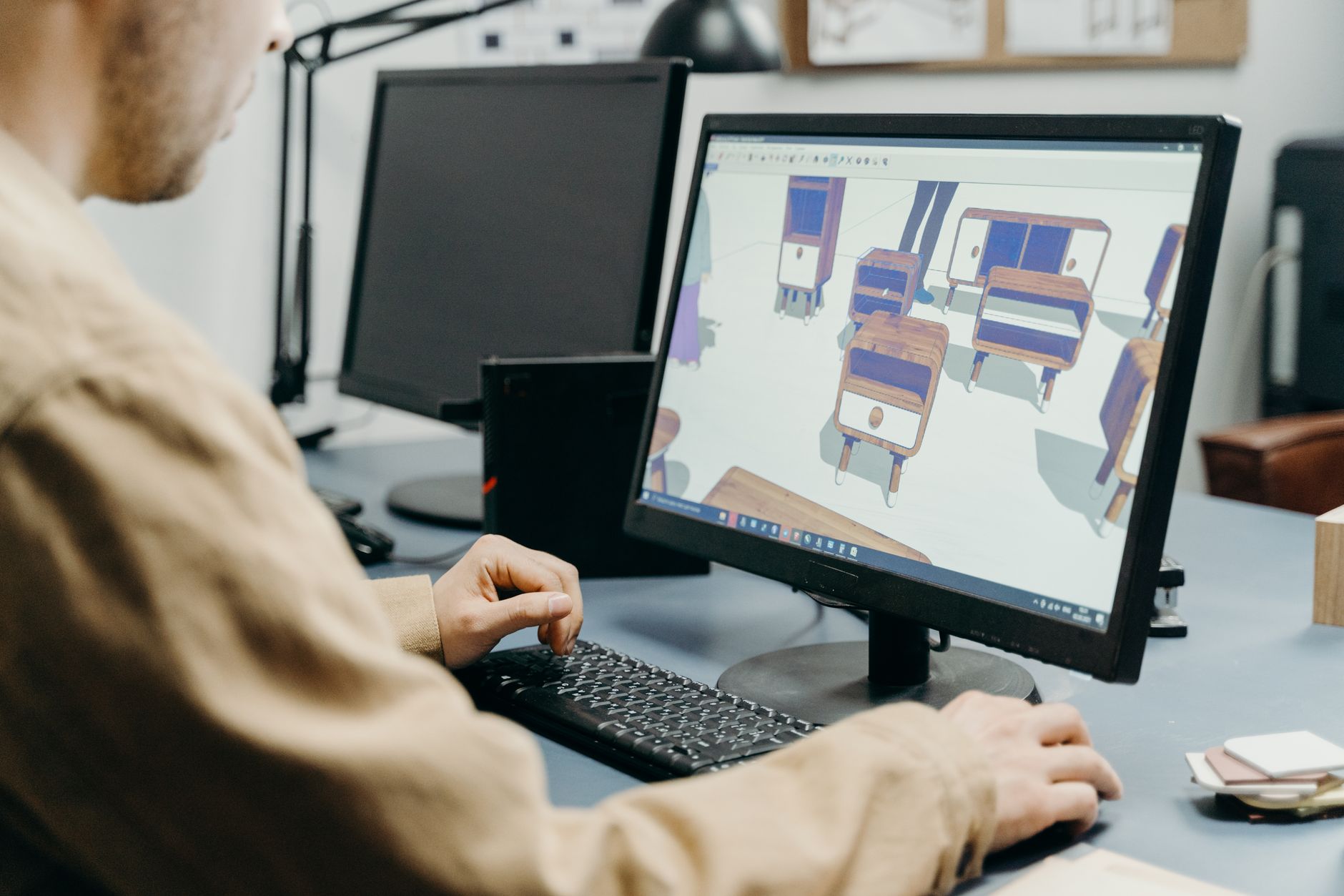
    Designer working on a build design system Figma 2026 project at a modern London studio workstation
    Designer working on a build design system Figma 2026 project at a modern London studio workstation

    Why Design Tokens Are the Foundation You Can’t Skip

    Before you touch a single component, you need to sort your tokens. Think of tokens as variables for your design decisions. Colour values, spacing increments, font sizes, border radii, shadow depths — all of it lives in tokens rather than being hard-coded into individual components. The moment you hardcode #1A1A2E directly into 47 components, you’ve built a maintenance nightmare, not a system.

    Tokens Studio (the Figma plugin) lets you define, organise, and sync tokens in a JSON format that your developers can consume directly. It also integrates with Style Dictionary, which transforms those tokens into platform-specific outputs: CSS custom properties for the web, Swift constants for iOS, XML for Android. That’s the handoff pipeline sorted before a single component is drawn.

    Naming Your Tokens Properly

    Naming is where most teams go wrong. There are broadly three tiers of tokens, and understanding them saves enormous grief later.

    • Primitive (global) tokens: Raw values. color.blue.500 = #3B82F6. These are the periodic table of your system. Never reference them directly in components.
    • Semantic (alias) tokens: Meaningful assignments. color.action.primary = {color.blue.500}. This is what your components actually reference.
    • Component tokens: Scoped to a specific component. button.background.default = {color.action.primary}. Optional but powerful for complex components.

    The reason for this three-tier structure? When your brand pivots from blue to teal (and it will happen, trust me), you update one primitive token and the entire system propagates the change. Magic, but actually just good architecture.

    Setting Up Tokens Studio in Figma

    Install Tokens Studio from the Figma Community. Once it’s running, you’ll see a panel where you can create token sets. Start with a global set for your primitives and a semantic set that references them. In Tokens Studio, you reference another token using curly brace syntax: {color.blue.500}.

    For teams working collaboratively, connect Tokens Studio to a GitHub repository. Your token JSON lives in source control alongside your code. Designers push token changes via the plugin; developers pull them and run Style Dictionary to generate updated CSS variables. The design-to-code gap narrows dramatically. According to the UK Government Design Principles, consistency and clarity are foundational to good service design, and a token-based system is precisely how you enforce both at scale.

    Close-up of Figma and Tokens Studio JSON panel used to build design system in Figma 2026
    Close-up of Figma and Tokens Studio JSON panel used to build design system in Figma 2026

    Component Architecture: Building for Scale

    Now the fun part. Components in Figma should follow an Atomic Design hierarchy, even if you don’t call it that out loud in your team documentation.

    Atoms First

    Build your smallest, indivisible elements first. Buttons, input fields, checkboxes, radio buttons, badges, icons. Each atom should use semantic tokens exclusively, never raw values. Use Figma’s component properties to handle variants: state (default, hover, active, disabled), size (small, medium, large), and hierarchy (primary, secondary, ghost).

    Keep each atom in a dedicated page or dedicated section within a page. Organise your layers obsessively. Naming matters here: use the Group/Component Name slash convention so Figma’s asset panel presents them cleanly. Button/Primary/Default reads like a file path, which is exactly what it is.

    Molecules and Organisms

    Molecules combine atoms into slightly more complex chunks. A form field is a molecule: it combines a label atom, an input atom, and a helper text atom. An organism is a full section: a navigation bar, a hero block, a card grid. Each layer of composition should reference its children as nested component instances, not as detached copies. Detaching components is the design system equivalent of deleting a git history.

    Using Figma Variables Alongside Tokens Studio

    Figma’s native Variables (introduced in 2023 and considerably more mature now in 2026) and Tokens Studio overlap in interesting ways. Figma Variables are great for live mode switching — light and dark themes, for instance — because they’re native to the runtime. Tokens Studio is better for complex multi-brand setups and for the developer export pipeline. In practice, many teams use both: Variables for the Figma-side interactive prototyping experience, Tokens Studio for the actual production handoff. It’s not either/or; it’s knowing which tool solves which problem.

    Developer Handoff That Doesn’t Make Developers Want to Quit

    When you build a design system in Figma 2026, the handoff process is where the theory meets reality. A few non-negotiable practices:

    • Token JSON in the repo: Developers should be able to run npm run build:tokens and get updated CSS custom properties automatically. No more screenshots of hex codes.
    • Component documentation: Use Figma’s built-in description fields to document intended behaviour, states, and usage restrictions. If a component shouldn’t be used without an icon, say so in the description.
    • Storybook integration: If your devs are working in React or Vue, push them towards maintaining a Storybook instance that mirrors the Figma component library. When the two drift apart, you have a system problem, not a communication problem.
    • Change logs: Every token or component update should be logged. A simple markdown file in the repo works fine. Designers tend to forget that a subtle colour tweak can break contrast ratios across an entire product.

    Keeping the System Alive (The Hard Bit)

    Building a design system is about 30% of the work. The other 70% is governance, iteration, and adoption. Appoint a system owner, even if it’s a rotating responsibility. Schedule quarterly audits of your token sets and component library. Create a clear contribution process so product teams can propose additions without every random one-off component ending up in the core library.

    Teams that genuinely succeed at this, whether they’re a ten-person startup in Sheffield or a hundred-person product org in London, share one trait: they treat the design system as a product in its own right. It has a roadmap, a backlog, and real users (the rest of the design and engineering team).

    The payoff is real. Faster prototyping, dramatically reduced QA cycles, consistent accessibility compliance, and designers who can spend their time solving actual UX problems rather than recreating the same button variant for the fourteenth time. That’s why so many teams are keen to build a design system in Figma 2026 rather than continuing to wing it with ad hoc component libraries.

    If you take one thing from all of this: start with your tokens. Get the naming right. Everything else builds on top of that foundation, and a solid foundation means the whole system scales without drama. Now go make something properly good.

    Frequently Asked Questions

    What is a design token and why does it matter for a design system?

    A design token is a named variable that stores a design decision, such as a colour value, spacing size, or font size. Rather than hardcoding raw values into components, you reference tokens, which means updating a single token automatically propagates changes across the entire system without manual edits.

    Do I need to pay for Tokens Studio to use it with Figma?

    Tokens Studio has a free tier that covers basic token management and is perfectly usable for small teams or solo projects. The Pro tier unlocks advanced features like GitHub, GitLab, and Azure DevOps sync, multi-file token sets, and themes, which are essential for larger product teams managing multiple brands or complex theming.

    What is the difference between Figma Variables and Tokens Studio?

    Figma Variables are a native Figma feature suited to live prototype switching, such as toggling between light and dark mode directly in the canvas. Tokens Studio is a plugin that excels at complex token structures, multi-brand setups, and generating developer-ready outputs via Style Dictionary. Many teams use both together rather than choosing one over the other.

    How long does it take to build a design system from scratch in Figma?

    A basic but functional token-based design system with core atoms and a documented handoff pipeline can take one to three weeks for an experienced designer working full-time. A comprehensive system covering typography, spacing, colour, elevation, motion, and a full component library for a mature product can take two to four months. The governance and adoption phase never really ends.

    How do I make sure developers actually use the design system?

    The single biggest driver of developer adoption is reducing friction in the handoff process. When tokens are available as auto-generated CSS custom properties or platform-specific constants directly from the repo, developers don’t need to manually transcribe values, which removes a major pain point. Maintaining a Storybook that mirrors the Figma library also helps bridge the gap between design intent and coded implementation.

  • Micro-Interactions That Convert: The Psychology Behind Small UI Details

    Micro-Interactions That Convert: The Psychology Behind Small UI Details

    There is a moment in product design that nobody talks about enough. A user hovers over a button. The button pulses slightly, shifts colour by 10%, maybe adds a tiny shadow. The user clicks. They did not consciously notice any of that. But somewhere in their nervous system, something said “this thing is alive and trustworthy.” That is the quiet power of micro-interactions that convert, and if you are not thinking carefully about them, you are leaving real engagement on the table.

    This is not fluff. Research from Nielsen Norman Group consistently shows that feedback loops, even imperceptible ones, reduce cognitive friction and build perceived reliability. When an interface responds to you instantly and honestly, it feels competent. When it is static and silent, it feels unfinished. The gap between those two feelings? That is where conversion rates live.

    Designer studying micro-interactions that convert on a large monitor in a modern studio
    Designer studying micro-interactions that convert on a large monitor in a modern studio

    What Actually Makes a Micro-Interaction Work?

    The term gets thrown around loosely, so let us be precise. A micro-interaction is a single-purpose response to a user action. Dan Saffer, who literally wrote the book on this, breaks them into four components: trigger, rules, feedback, and loops and modes. That framework is still the most useful one I have come across.

    The trigger is what starts the interaction (a hover, a click, a form submission). The rules define what happens next. The feedback is the visible, audible, or tactile response the user gets. And loops govern whether that behaviour repeats or changes over time. Most developers get the trigger and feedback right, then stop. The loops and rules, the parts that adapt the interaction based on context, are where the genuinely clever stuff happens.

    Take something as mundane as a form validation message. A red border appearing after a failed submission is basic feedback. But an input field that gently shakes when you try to submit an empty required field? That is a rule-driven, physics-informed response. The user does not need to read an error message. Their brain has already processed “no” through the visual metaphor of resistance. Fewer words, faster correction, lower drop-off rate.

    Hover States: More Than Just Pointer Feedback

    Hover states are the most underestimated tool in the front-end designer’s kit. They are often treated as an afterthought, a quick :hover { background: #eee; } thrown in during QA. That is a waste of a genuinely persuasive moment.

    A well-designed hover state communicates affordance. It tells the user “yes, this is clickable, and here is roughly what clicking it will do.” Shopify stores consistently report higher add-to-basket rates when product cards have animated hover states that preview secondary product images or surface a quick-action button. That is not coincidence. That is the affordance principle at work: reveal the next action before the user commits to it, and the commitment feels less risky.

    In CSS, building this efficiently looks like this:

    .product-card {
      position: relative;
      overflow: hidden;
      transition: transform 0.2s ease, box-shadow 0.2s ease;
    }
    
    .product-card:hover {
      transform: translateY(-4px);
      box-shadow: 0 12px 24px rgba(0, 0, 0, 0.12);
    }
    
    .product-card .quick-action {
      opacity: 0;
      transform: translateY(8px);
      transition: opacity 0.2s ease, transform 0.2s ease;
    }
    
    .product-card:hover .quick-action {
      opacity: 1;
      transform: translateY(0);
    }

    Keep transitions between 150ms and 300ms. Under 100ms feels glitchy. Over 400ms feels sluggish. That 150-300ms window is where animations feel responsive without being jarring. You can cite this back to research from Google’s Material Design team if anyone questions you in a meeting.

    Hover state micro-interaction on a mobile product card demonstrating micro-interactions that convert
    Hover state micro-interaction on a mobile product card demonstrating micro-interactions that convert

    Feedback Loops and the Dopamine Hook

    Here is where it gets properly nerdy. Feedback loops in UI borrow heavily from behavioural psychology, specifically the concept of variable reward schedules. When a user takes an action and receives immediate, satisfying feedback, dopamine is released. The interface feels good to use. The user is more likely to take the next action.

    Think about the LinkedIn “like” animation. The little burst of colour and scale when you tap a reaction button is not decorative. It is a micro-reward. Instagram, Duolingo, and yes, even some of the better e-commerce apps in the UK (ASOS’s wishlist animation is a textbook example) have baked this thinking into their core interaction patterns.

    For button click feedback, the simplest high-impact technique is the “press” state. Not just :active with a colour change, but a physical downward shift combined with reduced shadow, simulating the button actually being pressed into the screen:

    .btn-primary:active {
      transform: translateY(2px);
      box-shadow: 0 2px 4px rgba(0, 0, 0, 0.1);
      transition: transform 0.05s ease, box-shadow 0.05s ease;
    }

    Fifty milliseconds. That is all you need. But it changes everything about how the button feels.

    Loading states are another feedback loop that developers habitually neglect. If a form submission takes two seconds and the UI does nothing in response, the user will click the button again. Now you have a double submission. A skeleton loader or a spinner with a subtle pulse animation solves this, reduces server load, and makes the wait feel shorter. It is a classic case where good UX and good engineering are the same decision.

    Building Micro-Interactions Efficiently at Scale

    The trap most teams fall into is building animations one-off, in component CSS, without any shared token system. You end up with 14 different easing curves across a codebase, and the whole product feels inconsistent in ways users cannot articulate but absolutely feel.

    The fix is to define a motion system early, exactly like a colour system or a type scale. In your design tokens, define a small set of approved durations and easing functions:

    :root {
      --duration-fast: 150ms;
      --duration-base: 250ms;
      --duration-slow: 400ms;
      --ease-standard: cubic-bezier(0.4, 0, 0.2, 1);
      --ease-decelerate: cubic-bezier(0, 0, 0.2, 1);
      --ease-accelerate: cubic-bezier(0.4, 0, 1, 1);
    }

    Then every animation in your system references these tokens. When a designer decides the base duration feels slightly slow, you change one line. Job done. The BBC’s GEL design system handles motion exactly this way, and it shows: their cross-product experience feels coherent even across very different interfaces.

    For React projects, I tend to reach for Framer Motion for anything complex, and plain CSS transitions for simple hover and focus states. Do not use Framer Motion for a button hover. That is using a sledgehammer on a drawing pin. Keep the abstraction level matched to the complexity of the problem.

    Accessibility and Performance: The Non-Negotiables

    Micro-interactions that convert are not micro-interactions that make half your users feel ill. Vestibular disorders affect a meaningful portion of the population, and excessive or fast motion can trigger genuine discomfort. The prefers-reduced-motion media query is not optional:

    @media (prefers-reduced-motion: reduce) {
      *, *::before, *::after {
        animation-duration: 0.01ms !important;
        transition-duration: 0.01ms !important;
      }
    }

    Stick that in your base CSS and never think about it again. Your animations will still exist for users who want them; users who do not will get instant state changes. The WCAG 2.1 guideline 2.3.3 makes this a legal consideration for public sector UK digital services, and it is good practice everywhere else.

    On performance: always animate transform and opacity. These are composited by the browser’s GPU and do not trigger layout recalculation. Never animate width, height, top, left, or margin if you can help it. Those trigger reflow, and on lower-end Android devices common across the UK market, you will see dropped frames that make your polished interaction look broken.

    One final, slightly unexpected thought on micro-interactions: they are not exclusive to software. The same principles of reward, feedback, and delight that make a UI feel satisfying appear in all kinds of interactive experiences, physical and digital. If you want a genuinely charming example of feedback loops applied to a real product experience, have a look at how the folks behind a LEGO Subscription box service think about the unboxing ritual as a sequence of progressive reveals. The design thinking is transferable, even if the medium is cardboard rather than CSS.

    The bottom line is this: micro-interactions that convert are not decoration. They are information architecture expressed in motion. Every hover state is a prompt. Every loading animation is a promise. Every button press is a handshake. Design them deliberately, build them efficiently, and respect the users on the receiving end. That combination is what separates interfaces that just work from interfaces people genuinely enjoy using.

    Frequently Asked Questions

    What are micro-interactions in UI design?

    Micro-interactions are small, single-purpose animations or feedback responses triggered by a user action, such as a button changing colour on hover or a form field shaking when submitted incorrectly. They communicate system status, confirm actions, and guide users through an interface without requiring them to read lengthy instructions.

    Do micro-interactions actually improve conversion rates?

    Yes, when implemented thoughtfully. Micro-interactions reduce cognitive friction by making interfaces feel responsive and trustworthy, which lowers hesitation before clicking or submitting. Studies from Nielsen Norman Group and real-world data from e-commerce platforms consistently show improved engagement metrics when feedback states are well-designed.

    How do I build micro-interactions without hurting page performance?

    Stick to animating only CSS properties that the browser can composite on the GPU: primarily `transform` and `opacity`. Avoid animating layout-triggering properties like `width`, `height`, or `margin`, as these cause expensive reflow calculations. Keep transition durations between 150ms and 300ms for best perceived responsiveness.

    What tools or libraries are best for creating micro-interactions in 2026?

    For React projects, Framer Motion is the go-to for complex sequenced animations, while CSS custom properties and transitions handle simpler hover and focus states perfectly well on their own. For vanilla JS or Vue projects, the Web Animations API is increasingly capable and requires no additional dependencies.

    How do I make micro-interactions accessible for users with motion sensitivity?

    Use the `prefers-reduced-motion` CSS media query to detect users who have enabled reduced motion in their operating system settings, then strip back or disable animations accordingly. WCAG 2.1 guideline 2.3.3 specifically addresses animation from interactions, and compliance is mandatory for UK public sector digital services.

  • The Best AI Design Tools of 2026: Figma, Adobe Firefly and the New Challengers

    The Best AI Design Tools of 2026: Figma, Adobe Firefly and the New Challengers

    Right, let’s be honest: the AI design tool space has exploded so aggressively that keeping track of it feels like watching a React framework appear every six minutes. There are genuinely useful tools in the mix, some that are mostly hype dressed up in a slick landing page, and a handful of newcomers doing things that would have seemed like science fiction in 2022. This breakdown covers the best AI design tools 2026 has produced so far, what they actually do well, where they fall short, and which type of designer should be reaching for which tool.

    One thing worth flagging up front: “AI-powered” is now essentially a marketing tick box. Almost every design tool will claim it. The interesting question is whether the AI actually changes how you work, or whether it’s just a generative fill button buried three menus deep. The tools that make this list earn their place by genuinely shifting workflow — not just tacking on a chatbot.

    Designers working with the best AI design tools 2026 in a modern London studio
    Designers working with the best AI design tools 2026 in a modern London studio

    Figma AI: The One That’s Already In Your Workflow

    Figma has had a head start that most competitors are still trying to close. Its AI features, rolled out properly across 2025 and expanded further this year, sit inside the tool you’re probably already using — which is a significant advantage. The standout features right now are the auto-layout suggestions, the “Make designs” prompt-to-component pipeline, and the AI-powered rename layers function that sounds trivial until you inherit a file with 400 layers called “Rectangle 47”.

    The prompt-to-wireframe feature has got genuinely good. You can describe a SaaS dashboard, get a rough structural layout, then refine from there. It’s not replacing senior-level design thinking, but for rapid ideation or scaffolding a new project, it saves real hours. Pricing sits within Figma’s standard tiers: the Professional plan is around £12 per editor per month, with AI features accessible on Professional and above. For teams already paying for Figma, there’s no additional cost to enable the AI layer, which is a smart bundling decision.

    Best for: Product designers, UI/UX professionals, design teams already in the Figma ecosystem who want AI augmentation without switching tools.

    Adobe Firefly and the Creative Cloud AI Stack

    Adobe’s bet on Firefly has turned into something more coherent than it looked in its early, slightly chaotic release. By 2026, Firefly is properly embedded across Photoshop, Illustrator, InDesign, and Express, and the quality of its generative outputs has improved markedly. The big thing Adobe keeps hammering (and it’s a legitimate point) is commercial safety: Firefly is trained on licensed Adobe Stock content, which matters enormously for agency work where IP liability is a real concern.

    Generative Fill in Photoshop remains genuinely impressive for photo manipulation. The Vector Recolour and Generative Recolour features in Illustrator are a proper time save for brand asset production. Where Adobe still frustrates is pricing: Creative Cloud All Apps is around £60 per month for individuals, and Firefly generative credits are metered — you can burn through them faster than you’d expect on a busy project. The enterprise tiers sort this out with unlimited credits, but that’s a conversation for procurement teams with actual budgets.

    Best for: Graphic designers, brand designers, photographers, agencies needing commercially safe generative outputs, print and editorial work.

    Close-up view of a professional using best AI design tools 2026 on a design monitor
    Close-up view of a professional using best AI design tools 2026 on a design monitor

    Canva AI: The One That Surprised Everyone

    Look, some people still sniff at Canva as “not real design”. Those people should probably update their priors. Canva’s AI suite, particularly Magic Studio, has become genuinely capable. Magic Write, the text generation layer, is solid for social content and marketing copy. Magic Design generates complete template layouts from a prompt or an uploaded image. Magic Animate adds motion to static designs without touching a timeline. And Magic Eraser for background and object removal now rivals standalone tools.

    For non-designers, marketing teams, and small businesses producing high volumes of social content, Canva Pro (around £10.99 per month for individuals) is extraordinary value. The AI features are meaningfully better than they were two years ago. The ceiling is lower than Figma or Adobe for complex, precise design work — but that’s not Canva’s audience, and it’s not trying to be.

    Best for: Marketing teams, content creators, non-designers, social media managers, small businesses. Less suited to detailed product UI or complex print work.

    Khroma, Uizard and the Specialist Challengers

    Beyond the platform giants, a cluster of specialist AI tools have carved out genuinely useful niches.

    Khroma is an AI colour tool that learns your palette preferences from a training set you provide, then generates infinite colour combinations you’d actually use. It’s free, it’s focused, and it’s oddly addictive. If colour is a consistent pain point in your process, it’s worth an afternoon of your time.

    Uizard has positioned itself as the fastest route from idea to testable prototype. You can sketch on paper, photograph it, and Uizard converts it to a digital wireframe. Prompt-to-UI is also on offer. For solo founders and startup teams validating ideas quickly, it fills a real gap. Plans start at around £12 per month.

    Galileo AI remains one to watch: it generates high-fidelity UI designs from text prompts at a speed that still raises eyebrows. It’s more useful for inspiration and early concepting than final delivery, but it has accelerated the early phases of product design projects noticeably.

    The BBC Technology section has been tracking how these AI tools are reshaping creative industries broadly, and the pattern is consistent: the tools that earn real adoption are the ones that remove friction from existing workflows rather than asking designers to rebuild their entire process around a new paradigm.

    How to Actually Choose Between Them

    Here’s my rough framework for cutting through the noise on the best AI design tools 2026 has thrown at us.

    If you’re a product or UI/UX designer working in teams, you’re almost certainly staying in Figma. The AI features are good enough, the collaboration layer is unbeaten, and switching cost is enormous. If you’re doing brand, print, or photo-heavy work professionally, Adobe’s stack earns its price for the commercial licensing alone. If you’re a solo operator or a small marketing team producing content at volume, Canva Pro plus its AI suite is genuinely hard to argue against on value.

    The specialist tools, Khroma, Uizard, Galileo, are best thought of as additions to your kit rather than replacements for a primary tool. They’re excellent at specific tasks and cheap enough that running two or three alongside your main platform is entirely reasonable.

    One thing I’d push back on is the anxiety that these tools are making design skills redundant. If anything, the designers getting the most out of them are the ones with strong fundamentals: good layout sense, typographic knowledge, understanding of visual hierarchy. The AI amplifies good taste. It doesn’t manufacture it.

    A Quick Note on Pricing and UK VAT

    All the prices mentioned above are approximate and exclude VAT. If you’re buying as an individual in the UK, add 20% VAT to your calculations. If you’re operating through a limited company and VAT registered, you can reclaim it, but check your accountant on the specifics. Adobe’s enterprise pricing in particular is worth negotiating directly, especially for agencies with five or more seats.

    Frequently Asked Questions

    What is the best AI design tool for beginners in 2026?

    Canva with its Magic Studio AI suite is the most approachable option for beginners, offering prompt-to-design, background removal, and auto-animation without needing any prior design training. For beginners who want to progress toward professional UI/UX work, Figma’s AI features are worth learning from the start, as it’s the industry standard tool.

    Is Adobe Firefly worth the subscription cost in 2026?

    For professional graphic designers and agencies already using Creative Cloud, yes — Firefly’s commercial licensing safety and tight integration across Photoshop and Illustrator make it genuinely valuable. If you’re only using one or two Adobe apps and primarily need generative image features, standalone alternatives like Midjourney or Ideogram may give you more output per pound.

    Can Figma's AI features replace a designer entirely?

    No, and it’s not designed to. Figma’s AI handles scaffolding, ideation, and repetitive tasks like auto-renaming layers or suggesting layout structures, but the output still requires a designer’s judgement to refine and make production-ready. Think of it as a fast, well-organised junior that needs direction.

    Which AI design tools are best for freelance designers?

    Figma Professional (around £12 per editor per month) covers UI/UX work comprehensively. For brand and visual design, Adobe Creative Cloud’s single-app plans can reduce cost if you only need Illustrator or Photoshop. Khroma is free and excellent for colour work. Canva Pro at around £10.99 per month is worth adding for fast client-facing content production.

    Are AI-generated designs commercially safe to use for client work in the UK?

    It depends on the tool. Adobe Firefly is trained on licensed content and is specifically positioned as commercially safe. Tools trained on scraped web imagery carry more legal ambiguity, and UK intellectual property law in this area is still developing. For client deliverables, sticking to tools with clear licensing provenance like Firefly is the lower-risk approach.

  • Dark Patterns Are Dead: Why Ethical UX Design Is Now an SEO Ranking Factor

    Dark Patterns Are Dead: Why Ethical UX Design Is Now an SEO Ranking Factor

    There is a certain irony in the fact that designers spent years perfecting the art of the sneaky checkbox, the guilt-trip unsubscribe button, and the “are you sure you don’t want to miss out?” pop-up, only for Google to turn around and say: actually, we’re counting all of that against you. Dark patterns, those deliberately manipulative UX tricks designed to confuse, coerce, or trap users, are not just bad ethics. In 2026, they are a measurable ranking liability. The intersection of ethical UX design SEO has gone from niche conversation to genuine commercial concern, fast.

    Web designer reviewing ethical UX design SEO interface patterns on a studio monitor
    Web designer reviewing ethical UX design SEO interface patterns on a studio monitor

    What Are Dark Patterns and Why Did We Ever Think They Were a Good Idea?

    Dark patterns are interface design choices that work against users’ interests to benefit the business. The term was coined by UX designer Harry Brignull back in 2010, and the taxonomy he built is still chillingly relevant: roach motels, misdirection, trick questions, hidden costs, disguised adverts. The underlying logic was always short-termist. Trick someone into signing up for a newsletter, and you’ve boosted your mailing list. Bury a pre-ticked subscription box, and you’ve juiced your conversion rate. For a while, that worked. Then it didn’t.

    The problem is that users got smarter, regulators got serious, and Google got algorithmic about the whole thing. The UK’s Competition and Markets Authority (CMA) published specific guidance on manipulative online choice architecture, and the ICO began tightening expectations around cookie consent patterns that deliberately make opting out harder than opting in. Meanwhile, Google’s helpful content updates and Core Web Vitals signals started rewarding pages that users actually wanted to stay on. Suddenly, the site with the aggressive pop-up gauntlet wasn’t just annoying: it was losing ground in search.

    How Google Detects and Penalises Manipulative UX

    Google has never published a clean list labelled “dark patterns we penalise”, but the signals are embedded across several ranking systems. Core Web Vitals includes Interaction to Next Paint (INP), which measures responsiveness: a page plastered with obstructive interstitials that delay meaningful engagement scores poorly. The Intrusive Interstitials penalty, introduced years ago but significantly reinforced in recent updates, specifically targets pop-ups that cover main content on mobile before a user has had a chance to read anything.

    Beyond technical signals, Google’s quality rater guidelines describe what “beneficial purpose” looks like. Pages that exist primarily to trap users, inflate dwell time through friction rather than genuine value, or make it nearly impossible to find the exit are flagged as low-quality. User behaviour data feeds into this: if people consistently bounce straight back to the search results after landing on your page, that tells Google something important about the experience you’re delivering. Ethical UX design SEO, in this context, is not a slogan. It is a system of measurable outcomes that good design produces naturally.

    What Ethical, User-First Design Actually Looks Like in Practice

    Let’s get specific, because “be ethical” is not a design brief. Here is what this looks like when you’re actually building something.

    Transparent Consent and Honest Copy

    Cookie banners should make it as easy to reject all as to accept all. That is not just an ICO requirement under UK GDPR guidance; it is a trust signal. Users who feel respected stay longer, return more often, and convert more reliably over time. Write your CTAs so they say what happens next. “Start your free trial” is fine. “Get instant access” that leads to a paywall is not.

    Navigation That Respects User Intent

    Menus should be findable. Search functionality should surface what users are actually looking for. Unsubscribe flows should take one click, not five screens of dark sorcery. I’ve audited apps where the “cancel subscription” path was buried under three different settings categories, each with a misleading label. That’s not clever retention strategy; it’s churn deferred and reputation destroyed.

    Close-up of accessible cookie consent interface demonstrating ethical UX design SEO principles
    Close-up of accessible cookie consent interface demonstrating ethical UX design SEO principles

    Confirmshaming Is Over

    “No thanks, I don’t want to save money” is not wit. It’s antagonising your user to make them feel guilty about clicking the wrong button. Modern users clock this immediately and it leaves a sour taste. Write your decline options with the same neutral, respectful tone as your accept options. The difference in conversion is negligible. The difference in brand perception is not.

    Accessible Defaults and Honest Pricing

    Pre-selected options should default to the user’s benefit, not yours. Hidden charges that appear at checkout are one of the UK’s most complained-about e-commerce practices, regularly cited by Which? and consumer groups. Showing the full price upfront, including VAT, is not only best practice under UK Consumer Rights obligations; it reduces cart abandonment because users aren’t ambushed at the final step.

    The Regulatory and Reputational Stakes in the UK

    The CMA’s investigation into online choice architecture resulted in firms being required to redesign subscription flows that obscured cancellation. The ICO has taken action against cookie walls that made consent effectively meaningless. The Advertising Standards Authority has tackled misleading urgency timers showing fake countdown clocks on product pages. These are not abstract risks. UK-based designers and product teams are operating in a regulatory environment that has clearly decided manipulative UX is a consumer harm, not a clever growth hack.

    The reputational dimension matters just as much. Trust is a compound asset. It takes years to build through consistent, honest design and seconds to crater with one viral thread about your subscription dark pattern. The BBC’s coverage of subscription trap complaints has driven real user behaviour change, with people actively checking cancellation terms before signing up. That means your ethical design choices are now a genuine acquisition differentiator, not just a compliance checkbox.

    For a well-structured breakdown of what constitutes legitimate and illegitimate consent mechanisms under UK GDPR, the ICO’s consent guidance is the definitive starting point for any UK-based design team.

    Measuring Ethical Design: Metrics That Actually Matter

    If you’re making the case internally for stripping out dark patterns, these are the numbers to watch. Task completion rate tells you whether users can do what they came to do without friction. Rage clicks (tracked in tools like Hotjar or Microsoft Clarity) reveal where your interface is confusing or frustrating users. Unsubscribe and cancellation completion rates show whether your offboarding respects user autonomy. And organic search performance over time will reflect whether Google’s quality signals are moving in the right direction.

    The shift toward ethical UX design SEO is not a soft, feels-good trend. It is a convergence of regulatory pressure, algorithmic incentive, and measurable user behaviour change. Google rewards pages that users find genuinely useful and respectful. Regulators penalise interfaces that manipulate. Users actively punish brands that treat them as targets rather than people. The dark pattern playbook was always borrowing against future trust; in 2026, the debt is being called in. The designers and product teams who treat ethics as a design constraint rather than an inconvenience are building products that rank better, convert more honestly, and last longer. That’s not idealism. That’s just good engineering.

    Frequently Asked Questions

    Does ethical UX design actually affect Google rankings?

    Yes, indirectly but meaningfully. Google’s Core Web Vitals, Intrusive Interstitials penalty, and helpful content signals all reward experiences where users can easily accomplish their goals without friction or manipulation. Pages that trap, confuse, or mislead users tend to generate poor behavioural signals like high bounce rates and low dwell time, which feed into ranking quality assessments.

    What are the most common dark patterns still used on UK websites in 2026?

    The most widespread include hard-to-find cancellation flows, pre-ticked marketing opt-in boxes, fake countdown timers creating false urgency, cookie banners that make rejecting harder than accepting, and hidden charges appearing only at checkout. Several of these are under active scrutiny from the CMA and ICO in the UK.

    How do I know if my website or app uses dark patterns?

    Run a task-based audit: ask a real user to subscribe and then cancel, or find the privacy settings. Record where they get stuck, confused, or frustrated. Tools like Hotjar, Microsoft Clarity, or simple usability testing sessions reveal friction points that often turn out to be inadvertent or deliberate dark patterns. User feedback and support tickets flagging the same navigation problems repeatedly are also strong signals.

    Can dark patterns get my business fined in the UK?

    Yes. The ICO can take enforcement action over non-compliant cookie consent mechanisms under UK GDPR. The CMA has powers to require businesses to redesign interfaces that constitute harmful online choice architecture. The ASA can act against misleading urgency tactics in advertising. Fines, enforcement notices, and public naming are all live risks for UK businesses.

    What is the difference between persuasive design and a dark pattern?

    Persuasive design nudges users towards a choice that genuinely serves their interests or at least doesn’t harm them; think clear benefit-focused CTAs or streamlined checkout flows. Dark patterns use that same psychological toolkit to coerce users into choices that benefit the business at the user’s expense, such as trapping them in subscriptions or obscuring costs. The key test is: if the user fully understood what was happening, would they feel deceived?

  • Micro-Interactions in UX Design: Small Details That Make a Big Difference

    Micro-Interactions in UX Design: Small Details That Make a Big Difference

    There’s a moment when you tap the heart icon on a post and it bounces, pulses, and fills with colour. Takes maybe 300 milliseconds. You barely notice it consciously. But you felt something. That’s the magic of micro-interactions in UX design, and it’s the kind of detail that separates a product people love from one they merely tolerate.

    Micro-interactions are the tiny, single-purpose animations and feedback loops baked into interfaces. A toggle that slides smoothly. A loading bar that fills with personality. A form field that subtly shakes when you enter the wrong password. None of these are the main feature. All of them are load-bearing walls in the structure of user experience.

    Designer working on micro-interactions in UX design on a laptop in a modern studio
    Designer working on micro-interactions in UX design on a laptop in a modern studio

    Why Micro-Interactions in UX Design Actually Matter

    It’s tempting to dismiss them as decoration. They’re not. They do several measurable jobs simultaneously. They communicate system status (something happened, the thing worked), they guide behaviour (you did it right, or wrong), and they add emotional texture to an otherwise flat digital surface.

    Research cited by the Nielsen Norman Group has long established that response times under 100ms feel instantaneous to users, while delays up to one second break the flow of thought. Micro-interactions live in that critical window. When an animation confirms an action within 200ms, the user’s brain registers cause and effect as seamless. When there’s nothing? Uncertainty creeps in. Did it work? Should I tap again?

    Dan Saffer’s framework for micro-interactions, which has basically become the canonical reference, breaks each one into four components: a trigger, rules, feedback, and loops/modes. The trigger starts it (a hover, a click, a system condition). The rules define what happens. The feedback is what the user sees, hears, or feels. Loops determine whether it repeats. Simple framework. Wildly useful when you actually apply it.

    Animation Timing: The Difference Between Slick and Sluggish

    Timing is where most developers get micro-interactions wrong. Either too fast to register, or so slow they feel like the interface is wading through treacle. Getting this right is genuinely nerdy and I love it.

    The general sweet spot for most UI feedback animations is between 150ms and 400ms. Shorter than that and human perception misses the feedback entirely. Longer than 500ms and it starts feeling like lag rather than intentional motion. For transitions that carry meaning (like a modal sliding in), 300ms with an ease-out curve tends to feel natural because it mirrors the physics of objects decelerating to rest.

    In CSS, transition and animation properties give you this control directly. A basic hover micro-interaction might look like this:

    .btn {
      transform: scale(1);
      transition: transform 200ms ease-out, box-shadow 200ms ease-out;
    }
    
    .btn:hover {
      transform: scale(1.05);
      box-shadow: 0 8px 24px rgba(0, 0, 0, 0.15);
    }

    That two-property transition costs essentially nothing in performance and immediately makes the button feel alive. Crucially, transform and opacity are the two CSS properties you should reach for first because they’re composited by the browser and don’t trigger layout recalculation. Animating width, height, or margin? That’s asking for jank.

    Smartphone screen showing a micro-interaction toggle animation in a mobile UX design
    Smartphone screen showing a micro-interaction toggle animation in a mobile UX design

    Designing Micro-Interactions with Purpose: Core Principles

    Not every pixel needs to dance. One of the more common mistakes I see in interface reviews is what I’d call micro-interaction soup: every element animated, every action celebrated, until the whole thing feels like a toddler’s birthday party rather than a professional product. Restraint is a skill.

    A few principles that hold up well in practice:

    Match energy to context

    A banking app confirming a payment transfer should feel calm and reassuring, not exuberant. A creative tool or game can afford something more expressive. The animation should feel like it belongs to the brand and context, not like it was borrowed from a dribbble shot.

    Use easing functions that feel physical

    Linear motion looks robotic. CSS gives you ease, ease-in, ease-out, ease-in-out, and full cubic-bezier() control. For most UI interactions, ease-out (starts fast, decelerates) feels most natural because objects in the real world decelerate. Reserve ease-in (starts slow, accelerates) for elements exiting the screen.

    Never hide information behind animation

    The feedback loop must be clear. If a form submission fails, the micro-interaction should make that failure unmistakably obvious, not bury it in a pretty wiggle. Accessibility also matters here: users who have enabled prefers-reduced-motion in their operating system should get functional feedback without the motion. Always wrap animations in a media query check:

    @media (prefers-reduced-motion: no-preference) {
      .icon {
        transition: transform 250ms ease-out;
      }
    }

    JavaScript-Powered Micro-Interactions: When CSS Isn’t Enough

    CSS handles most standard micro-interactions cleanly, but some scenarios need JavaScript’s logic. Think: a like button that counts up, a progress indicator that responds to real upload speed, or a drag-and-drop interface that gives haptic-style visual feedback based on position.

    The Web Animations API (WAAPI) is worth knowing if you’re doing anything complex. It gives you JavaScript control over animations with the performance benefits of CSS-level compositing. A simple implementation:

    const button = document.querySelector('.like-btn');
    
    button.addEventListener('click', () => {
      button.animate([
        { transform: 'scale(1)' },
        { transform: 'scale(1.3)' },
        { transform: 'scale(1)' }
      ], {
        duration: 300,
        easing: 'ease-out'
      });
    });

    For heavier animations involving scroll-triggered sequences or complex state transitions, libraries like GSAP remain the go-to in professional production environments. Framer Motion is the choice for React-based projects, with its whileHover and whileTap props making micro-interaction implementation almost embarrassingly simple.

    Speaking of things that affect focus and performance: it’s a bit like comparing the precision engineering behind oxygen tanks to a garden hose. The underlying mechanism matters enormously, even when the visible output looks similar.

    Real-World Implementation: Where to Start

    If you’re auditing an existing product or starting a new one, prioritise micro-interactions at the highest-frequency touchpoints first. Buttons, form inputs, toggles, and loading states are touched hundreds of times per session. These are where well-crafted feedback compounds most rapidly into a perception of quality.

    A practical starting checklist:

    • Every interactive element should have a visible hover and active state.
    • Form validation feedback should be immediate and clearly directional (green border for valid, red with a shake for invalid).
    • Loading states should show progress, not just a spinner. A determinate progress bar is always more reassuring than indeterminate spinning.
    • Success and error confirmations should use both colour and motion, never just colour alone (colour-blind users exist, and your UI should work for them).
    • All animations should respect prefers-reduced-motion.

    The cumulative effect of getting these right is difficult to quantify precisely, but qualitative user research consistently shows that interfaces with cohesive micro-interactions are perceived as faster, more trustworthy, and more premium than technically equivalent interfaces without them. Users can’t always articulate why. They just feel the difference.

    The Bottom Line

    Micro-interactions in UX design are one of the highest-return-on-investment details you can invest time in. They don’t require huge engineering effort, they don’t require a visual overhaul, and they don’t require a design system rebuild. They require careful thought about timing, feedback, and purpose, applied consistently across the touchpoints that matter most. Get them right and your product starts to feel like it was made by people who genuinely cared about the experience. Which, presumably, you are.

    Frequently Asked Questions

    What are micro-interactions in UX design?

    Micro-interactions are small, single-purpose animations or feedback mechanisms built into a user interface. They confirm actions, communicate system status, and add emotional texture to digital products. Examples include a button scaling slightly on hover, a toggle sliding smoothly, or a form field shaking when an incorrect value is entered.

    How long should micro-interaction animations be?

    Most UI micro-interaction animations should fall between 150ms and 400ms. Shorter than that and users won’t register the feedback; longer than 500ms and it starts to feel like lag. For transitions carrying meaning, such as modals or drawers, 300ms with an ease-out curve tends to feel most natural.

    Which CSS properties are best for micro-interactions?

    Use transform and opacity wherever possible because they are composited by the browser and don’t trigger layout recalculation, resulting in smooth, jank-free animations. Avoid animating properties like width, height, or margin, as these cause expensive layout reflows.

    Do micro-interactions affect accessibility?

    Yes, and this is important. Some users have vestibular disorders or motion sensitivity and enable the prefers-reduced-motion setting in their OS. Always wrap non-essential animations in a @media (prefers-reduced-motion: no-preference) query so those users receive functional feedback without the motion. Never rely on colour alone for feedback either.

    Should I use CSS or JavaScript for micro-interactions?

    CSS handles the majority of standard micro-interactions efficiently and is the right first choice. Use JavaScript (via the Web Animations API or libraries like GSAP or Framer Motion) when you need logic-driven animations, such as interactions that respond to dynamic data, scroll position, or complex state changes that CSS cannot manage on its own.

  • Dark Mode Design Done Right: Best Practices for Apps and Websites

    Dark Mode Design Done Right: Best Practices for Apps and Websites

    Dark mode has graduated from a novelty toggle to a genuine design discipline. Almost every major platform — iOS, Android, Windows 11, macOS — ships with it built in, and users expect it. But here is the thing: slapping a dark background behind your existing UI is not dark mode design. It is dark mode chaos. Getting it right means understanding how light, colour, and contrast behave differently when the canvas flips, and there are specific dark mode design best practices that separate the polished from the painful.

    Designer working on dark mode design best practices at a studio desk with a dark UI displayed on monitor
    Designer working on dark mode design best practices at a studio desk with a dark UI displayed on monitor

    Why Dark Mode Is Harder Than It Looks

    The assumption most developers make is that dark mode is roughly the inverse of light mode. Swap white for near-black, swap dark text for light text, ship it. Except human vision does not work like a colour picker. On a light interface, our pupils constrict slightly. On a dark interface, they dilate. That shift changes how we perceive colour saturation, edge definition, and fine typographic detail. Colours that look perfectly saturated on a white background can appear garish and vibrating on dark grey. Typography that reads crisply at regular weight suddenly looks too thin. These are not aesthetic opinions; they are physiological realities.

    Then there is the accessibility dimension. The Web Content Accessibility Guidelines (WCAG) specify minimum contrast ratios: 4.5:1 for body text and 3:1 for large text and UI components. These ratios apply just as strictly in dark mode, and in practice they are easier to violate. A light grey on a slightly lighter dark background can feel visually distinct to someone with perfect vision while failing the contrast check entirely for someone with a visual impairment. Tools like the Paciello Group’s Colour Contrast Analyser (free, Windows and macOS) are genuinely useful here and worth keeping in your toolkit.

    Choosing the Right Background Colours

    Pure black (#000000) is almost never the right call. It creates an extreme luminance contrast that causes visual halation, a phenomenon where bright text on absolute black appears to bleed or glow at the edges. This is particularly noticeable on OLED displays, which are everywhere now. Google Material Design recommends #121212 as a baseline dark surface. Apple’s Human Interface Guidelines use a layered system of near-blacks and dark greys to create depth.

    The practical approach is to build a surface scale: a base colour around 8-12% lightness in HSL, then stepped layers at 14-16%, 18-20%, and so on. Each layer represents an elevation in your UI. Cards sit slightly lighter than the base. Modals sit slightly lighter than cards. This creates a sense of hierarchy without using shadows (which work poorly on dark backgrounds). The difference between each step should be subtle, roughly 5-8% lightness, enough to perceive without creating jarring jumps.

    Close-up of phone and laptop showing dark mode design best practices with layered surface colours
    Close-up of phone and laptop showing dark mode design best practices with layered surface colours

    Dark Mode Colour Theory: Desaturate Everything

    This is the rule most people skip, and it is why their dark UIs look like a rave flyer. Brand colours and accent colours that look great in light mode are almost always too saturated for dark mode. A vivid blue at full saturation on a light background reads as confident and clear. On a dark background, it screams. The fix is to desaturate and slightly lighten your accent colours for dark mode. If your brand blue is hsl(220, 80%, 50%) in light mode, try something closer to hsl(220, 50%, 65%) for dark mode. You get the same hue identity with far less visual noise.

    The same logic applies to status colours. Error reds, success greens, and warning yellows all need adjustment. Fully saturated red on near-black is practically unusable for anything beyond a brief flash. Bring the saturation down, bring the lightness up, and you get something that communicates urgency without being physically uncomfortable to look at.

    Typography in Dark Mode: Weight and Spacing Matter

    Text rendering on dark backgrounds is genuinely tricky. On light backgrounds, letterforms are defined by dark ink on a bright field. On dark backgrounds, the relationship inverts, and thin strokes in a typeface can disappear or appear broken, especially on non-retina displays. The practical implications are straightforward: avoid thin or extra-light font weights for body text in dark mode. Regular and medium weights hold up far better. If you are using a variable font, consider bumping the weight axis by 50-100 units specifically for your dark mode stylesheet.

    Letter spacing is worth revisiting too. Slightly increased tracking, around 0.01em to 0.02em on body text, can improve legibility on dark backgrounds. It is a small change but it compounds across paragraphs. Equally, do not go to pure white (#FFFFFF) for your body text. It is too bright against dark greys and contributes to eye fatigue over long reading sessions. A slightly off-white like #E8E8E8 or #F0F0F0 brings down the harshness while maintaining a perfectly comfortable contrast ratio.

    Handling Images, Illustrations, and Icons

    Images with white or near-white backgrounds become glaring rectangles in dark mode. The options are: use transparent PNGs or SVGs wherever possible, apply a subtle border-radius and a low-opacity border to separate image edges from the background, or use CSS filters like brightness(0.9) as a mild global dimming on images in dark mode. None of these are perfect solutions for every case, but using transparent assets by default is the cleanest approach and saves you problem-solving later.

    Icons deserve specific attention. Outlined icon sets often look visually heavier in dark mode because the stroke appears brighter than expected. Test your icon set in both modes early in the design process. Sometimes switching from outline to filled icons for dark mode, or offering both as a toggle, is the right answer depending on your UI density.

    Common Mistakes Developers and Designers Still Make

    Beyond the theoretical, there are specific implementation errors I see repeatedly in code review and design critiques. First: hardcoding colours instead of using a token or custom property system. If your dark mode colours are scattered across a stylesheet rather than defined as CSS custom properties and toggled at the :root level via a [data-theme="dark"] attribute or the prefers-color-scheme media query, you will spend weeks untangling it when the design changes.

    Second: ignoring the system preference altogether. The prefers-color-scheme media query has excellent browser support now, above 96% globally according to Can I Use. Not hooking into it means users with system-level dark mode enabled get a blinding light UI before they can find your manual toggle. Respect the preference by default; let users override it if they want.

    Third: forgetting focus states. Keyboard navigation focus rings that look fine in light mode can become almost invisible in dark mode if they rely on dark outlines. Make sure your :focus-visible styles use a colour with sufficient contrast in both modes. This is both an accessibility requirement and just decent design.

    Testing Dark Mode Properly

    Browser DevTools now include dark mode simulation. In Chrome, open DevTools, go to the Rendering tab, and set the emulated CSS media feature to prefers-color-scheme: dark. Firefox has the same capability. Use this constantly. Also test on actual devices: a phone screen at medium brightness in a dimly lit room is the canonical dark mode use case, and it reveals issues that a calibrated monitor in a bright studio will hide.

    Getting dark mode right is not about following a single rule; it is about understanding that every design decision has a different weight when light and dark swap roles. Spend the time on your colour tokens, check your contrast ratios religiously, and treat dark mode as a first-class design target rather than a theme you bolt on at the end. Your users, especially those using your app at midnight with one eye open, will genuinely thank you for it.

    Frequently Asked Questions

    What contrast ratio do I need for dark mode to pass accessibility standards?

    WCAG 2.1 requires a minimum contrast ratio of 4.5:1 for normal body text and 3:1 for large text (18pt or 14pt bold) and UI components. These requirements apply equally in dark mode, and are just as easy to fail if you use mid-toned greys carelessly. Always verify with a contrast checker tool rather than relying on your eyes alone.

    Should I use pure black as the background in dark mode?

    Generally no. Pure black (#000000) creates extreme luminance contrast that causes a halation or glow effect around bright text, particularly on OLED screens. Most design systems, including Google Material Design, recommend a very dark grey around #121212 as the base surface colour, which is far more comfortable for extended viewing.

    How do I handle brand colours that look too bright in dark mode?

    Desaturate and slightly lighten your brand accent colours specifically for dark mode. A fully saturated colour at 80% saturation on a dark background can appear aggressive and hard to look at. Reducing saturation to around 50% and increasing lightness by 10-15% preserves the hue identity while making the colour feel comfortable in a darker environment.

    What is the best way to implement dark mode in CSS?

    Define all your colours as CSS custom properties on the :root element, then override them inside a [data-theme=’dark’] attribute selector or a prefers-color-scheme: dark media query. This approach centralises all your colour tokens, makes switching seamless, and keeps your stylesheets maintainable as the design evolves.

    Do I need separate typography settings for dark mode?

    It is worth considering, yes. Thin and extra-light font weights can lose definition on dark backgrounds, so bumping to regular or medium weight for dark mode body text improves legibility. Slightly increasing letter spacing by around 0.01-0.02em and using an off-white like #E8E8E8 rather than pure white also reduces eye fatigue during extended reading.

  • How AI Is Changing Graphic Design Jobs in 2026 (The Honest Truth)

    How AI Is Changing Graphic Design Jobs in 2026 (The Honest Truth)

    Let’s not bury the lede. AI graphic design in 2026 is not a distant threat on the horizon; it’s already inside the building, rearranging the furniture, and asking if anyone wants a flat white. Tools like Midjourney v7, Adobe Firefly 3, and a growing stack of generative platforms have made it genuinely possible for a non-designer to produce something that looks polished in under three minutes. That fact makes a lot of people in the design community uncomfortable, and honestly, it should prompt some serious thinking.

    But uncomfortable and doomed are two very different things. The picture is more complicated than the LinkedIn doom-posters would have you believe, and significantly more interesting.

    Graphic designer working with AI graphic design tools in a London studio in 2026
    Graphic designer working with AI graphic design tools in a London studio in 2026

    What AI tools are actually doing to the workflow right now

    Adobe Firefly’s integration into Photoshop and Illustrator is the most mainstream example of generative design landing inside a professional workflow. Generative Fill, Generative Expand, and the text-to-vector features in Illustrator have compressed certain tasks from hours to minutes. Concept mockups, background generation, asset variation at scale, colour palette exploration: these used to be billable hours. Now they’re a keyboard shortcut.

    Midjourney sits slightly differently. It’s brilliant at producing mood boards, visual references, and high-fidelity concept imagery that would previously require a full photoshoot or a commission. I’ve seen brand teams in London agencies use it to produce twenty concept directions in a single morning before a client presentation, something that would have been a week’s work eighteen months ago.

    Then there’s Canva’s AI suite, which quietly ate a significant chunk of the low-end design market. Social media graphics, presentation decks, simple marketing collateral: a decent chunk of what junior designers used to cut their teeth on is now being handled by marketing assistants armed with Magic Design. According to a BBC report on AI’s impact on creative industries, around a third of creative professionals in the UK felt AI tools had already affected their workload by early 2024. That number has only grown.

    Which design skills are genuinely at risk

    Repetitive production work is the obvious casualty. Resizing assets across formats, generating multiple iterations of a banner ad, basic icon creation, stock illustration sourcing: these tasks are either automated or dramatically accelerated. If your entire value proposition as a designer lives in that zone, the market has shifted beneath your feet.

    Template-driven design is similarly exposed. Not gone, but commoditised to a degree that makes it very hard to charge professional rates. This is partly why many UK design agencies have restructured their junior tiers; not because they’re employing fewer people necessarily, but because the nature of entry-level work has changed.

    Designer reviewing AI graphic design 2026 outputs on screen close up detail shot
    Designer reviewing AI graphic design 2026 outputs on screen close up detail shot

    What actually still requires a human designer

    Here’s where it gets genuinely nerdy and interesting. Generative AI is extraordinarily good at pattern completion. It produces outputs that are statistically coherent with what already exists. That is also its fundamental limitation.

    Brand strategy and visual identity work at the conceptual level requires understanding client psychology, market positioning, cultural context specific to the UK high street or a particular industry sector, and the ability to make opinionated creative decisions that are defensible in a boardroom. An AI can generate a hundred logo variations; it cannot tell you why one of them is the right one for this particular client at this particular moment. That reasoning is irreducibly human.

    Typography expertise is another area where trained designers still have a serious edge. Choosing and pairing typefaces for specific contexts, understanding how type behaves in long-form reading environments versus display settings, knowing when to break the rules intelligently: Firefly cannot do this. It assembles, it doesn’t think.

    Motion and interaction design remain largely in human territory. Tools are improving, but designing micro-interactions that feel genuinely intuitive, that respect the mental model of the user rather than just looking slick, still requires a practitioner who understands both design principles and behavioural psychology.

    And then there’s the softer skill set that never gets listed on a job spec but runs everything: client management, presenting creative work compellingly, translating a vague brief into a sharp direction, knowing when to push back. No model has cracked that yet.

    How designers can actually stay competitive in AI graphic design 2026

    The designers I’ve seen thrive this year have done one specific thing: they’ve treated AI tools as a studio assistant rather than a rival. They’ve absorbed Firefly and Midjourney into their process the same way a previous generation absorbed desktop publishing. Photoshop once made darkroom technicians nervous. It also created an entirely new profession.

    Practically, that means a few things. First, get fluent with prompt engineering. The ability to direct generative tools with precision, to know how to constrain an output stylistically, to iterate intelligently rather than randomly, is a genuine skill gap right now and it’s learnable. Second, push your strategic thinking upmarket. The more your value sits in the brief, the concept, and the rationale, the less exposed you are to automation of the production layer. Third, specialise. Generalist production designers face more pressure than specialists in, say, editorial illustration, brand identity for specific sectors, or packaging design for physical goods.

    There’s also a real opportunity in being the person who can audit and quality-control AI-generated work. Because the outputs can be subtly wrong in ways that require a trained eye to catch: anatomical oddities, legally problematic resemblances to existing IP, brand inconsistencies, typographic errors baked into rasterised images. Someone has to check the work. Make that someone you.

    The industry picture in the UK

    UK creative industries contributed over £124 billion to the economy in the most recently reported year, according to the Department for Culture, Media and Sport. Design sits at the heart of that. The pressure isn’t that AI is destroying the field; it’s that it’s reshuffling the value chain. The designers who understand both the human craft and the machine’s capabilities will consolidate work that previously required larger teams.

    The honest truth about AI graphic design in 2026 is this: it’s not coming for design as a discipline. It’s coming for design as a set of disconnected production tasks. If you’ve been thinking of yourself as someone who executes rather than someone who thinks, this is the year to change that.

    The tools are genuinely impressive. They’re also genuinely limited. The gap between those two facts is where the interesting work lives.

    Frequently Asked Questions

    Will AI replace graphic designers in 2026?

    AI is automating specific production tasks but is not replacing designers wholesale. Strategic, conceptual, and brand-level design work still requires human expertise, judgement, and client communication skills that current tools cannot replicate.

    What AI tools are graphic designers using most in 2026?

    Adobe Firefly (integrated into Photoshop and Illustrator), Midjourney v7, and Canva’s AI suite are the most widely adopted. Many professional studios also use Runway for motion work and various specialised generative platforms depending on their discipline.

    How can graphic designers stay relevant as AI tools improve?

    Focus on strategic and conceptual skills that AI cannot replicate, get fluent with prompt engineering so you can direct generative tools effectively, and specialise in a discipline where craft and human judgement command premium rates.

    Is it worth learning Midjourney or Firefly as a professional designer?

    Yes, absolutely. Designers who can direct these tools precisely and integrate them into a professional workflow are producing better work faster than those who avoid them. Fluency with AI tools is increasingly listed in UK agency job specifications.

    What design skills are most at risk from AI automation?

    Repetitive production work including asset resizing, stock illustration sourcing, banner ad variations, and template-based social media graphics are the most exposed. Skills tied to strategic thinking, brand identity, and complex client relationships are significantly more resilient.

  • What Is Spatial Design and Why Every Designer Needs to Understand It in 2026

    What Is Spatial Design and Why Every Designer Needs to Understand It in 2026

    Flat screens are, in a very real sense, a temporary detour. The history of computing has been marching steadily towards immersive, three-dimensional environments since at least the early 1990s, and in 2026, it finally feels like that march has arrived somewhere interesting. Spatial design for AR and VR is no longer a niche pursuit for game developers and science fiction prop designers. It is becoming a core competency for anyone who takes digital design seriously. If you have not already started paying attention to it, now is the right moment.

    Designer using Apple Vision Pro to work on spatial design for AR and VR in a modern studio
    Designer using Apple Vision Pro to work on spatial design for AR and VR in a modern studio

    So What Actually Is Spatial Design?

    Spatial design, in the context of mixed reality, AR, and VR, is the practice of designing experiences that exist in three-dimensional space rather than on a flat, two-dimensional surface. Think less “where does this button go on the screen” and more “where does this interface element live in the room, relative to the user’s body, line of sight, and physical environment.”

    It borrows heavily from architecture, interior design, and theatrical set design, disciplines that have understood for centuries how humans perceive and navigate physical space. The difference now is that the space being designed is digital, layered on top of reality or fully synthetic, and the user is inside it rather than looking at it from the outside. That single inversion changes almost everything about how design decisions get made.

    Proximity matters. Depth matters. Sound direction matters. The fact that a user can physically move their head, lean in, or walk around an object means you can no longer rely on the static hierarchy of a webpage or a mobile interface. Spatial design is, in many ways, design with the training wheels removed.

    Core Principles of Spatial Design for AR and VR

    There are a handful of foundational principles that any designer moving into this space needs to internalise fairly quickly.

    Depth and Z-Axis Thinking

    On a screen, you fake depth with shadows, scale, and opacity. In spatial environments, depth is real and has physical consequences. Elements placed too close to a user’s face cause eye strain. Objects positioned at inconsistent depths break the sense of presence. Designers need to think in three axes simultaneously, not two, which sounds straightforward until you actually try to prototype something and realise your brain has been trained to think in rectangles for the past decade.

    Ergonomics and Comfort Zones

    The human field of comfortable vision sits roughly within a 30-degree cone directly ahead. Pushing important interface elements outside this zone is the spatial equivalent of putting a navigation menu behind a user’s back. Comfort zones, both visual and physical, need to drive layout decisions in the same way grid systems drive flat UI work.

    Affordances Without Screens

    In flat UI, buttons look tappable because decades of convention have trained users to recognise them. In spatial environments, those conventions largely evaporate. A floating 3D object needs to communicate its interactivity through shape, glow, haptic feedback, or audio cues. Designing affordances from scratch is genuinely hard and creatively fascinating in equal measure.

    Environmental Awareness in AR

    Augmented reality layers digital content onto the real world, which means your design exists in a space you did not create and cannot fully control. A translucent panel that reads beautifully against a white studio wall might be completely illegible in a cluttered living room or a busy office. Adaptive contrast, anchoring logic, and graceful degradation are not optional extras in AR design; they are the job.

    Close-up of hands interacting with spatial design for AR and VR interface elements
    Close-up of hands interacting with spatial design for AR and VR interface elements

    The Key Tools in 2026

    The tooling landscape for spatial design for AR and VR has matured considerably. A few years ago you were largely at the mercy of game engines and command-line configuration. Now the options are more accessible, though still demanding.

    Apple Vision Pro Development Kit

    Apple’s Vision Pro, and the associated visionOS SDK distributed through Xcode, has shifted expectations significantly. The development kit supports RealityKit and Reality Composer Pro, which let designers build spatial experiences with relatively accessible drag-and-drop workflows alongside Swift-based coding. The device itself has sold in relatively modest volumes so far, but the design standards Apple has established, particularly around personal space, typography legibility in 3D, and eye-tracking interaction, have become reference points for the whole industry. If you want to understand where premium spatial UI is heading, studying the visionOS Human Interface Guidelines is time well spent.

    Unity and Unreal Engine

    Both remain the workhorses of VR development. Unity’s XR Interaction Toolkit has improved dramatically, and for designers who are comfortable crossing into light coding territory, it gives you fine-grained control over spatial interactions. Unreal Engine’s Lumen lighting system produces physically accurate lighting in real time, which matters enormously when you are trying to make virtual objects feel like they genuinely occupy a space.

    Spline and ShapesXR

    For designers who want to prototype spatial interfaces without going full game-engine, tools like Spline (which now exports to WebXR) and ShapesXR (a design tool you use inside a VR headset) have become genuinely useful. They are not production-ready pipelines, but for exploring ideas and communicating spatial concepts to stakeholders, they are excellent.

    WebXR and the Open Web

    It is worth noting that not all spatial experiences require native apps or expensive hardware. WebXR, supported across major browsers, allows spatial and AR experiences to be delivered through a URL. For web designers in particular, this is probably the lowest-friction entry point into spatial work. The Mozilla WebXR documentation is solid and genuinely accessible if you want to start experimenting.

    Why Spatial Design Is Becoming an Essential Skill Right Now

    Here is the honest version of why this matters in 2026 specifically. The hardware bottleneck is starting to ease. Headset prices are dropping, pass-through AR on devices like the Meta Quest 3 is surprisingly capable at a fraction of the Vision Pro’s price, and several UK retailers, including John Lewis and Currys, have been steadily expanding their immersive tech sections. The demand for spatial experiences is growing faster than the supply of designers who can actually build them well.

    There is also a broader professional context worth thinking about. Businesses across sectors, from retail and property to healthcare and training, are exploring spatial applications. A design agency that can credibly offer spatial design work alongside its flat digital output is going to be in a genuinely differentiated position. Even from a visibility standpoint, the kind of earned attention that comes from doing genuinely novel work, whether that is through industry press, community recognition, or even local PR, tends to follow early movers in emerging disciplines. Being the practice that demonstrably understands spatial work before it goes fully mainstream is a compounding advantage.

    Where to Actually Start

    My honest recommendation: do not try to learn everything at once. Pick one device, one tool, and one small project. Build a spatial UI prototype in ShapesXR or Reality Composer Pro. Walk through it. Notice what feels wrong. Notice the specific moments where your flat-screen instincts lead you somewhere uncomfortable. That friction is the lesson.

    Then read the visionOS HIG and compare Apple’s spatial design decisions against what you built intuitively. The gap between those two things is your curriculum.

    Spatial design for AR and VR is not a replacement for everything you already know about design. It is an extension of it into three dimensions, with higher stakes, more constraints, and considerably more creative headroom. The designers who start building fluency now will not be scrambling to catch up when spatial computing shifts from early adopter territory to mainstream expectation. And based on the trajectory of the hardware and the software ecosystems around it, that shift is closer than most people in the industry are currently planning for.

    Frequently Asked Questions

    What is spatial design in AR and VR?

    Spatial design for AR and VR is the practice of creating digital experiences that exist in three-dimensional space rather than on a flat screen. It involves designing interfaces, environments, and interactions that respond to a user’s physical position, gaze, and movement within a real or simulated space.

    Do I need to know how to code to get into spatial design?

    Not necessarily at the start. Tools like Reality Composer Pro, ShapesXR, and Spline allow designers to prototype spatial experiences with minimal coding. However, progressing to production-level work on platforms like visionOS or Unity will benefit significantly from at least a working knowledge of Swift or C#.

    What hardware do I need to start learning spatial design?

    You can begin with WebXR experiments using just a browser and a standard computer. For more immersive prototyping, a Meta Quest 3 offers a relatively accessible entry point at a lower price point than the Apple Vision Pro, and it supports a wide range of development tools.

    How is spatial design different from regular UI/UX design?

    Traditional UI/UX design works within fixed rectangular boundaries on flat screens. Spatial design removes those boundaries and requires designers to think about depth, physical comfort, environmental context, and three-dimensional affordances. Established conventions like buttons and navigation menus largely have to be rethought from first principles.

    Is spatial design only relevant for games and entertainment?

    No. Spatial design is increasingly relevant across sectors including retail, property, healthcare, education, and industrial training. In the UK, industries such as construction, architecture, and medical simulation are already deploying spatial applications, making it a broadly useful skill for digital designers beyond gaming contexts.

  • Figma vs Adobe XD vs Sketch in 2026: Which UI/UX Design Tool Actually Wins?

    Figma vs Adobe XD vs Sketch in 2026: Which UI/UX Design Tool Actually Wins?

    Picking the right software from the current landscape of UI/UX design tools feels a bit like choosing a programming language at a hackathon: everyone has a fierce opinion, the options keep multiplying, and someone in the corner is already using something you’ve never heard of. In 2026, the three names still dominating the professional conversation are Figma, Adobe XD, and Sketch. Each has evolved significantly, each has a genuinely different philosophy, and each will suit a different kind of designer. Here is the honest breakdown.

    Before diving in, it is worth noting that the gap between these tools has narrowed in some areas and widened dramatically in others. AI-assisted features, real-time collaboration, and performance on large component libraries are the metrics that matter most to working designers right now. Pricing structures have also shifted, so let’s get into the numbers as well as the nerdy details.

    Professional designer working on UI/UX design tools with complex component library visible on ultra-wide monitor
    Professional designer working on UI/UX design tools with complex component library visible on ultra-wide monitor

    Figma in 2026: Still the Collaboration King

    Figma remains the default choice for most product design teams, and it is not hard to see why. Its browser-first architecture means your entire team can be inside the same file simultaneously without anyone firing up a sync client or worrying about version conflicts. In 2026, Figma’s AI features have matured considerably. Auto-layout has become genuinely intelligent, the component suggestion engine is context-aware, and the new Figma AI assistant can generate wireframe variations from a text prompt, which is either brilliant or terrifying depending on your job security.

    Pricing sits at around £12 per editor per month on the Professional plan, with an Organisation tier pushing toward £40 per editor for enterprise needs. The free tier is still functional for solo projects, which makes it a solid entry point for freelancers. Performance on massive files with hundreds of frames has improved, though power users on older machines may still feel the drag. The plugin ecosystem is enormous, covering everything from accessibility auditing to generative icon sets. If your workflow involves handing off to developers using tools like VS Code or GitHub, Figma’s Dev Mode makes that handoff genuinely painless.

    Adobe XD in 2026: The Creative Cloud Advantage

    Adobe XD has had a complicated few years. Adobe’s attempt to acquire Figma was blocked on competition grounds, which sent the company back to investing heavily in XD’s own roadmap. The result in 2026 is a tool that is significantly more capable than it was, particularly for designers already embedded in the Adobe ecosystem. If you are regularly moving between Photoshop, Illustrator, After Effects, and your design tool, XD’s native asset sharing and Creative Cloud Libraries integration is genuinely frictionless in a way that nothing else matches.

    The AI features in XD lean heavily on Adobe Firefly, the company’s generative image model. You can pull generative fills, generate image placeholders, and use content-aware layout tools without ever leaving the canvas. This is a real differentiator for brand and marketing designers who work with rich visual assets. Collaboration has improved but still feels a step behind Figma; co-editing works, but simultaneous cursor tracking and real-time comment threading feel less polished. XD is included in the full Creative Cloud subscription, which currently sits around £60 per month, making it expensive if XD is all you need but excellent value if you are already paying for the Adobe suite.

    Designer using a stylus tablet for UI/UX design tools with prototype flow visible on background monitor
    Designer using a stylus tablet for UI/UX design tools with prototype flow visible on background monitor

    Sketch in 2026: The macOS Native Dark Horse

    Sketch occupies a particular niche that it defends fiercely: it is a macOS-native application, and it makes no apologies for that. In 2026, that exclusivity is both a strength and a limitation. The performance on Apple Silicon Macs is genuinely outstanding. Sketch opens files faster, renders prototypes more smoothly, and handles large symbol libraries with a responsiveness that browser-based tools simply cannot match on equivalent hardware. For solo designers or small Mac-only teams, this matters.

    Sketch’s collaboration story has improved with its web companion and Sketch Teams plan, but it still does not offer true simultaneous multi-user editing in the way Figma does. The AI features are more modest compared to its rivals, focusing on smart layout suggestions and automated component organisation rather than generative content. Pricing is £99 per year for an individual licence, which is refreshingly straightforward in a market full of per-seat monthly billing. The plugin ecosystem, while smaller than Figma’s, covers the essentials, and the community remains loyal and active.

    Which UI/UX Design Tool Should You Actually Pick?

    The honest answer is that it depends almost entirely on your workflow context rather than any single feature. If you work in a cross-platform product team where engineers, designers, and stakeholders all need live access to the same source of truth, Figma is the clear winner. Its collaboration infrastructure is best-in-class and the developer handoff tools are properly useful rather than decorative.

    If you live inside Adobe Creative Cloud and your work is heavy on rich visual assets, brand identities, and marketing materials, Adobe XD’s Firefly integration and asset libraries give it a genuine edge. The tool has found its lane and is executing well within it. Sketch makes the most sense if you are a Mac-committed solo designer or a small studio that values raw performance and a clean, distraction-free interface over multi-user collaboration features. The per-year flat pricing also rewards designers who dislike subscription fatigue.

    It is also worth keeping perspective on the broader creative ecosystem. Designers today are not just working with pixels; many are creating assets that feed into physical prototypes, presentations, and manufacturing pipelines. Prototypes generated in Figma have ended up informing physical product shells, just as designs created for digital interfaces are sometimes sent to 3d printing services for physical mock-up production. The line between digital design tools and physical output is blurring in interesting ways.

    The Verdict: Figma Leads, But the Others Have Found Their Purpose

    Figma is the most complete UI/UX design tool for the majority of professional scenarios in 2026. It wins on collaboration, developer handoff, plugin breadth, and cross-platform accessibility. Adobe XD is the right call for Adobe-native workflows and visually rich creative projects. Sketch remains the refined choice for Mac-loyal designers who prize performance and simplicity. None of these tools is going anywhere soon, and the healthy competition between them continues to push each one forward in ways that benefit everyone using them.

    Frequently Asked Questions

    Is Figma still the best UI/UX design tool in 2026?

    For most product design teams, yes. Figma leads on real-time collaboration, developer handoff, and cross-platform accessibility. Its AI features have matured significantly, and the plugin ecosystem remains the largest of the three tools covered here.

    What happened to Adobe XD after the Figma acquisition was blocked?

    Adobe invested heavily in XD’s own development roadmap. The tool now features deep Firefly AI integration for generative fills and content-aware layouts, and its Creative Cloud asset sharing has become a genuine competitive advantage for designers already in the Adobe ecosystem.

    Does Sketch work on Windows in 2026?

    No, Sketch remains a macOS-only application. This is a deliberate choice that allows Sketch to optimise specifically for Apple Silicon performance, but it makes the tool unsuitable for cross-platform or Windows-based teams.

    How much do Figma, Adobe XD, and Sketch cost in 2026?

    Figma’s Professional plan costs around £12 per editor per month. Adobe XD is bundled with Creative Cloud at approximately £60 per month for the full suite. Sketch offers a flat annual licence at £99 per year for individual users, making it the most straightforward pricing model of the three.

    Which design tool has the best AI features right now?

    Adobe XD currently has the most visually capable AI features through its Firefly integration, particularly for generative image content. Figma’s AI tooling is broader in scope, covering layout, component suggestions, and wireframe generation. Sketch’s AI features are more limited but focus on practical workflow improvements like smart layout and component organisation.

  • The Rise of Generative UI: How AI Is Designing Interfaces in Real Time

    The Rise of Generative UI: How AI Is Designing Interfaces in Real Time

    Something quietly seismic has been happening in the design world. Generative UI has moved from being a speculative conference topic to a genuine shift in how interfaces get built. We are talking about AI systems that do not just suggest layout tweaks or autocomplete a colour palette; they actively compose, render, and adapt entire user interfaces in real time, based on context, user behaviour, and live data. That is a fundamentally different beast from the Figma plugins and design token generators that got everyone excited a couple of years ago.

    To understand why this matters, you need to appreciate what the old pipeline looked like. A designer would research, wireframe, prototype, test, iterate, and hand off to developers. Each stage had its own friction. Generative UI collapses several of those stages into a single computational loop. The interface becomes less of a static artefact and more of a living system that responds to its environment. That is not hyperbole; it is simply what happens when you give a sufficiently capable model access to a component library, a design system, and a stream of user context signals.

    Designer workstation showing generative UI component layouts across multiple monitors
    Designer workstation showing generative UI component layouts across multiple monitors

    What Generative UI Actually Means in Practice

    The term gets used loosely, so it is worth pinning down. Generative UI refers to interfaces where the structure, layout, and even content of the UI itself are produced dynamically by a generative model rather than hand-coded or statically designed. Think of it as the difference between a printed menu and a chef who invents a dish based on what you tell them you feel like eating. The underlying components may be consistent, but their arrangement, hierarchy, and presentation are generated fresh based on intent.

    Vercel’s AI SDK with its streamUI function gave developers an early, tangible taste of this. Instead of returning JSON that the front end interprets, the model streams actual React components directly. The interface is not retrieved; it is composed. Frameworks like this are being adopted by product teams who want conversational interfaces that feel native rather than bolted on. The component library becomes the model’s vocabulary, and the user’s input or session data becomes the prompt.

    How Generative UI Is Changing UX Design Workflows

    Here is where it gets genuinely interesting for designers and not entirely comfortable. The traditional handoff model assumed that humans made creative decisions and machines executed them. Generative UI inverts that in specific, bounded contexts. A model can now be given a goal, a design system, and some constraints, and it will produce a working interface without a human composing each screen manually.

    This does not make UX designers redundant. What it does do is shift where their expertise is most valuable. The high-leverage work moves upstream into design systems architecture, constraint definition, and output evaluation. Someone still needs to decide what the model is allowed to do, what tokens it can use, what accessibility rules must never be violated, and what the acceptable range of outputs looks like. That is deeply skilled design work; it is just a different kind than drawing artboards.

    Close-up of developer hands coding a generative UI system with dynamic components on screen
    Close-up of developer hands coding a generative UI system with dynamic components on screen

    Practically, design teams are already restructuring around this. Component libraries are being annotated with semantic metadata so models can understand not just what a component looks like but when it is appropriate to use it. Design systems are getting more explicit about rules and constraints, because those rules are now being consumed programmatically. The design system is, in a very real sense, becoming the brief that the AI works from.

    Adaptive Interfaces: Personalisation at a Structural Level

    One of the most compelling applications of generative UI is genuinely adaptive personalisation. Not the usual stuff where you see your name in a heading or get shown different product recommendations. Structural adaptation means the actual layout, navigation hierarchy, and interaction patterns change based on who is using the interface and how.

    A power user who opens a dashboard tool fifty times a week might get a denser, more data-rich layout with keyboard shortcut affordances surfaced prominently. A first-time visitor gets a more guided, spacious layout with contextual tooltips. Both experiences are generated from the same underlying component set; the model has simply made different compositional decisions based on inferred user profiles. This is what personalisation looks like when it operates at the UI layer rather than the content layer.

    The technical stack required for this is non-trivial. You need a runtime that can compose and serve UI components dynamically, a model with enough context about the design system to make sensible decisions, and telemetry feeding back which generated layouts are actually performing. It is a feedback loop that blends design, engineering, and data science. Incidentally, if you are interested in how feedback loops work in entirely different domains, the way biometric data informs treatments like red light therapy follows a similar principle of iterative, data-driven adjustment.

    The Real Risks Designers Should Be Thinking About

    Generative UI introduces failure modes that static design never had to contend with. If a model makes a compositional error, you might get an interface that is technically valid but cognitively chaotic, a navigation pattern that violates established conventions, or an accessibility gap that no one explicitly coded in but that emerged from the model’s output. Testing and evaluation become significantly harder when the design space is theoretically infinite.

    There is also a consistency challenge. Brand coherence across generated interfaces requires extremely disciplined design systems and robust evaluation pipelines. You cannot just do a visual QA pass on a few static screens when the interface can take countless permutations. Teams adopting generative UI need to invest heavily in automated accessibility testing, visual regression tooling, and clear documentation of what constitutes an acceptable output.

    Where This Is All Heading

    The trajectory is clear enough. Design tools themselves are being rebuilt around generative capabilities. Figma’s continued investment in AI features, the emergence of tools like Galileo AI and Uizard, and the growing number of code-level frameworks for streaming UI all point in the same direction. The question is not whether generative UI will become mainstream in production applications; it is how fast, and which teams will have the foundational design systems infrastructure to use it well versus which ones will produce chaotic, inconsistent messes.

    For designers, the message is straightforward. The craft is not disappearing; it is relocating. Generative UI rewards people who think systemically, who can define constraints precisely, and who understand the relationship between structure and user cognition at a deep level. Those skills matter more, not less, when the machine is doing the composing. The artboard is giving way to the ruleset, and the designers who embrace that shift will find themselves more central to product development than ever.

    Frequently Asked Questions

    What is generative UI and how is it different from regular UI design?

    Generative UI refers to interfaces where the layout, structure, and components are composed dynamically by an AI model rather than being hand-coded or statically designed by a human. Unlike traditional UI design where each screen is crafted manually, generative UI produces interface configurations in real time based on user context, behaviour, or intent. The result is an interface that can adapt structurally, not just visually, to different situations.

    Will generative UI replace UX designers?

    Generative UI is unlikely to replace UX designers, but it does shift where their work is most impactful. The high-value tasks move upstream into design systems architecture, defining constraints and rules, and evaluating model outputs for quality and coherence. Designers who understand how to create the systems and guidelines that AI models work within will be more valuable, not less, as these tools become standard.

    What tools or frameworks support generative UI right now?

    Vercel’s AI SDK, particularly its streamUI functionality, is one of the more mature frameworks for building generative UI in production React applications. Design-side tools like Galileo AI and Uizard allow AI-assisted interface generation from prompts. These are evolving rapidly, and most major design platforms are integrating generative features into their core workflows throughout 2026.

    How do you maintain brand consistency with generative UI?

    Maintaining consistency requires a tightly defined design system with rich semantic metadata, so the model understands not just the visual properties of components but also their appropriate use cases. Automated visual regression testing and accessibility audits become essential, since you cannot manually QA every possible generated layout. Clear documentation of what constitutes an acceptable output is critical before deploying generative UI in production.

    What are the biggest technical challenges in implementing generative UI?

    The main challenges include building a runtime capable of composing and serving components dynamically, ensuring the AI model has sufficient context about the design system to make coherent decisions, and establishing feedback loops so the system learns which generated layouts perform well. Accessibility is a significant concern, since errors can emerge from generated outputs rather than explicit code, requiring robust automated testing pipelines to catch issues before they reach users.