

For decades, British publishing houses ran two essentially separate design operations. The print team lived in InDesign, Quark, and a proprietary colour system calibrated to CMYK press output. The digital team worked in whatever flavour of the week the web side had adopted, arguing about hex values and spacing scales that bore no relation to the print grid. The result was brand identity that forked the moment it left the studio: the same masthead, visually inconsistent across a magazine rack and a mobile browser. A print to web design system for UK publishing is the thing that finally addresses this, and in 2026 a handful of serious British media brands are making genuine headway.

What makes this interesting from a systems perspective is that the problem is not merely cosmetic. It is architectural. Print design operates on a fixed-canvas, output-specific model where colour is defined in CMYK or Pantone, type is set in points, and the grid is absolute. Web design is fluid, responsive, device-agnostic. You cannot simply export one into the other. The teams that are succeeding are the ones that have stopped trying to translate between the two worlds and started building a shared language above both of them.
Token architecture as the common layer
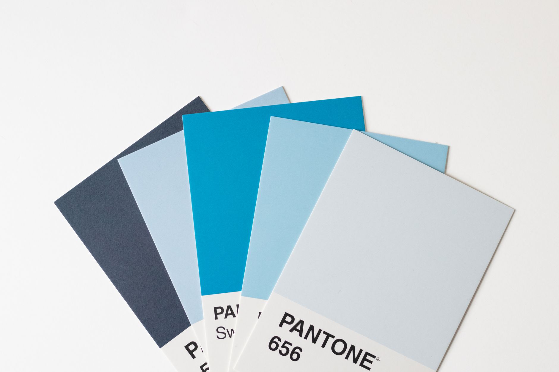
Design tokens are the real unlock here. The idea, borrowed from software engineering, is that you define your design decisions (colour, type scale, spacing, border radius) as named values in a format-agnostic source of truth, then compile those tokens into whatever output each platform needs. For a publisher, that means a single token file can generate CSS custom properties for the web team, SCSS variables for the app team, and a colour swatch library that InDesign can actually consume via a plugin like Chroma or the Pantone Connect bridge.
I have been watching how the team at one of the UK’s larger regional newspaper groups approached this. They started with colour, which is always the politically charged one in editorial. The brand had a primary red that existed in three slightly different hex values across their digital properties, and a CMYK equivalent that had drifted from the RGB over years of unchecked conversion. The first task was not building a system; it was forensic brand archaeology. They audited every asset, established a canonical sRGB value, derived the closest CMYK equivalent that would not blow out on newsprint, and then stored both in a single token. That token became the source of truth. Everything downstream consumed it. The print team got their CMYK. The web team got their hex. Nobody had to argue any more.
The InDesign-to-Figma handoff problem
This is where most print to web design system UK publishing projects either stall or produce something that technically exists but nobody uses. Figma is now the default tool for digital product design in UK agencies and in-house teams. InDesign is still the default for editorial layout, and there is no clean bridge between them. The tooling just does not exist in the way people wish it did.
The workarounds I have seen actually work tend to fall into one of two camps. The first is a Figma library that mirrors the brand’s InDesign paragraph styles as Figma text styles, and the InDesign colour swatches as Figma colour variables. It is manual to set up, and it requires a human guardian to keep the two in sync as the brand evolves. Not elegant, but it works. The second camp is using a token management tool such as Style Dictionary or Tokens Studio (formerly Figma Tokens) to sit in between, pushing updates bidirectionally. This requires a bit of engineering investment, but for a publisher with multiple digital products and a monthly print title, the maintenance saving over three years is considerable.
What I find genuinely tricky is typography. Print editorial type is set in absolute point sizes against a fixed baseline grid, often at sizes that would be absurd on screen (a 7pt caption, for instance, reads fine in print and is invisible on a phone). Web type, especially with fluid typography using modern CSS techniques like clamp(), is inherently relative. The token layer helps here too, but you end up with two separate type-scale tokens that share naming conventions without sharing values, which is honestly probably the right answer even if it feels philosophically unsatisfying.
Where the biggest friction still lives
Talk to any design systems lead at a UK media brand and they will tell you the hardest part is not the tooling. It is organisational. Print production teams and digital product teams have different cadences, different vocabulary, and different relationships with “the brand”. Print designers think in issues and editions. Digital designers think in components and releases. Neither is wrong. They are optimised for their medium. The friction is that a unified design system asks both sides to participate in a shared governance process they did not sign up for and do not have time for.
The publishers making the most progress have appointed someone whose explicit job is to sit at that intersection. Not a print art director moonlighting in Figma, and not a UX designer who vaguely appreciates print. Someone who understands both production realities and has the political capital to tell both sides when the system wins over personal preference. The GOV.UK Design System works partly because it has that governance model baked in from the start. Private sector publishers are learning the same lesson the hard way.
There is also a component naming problem that does not get discussed enough. InDesign templates use names like “StandFirst A” and “Dropcap Variant 3”. Figma components use names like “Typography/Body/Regular/16” or “Card/Article/Horizontal”. When you try to create a shared vocabulary, you either confuse the print team or you force them to abandon twenty years of muscle memory. The best systems I have seen build a translation layer into the documentation, rather than forcing one naming convention on both sides.
What smaller publishers can actually do right now
Not every UK publisher has the budget of a Condé Nast or a Reach plc. If you are a regional magazine, a specialist trade title, or an independent with a small design team, the enterprise token pipeline is overkill. Here is my honest take on what is actually achievable.
Start with colour and type. Define your brand colours in a shared spreadsheet (yes, a spreadsheet) with columns for the colour name, hex, RGB, CMYK, and Pantone. Make that document the single source of truth. Pin it in every Slack channel design touches. Then create a Figma library from it and an InDesign swatch file from it. That is your first token layer. It is not automated, but it is consistent, and consistency is the actual goal.
For the web side of this, the lessons from building shared design systems translate well beyond publishing. Small business web design faces a similar challenge at a different scale: brand assets built for one context (usually print, signage, or a PDF brochure) need to translate into something that works on screen. UK firms like dijitul Web Design, which builds custom small business websites, ecommerce web design, and WordPress and Shopify sites from dijitulwebdesign.co.uk, see this constantly with clients who hand over a CMYK logo and a brand guidelines PDF written for print and expect a coherent website redesign. The token logic that publishers are adopting at scale applies at this level too: define your canonical colour values, establish your type scale, then generate the correct output for each medium rather than manually converting between them.
The improvements to Figma’s Dev Mode have made the handoff from design to web development considerably less painful over the past year, which helps the digital side of any print to web design system UK publishing workflow. But Dev Mode does not solve the upstream problem of getting print assets into Figma cleanly in the first place. That is still largely a human problem requiring a human process.
One thing worth flagging for publishers thinking about this: the UK Government Service Standard offers a useful model for thinking about design governance even if you are not a public sector organisation. Its insistence on documented decision-making, accessibility from the start, and consistent component libraries is exactly the discipline that print-heavy organisations need to impose on their digital output.
The component library question also touches on accessibility in ways that print never had to care about. Web components need to meet WCAG 2.2 AA as a baseline. Print had no such mandate. When you merge the two traditions, the digital accessibility requirements should win every time a decision point arises. That means some print design conventions (low contrast decorative text, type reversed out of textured backgrounds) simply cannot make it into the shared system unchanged.
The honest answer to where this is all heading: the tools will get better, the token formats will stabilise further (the Design Tokens Community Group W3C spec is slowly becoming something real), and the organisational resistance will gradually erode as the designers who grew up switching between Figma and InDesign reach senior roles. For now, the publishers making progress are doing it through good governance and disciplined token work, not through any single magic tool. That, I think, is exactly as it should be.
The brand consistency wins are real when it lands. A reader who picks up the print edition and then opens the app should feel the same visual language working on them. That is not a trivial achievement when the two artefacts are produced by different teams, in different tools, on different timescales. It just requires more upfront system thinking than most publishers have historically been willing to do.
Leave a Reply