Typography on the web has always been a bit of a faff. You pick a typeface, you download four or five separate font files for the different weights and styles, your page load bloats accordingly, and then your designer asks for a slightly bolder heading variant and the whole cycle starts again. Variable fonts break that cycle completely. And yet, despite browser support being essentially universal since around 2020, a surprising number of live production sites are still serving static font stacks like it’s 2015. In variable fonts web design, there is a genuinely dramatic performance and flexibility win sitting on the table, and most teams still haven’t picked it up.

What Are Variable Fonts, Exactly?
A variable font is a single font file that contains an entire design space rather than a fixed snapshot. Instead of separate files for Regular, Medium, SemiBold, Bold, ExtraBold and so on, you get one file with axes that you can interpolate along continuously. The OpenType variable font specification defines several standard axes: wght (weight), wdth (width), ital (italic), slnt (slant), and opsz (optical size). Typeface designers can also define custom axes, which opens up some genuinely wild creative territory. Recursive, a variable font from ArrowType, has an axis called MONO that lets you slide between proportional and monospaced spacing mid-render. That kind of thing simply does not exist in the static font world.
The spec is maintained by the OpenType consortium and has been supported in Chrome, Firefox, Safari and Edge for years. The Google web.dev documentation on variable fonts is still one of the clearest technical references going, even if you want to go deeper than this article covers.
Why Variable Fonts Are a Real Performance Win
Here is the part that tends to surprise people. A single variable font file is not the same size as all those individual static files added together. It is considerably smaller. A typical type family might ship five or six static weight files totalling 300-400 KB combined. The equivalent variable font file frequently comes in under 100 KB, sometimes much less depending on the character set. That is a meaningful reduction in font payload, and on mobile connections, particularly on 4G in rural areas of the UK where speeds can be inconsistent, that matters to real users.
Beyond raw file size, there is the HTTP request count. Each static font file is a separate request. A variable font is one request. Fewer round trips, simpler caching strategy, less complexity in your <link rel="preload"> logic. It all compounds.
How to Implement Variable Fonts in CSS
Implementation is genuinely straightforward. If you are self-hosting a variable font (recommended for performance over relying on a third-party CDN), your @font-face declaration looks like this:
@font-face {
  font-family: 'Inter';
  src: url('/fonts/Inter-Variable.woff2') format('woff2 supports variations'),
       url('/fonts/Inter-Variable.woff2') format('woff2');
  font-weight: 100 900;
  font-style: normal;
  font-display: swap;
}
The font-weight: 100 900 range declaration is what tells the browser this file covers the full weight axis. Once declared, you can use any value in that range in your CSS without downloading anything extra:
h1 {
  font-weight: 750;
}

.caption {
  font-weight: 380;
}
That is not a typo. 750 and 380 are valid values. You are no longer constrained to multiples of 100. This is the design flexibility part that typographically-minded developers tend to get quite excited about.
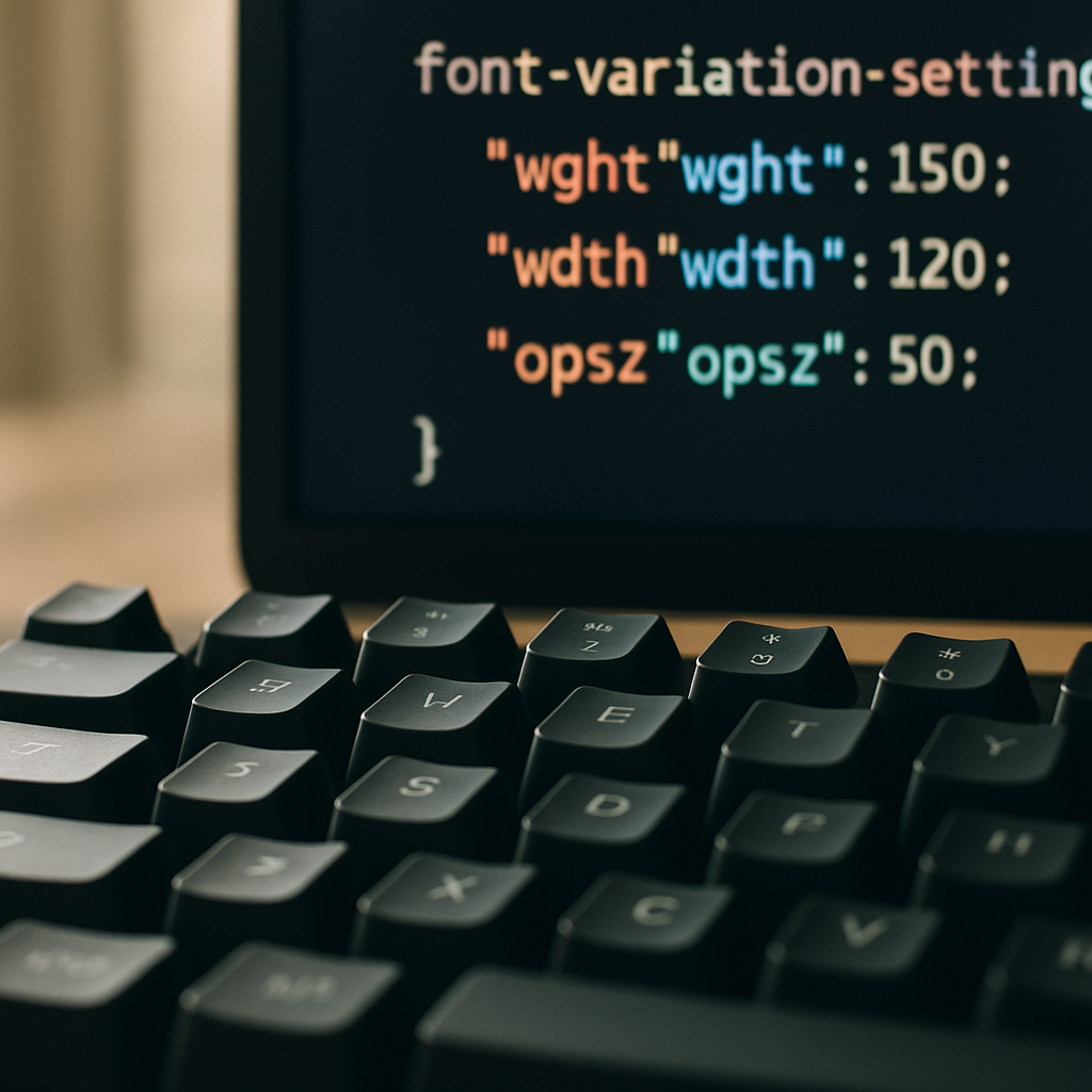
Using Font Variation Settings for Custom Axes
Standard axes like wght and wdth map to familiar CSS properties. But custom axes require the lower-level font-variation-settings property. Four-letter axis tags in uppercase are custom; lowercase are registered standard axes. Here is an example using a hypothetical font with a custom CASL (casual) axis, which Recursive actually ships:
body {
  font-variation-settings: 'wght' 400, 'CASL' 0.5;
}

.pull-quote {
  font-variation-settings: 'wght' 600, 'CASL' 1;
}
One gotcha worth knowing: font-variation-settings does not inherit individual values elegantly. If you set it on a parent and override it on a child, you need to re-declare all axes on the child or the unspecified ones snap to their defaults. It is one of those CSS specifics that bites everyone at least once. The workaround is to use CSS custom properties as axis value holders and reference them inside font-variation-settings:
:root {
  --font-weight: 400;
  --font-casual: 0;
}

body {
  font-variation-settings: 'wght' var(--font-weight), 'CASL' var(--font-casual);
}

.pull-quote {
  --font-weight: 600;
  --font-casual: 1;
}
Now the child only overrides the custom property it needs to change, and the rest inherit correctly. Tidy.
Animating Variable Font Axes with CSS
Because variable font axes are numerical values, they are animatable. You can transition font-variation-settings in CSS, which opens up some genuinely striking UI effects without a single line of JavaScript. A weight transition on hover, for instance:
.nav-link {
  font-variation-settings: 'wght' 400;
  transition: font-variation-settings 200ms ease;
}

.nav-link:hover {
  font-variation-settings: 'wght' 700;
}
That said, animating font axes is GPU-hungry when done carelessly. Stick to will-change: font-variation-settings on elements you know will animate, and avoid triggering reflows on large blocks of body text. Test on a mid-range Android handset, not just your MacBook Pro, because the render cost can be quite visible on lower-powered hardware.
Where to Find Good Variable Fonts
Google Fonts now has a solid and growing variable font catalogue, and all fonts are free to self-host. Fontshare, run by Indian Type Foundry, has some excellent variable options at no cost. For commercial projects with stricter brand requirements, type foundries like Dalton Maag (London-based, work with major UK brands) offer premium variable font licences that include the full axis range. It is worth checking licence terms carefully; some variable font licences restrict the number of axes you can use in web contexts, which is an odd quirk of the industry still working itself out.
Variable Fonts and Optical Size: The Hidden Gem
The opsz axis is the one most developers overlook entirely, and it is arguably the most typographically valuable. Optical size adjustments change the actual letterform design, not just scale, based on the intended size of use. A 12px caption and a 60px display heading are rendered at different weights and proportions automatically when font-optical-sizing: auto is set in CSS. This is how type was handled in quality print for centuries, and it has only been feasible on screen since variable fonts arrived. It is the kind of detail that makes a design feel expensive without being able to pinpoint exactly why.
Is the Performance Argument Still Valid in 2026?
Some engineers push back and argue that with HTTP/2 multiplexing and aggressive browser caching, the number-of-requests argument is less compelling than it used to be. Fair point. But the file size argument holds up even under that scrutiny. And the design flexibility argument has nothing to do with performance at all; it is purely about what you can build. Being able to set font-weight: 467 to hit exactly the visual weight your brand system specifies, without any extra asset, is just a better way to work. The variable fonts web design case was strong in 2020 when this landed; in 2026 it is essentially inarguable. There is no good reason to be shipping five static font files when one variable file does the same job better.
If your current project is still on static fonts, running a quick audit with Chrome DevTools’ Network tab filtered to font resources will show you exactly what you are dealing with. The migration path is usually a morning’s work, and the performance uplift in Core Web Vitals, specifically the reduction in render-blocking time from font loading, tends to show up clearly in your Lighthouse scores within a few days of deployment.
Frequently Asked Questions
What is a variable font and how does it differ from a regular web font?
A variable font is a single font file that contains an entire range of weights, widths, and other stylistic variations along continuous axes, rather than fixed snapshots. A regular static font file only contains one specific style, so you need multiple files to cover different weights. Variable fonts give you far more design flexibility with fewer files.
Do variable fonts actually improve website loading speed?
Yes, in most cases. A single variable font file is typically much smaller than the combined file size of equivalent static font files, and it requires only one HTTP request instead of several. This reduces page weight and simplifies caching, which can noticeably improve font loading performance, especially on slower mobile connections.
Are variable fonts supported in all modern browsers?
Browser support is essentially universal. Chrome, Firefox, Safari, and Edge have all supported the OpenType variable font specification for several years. You may encounter issues only with very old browser versions, but a straightforward fallback using the standard font stack handles those gracefully.
Where can I find free variable fonts to use on my website?
Google Fonts has a growing selection of free variable fonts that can be self-hosted. Fontshare by Indian Type Foundry also offers high-quality variable fonts at no cost. For commercial work requiring more distinct typography, foundries like Dalton Maag offer premium licensed variable fonts.
Can I animate variable font axes in CSS without JavaScript?
Yes. Because variable font axes are numerical values, CSS transitions and animations work on the font-variation-settings property directly. You can animate weight, width, or any custom axis purely in CSS. Be mindful of performance on lower-powered devices and use will-change sparingly on elements you know will animate.