Tag: ui animation

  • Micro-Interactions That Convert: The Psychology Behind Small UI Details

    Micro-Interactions That Convert: The Psychology Behind Small UI Details

    There is a moment in product design that nobody talks about enough. A user hovers over a button. The button pulses slightly, shifts colour by 10%, maybe adds a tiny shadow. The user clicks. They did not consciously notice any of that. But somewhere in their nervous system, something said “this thing is alive and trustworthy.” That is the quiet power of micro-interactions that convert, and if you are not thinking carefully about them, you are leaving real engagement on the table.

    This is not fluff. Research from Nielsen Norman Group consistently shows that feedback loops, even imperceptible ones, reduce cognitive friction and build perceived reliability. When an interface responds to you instantly and honestly, it feels competent. When it is static and silent, it feels unfinished. The gap between those two feelings? That is where conversion rates live.

    Designer studying micro-interactions that convert on a large monitor in a modern studio
    Designer studying micro-interactions that convert on a large monitor in a modern studio

    What Actually Makes a Micro-Interaction Work?

    The term gets thrown around loosely, so let us be precise. A micro-interaction is a single-purpose response to a user action. Dan Saffer, who literally wrote the book on this, breaks them into four components: trigger, rules, feedback, and loops and modes. That framework is still the most useful one I have come across.

    The trigger is what starts the interaction (a hover, a click, a form submission). The rules define what happens next. The feedback is the visible, audible, or tactile response the user gets. And loops govern whether that behaviour repeats or changes over time. Most developers get the trigger and feedback right, then stop. The loops and rules, the parts that adapt the interaction based on context, are where the genuinely clever stuff happens.

    Take something as mundane as a form validation message. A red border appearing after a failed submission is basic feedback. But an input field that gently shakes when you try to submit an empty required field? That is a rule-driven, physics-informed response. The user does not need to read an error message. Their brain has already processed “no” through the visual metaphor of resistance. Fewer words, faster correction, lower drop-off rate.

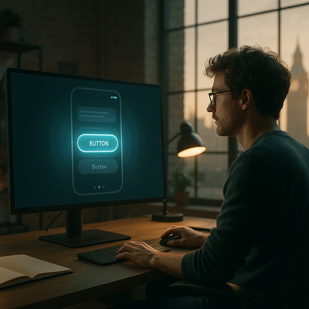
    Hover States: More Than Just Pointer Feedback

    Hover states are the most underestimated tool in the front-end designer’s kit. They are often treated as an afterthought, a quick :hover { background: #eee; } thrown in during QA. That is a waste of a genuinely persuasive moment.

    A well-designed hover state communicates affordance. It tells the user “yes, this is clickable, and here is roughly what clicking it will do.” Shopify stores consistently report higher add-to-basket rates when product cards have animated hover states that preview secondary product images or surface a quick-action button. That is not coincidence. That is the affordance principle at work: reveal the next action before the user commits to it, and the commitment feels less risky.

    In CSS, building this efficiently looks like this:

    .product-card {
      position: relative;
      overflow: hidden;
      transition: transform 0.2s ease, box-shadow 0.2s ease;
    }
    
    .product-card:hover {
      transform: translateY(-4px);
      box-shadow: 0 12px 24px rgba(0, 0, 0, 0.12);
    }
    
    .product-card .quick-action {
      opacity: 0;
      transform: translateY(8px);
      transition: opacity 0.2s ease, transform 0.2s ease;
    }
    
    .product-card:hover .quick-action {
      opacity: 1;
      transform: translateY(0);
    }

    Keep transitions between 150ms and 300ms. Under 100ms feels glitchy. Over 400ms feels sluggish. That 150-300ms window is where animations feel responsive without being jarring. You can cite this back to research from Google’s Material Design team if anyone questions you in a meeting.

    Hover state micro-interaction on a mobile product card demonstrating micro-interactions that convert
    Hover state micro-interaction on a mobile product card demonstrating micro-interactions that convert

    Feedback Loops and the Dopamine Hook

    Here is where it gets properly nerdy. Feedback loops in UI borrow heavily from behavioural psychology, specifically the concept of variable reward schedules. When a user takes an action and receives immediate, satisfying feedback, dopamine is released. The interface feels good to use. The user is more likely to take the next action.

    Think about the LinkedIn “like” animation. The little burst of colour and scale when you tap a reaction button is not decorative. It is a micro-reward. Instagram, Duolingo, and yes, even some of the better e-commerce apps in the UK (ASOS’s wishlist animation is a textbook example) have baked this thinking into their core interaction patterns.

    For button click feedback, the simplest high-impact technique is the “press” state. Not just :active with a colour change, but a physical downward shift combined with reduced shadow, simulating the button actually being pressed into the screen:

    .btn-primary:active {
      transform: translateY(2px);
      box-shadow: 0 2px 4px rgba(0, 0, 0, 0.1);
      transition: transform 0.05s ease, box-shadow 0.05s ease;
    }

    Fifty milliseconds. That is all you need. But it changes everything about how the button feels.

    Loading states are another feedback loop that developers habitually neglect. If a form submission takes two seconds and the UI does nothing in response, the user will click the button again. Now you have a double submission. A skeleton loader or a spinner with a subtle pulse animation solves this, reduces server load, and makes the wait feel shorter. It is a classic case where good UX and good engineering are the same decision.

    Building Micro-Interactions Efficiently at Scale

    The trap most teams fall into is building animations one-off, in component CSS, without any shared token system. You end up with 14 different easing curves across a codebase, and the whole product feels inconsistent in ways users cannot articulate but absolutely feel.

    The fix is to define a motion system early, exactly like a colour system or a type scale. In your design tokens, define a small set of approved durations and easing functions:

    :root {
      --duration-fast: 150ms;
      --duration-base: 250ms;
      --duration-slow: 400ms;
      --ease-standard: cubic-bezier(0.4, 0, 0.2, 1);
      --ease-decelerate: cubic-bezier(0, 0, 0.2, 1);
      --ease-accelerate: cubic-bezier(0.4, 0, 1, 1);
    }

    Then every animation in your system references these tokens. When a designer decides the base duration feels slightly slow, you change one line. Job done. The BBC’s GEL design system handles motion exactly this way, and it shows: their cross-product experience feels coherent even across very different interfaces.

    For React projects, I tend to reach for Framer Motion for anything complex, and plain CSS transitions for simple hover and focus states. Do not use Framer Motion for a button hover. That is using a sledgehammer on a drawing pin. Keep the abstraction level matched to the complexity of the problem.

    Accessibility and Performance: The Non-Negotiables

    Micro-interactions that convert are not micro-interactions that make half your users feel ill. Vestibular disorders affect a meaningful portion of the population, and excessive or fast motion can trigger genuine discomfort. The prefers-reduced-motion media query is not optional:

    @media (prefers-reduced-motion: reduce) {
      *, *::before, *::after {
        animation-duration: 0.01ms !important;
        transition-duration: 0.01ms !important;
      }
    }

    Stick that in your base CSS and never think about it again. Your animations will still exist for users who want them; users who do not will get instant state changes. The WCAG 2.1 guideline 2.3.3 makes this a legal consideration for public sector UK digital services, and it is good practice everywhere else.

    On performance: always animate transform and opacity. These are composited by the browser’s GPU and do not trigger layout recalculation. Never animate width, height, top, left, or margin if you can help it. Those trigger reflow, and on lower-end Android devices common across the UK market, you will see dropped frames that make your polished interaction look broken.

    One final, slightly unexpected thought on micro-interactions: they are not exclusive to software. The same principles of reward, feedback, and delight that make a UI feel satisfying appear in all kinds of interactive experiences, physical and digital. If you want a genuinely charming example of feedback loops applied to a real product experience, have a look at how the folks behind a LEGO Subscription box service think about the unboxing ritual as a sequence of progressive reveals. The design thinking is transferable, even if the medium is cardboard rather than CSS.

    The bottom line is this: micro-interactions that convert are not decoration. They are information architecture expressed in motion. Every hover state is a prompt. Every loading animation is a promise. Every button press is a handshake. Design them deliberately, build them efficiently, and respect the users on the receiving end. That combination is what separates interfaces that just work from interfaces people genuinely enjoy using.

    Frequently Asked Questions

    What are micro-interactions in UI design?

    Micro-interactions are small, single-purpose animations or feedback responses triggered by a user action, such as a button changing colour on hover or a form field shaking when submitted incorrectly. They communicate system status, confirm actions, and guide users through an interface without requiring them to read lengthy instructions.

    Do micro-interactions actually improve conversion rates?

    Yes, when implemented thoughtfully. Micro-interactions reduce cognitive friction by making interfaces feel responsive and trustworthy, which lowers hesitation before clicking or submitting. Studies from Nielsen Norman Group and real-world data from e-commerce platforms consistently show improved engagement metrics when feedback states are well-designed.

    How do I build micro-interactions without hurting page performance?

    Stick to animating only CSS properties that the browser can composite on the GPU: primarily `transform` and `opacity`. Avoid animating layout-triggering properties like `width`, `height`, or `margin`, as these cause expensive reflow calculations. Keep transition durations between 150ms and 300ms for best perceived responsiveness.

    What tools or libraries are best for creating micro-interactions in 2026?

    For React projects, Framer Motion is the go-to for complex sequenced animations, while CSS custom properties and transitions handle simpler hover and focus states perfectly well on their own. For vanilla JS or Vue projects, the Web Animations API is increasingly capable and requires no additional dependencies.

    How do I make micro-interactions accessible for users with motion sensitivity?

    Use the `prefers-reduced-motion` CSS media query to detect users who have enabled reduced motion in their operating system settings, then strip back or disable animations accordingly. WCAG 2.1 guideline 2.3.3 specifically addresses animation from interactions, and compliance is mandatory for UK public sector digital services.

  • Micro-Interactions in UX Design: Small Details That Make a Big Difference

    Micro-Interactions in UX Design: Small Details That Make a Big Difference

    There’s a moment when you tap the heart icon on a post and it bounces, pulses, and fills with colour. Takes maybe 300 milliseconds. You barely notice it consciously. But you felt something. That’s the magic of micro-interactions in UX design, and it’s the kind of detail that separates a product people love from one they merely tolerate.

    Micro-interactions are the tiny, single-purpose animations and feedback loops baked into interfaces. A toggle that slides smoothly. A loading bar that fills with personality. A form field that subtly shakes when you enter the wrong password. None of these are the main feature. All of them are load-bearing walls in the structure of user experience.

    Designer working on micro-interactions in UX design on a laptop in a modern studio
    Designer working on micro-interactions in UX design on a laptop in a modern studio

    Why Micro-Interactions in UX Design Actually Matter

    It’s tempting to dismiss them as decoration. They’re not. They do several measurable jobs simultaneously. They communicate system status (something happened, the thing worked), they guide behaviour (you did it right, or wrong), and they add emotional texture to an otherwise flat digital surface.

    Research cited by the Nielsen Norman Group has long established that response times under 100ms feel instantaneous to users, while delays up to one second break the flow of thought. Micro-interactions live in that critical window. When an animation confirms an action within 200ms, the user’s brain registers cause and effect as seamless. When there’s nothing? Uncertainty creeps in. Did it work? Should I tap again?

    Dan Saffer’s framework for micro-interactions, which has basically become the canonical reference, breaks each one into four components: a trigger, rules, feedback, and loops/modes. The trigger starts it (a hover, a click, a system condition). The rules define what happens. The feedback is what the user sees, hears, or feels. Loops determine whether it repeats. Simple framework. Wildly useful when you actually apply it.

    Animation Timing: The Difference Between Slick and Sluggish

    Timing is where most developers get micro-interactions wrong. Either too fast to register, or so slow they feel like the interface is wading through treacle. Getting this right is genuinely nerdy and I love it.

    The general sweet spot for most UI feedback animations is between 150ms and 400ms. Shorter than that and human perception misses the feedback entirely. Longer than 500ms and it starts feeling like lag rather than intentional motion. For transitions that carry meaning (like a modal sliding in), 300ms with an ease-out curve tends to feel natural because it mirrors the physics of objects decelerating to rest.

    In CSS, transition and animation properties give you this control directly. A basic hover micro-interaction might look like this:

    .btn {
      transform: scale(1);
      transition: transform 200ms ease-out, box-shadow 200ms ease-out;
    }
    
    .btn:hover {
      transform: scale(1.05);
      box-shadow: 0 8px 24px rgba(0, 0, 0, 0.15);
    }

    That two-property transition costs essentially nothing in performance and immediately makes the button feel alive. Crucially, transform and opacity are the two CSS properties you should reach for first because they’re composited by the browser and don’t trigger layout recalculation. Animating width, height, or margin? That’s asking for jank.

    Smartphone screen showing a micro-interaction toggle animation in a mobile UX design
    Smartphone screen showing a micro-interaction toggle animation in a mobile UX design

    Designing Micro-Interactions with Purpose: Core Principles

    Not every pixel needs to dance. One of the more common mistakes I see in interface reviews is what I’d call micro-interaction soup: every element animated, every action celebrated, until the whole thing feels like a toddler’s birthday party rather than a professional product. Restraint is a skill.

    A few principles that hold up well in practice:

    Match energy to context

    A banking app confirming a payment transfer should feel calm and reassuring, not exuberant. A creative tool or game can afford something more expressive. The animation should feel like it belongs to the brand and context, not like it was borrowed from a dribbble shot.

    Use easing functions that feel physical

    Linear motion looks robotic. CSS gives you ease, ease-in, ease-out, ease-in-out, and full cubic-bezier() control. For most UI interactions, ease-out (starts fast, decelerates) feels most natural because objects in the real world decelerate. Reserve ease-in (starts slow, accelerates) for elements exiting the screen.

    Never hide information behind animation

    The feedback loop must be clear. If a form submission fails, the micro-interaction should make that failure unmistakably obvious, not bury it in a pretty wiggle. Accessibility also matters here: users who have enabled prefers-reduced-motion in their operating system should get functional feedback without the motion. Always wrap animations in a media query check:

    @media (prefers-reduced-motion: no-preference) {
      .icon {
        transition: transform 250ms ease-out;
      }
    }

    JavaScript-Powered Micro-Interactions: When CSS Isn’t Enough

    CSS handles most standard micro-interactions cleanly, but some scenarios need JavaScript’s logic. Think: a like button that counts up, a progress indicator that responds to real upload speed, or a drag-and-drop interface that gives haptic-style visual feedback based on position.

    The Web Animations API (WAAPI) is worth knowing if you’re doing anything complex. It gives you JavaScript control over animations with the performance benefits of CSS-level compositing. A simple implementation:

    const button = document.querySelector('.like-btn');
    
    button.addEventListener('click', () => {
      button.animate([
        { transform: 'scale(1)' },
        { transform: 'scale(1.3)' },
        { transform: 'scale(1)' }
      ], {
        duration: 300,
        easing: 'ease-out'
      });
    });

    For heavier animations involving scroll-triggered sequences or complex state transitions, libraries like GSAP remain the go-to in professional production environments. Framer Motion is the choice for React-based projects, with its whileHover and whileTap props making micro-interaction implementation almost embarrassingly simple.

    Speaking of things that affect focus and performance: it’s a bit like comparing the precision engineering behind oxygen tanks to a garden hose. The underlying mechanism matters enormously, even when the visible output looks similar.

    Real-World Implementation: Where to Start

    If you’re auditing an existing product or starting a new one, prioritise micro-interactions at the highest-frequency touchpoints first. Buttons, form inputs, toggles, and loading states are touched hundreds of times per session. These are where well-crafted feedback compounds most rapidly into a perception of quality.

    A practical starting checklist:

    • Every interactive element should have a visible hover and active state.
    • Form validation feedback should be immediate and clearly directional (green border for valid, red with a shake for invalid).
    • Loading states should show progress, not just a spinner. A determinate progress bar is always more reassuring than indeterminate spinning.
    • Success and error confirmations should use both colour and motion, never just colour alone (colour-blind users exist, and your UI should work for them).
    • All animations should respect prefers-reduced-motion.

    The cumulative effect of getting these right is difficult to quantify precisely, but qualitative user research consistently shows that interfaces with cohesive micro-interactions are perceived as faster, more trustworthy, and more premium than technically equivalent interfaces without them. Users can’t always articulate why. They just feel the difference.

    The Bottom Line

    Micro-interactions in UX design are one of the highest-return-on-investment details you can invest time in. They don’t require huge engineering effort, they don’t require a visual overhaul, and they don’t require a design system rebuild. They require careful thought about timing, feedback, and purpose, applied consistently across the touchpoints that matter most. Get them right and your product starts to feel like it was made by people who genuinely cared about the experience. Which, presumably, you are.

    Frequently Asked Questions

    What are micro-interactions in UX design?

    Micro-interactions are small, single-purpose animations or feedback mechanisms built into a user interface. They confirm actions, communicate system status, and add emotional texture to digital products. Examples include a button scaling slightly on hover, a toggle sliding smoothly, or a form field shaking when an incorrect value is entered.

    How long should micro-interaction animations be?

    Most UI micro-interaction animations should fall between 150ms and 400ms. Shorter than that and users won’t register the feedback; longer than 500ms and it starts to feel like lag. For transitions carrying meaning, such as modals or drawers, 300ms with an ease-out curve tends to feel most natural.

    Which CSS properties are best for micro-interactions?

    Use transform and opacity wherever possible because they are composited by the browser and don’t trigger layout recalculation, resulting in smooth, jank-free animations. Avoid animating properties like width, height, or margin, as these cause expensive layout reflows.

    Do micro-interactions affect accessibility?

    Yes, and this is important. Some users have vestibular disorders or motion sensitivity and enable the prefers-reduced-motion setting in their OS. Always wrap non-essential animations in a @media (prefers-reduced-motion: no-preference) query so those users receive functional feedback without the motion. Never rely on colour alone for feedback either.

    Should I use CSS or JavaScript for micro-interactions?

    CSS handles the majority of standard micro-interactions efficiently and is the right first choice. Use JavaScript (via the Web Animations API or libraries like GSAP or Framer Motion) when you need logic-driven animations, such as interactions that respond to dynamic data, scroll position, or complex state changes that CSS cannot manage on its own.