For decades, sRGB was the safe bet. Every monitor, every browser, every design workflow assumed it. If you picked a colour in Figma, exported it, and slapped it on a website, it looked roughly the same on every screen. Comfortable. Predictable. Also, increasingly, a bit dull. The honest truth in 2026 is that sRGB covers only about 35% of the colours the human eye can perceive, and modern screens have quietly left it behind. If you’re still designing exclusively in sRGB, you’re essentially handing clients a watercolour painted with three crayons when the full art supply shop is sitting right there.
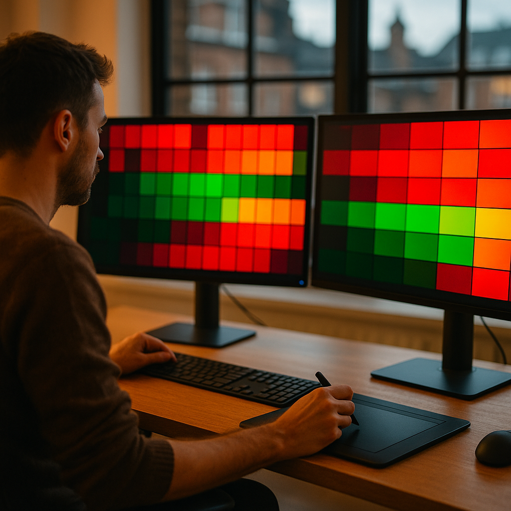
The shift to wide-gamut colour spaces isn’t just a trendy designer flex. It’s a genuine, technically significant change in how screens render colour, and understanding it is rapidly becoming essential knowledge for anyone building interfaces or visual assets for modern displays. Let’s get into the weeds on this, because it’s properly fascinating once you see the full picture.
What Are Wide-Gamut Colour Spaces and Why Do They Matter?
A colour space is essentially a defined range of colours (a “gamut”) that a system can represent. sRGB was standardised in 1996 by HP and Microsoft, designed around the limitations of CRT monitors at the time. It was brilliant for its era. That era ended roughly when streaming 4K HDR content on an OLED panel became a Tuesday evening activity.
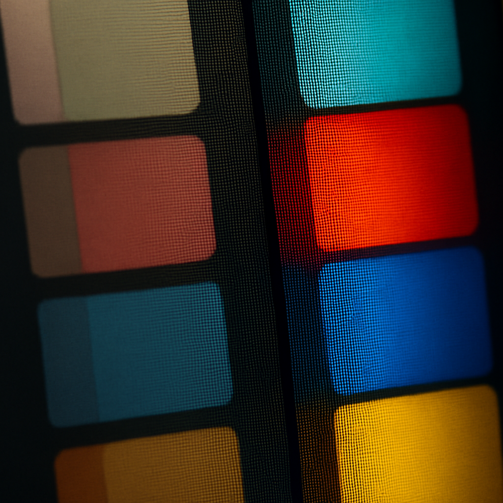
Display P3 is the wide-gamut colour space you’ll hear most about right now. Developed by Apple and based on the DCI-P3 cinema standard, it covers roughly 45% more colour volume than sRGB. Practically speaking, that means richer reds, more vivid greens, and a whole spread of deep, saturated tones that sRGB simply cannot express. Apple has shipped P3-capable displays in iPhones since the iPhone 7, and virtually every modern MacBook, iPad Pro, and iPhone 15/16 series screen supports it natively. On the Android side, Google Pixel devices and Samsung Galaxy flagships have shipped with wide-gamut displays for several years now.
Beyond Display P3, there’s also Rec. 2020, which is used in broadcast and cinema HDR pipelines and covers an even larger portion of human-visible colour. Most consumer screens can’t fully render it yet, but it’s the direction of travel. Designing with awareness of the hierarchy (sRGB inside P3 inside Rec. 2020) helps you make sensible choices today whilst future-proofing your work for whatever lands in 2027.
How Browsers Now Handle Wide-Gamut Colour
This is where it gets genuinely exciting for front-end developers and UI designers. CSS Colour Level 4 brought native support for wide-gamut colour spaces directly into the browser. You can now write colours in display-p3, oklch, oklch, lab, and several other modern colour spaces using the color() function. Here’s a quick example:
/* A vivid red that sRGB simply cannot express */
color: color(display-p3 0.9 0.1 0.1);

/* With sRGB fallback for older browsers */
@supports not (color: color(display-p3 0 0 0)) {
  color: rgb(220, 38, 38);
}
Safari has supported wide-gamut CSS colours the longest, with Chrome and Firefox catching up properly through 2024 and 2025. As of now, browser support is solid enough to use in production with graceful fallbacks. The MDN Web Docs provide a thorough breakdown of browser compatibility tables for the color() function, which is worth bookmarking.
The colour space that’s genuinely turning heads amongst designers and developers right now is OKLCH. Unlike HSL, which was designed to be human-readable but is perceptually inconsistent (a yellow at 50% lightness looks dramatically brighter than a blue at the same value), OKLCH is perceptually uniform. Rotating the hue in OKLCH whilst keeping lightness constant actually produces colours that look the same brightness to the human eye. That’s a massive deal for generating consistent palettes algorithmically, building design tokens, or creating accessible colour systems.
Practical Guidance: Future-Proofing Your Palette as a UK Designer
Right, so how do you actually incorporate this into a real workflow without throwing away everything you know? Here’s my take, built from going through this transition myself over the past year or so.
Start with Figma’s Colour Settings
Figma added Display P3 document colour space support in late 2023. If you’re on a P3-capable Mac display (basically any MacBook Pro from 2016 onwards), you can now enable this in your document settings and actually see the wider gamut as you design. Go to File, then Document Settings, and switch Colour Profile to Display P3. Colours you define in this space will carry through to exports correctly, provided the receiving context supports them.
A word of caution: if your client’s target audience is primarily using older or budget hardware, the expanded gamut will map back down to sRGB on those screens. That’s not a disaster; browsers handle this reasonably well. But it does mean your gorgeous P3 coral might look like a fairly ordinary sRGB orange on an older laptop. Test across devices before committing a P3-heavy brand palette.
Adopt OKLCH for Design Tokens
If you’re building a design system (and you should be, I’ve written about that at length elsewhere on this site), switching your token layer to OKLCH pays dividends immediately. Tools like CSS Colour 4 utilities and the Colour.js library let you interpolate palettes in OKLCH space, which means your generated shades will be perceptually even across the full scale. Paired with a tool like Tokens Studio for Figma, you can define your full palette in OKLCH and have it output correctly targeted CSS variables for production.
Use SVG and Canvas Colour Profiles Correctly
SVG files don’t embed colour profile information by default. If you’re exporting illustrations or icons intended for P3 displays, you’ll want to ensure your export pipeline embeds the correct ICC profile or uses CSS colour space declarations where the SVG is inlined. Adobe Illustrator and Affinity Designer both allow you to work in P3 colour space, though workflow specifics vary between them.
Canvas-based animations and WebGL projects have their own considerations. The colorSpace parameter in the Canvas API now supports display-p3 in modern browsers, which is relevant if you’re building creative coded experiences or data visualisations where colour accuracy genuinely matters.
The Accessibility Angle You Probably Haven’t Considered
Wide-gamut colour spaces and accessibility aren’t in conflict, but they do interact in interesting ways. WCAG contrast ratios were defined against sRGB, and the upcoming WCAG 3.0 guidelines are moving towards the APCA (Advanced Perceptual Contrast Algorithm) model, which is designed to work properly across colour spaces. Staying ahead of this means testing contrast not just with standard sRGB tools but with perceptually-accurate calculators that account for your actual gamut.
It’s a bit like making sure your house is properly insulated before you upgrade the heating system. (Speaking of which, if you’re curious about thermal efficiency in the physical world rather than digital colour theory, loft insulation is one of those foundational investments that genuinely pays for itself.) The point being: you want the fundamentals right before you layer on the advanced stuff. Same logic applies here.
What This Means for Brand Colour in 2026
Brand colour is where wide-gamut support becomes a commercial differentiator. A startup launching a new product today, optimising for iPhone and high-end Android users, can define brand primaries that exist outside the sRGB gamut entirely. Those colours will look genuinely more vibrant, more premium, and more distinct on the devices their audience uses daily. In five years, designing brand palettes entirely within sRGB will feel like designing in 8-bit colour looked in the mid-2000s.
UK agencies and freelancers working with tech clients, consumer brands, and media companies should be having this conversation now. It’s not wildly complex to implement, and the creative payoff is real. Wide-gamut colour spaces are one of those quiet technical shifts that, once you’ve seen what’s possible, you genuinely cannot unsee.
The tools are ready. The browsers are ready. The screens are ready. The question is whether your workflow is.
Frequently Asked Questions
What is the difference between sRGB and Display P3?
sRGB is the traditional colour space standardised in 1996, covering roughly 35% of human-visible colour. Display P3 is a wider colour space that covers approximately 45% more colour volume than sRGB, enabling richer and more vibrant colours on capable modern screens. Most iPhones from 2016 onwards and many current Android flagships support Display P3.
Do UK designers need to switch to wide-gamut colour spaces right now?
It depends on your audience and project type. If you’re designing for modern mobile apps, premium consumer products, or media-forward websites where a significant portion of users will be on high-end displays, adopting wide-gamut colour spaces now gives you a creative and technical edge. For projects targeting older or budget hardware, robust sRGB fallbacks remain essential.
Which browsers support CSS wide-gamut colour in 2026?
All major modern browsers now support wide-gamut colour via the CSS color() function, including Chrome, Firefox, and Safari. Safari has had the longest support history, whilst Chrome and Firefox reached solid production-ready support through 2024 and 2025. Always include sRGB fallbacks using @supports for older browser versions.
What is OKLCH and why are designers talking about it?
OKLCH is a perceptually uniform colour space, meaning equal numerical steps in lightness or chroma look visually equal to the human eye, which is not the case with older models like HSL. This makes it far better for generating consistent design token palettes, creating accessible colour systems, and interpolating smoothly between colours. It’s natively supported in CSS Colour Level 4.
How do I set up Figma to design in Display P3?
In Figma, open your file and go to File, then Document Settings. Change the Colour Profile from sRGB to Display P3. You’ll need a P3-capable display (such as a MacBook Pro from 2016 or later) to actually see the wider gamut rendered correctly. Exports from a P3 document will carry the correct colour profile information for web and app use.