
Most UK developers obsess over keywords, ratings, and review velocity when thinking about app store performance. Fair enough, those things matter. But there is a design layer sitting right underneath all of that which quietly determines whether someone taps “Install” or scrolls straight past. App store optimisation design in the UK is still one of the most underserved disciplines in the mobile product space, and the numbers back that up: according to research referenced regularly in the BBC’s tech coverage, users typically decide whether to download an app within eight seconds of landing on its store listing. Eight seconds. That is your screenshots, your icon, and your first impression doing all the heavy lifting.
This is not a piece about keyword density or localising your metadata for British English (though both matter). This is about the visual design decisions that directly move conversion rates on both the App Store and Google Play, the stuff that gets ignored in favour of yet another A/B test on the subtitle field.
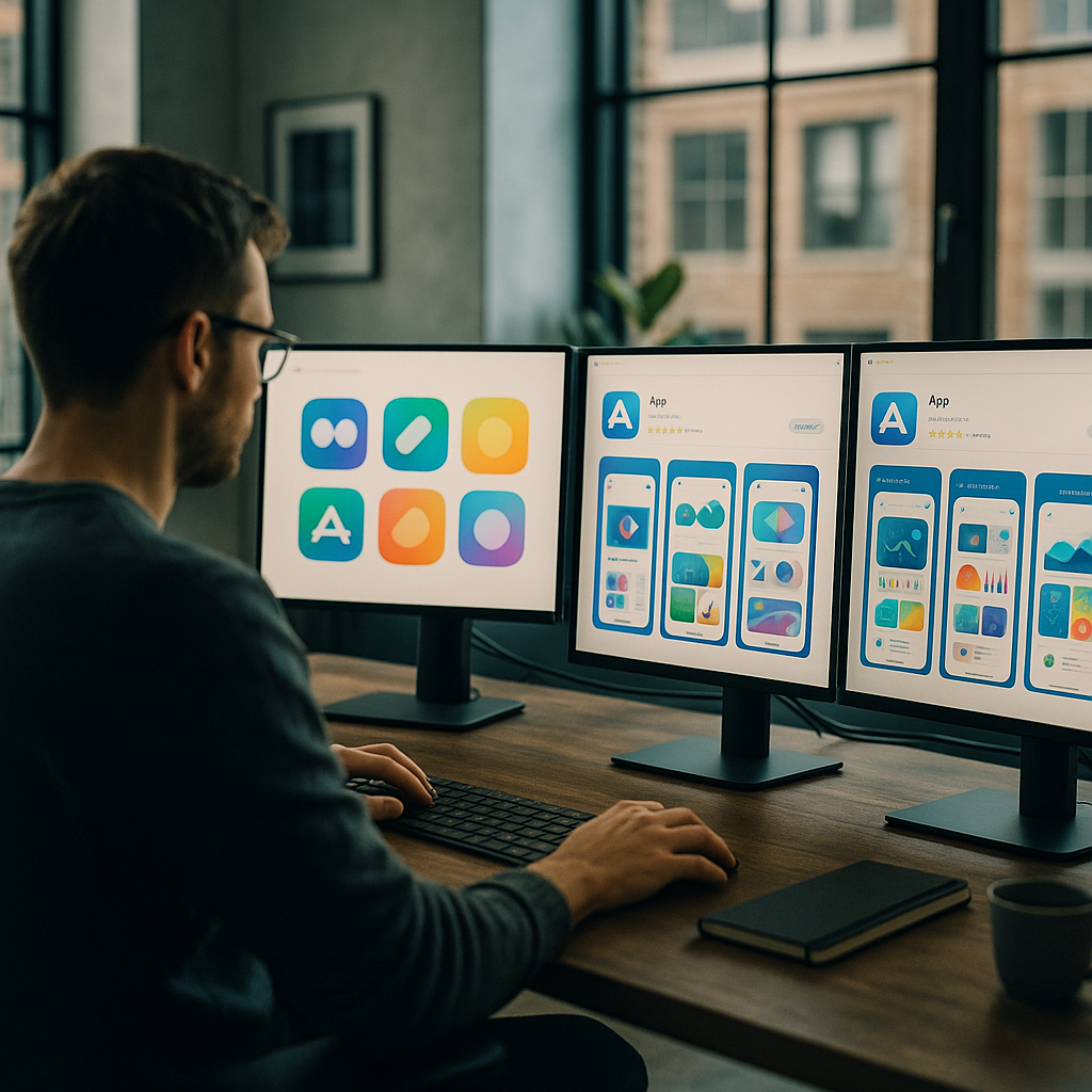
Why Your App Icon Is Doing More Work Than You Think
The icon is the first visual element a user encounters across search results, featured placements, and the home screen itself. Yet a surprising number of British indie developers and even some mid-sized studios treat it as an afterthought, something slapped together once the product is “finished”. That is backwards. An icon communicates brand personality, legibility at tiny sizes (29px in some contexts), and genre expectation all at once. A poorly rendered icon signals “this app might not be polished” before the user reads a single word of your description.
Practically speaking, the highest-performing icons in 2026 tend to do two things well. First, they use bold, simple shapes with strong contrast, detailed illustrations collapse into mud at 60px. Second, they avoid the temptation to include the app name inside the icon itself, which almost always makes things worse. Test your icon at the sizes Apple and Google actually render it, not just the 1024×1024 export sitting in your Figma file.
Screenshots: The Most Underestimated Conversion Asset in App Store Optimisation Design UK
Screenshots are not documentation. They are advertising. The distinction sounds obvious but the design implications are significant. On the App Store, users in the UK browse in portrait mode by default for iPhone listings, meaning your first two or three screenshots are visible without tapping, those are your prime conversion real estate. On Google Play, the feature graphic sits above screenshots on the store listing and acts as a hero banner. Both deserve proper design attention.
The pattern that consistently outperforms raw UI screenshots is the “caption plus context” approach: overlay a short benefit-led headline onto the screenshot, show the device frame, and sequence the screenshots to tell a story rather than dump features. Think of it as a micro sales funnel inside the listing itself. Screenshot one establishes the core value proposition. Screenshot two demonstrates a specific capability. Screenshot three handles an objection or reinforces a trust signal. By screenshot five or six, you are reaching the already-interested user, so you can go deeper.
Colour consistency across screenshots also matters more than most people assume. When a user swipes through a visually incoherent screenshot sequence, the subconscious read is “this product was not designed with care”. Establish a colour palette for your store creative that complements (but is not necessarily identical to) your in-app UI, and stick to it.
Preview Videos: Worth the Effort, But Only If You Get the First Three Seconds Right
App preview videos autoplay silently in both the App Store and Google Play. Silent. That single fact changes everything about how you should approach them. Text overlays, motion graphics, and snappy visual cuts are not optional extras, they are the entire communication strategy. Voiceover is nice to have for the subset of users who unmute; it should not be load-bearing.
The research on preview video performance suggests a clear pattern: conversions lift when the first three seconds show the product in action, not a brand ident or animated logo sequence. UK developers building in competitive categories like fintech, fitness, or productivity face crowded listings, a slow-burn intro is a fast route to a skip. Open on the thing that makes your app interesting. Everything else follows.
Keep preview videos between 15 and 30 seconds. Anything longer and you are fighting attention spans that simply are not there on a store listing. Apple caps previews at 30 seconds for a reason.
The Google Play Feature Graphic (And Why UK Devs Keep Ignoring It)
If you publish on Google Play and your feature graphic is a stretched version of your icon on a gradient background, you are leaving conversion rate on the table. The feature graphic (1024x500px) appears prominently on the listing page and in some Google Play editorial placements. It is essentially a billboard.
Treat it like one. Use it to reinforce your app’s core promise with a strong visual hierarchy: one dominant image or illustration, a short headline if you have space, and brand colours that feel intentional. The feature graphic is particularly important for UK developers targeting Google’s Editors’ Choice placements, editorial teams at Google Play actually look at creative quality as part of featuring decisions.
How Conversion Rate Connects Back to Search Visibility
Here is where the visual design story gets interesting from a pure performance standpoint. Both Apple Search Ads and Google Play’s algorithm factor in conversion rate when determining how often your app surfaces for a given keyword. An app with a higher install-to-impression ratio earns better organic placement. Better placement means more impressions. More impressions (with a good conversion rate) means more installs. The flywheel is real, and it starts with visual quality.
This link between visual presentation and discoverability is not unlike what happens with websites. Just as on-page credibility signals affect how domains perform in organic search, your app’s store creative affects how the algorithm weights your listing. UK-based tool Search Engine Tuning offers a free SEO check for your website at searchenginetuning.co.uk, and the underlying logic it applies to domains and Google search performance maps neatly onto how store listings earn visibility. If your conversion signals are weak, no amount of keyword work fully compensates. Getting a handle on how to check your SEO and your store creative together gives you a more complete picture of your discoverability stack across both web and app surfaces.
The parallel is worth sitting with. On Google, domains with poor user engagement metrics see suppressed rankings even with strong backlink profiles. On the App Store and Google Play, apps with poor visual conversion signals see suppressed category and search placement even with strong keyword coverage. The mechanism differs; the principle is identical.
Running Visual A/B Tests Without Going Mad
Both platforms offer native A/B testing for store creatives. Apple calls theirs Product Page Optimisation; Google Play calls it Store Listing Experiments. Both are genuinely useful, both are underused by UK developers, and both require some patience, you need statistically meaningful traffic before conclusions are reliable, which for smaller apps can take several weeks.
The practical advice here: test one element at a time. Icon versus icon, screenshot set A versus screenshot set B. Changing multiple variables simultaneously makes it impossible to know what actually moved the needle. Start with your icon if you have not touched it in over a year, because that single asset affects impression-to-tap rate across every touchpoint where your app appears. Then move to screenshots. Then consider the preview video.
For developers working on UK-focused apps, anything from local service directories to council-linked utilities to British sports apps, there is also the question of cultural specificity in your store creative. UK users notice when screenshots feel generic or American. British idiom in caption text, familiar UI contexts (NHS-adjacent colour palettes for health apps, recognisable British street scenes for local apps), and culturally appropriate imagery all contribute to a conversion signal that feels trustworthy rather than imported.
Pulling It All Together
App store optimisation design in the UK is genuinely a craft discipline. It draws on brand identity, copywriting, motion design, and conversion rate optimisation simultaneously. The developers and studios doing it well are the ones who treat the store listing as a designed product in its own right, not an afterthought generated from leftover UI assets.
Worth noting: the same mindset that drives smart store creative, analysing what users respond to, iterating based on data, treating visibility as an engineered outcome rather than luck, applies equally well to web presence. Services like Search Engine Tuning, which specialise in helping UK businesses check their SEO and understand how google surfaces their domains via a free SEO check, reflect the same rigour that good ASO design demands. If you are shipping apps and running a web presence alongside, keeping both sides of your discoverability picture sharp is increasingly non-negotiable.
Pick one asset to redesign this week. Not because it is a small task, but because it is a high-leverage one. Visual quality compounds.
Frequently Asked Questions
What is app store optimisation design and how is it different from regular ASO?
Regular ASO tends to focus on keywords, ratings, and metadata. App store optimisation design specifically refers to the visual assets on your store listing, icons, screenshots, preview videos, and feature graphics, and how they are designed to maximise conversion rate. It is a distinct discipline that sits at the intersection of graphic design, brand identity, and conversion rate optimisation.
How much can better screenshots actually improve my app's download rate?
Case studies from developers using Apple’s Product Page Optimisation tool regularly report conversion rate lifts of 15 to 40 percent from screenshot redesigns alone, though results vary significantly by category and audience. Even a modest 10 percent improvement compounds meaningfully when multiplied across hundreds of thousands of impressions. The first two screenshots visible in portrait browse mode typically have the largest individual impact.
Do App Store and Google Play have different visual requirements I need to design for?
Yes, meaningfully so. The App Store uses portrait screenshot orientation for iPhone by default, with preview videos capped at 30 seconds. Google Play prominently features a 1024x500px feature graphic at the top of the listing, which Apple does not have an equivalent of. Icon dimensions and safe zone guidelines also differ between platforms, so designing separate assets rather than repurposing one set across both is strongly advisable.
How does visual conversion rate affect my app's search ranking in the App Store?
Both Apple and Google factor conversion rate into their search and browse ranking algorithms. An app that converts a higher proportion of impressions into installs is rewarded with better placement in search results and category listings. This creates a direct link between visual design quality and organic discoverability, poor store creative suppresses ranking even when keyword coverage is strong.
How long does it take to see results from redesigning my app's store visuals?
If you are running native A/B tests through Product Page Optimisation or Google Play Store Listing Experiments, expect to need at least two to four weeks of data for statistically reliable results, longer if your app has lower traffic volumes. Organic impact from a live redesign (without a formal test) can show up in conversion metrics within a week, though isolating the visual change from other variables is harder without a controlled experiment.