
Tag: font-variation-settings

  • Variable Fonts in 2026: The Typography Superpower Most Sites Aren’t Using

    Variable Fonts in 2026: The Typography Superpower Most Sites Aren’t Using

    Typography on the web has always been a bit of a faff. You pick a typeface, you download four or five separate font files for the different weights and styles, your page load bloats accordingly, and then your designer asks for a slightly bolder heading variant and the whole cycle starts again. Variable fonts break that cycle completely. And yet, despite browser support being essentially universal since around 2020, a surprising number of live production sites are still serving static font stacks like it’s 2015. In variable fonts web design, there is a genuinely dramatic performance and flexibility win sitting on the table, and most teams still haven’t picked it up.
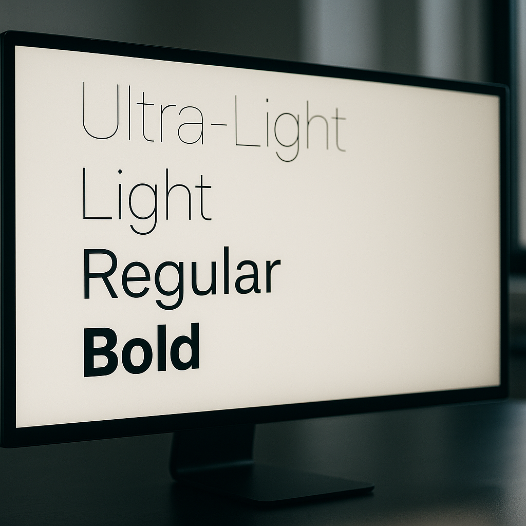
    Monitor displaying variable fonts web design weight axis specimens in a modern studio
    Monitor displaying variable fonts web design weight axis specimens in a modern studio

    What Are Variable Fonts, Exactly?

    A variable font is a single font file that contains an entire design space rather than a fixed snapshot. Instead of separate files for Regular, Medium, SemiBold, Bold, ExtraBold and so on, you get one file with axes that you can interpolate along continuously. The OpenType variable font specification defines several standard axes: wght (weight), wdth (width), ital (italic), slnt (slant), and opsz (optical size). Typeface designers can also define custom axes, which opens up some genuinely wild creative territory. Recursive, a variable font from ArrowType, has an axis called MONO that lets you slide between proportional and monospaced spacing mid-render. That kind of thing simply does not exist in the static font world.

    The spec is maintained by the OpenType consortium and has been supported in Chrome, Firefox, Safari and Edge for years. The Google web.dev documentation on variable fonts is still one of the clearest technical references going, even if you want to go deeper than this article covers.

    Why Variable Fonts Are a Real Performance Win

    Here is the part that tends to surprise people. A single variable font file is not the same size as all those individual static files added together. It is considerably smaller. A typical type family might ship five or six static weight files totalling 300-400 KB combined. The equivalent variable font file frequently comes in under 100 KB, sometimes much less depending on the character set. That is a meaningful reduction in font payload, and on mobile connections, particularly on 4G in rural areas of the UK where speeds can be inconsistent, that matters to real users.

    Beyond raw file size, there is the HTTP request count. Each static font file is a separate request. A variable font is one request. Fewer round trips, simpler caching strategy, less complexity in your <link rel="preload"> logic. It all compounds.

    How to Implement Variable Fonts in CSS

    Implementation is genuinely straightforward. If you are self-hosting a variable font (recommended for performance over relying on a third-party CDN), your @font-face declaration looks like this:

    @font-face {
      font-family: 'Inter';
      src: url('/fonts/Inter-Variable.woff2') format('woff2 supports variations'),
           url('/fonts/Inter-Variable.woff2') format('woff2');
      font-weight: 100 900;
      font-style: normal;
      font-display: swap;
    }

    The font-weight: 100 900 range declaration is what tells the browser this file covers the full weight axis. Once declared, you can use any value in that range in your CSS without downloading anything extra:

    h1 {
      font-weight: 750;
    }
    
    .caption {
      font-weight: 380;
    }

    That is not a typo. 750 and 380 are valid values. You are no longer constrained to multiples of 100. This is the design flexibility part that typographically-minded developers tend to get quite excited about.
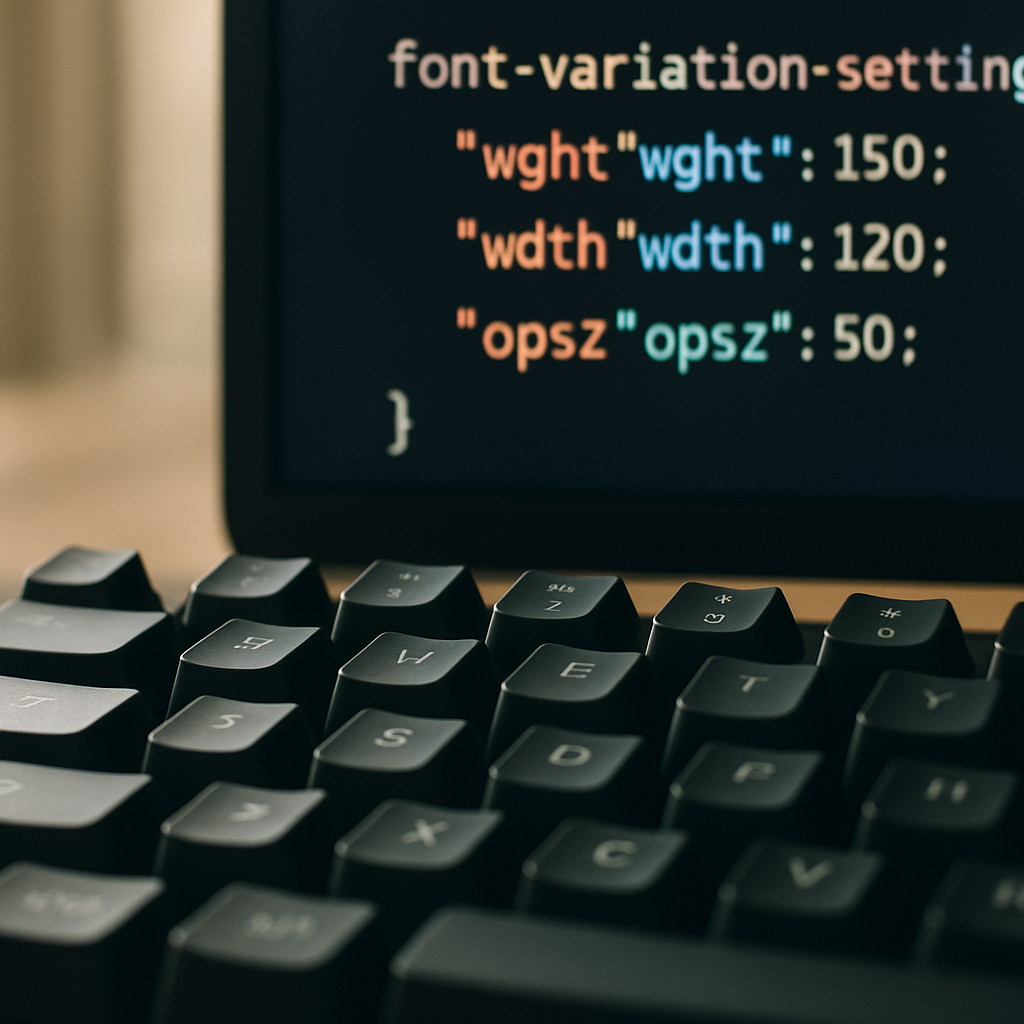
    Developer coding variable fonts web design implementation with CSS font-variation-settings on screen
    Developer coding variable fonts web design implementation with CSS font-variation-settings on screen

    Using Font Variation Settings for Custom Axes

    Standard axes like wght and wdth map to familiar CSS properties. But custom axes require the lower-level font-variation-settings property. Four-letter axis tags in uppercase are custom; lowercase are registered standard axes. Here is an example using a hypothetical font with a custom CASL (casual) axis, which Recursive actually ships:

    body {
      font-variation-settings: 'wght' 400, 'CASL' 0.5;
    }
    
    .pull-quote {
      font-variation-settings: 'wght' 600, 'CASL' 1;
    }

    One gotcha worth knowing: font-variation-settings does not inherit individual values elegantly. If you set it on a parent and override it on a child, you need to re-declare all axes on the child or the unspecified ones snap to their defaults. It is one of those CSS specifics that bites everyone at least once. The workaround is to use CSS custom properties as axis value holders and reference them inside font-variation-settings:

    :root {
      --font-weight: 400;
      --font-casual: 0;
    }
    
    body {
      font-variation-settings: 'wght' var(--font-weight), 'CASL' var(--font-casual);
    }
    
    .pull-quote {
      --font-weight: 600;
      --font-casual: 1;
    }

    Now the child only overrides the custom property it needs to change, and the rest inherit correctly. Tidy.

    Animating Variable Font Axes with CSS

    Because variable font axes are numerical values, they are animatable. You can transition font-variation-settings in CSS, which opens up some genuinely striking UI effects without a single line of JavaScript. A weight transition on hover, for instance:

    .nav-link {
      font-variation-settings: 'wght' 400;
      transition: font-variation-settings 200ms ease;
    }
    
    .nav-link:hover {
      font-variation-settings: 'wght' 700;
    }

    That said, animating font axes is GPU-hungry when done carelessly. Stick to will-change: font-variation-settings on elements you know will animate, and avoid triggering reflows on large blocks of body text. Test on a mid-range Android handset, not just your MacBook Pro, because the render cost can be quite visible on lower-powered hardware.

    Where to Find Good Variable Fonts

    Google Fonts now has a solid and growing variable font catalogue, and all fonts are free to self-host. Fontshare, run by Indian Type Foundry, has some excellent variable options at no cost. For commercial projects with stricter brand requirements, type foundries like Dalton Maag (London-based, work with major UK brands) offer premium variable font licences that include the full axis range. It is worth checking licence terms carefully; some variable font licences restrict the number of axes you can use in web contexts, which is an odd quirk of the industry still working itself out.

    Variable Fonts and Optical Size: The Hidden Gem

    The opsz axis is the one most developers overlook entirely, and it is arguably the most typographically valuable. Optical size adjustments change the actual letterform design, not just scale, based on the intended size of use. A 12px caption and a 60px display heading are rendered at different weights and proportions automatically when font-optical-sizing: auto is set in CSS. This is how type was handled in quality print for centuries, and it has only been feasible on screen since variable fonts arrived. It is the kind of detail that makes a design feel expensive without being able to pinpoint exactly why.

    Is the Performance Argument Still Valid in 2026?

    Some engineers push back and argue that with HTTP/2 multiplexing and aggressive browser caching, the number-of-requests argument is less compelling than it used to be. Fair point. But the file size argument holds up even under that scrutiny. And the design flexibility argument has nothing to do with performance at all; it is purely about what you can build. Being able to set font-weight: 467 to hit exactly the visual weight your brand system specifies, without any extra asset, is just a better way to work. The variable fonts web design case was strong in 2020 when this landed; in 2026 it is essentially inarguable. There is no good reason to be shipping five static font files when one variable file does the same job better.

    If your current project is still on static fonts, running a quick audit with Chrome DevTools’ Network tab filtered to font resources will show you exactly what you are dealing with. The migration path is usually a morning’s work, and the performance uplift in Core Web Vitals, specifically the reduction in render-blocking time from font loading, tends to show up clearly in your Lighthouse scores within a few days of deployment.

    Frequently Asked Questions

    What is a variable font and how does it differ from a regular web font?

    A variable font is a single font file that contains an entire range of weights, widths, and other stylistic variations along continuous axes, rather than fixed snapshots. A regular static font file only contains one specific style, so you need multiple files to cover different weights. Variable fonts give you far more design flexibility with fewer files.

    Do variable fonts actually improve website loading speed?

    Yes, in most cases. A single variable font file is typically much smaller than the combined file size of equivalent static font files, and it requires only one HTTP request instead of several. This reduces page weight and simplifies caching, which can noticeably improve font loading performance, especially on slower mobile connections.

    Are variable fonts supported in all modern browsers?

    Browser support is essentially universal. Chrome, Firefox, Safari, and Edge have all supported the OpenType variable font specification for several years. You may encounter issues only with very old browser versions, but a straightforward fallback using the standard font stack handles those gracefully.

    Where can I find free variable fonts to use on my website?

    Google Fonts has a growing selection of free variable fonts that can be self-hosted. Fontshare by Indian Type Foundry also offers high-quality variable fonts at no cost. For commercial work requiring more distinct typography, foundries like Dalton Maag offer premium licensed variable fonts.

    Can I animate variable font axes in CSS without JavaScript?

    Yes. Because variable font axes are numerical values, CSS transitions and animations work on the font-variation-settings property directly. You can animate weight, width, or any custom axis purely in CSS. Be mindful of performance on lower-powered devices and use will-change sparingly on elements you know will animate.
  • Variable Fonts and the Future of Web Typography: A Developer’s Deep Dive

    Variable Fonts and the Future of Web Typography: A Developer’s Deep Dive

    Typography on the web has been quietly having its best decade ever. And sitting right at the centre of that glow-up is something that, once you understand it, genuinely makes you annoyed that we spent so long without it. Variable fonts are one of those things that sounds like a minor technical curiosity until you actually pull back the curtain and realise the entire approach to loading, rendering, and animating type has fundamentally shifted. If you care about variable fonts web development, buckle in.

    The short version: a variable font is a single font file that contains the entire design space of a typeface. Weight, width, slant, optical size, and any number of custom axes the type designer has chosen to include. All baked into one file. One request. One render. Compare that to the old way of doing things, where you’d load a separate file for regular, bold, italic, bold italic, condensed, and so on. A website with four or five font variants could easily rack up half a megabyte of font requests before a single pixel of content loaded. Variable fonts fix that in an almost embarrassingly elegant way.

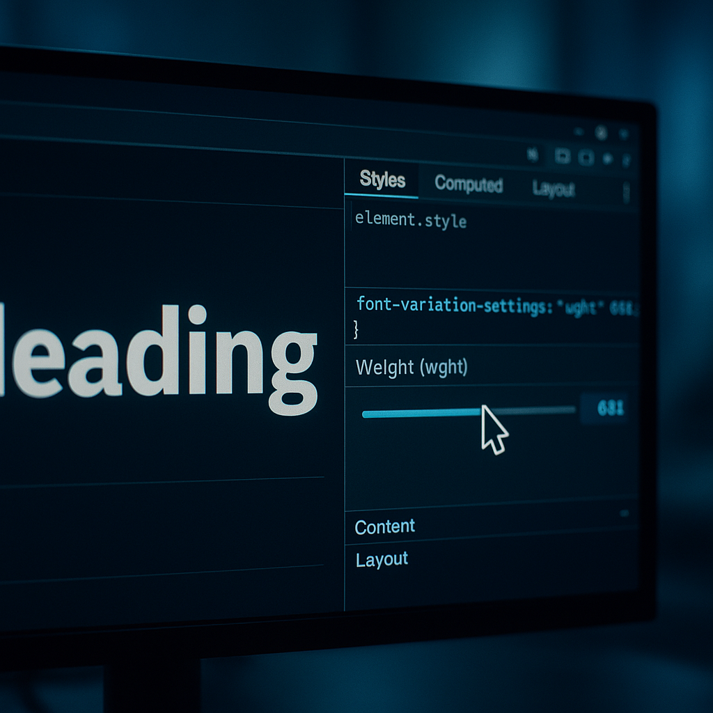
    Developer adjusting variable fonts web development axis in browser DevTools on a studio monitor
    Developer adjusting variable fonts web development axis in browser DevTools on a studio monitor

    How Variable Fonts Actually Work Under the Hood

    The OpenType specification (version 1.8, introduced back in 2016) added what’s called the OpenType Font Variations standard. Inside a variable font file, you have two kinds of data working together. First, you have the default glyph outlines, the master design, usually somewhere in the middle of the design space. Second, you have delta values: instructions that describe how each point in every glyph should move as you travel along a given axis.

    Think of it like a 3D mesh being deformed by invisible handles. The font engine interpolates between these delta states in real time, at render time, on the fly. It’s genuinely clever. A weight axis with a range of 100 to 900 doesn’t store nine separate sets of glyphs. It stores the default outlines plus the instructions for how points shift as weight increases or decreases. The maths is relatively lightweight, and modern rendering engines handle it with barely a blink.

    There are five registered axes in the OpenType spec that you’ll encounter most often: wght (weight), wdth (width), ital (italic), slnt (slant), and opsz (optical size). Beyond those, type designers can register entirely custom axes with four-character tags. The Recursive font, for example, has a MONO axis that morphs the typeface from a proportional sans-serif into a monospaced coding font. That’s not a gimmick. That’s genuinely useful for a codebase where you want visual consistency across UI and code samples.

    Implementing Variable Fonts with CSS: The Practical Bit

    Loading a variable font in CSS is mostly familiar territory, with one important addition. Your @font-face block needs to declare the ranges your font supports, otherwise the browser won’t know it’s variable and may not hand control of the axes over to you.

    @font-face {
      font-family: 'InterVariable';
      src: url('/fonts/inter-variable.woff2') format('woff2 supports variations'),
           url('/fonts/inter-variable.woff2') format('woff2');
      font-weight: 100 900;
      font-style: normal;
      font-display: swap;
    }
    

    That font-weight: 100 900 range is the key signal. It tells the browser this file covers the full weight spectrum. Once loaded, you can do things that would have required multiple files before. Setting font-weight: 350 on a heading, for instance. That’s not a value traditional font stacks could honour. With a variable font, it just works.

    The low-level axis control lives in font-variation-settings. Registered axes use lowercase tags; custom axes use uppercase.

    h1 {
      font-variation-settings: 'wght' 720, 'wdth' 85;
    }
    
    .mono-code {
      font-variation-settings: 'MONO' 1, 'wght' 400;
    }
    

    One thing worth knowing: font-variation-settings doesn’t inherit gracefully the way font-weight does. If you set it on a parent and want to override just one axis on a child, you have to re-declare all the axes. It’s a small gotcha that catches people out. The workaround is to use CSS custom properties as intermediaries, which makes the whole thing considerably cleaner to manage at scale.

    CSS code for variable fonts web development displayed on a laptop screen beside a mechanical keyboard
    CSS code for variable fonts web development displayed on a laptop screen beside a mechanical keyboard

    Animating Variable Fonts with CSS and JavaScript

    Here’s where it genuinely gets fun. Variable font axes are animatable. You can transition weight, width, slant, all of it, with CSS transitions or JavaScript. The results can be subtle and refined or completely unhinged, depending on what you’re after.

    A simple CSS transition on hover:

    .nav-link {
      font-variation-settings: 'wght' 400;
      transition: font-variation-settings 0.2s ease;
    }
    
    .nav-link:hover {
      font-variation-settings: 'wght' 700;
    }
    

    That’s a weight transition on hover, no JavaScript, no extra files. Smooth, performant, a single font request.

    For more dynamic control, JavaScript lets you tie axis values to user input, scroll position, cursor movement, or any other runtime data. A classic demo approach is mapping the mouse Y position to font weight across a heading. In practice, you’d reach for this kind of thing for interactive editorial pieces or portfolio hero sections where you want something genuinely memorable. The browser interpolates every frame, and because the glyph geometry is computed by the font engine rather than the GPU compositing layer, it stays crisp at any size.

    const heading = document.querySelector('h1');
    
    document.addEventListener('mousemove', (e) => {
      const weight = Math.round(100 + (e.clientY / window.innerHeight) * 800);
      heading.style.fontVariationSettings = `'wght' ${weight}`;
    });
    

    Straightforward, effective, and the kind of thing that lands differently in a live demo than it does in a paragraph of text.

    Why Variable Fonts Make Sense for Performance-Conscious Projects

    The performance case is fairly open and shut. Web font loading has historically been one of the trickier things to optimise for Core Web Vitals, particularly Largest Contentful Paint and Cumulative Layout Shift. Multiple font file requests introduce latency and render-blocking risk. A single variable font file, compressed in woff2 format, typically comes in smaller than three or four traditional weight files combined, even though it covers the entire range.

    According to the web.dev documentation maintained by Google’s Chrome team, a variable font can reduce font payload significantly compared to loading multiple static weights, with real-world savings depending heavily on the typeface and how many weights a project actually needs.

    Browser support is no longer a genuine concern in 2026. All modern browsers have supported variable fonts since well before this decade. The only edge case you’d realistically encounter is very old embedded browser environments, and font-display: swap handles graceful degradation there anyway. There’s very little reason not to use them.

    Variable Fonts Worth Actually Using in Projects

    For variable fonts web development work in 2026, a handful of typefaces come up repeatedly because they’re excellent and genuinely free. Inter Variable is practically standard at this point for UI work. Recursive is worth pulling in whenever you need a single typeface to span both interface copy and code samples. Fraunces is a beautiful display font with an optical size axis that makes it genuinely usable across wildly different contexts. All three are available via Google Fonts or direct download, with full variable font support.

    If you want to inspect what axes a font exposes before committing to it, the Wakamai Fondue tool (fondue.underscoretype.com) is the most useful browser-based font inspector I’ve found. Drop a font file in and it tells you everything: axes, ranges, named instances, OpenType features. Proper nerd-level font archaeology.

    The Bigger Picture for Design-Forward Web Work

    Variable fonts aren’t a trend. They’re an infrastructure upgrade. The way the web loads and renders type has genuinely improved, and the design space that opens up when you’re not constrained to a handful of preset weights is larger than it first appears. Fluid typography systems, where font weight and size scale continuously with viewport width rather than jumping at breakpoints, are much more viable when you’re not loading a separate file for each step. Responsive type becomes genuinely responsive, not just responsive-ish.

    The investment to get started is low. Swap one of your static font stacks for a variable equivalent on your next project. Spend twenty minutes with font-variation-settings. See what axis values your chosen typeface supports. The gap between knowing about variable fonts and actually using them confidently is smaller than most people expect, and the results speak loudly.

    Frequently Asked Questions

    What is a variable font and how is it different from a regular web font?

    A variable font is a single font file that contains an entire range of styles along one or more design axes, such as weight, width, or slant. A traditional web font file contains only one fixed style, so loading multiple weights means multiple file requests. A variable font handles all of those in a single download.

    Do variable fonts actually improve website performance?

    Yes, in most real-world cases. A single variable font file in woff2 format is typically smaller than loading three or four separate static weight files combined. Fewer HTTP requests and a smaller total payload generally translate to faster load times and better Core Web Vitals scores, particularly for Largest Contentful Paint.

    How do I use font-variation-settings in CSS?

    You declare it as a CSS property with axis tags and values, for example: font-variation-settings: ‘wght’ 600, ‘wdth’ 90. Registered axes like weight use lowercase four-character tags, while custom axes defined by the type designer use uppercase tags. Be aware that this property doesn’t inherit partially, so changing one axis on a child element requires re-declaring all axes.

    Can you animate variable fonts with JavaScript or CSS transitions?

    Yes, and it works extremely well. The font-variation-settings property is animatable via CSS transitions and animations, or you can update it dynamically with JavaScript tied to scroll position, mouse movement, or any other runtime event. The browser interpolates between axis values smoothly at render time, keeping the output crisp at any size.

    Which variable fonts are best for web projects in 2026?

    Inter Variable is the go-to for most UI work given its readability and comprehensive axis support. Recursive is excellent when you need a single typeface to cover both interface text and monospaced code samples. For display headings, Fraunces offers an optical size axis that adapts elegantly across very different sizes. All three are freely available with full variable font support.