
There is a certain irony in the fact that designers spent years perfecting the art of the sneaky checkbox, the guilt-trip unsubscribe button, and the “are you sure you don’t want to miss out?” pop-up, only for Google to turn around and say: actually, we’re counting all of that against you. Dark patterns, those deliberately manipulative UX tricks designed to confuse, coerce, or trap users, are not just bad ethics. In 2026, they are a measurable ranking liability. The intersection of ethical UX design SEO has gone from niche conversation to genuine commercial concern, fast.

What Are Dark Patterns and Why Did We Ever Think They Were a Good Idea?
Dark patterns are interface design choices that work against users’ interests to benefit the business. The term was coined by UX designer Harry Brignull back in 2010, and the taxonomy he built is still chillingly relevant: roach motels, misdirection, trick questions, hidden costs, disguised adverts. The underlying logic was always short-termist. Trick someone into signing up for a newsletter, and you’ve boosted your mailing list. Bury a pre-ticked subscription box, and you’ve juiced your conversion rate. For a while, that worked. Then it didn’t.
The problem is that users got smarter, regulators got serious, and Google got algorithmic about the whole thing. The UK’s Competition and Markets Authority (CMA) published specific guidance on manipulative online choice architecture, and the ICO began tightening expectations around cookie consent patterns that deliberately make opting out harder than opting in. Meanwhile, Google’s helpful content updates and Core Web Vitals signals started rewarding pages that users actually wanted to stay on. Suddenly, the site with the aggressive pop-up gauntlet wasn’t just annoying: it was losing ground in search.
How Google Detects and Penalises Manipulative UX
Google has never published a clean list labelled “dark patterns we penalise”, but the signals are embedded across several ranking systems. Core Web Vitals includes Interaction to Next Paint (INP), which measures responsiveness: a page plastered with obstructive interstitials that delay meaningful engagement scores poorly. The Intrusive Interstitials penalty, introduced years ago but significantly reinforced in recent updates, specifically targets pop-ups that cover main content on mobile before a user has had a chance to read anything.
Beyond technical signals, Google’s quality rater guidelines describe what “beneficial purpose” looks like. Pages that exist primarily to trap users, inflate dwell time through friction rather than genuine value, or make it nearly impossible to find the exit are flagged as low-quality. User behaviour data feeds into this: if people consistently bounce straight back to the search results after landing on your page, that tells Google something important about the experience you’re delivering. Ethical UX design SEO, in this context, is not a slogan. It is a system of measurable outcomes that good design produces naturally.
What Ethical, User-First Design Actually Looks Like in Practice
Let’s get specific, because “be ethical” is not a design brief. Here is what this looks like when you’re actually building something.
Transparent Consent and Honest Copy
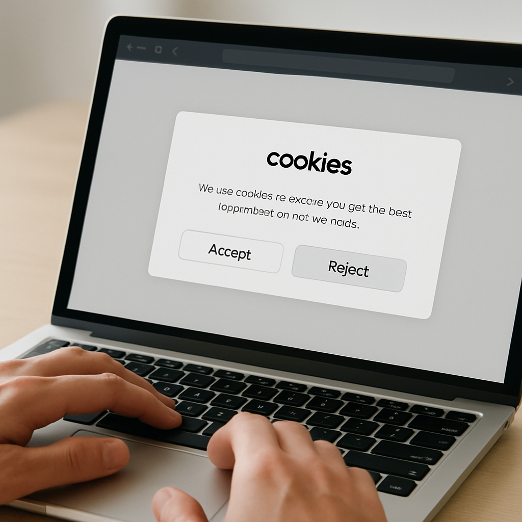
Cookie banners should make it as easy to reject all as to accept all. That is not just an ICO requirement under UK GDPR guidance; it is a trust signal. Users who feel respected stay longer, return more often, and convert more reliably over time. Write your CTAs so they say what happens next. “Start your free trial” is fine. “Get instant access” that leads to a paywall is not.
Navigation That Respects User Intent
Menus should be findable. Search functionality should surface what users are actually looking for. Unsubscribe flows should take one click, not five screens of dark sorcery. I’ve audited apps where the “cancel subscription” path was buried under three different settings categories, each with a misleading label. That’s not clever retention strategy; it’s churn deferred and reputation destroyed.
Confirmshaming Is Over
“No thanks, I don’t want to save money” is not wit. It’s antagonising your user to make them feel guilty about clicking the wrong button. Modern users clock this immediately and it leaves a sour taste. Write your decline options with the same neutral, respectful tone as your accept options. The difference in conversion is negligible. The difference in brand perception is not.
Accessible Defaults and Honest Pricing
Pre-selected options should default to the user’s benefit, not yours. Hidden charges that appear at checkout are one of the UK’s most complained-about e-commerce practices, regularly cited by Which? and consumer groups. Showing the full price upfront, including VAT, is not only best practice under UK Consumer Rights obligations; it reduces cart abandonment because users aren’t ambushed at the final step.
The Regulatory and Reputational Stakes in the UK
The CMA’s investigation into online choice architecture resulted in firms being required to redesign subscription flows that obscured cancellation. The ICO has taken action against cookie walls that made consent effectively meaningless. The Advertising Standards Authority has tackled misleading urgency timers showing fake countdown clocks on product pages. These are not abstract risks. UK-based designers and product teams are operating in a regulatory environment that has clearly decided manipulative UX is a consumer harm, not a clever growth hack.
The reputational dimension matters just as much. Trust is a compound asset. It takes years to build through consistent, honest design and seconds to crater with one viral thread about your subscription dark pattern. The BBC’s coverage of subscription trap complaints has driven real user behaviour change, with people actively checking cancellation terms before signing up. That means your ethical design choices are now a genuine acquisition differentiator, not just a compliance checkbox.
For a well-structured breakdown of what constitutes legitimate and illegitimate consent mechanisms under UK GDPR, the ICO’s consent guidance is the definitive starting point for any UK-based design team.
Measuring Ethical Design: Metrics That Actually Matter
If you’re making the case internally for stripping out dark patterns, these are the numbers to watch. Task completion rate tells you whether users can do what they came to do without friction. Rage clicks (tracked in tools like Hotjar or Microsoft Clarity) reveal where your interface is confusing or frustrating users. Unsubscribe and cancellation completion rates show whether your offboarding respects user autonomy. And organic search performance over time will reflect whether Google’s quality signals are moving in the right direction.
The shift toward ethical UX design SEO is not a soft, feels-good trend. It is a convergence of regulatory pressure, algorithmic incentive, and measurable user behaviour change. Google rewards pages that users find genuinely useful and respectful. Regulators penalise interfaces that manipulate. Users actively punish brands that treat them as targets rather than people. The dark pattern playbook was always borrowing against future trust; in 2026, the debt is being called in. The designers and product teams who treat ethics as a design constraint rather than an inconvenience are building products that rank better, convert more honestly, and last longer. That’s not idealism. That’s just good engineering.
Frequently Asked Questions
Does ethical UX design actually affect Google rankings?
Yes, indirectly but meaningfully. Google’s Core Web Vitals, Intrusive Interstitials penalty, and helpful content signals all reward experiences where users can easily accomplish their goals without friction or manipulation. Pages that trap, confuse, or mislead users tend to generate poor behavioural signals like high bounce rates and low dwell time, which feed into ranking quality assessments.
What are the most common dark patterns still used on UK websites in 2026?
The most widespread include hard-to-find cancellation flows, pre-ticked marketing opt-in boxes, fake countdown timers creating false urgency, cookie banners that make rejecting harder than accepting, and hidden charges appearing only at checkout. Several of these are under active scrutiny from the CMA and ICO in the UK.
How do I know if my website or app uses dark patterns?
Run a task-based audit: ask a real user to subscribe and then cancel, or find the privacy settings. Record where they get stuck, confused, or frustrated. Tools like Hotjar, Microsoft Clarity, or simple usability testing sessions reveal friction points that often turn out to be inadvertent or deliberate dark patterns. User feedback and support tickets flagging the same navigation problems repeatedly are also strong signals.
Can dark patterns get my business fined in the UK?
Yes. The ICO can take enforcement action over non-compliant cookie consent mechanisms under UK GDPR. The CMA has powers to require businesses to redesign interfaces that constitute harmful online choice architecture. The ASA can act against misleading urgency tactics in advertising. Fines, enforcement notices, and public naming are all live risks for UK businesses.
What is the difference between persuasive design and a dark pattern?
Persuasive design nudges users towards a choice that genuinely serves their interests or at least doesn’t harm them; think clear benefit-focused CTAs or streamlined checkout flows. Dark patterns use that same psychological toolkit to coerce users into choices that benefit the business at the user’s expense, such as trapping them in subscriptions or obscuring costs. The key test is: if the user fully understood what was happening, would they feel deceived?