Dark mode has graduated from a novelty toggle to a genuine design discipline. Almost every major platform — iOS, Android, Windows 11, macOS — ships with it built in, and users expect it. But here is the thing: slapping a dark background behind your existing UI is not dark mode design. It is dark mode chaos. Getting it right means understanding how light, colour, and contrast behave differently when the canvas flips, and there are specific dark mode design best practices that separate the polished from the painful.

Why Dark Mode Is Harder Than It Looks
The assumption most developers make is that dark mode is roughly the inverse of light mode. Swap white for near-black, swap dark text for light text, ship it. Except human vision does not work like a colour picker. On a light interface, our pupils constrict slightly. On a dark interface, they dilate. That shift changes how we perceive colour saturation, edge definition, and fine typographic detail. Colours that look perfectly saturated on a white background can appear garish and vibrating on dark grey. Typography that reads crisply at regular weight suddenly looks too thin. These are not aesthetic opinions; they are physiological realities.
Then there is the accessibility dimension. The Web Content Accessibility Guidelines (WCAG) specify minimum contrast ratios: 4.5:1 for body text and 3:1 for large text and UI components. These ratios apply just as strictly in dark mode, and in practice they are easier to violate. A light grey on a slightly lighter dark background can feel visually distinct to someone with perfect vision while failing the contrast check entirely for someone with a visual impairment. Tools like the Paciello Group’s Colour Contrast Analyser (free, Windows and macOS) are genuinely useful here and worth keeping in your toolkit.
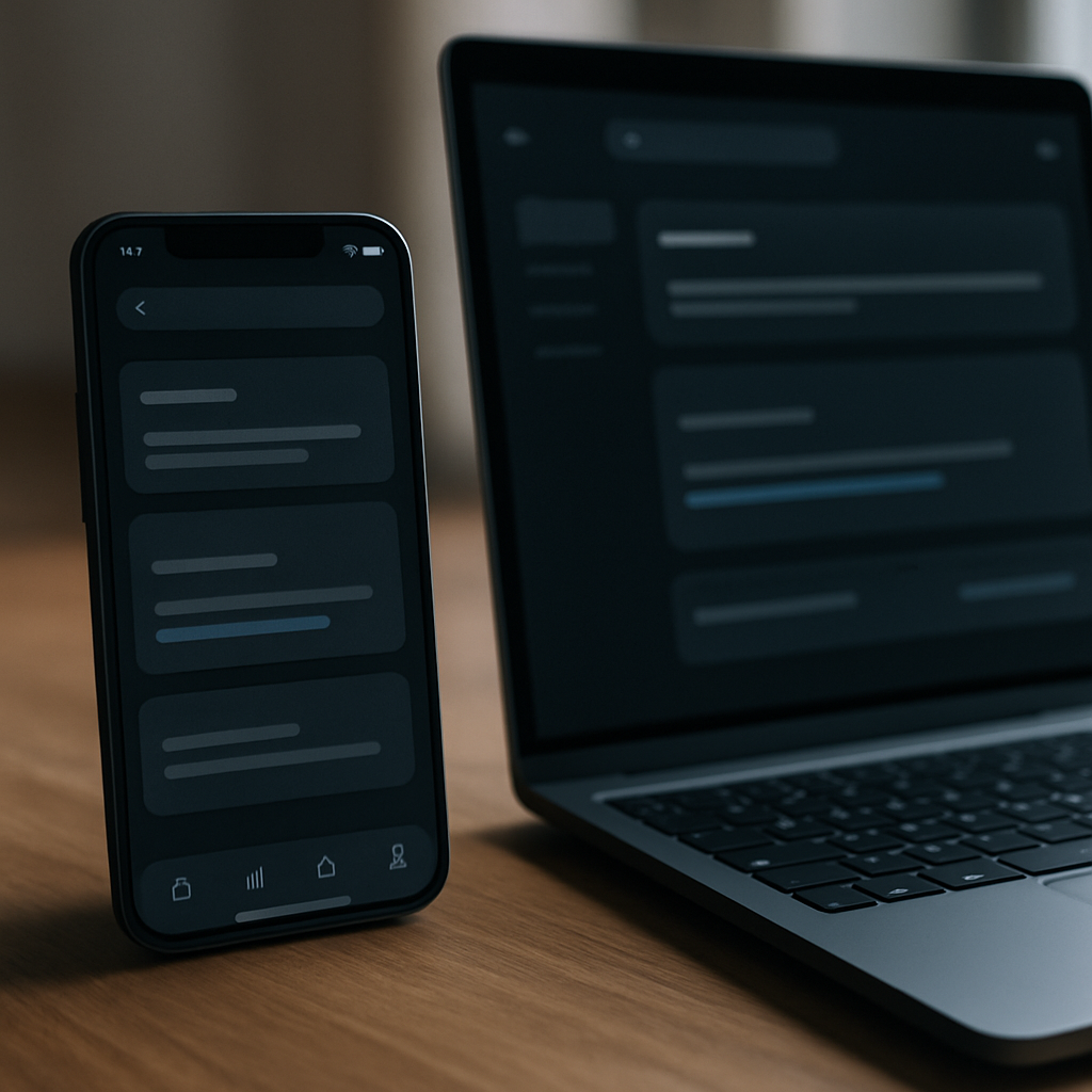
Choosing the Right Background Colours
Pure black (#000000) is almost never the right call. It creates an extreme luminance contrast that causes visual halation, a phenomenon where bright text on absolute black appears to bleed or glow at the edges. This is particularly noticeable on OLED displays, which are everywhere now. Google Material Design recommends #121212 as a baseline dark surface. Apple’s Human Interface Guidelines use a layered system of near-blacks and dark greys to create depth.
The practical approach is to build a surface scale: a base colour around 8-12% lightness in HSL, then stepped layers at 14-16%, 18-20%, and so on. Each layer represents an elevation in your UI. Cards sit slightly lighter than the base. Modals sit slightly lighter than cards. This creates a sense of hierarchy without using shadows (which work poorly on dark backgrounds). The difference between each step should be subtle, roughly 5-8% lightness, enough to perceive without creating jarring jumps.
Dark Mode Colour Theory: Desaturate Everything
This is the rule most people skip, and it is why their dark UIs look like a rave flyer. Brand colours and accent colours that look great in light mode are almost always too saturated for dark mode. A vivid blue at full saturation on a light background reads as confident and clear. On a dark background, it screams. The fix is to desaturate and slightly lighten your accent colours for dark mode. If your brand blue is hsl(220, 80%, 50%) in light mode, try something closer to hsl(220, 50%, 65%) for dark mode. You get the same hue identity with far less visual noise.
The same logic applies to status colours. Error reds, success greens, and warning yellows all need adjustment. Fully saturated red on near-black is practically unusable for anything beyond a brief flash. Bring the saturation down, bring the lightness up, and you get something that communicates urgency without being physically uncomfortable to look at.
Typography in Dark Mode: Weight and Spacing Matter
Text rendering on dark backgrounds is genuinely tricky. On light backgrounds, letterforms are defined by dark ink on a bright field. On dark backgrounds, the relationship inverts, and thin strokes in a typeface can disappear or appear broken, especially on non-retina displays. The practical implications are straightforward: avoid thin or extra-light font weights for body text in dark mode. Regular and medium weights hold up far better. If you are using a variable font, consider bumping the weight axis by 50-100 units specifically for your dark mode stylesheet.
Letter spacing is worth revisiting too. Slightly increased tracking, around 0.01em to 0.02em on body text, can improve legibility on dark backgrounds. It is a small change but it compounds across paragraphs. Equally, do not go to pure white (#FFFFFF) for your body text. It is too bright against dark greys and contributes to eye fatigue over long reading sessions. A slightly off-white like #E8E8E8 or #F0F0F0 brings down the harshness while maintaining a perfectly comfortable contrast ratio.
Handling Images, Illustrations, and Icons
Images with white or near-white backgrounds become glaring rectangles in dark mode. The options are: use transparent PNGs or SVGs wherever possible, apply a subtle border-radius and a low-opacity border to separate image edges from the background, or use CSS filters like brightness(0.9) as a mild global dimming on images in dark mode. None of these are perfect solutions for every case, but using transparent assets by default is the cleanest approach and saves you problem-solving later.
Icons deserve specific attention. Outlined icon sets often look visually heavier in dark mode because the stroke appears brighter than expected. Test your icon set in both modes early in the design process. Sometimes switching from outline to filled icons for dark mode, or offering both as a toggle, is the right answer depending on your UI density.
Common Mistakes Developers and Designers Still Make
Beyond the theoretical, there are specific implementation errors I see repeatedly in code review and design critiques. First: hardcoding colours instead of using a token or custom property system. If your dark mode colours are scattered across a stylesheet rather than defined as CSS custom properties and toggled at the :root level via a [data-theme="dark"] attribute or the prefers-color-scheme media query, you will spend weeks untangling it when the design changes.
Second: ignoring the system preference altogether. The prefers-color-scheme media query has excellent browser support now, above 96% globally according to Can I Use. Not hooking into it means users with system-level dark mode enabled get a blinding light UI before they can find your manual toggle. Respect the preference by default; let users override it if they want.
Third: forgetting focus states. Keyboard navigation focus rings that look fine in light mode can become almost invisible in dark mode if they rely on dark outlines. Make sure your :focus-visible styles use a colour with sufficient contrast in both modes. This is both an accessibility requirement and just decent design.
Testing Dark Mode Properly
Browser DevTools now include dark mode simulation. In Chrome, open DevTools, go to the Rendering tab, and set the emulated CSS media feature to prefers-color-scheme: dark. Firefox has the same capability. Use this constantly. Also test on actual devices: a phone screen at medium brightness in a dimly lit room is the canonical dark mode use case, and it reveals issues that a calibrated monitor in a bright studio will hide.
Getting dark mode right is not about following a single rule; it is about understanding that every design decision has a different weight when light and dark swap roles. Spend the time on your colour tokens, check your contrast ratios religiously, and treat dark mode as a first-class design target rather than a theme you bolt on at the end. Your users, especially those using your app at midnight with one eye open, will genuinely thank you for it.
Frequently Asked Questions
What contrast ratio do I need for dark mode to pass accessibility standards?
WCAG 2.1 requires a minimum contrast ratio of 4.5:1 for normal body text and 3:1 for large text (18pt or 14pt bold) and UI components. These requirements apply equally in dark mode, and are just as easy to fail if you use mid-toned greys carelessly. Always verify with a contrast checker tool rather than relying on your eyes alone.
Should I use pure black as the background in dark mode?
Generally no. Pure black (#000000) creates extreme luminance contrast that causes a halation or glow effect around bright text, particularly on OLED screens. Most design systems, including Google Material Design, recommend a very dark grey around #121212 as the base surface colour, which is far more comfortable for extended viewing.
How do I handle brand colours that look too bright in dark mode?
Desaturate and slightly lighten your brand accent colours specifically for dark mode. A fully saturated colour at 80% saturation on a dark background can appear aggressive and hard to look at. Reducing saturation to around 50% and increasing lightness by 10-15% preserves the hue identity while making the colour feel comfortable in a darker environment.
What is the best way to implement dark mode in CSS?
Define all your colours as CSS custom properties on the :root element, then override them inside a [data-theme=’dark’] attribute selector or a prefers-color-scheme: dark media query. This approach centralises all your colour tokens, makes switching seamless, and keeps your stylesheets maintainable as the design evolves.
Do I need separate typography settings for dark mode?
It is worth considering, yes. Thin and extra-light font weights can lose definition on dark backgrounds, so bumping to regular or medium weight for dark mode body text improves legibility. Slightly increasing letter spacing by around 0.01-0.02em and using an off-white like #E8E8E8 rather than pure white also reduces eye fatigue during extended reading.