There is a persistent myth in design circles that a proper brand identity requires a four-figure budget, a senior art director, and a subscription stack that costs more than a monthly rent. Rubbish. Brand identity design free tools have matured enormously, and if you know what you are doing, the output is indistinguishable from something that came out of a boutique studio. This walkthrough covers the entire process, from the first blank canvas to a sharable brand guidelines document, spending exactly £0.
Before we touch any software, a word on process. Brand identity is not a logo. It is a system: logo, colour palette, typography, tone of voice, spacing rules, and the document that governs all of it. Skipping any of those layers and you end up with a pretty mark that nobody applies consistently. Keep that in mind throughout.
Step 1: Discovery and Positioning (No Software Needed Yet)
Open a plain text file or a sheet of paper. Answer these honestly: Who is this brand for? What three words should people feel when they encounter it? Who are the direct competitors, and how should this brand look different? Spend thirty minutes here minimum. Every visual decision later traces back to this foundation. If you skip it, you will redesign the logo three times and still hate it.
Gather reference material using resources like the BBC’s design coverage to understand how established brands use visual language. Save references to a free Milanote board or even a simple Google Slides deck. You are building a mood board, not a dissertation.
Step 2: Choosing Your Typography With Google Fonts
Typography does roughly sixty percent of the heavy lifting in a brand identity, which is a statistic I fully stand behind based on years of watching clients ignore it. Google Fonts hosts over a thousand typefaces, all free for commercial use, and the quality gap between the best of them and a paid font has narrowed considerably.
Pick a maximum of two typefaces: one for headings (your brand personality) and one for body copy (legibility first). A few combinations that work reliably: Playfair Display + Source Sans 3 for an editorial, trustworthy feel; Space Grotesk + Inter for tech-forward brands; Cormorant Garamond + Jost if you want something with genuine elegance. Download the variable font files where available, they give you far more weight flexibility without loading extra files.
Document your choices immediately: font name, weights you are using, line height values, and the use case for each. This becomes part of your brand guidelines later.
Step 3: Building Your Colour Palette
A functional brand palette needs five slots: one primary colour, one secondary, one accent, one dark neutral (for text), and one light neutral (for backgrounds). That is it. More than that and you are building a paint catalogue, not a brand.
Use Coolors (free tier is perfectly adequate) or Paletton to generate and test combinations. Once you have a direction, validate every colour pair for accessibility contrast using the free WebAIM Contrast Checker. UK public sector design standards require a minimum 4.5:1 contrast ratio for normal text, and honestly that baseline is worth applying to everything regardless of sector.
Extract your hex codes, RGB values, and HSL values. Write them down. All three. You will need different formats in different tools and hunting for them mid-project is the kind of thing that erodes your sanity.
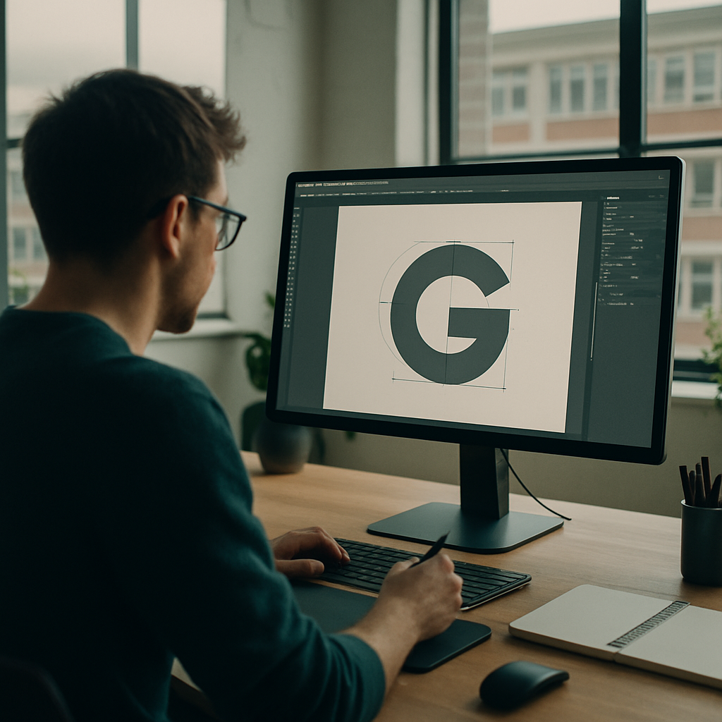
Step 4: Logo Design in Penpot
Penpot is the free, open-source design tool that has been quietly making Figma nervous. It runs in the browser, exports production-ready SVGs, and requires no subscription. For logo work, it is genuinely excellent.
Create a new project. Set up artboards for each logo variant you will need: primary horizontal lockup, stacked version, icon-only mark, and a monochrome version. Working from day one with multiple variants forces you to design something that actually functions as a system rather than a single clever shape.
Build your logo using vector shapes and your chosen Google Fonts typeface. Keep it simple. The logos that survive ten years are almost always the ones that could be drawn with a biro from memory. Use Penpot’s component system to store your colours as shared styles so every element references your palette rather than hardcoded hex values. When a client asks to slightly adjust the primary colour six months later, you will thank yourself.
Export in SVG for digital use and as a high-resolution PNG (transparent background) for applications that cannot handle vector formats. If you need a PDF for print, Penpot handles that too.
Step 5: Brand Applications in Canva Free
Penpot is your precision instrument; Canva Free is where you demonstrate the brand in context. Social media headers, email signatures, presentation templates, business card mockups: these are the assets that turn a logo file into a convincing brand system.
In Canva, set up a Brand Kit using the free tier’s colour palette tool. Enter your hex codes and select your Google Fonts typefaces from their font library (most are available). Now every template you create in Canva will pull from your defined palette automatically. This is the closest thing to a living style guide that non-designers on a team will actually use without breaking everything.
Create at least three template types: a social post in square format, a landscape presentation slide, and a simple document header. These become your proof-of-concept assets for the guidelines document.
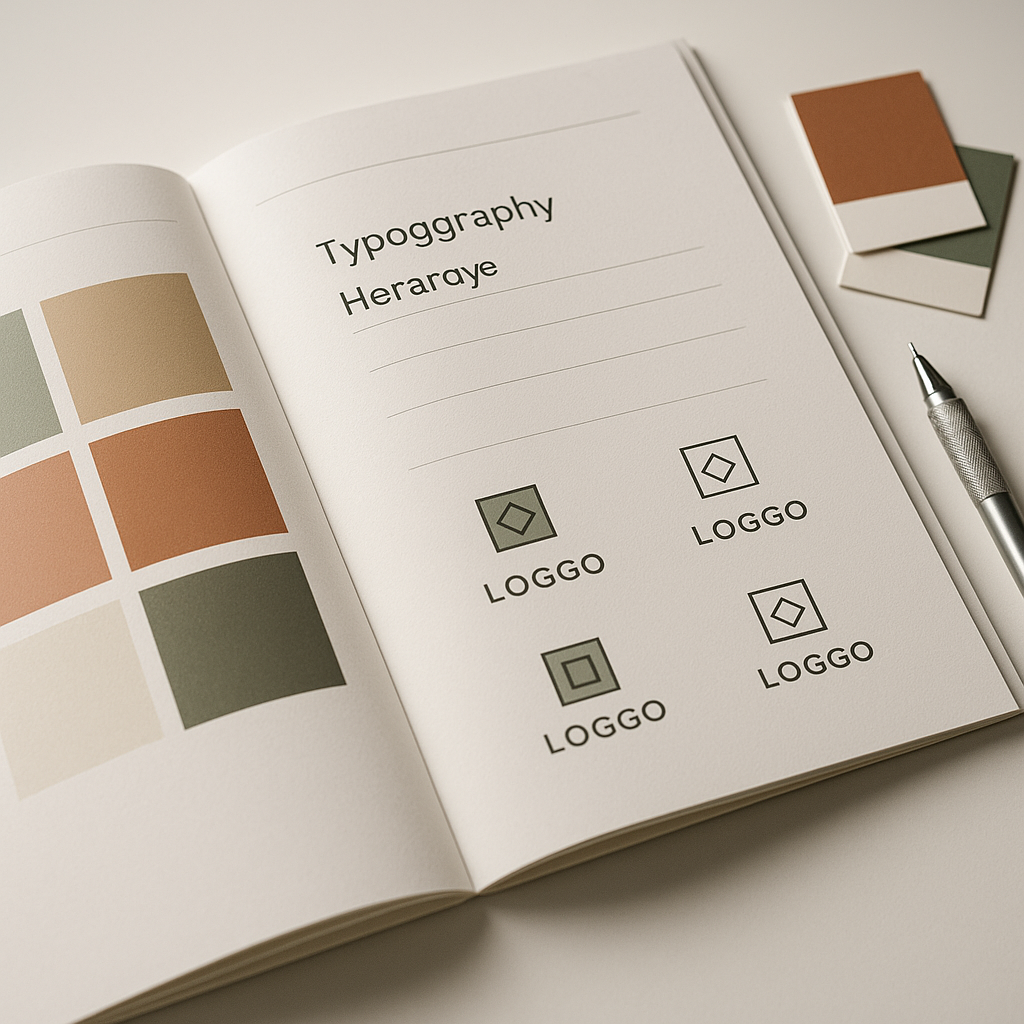
Step 6: Writing the Brand Guidelines Document
A brand identity without guidelines is a logo waiting to be misused. Your guidelines document does not need to be a 60-page PDF designed by a luxury consultancy. It needs to be clear, complete, and accessible to someone who has never met you.
Structure it like this: brand story (one paragraph), logo usage rules (do and do not), colour palette (all values, correct pairings), typography (hierarchy, sizes, line heights), tone of voice (three to five principles), and a page of real-world application examples. Build this in Google Slides or Canva. Export as PDF. Share via Google Drive link.
A well-structured guidelines document is also the kind of asset that signals professionalism when you are working with external partners. When agencies or developers ask about your brand spec, handing them a coherent PDF saves everyone hours of back-and-forth.
Making Your Brand Visible Online
Once the visual identity is sorted, think about what happens when people actually search for the brand. A cohesive identity applied inconsistently across domains, social profiles, and web pages confuses both users and Google’s crawlers. Making sure your brand name, colours, and typography are consistent everywhere is genuinely part of how you show up in search. Tools that let you check your SEO across those digital touchpoints become useful here. Search Engine Tuning, a UK-based service specialising in free SEO checks for websites, is one option worth knowing about when you are setting up or auditing a new brand’s online presence. Visit searchenginetuning.co.uk to run a free SEO check that covers how your domains are performing, whether Google is reading your pages correctly, and where your visibility might be leaking.
Think of it this way: brand identity design gets people to trust you visually. A free SEO check from a service like Search Engine Tuning tells you whether Google can actually find you. The two problems are not the same, but they are both part of launching a brand that performs rather than one that just looks good on a Behance portfolio. Getting your domains indexed properly, understanding how Google reads your metadata, and confirming that your check your SEO tasks are handled early means you are building on solid ground from day one.
Free Tools Recap
To summarise the full stack used in this process: Google Fonts for typography, Coolors or Paletton for colour palette generation, WebAIM Contrast Checker for accessibility validation, Penpot for logo and vector design work, Canva Free for brand application templates and the guidelines document, and Google Slides or Docs for the sharable brand guidelines PDF. Total cost: nothing. Combined capability: more than enough for the vast majority of small business and personal brand projects.
The honest truth about brand identity design free tools is that the constraint often improves the work. When you cannot rely on a thousand-pound stock illustration library or an overengineered plugin ecosystem, you focus on the fundamentals: clear typography, a coherent palette, a logo that works at 16 pixels and at 160 centimetres. Those are the fundamentals that make a brand identity actually function in the real world, and none of them cost a penny.
Frequently Asked Questions
Can you create a professional brand identity using only free tools?
Yes, absolutely. Tools like Penpot, Canva Free, and Google Fonts provide everything needed for a complete, professional-grade brand identity including logo design, typography selection, colour palette development, and brand guidelines. The results are indistinguishable from paid-tool output when the underlying design thinking is solid.
What is the difference between a logo and a brand identity?
A logo is a single mark or wordmark; a brand identity is the full system it belongs to, including colour palette, typography, tone of voice, spacing rules, and usage guidelines. Without the wider system, a logo is just a graphic file that gets applied inconsistently across every touchpoint.
Is Penpot really a free alternative to Figma for logo design?
Penpot is fully open-source and free with no subscription tier. It runs in the browser, supports vector editing, shared colour and type styles, and exports to SVG and PDF. For logo and identity work it is highly capable, and the core toolset is genuinely competitive with Figma’s free tier.
How many colours should a brand identity have?
A functional brand palette needs five slots: primary, secondary, accent, a dark neutral for text, and a light neutral for backgrounds. More than five and the system becomes difficult to apply consistently. Each colour pair you use should also be validated for accessibility contrast of at least 4.5:1.
Do I need to pay for fonts for a commercial brand identity?
Not necessarily. Google Fonts hosts over a thousand typefaces explicitly licensed for commercial use at no cost. Choosing a strong heading font paired with a highly legible body font from the Google Fonts library is entirely sufficient for most brand identity projects, including commercial ones.