

I’ve spent more time than is professionally advisable picking apart how the BBC iPlayer interface works. Not watching content on it, mind you. Actually staring at hover states, tab-order behaviour, loading skeletons, and the way the navigation rail collapses on a 40-inch telly versus a 320px mobile viewport. The BBC iPlayer UI design principles UK product teams should be studying are genuinely embedded in every screen of that product, and I want to drag them out properly.
This is a teardown, not a fan letter. Where iPlayer does something brilliantly, I’ll say so. Where there’s a head-scratching inconsistency, that’s going in too. Either way, there’s a stack of transferable thinking here that most UK product teams would benefit from nicking.
How iPlayer handles content discovery without overwhelming you
Content discovery is probably the hardest design problem in streaming. You have thousands of titles, a user with forty-five seconds of patience, and a recommendation system that may or may not know them well yet. iPlayer’s solution is surprisingly restrained given the scale of the BBC’s catalogue.
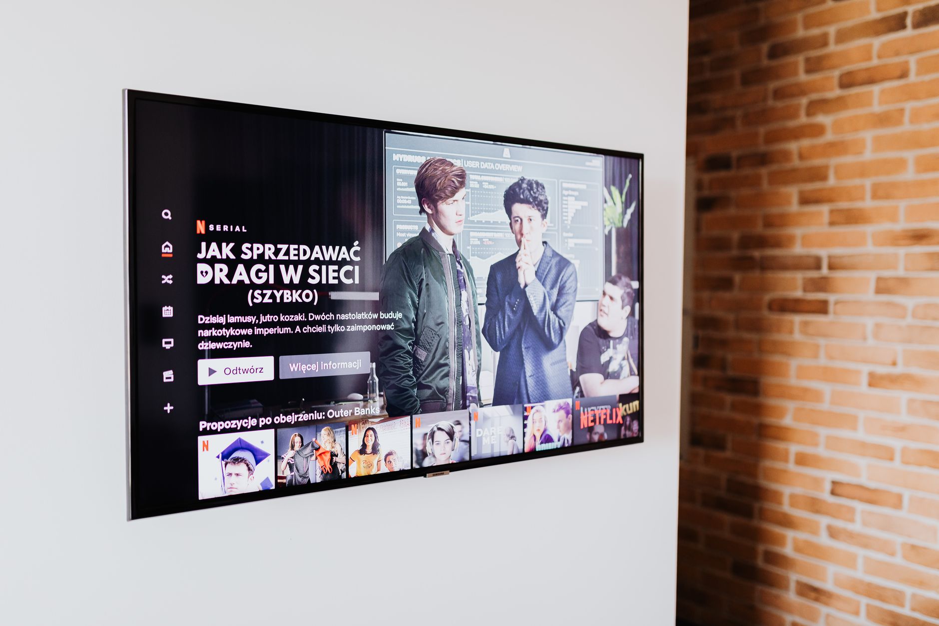
The homepage is structured as a progressive hierarchy. The hero slot anchors attention, but it’s not auto-advancing like Netflix’s carousel assault on your focus. Below it, content rows are labelled with actual editorial intent: “Catch Up”, “Recommended for You”, “New Arrivals”. These are not clever algorithmic names. They’re plain English labels that tell you immediately what logic organised them. That’s a design decision, not a default.
I’d argue the most important part of the discovery UI is what iPlayer refuses to do. There are no autoplay trailers on hover in the web interface. There’s no “you have 5 seconds before the next episode starts” pressure mechanic unless you’ve opted into it. That restraint lowers cognitive load measurably, and it respects the fact that a significant portion of the BBC’s audience, covered thoroughly in the over-55 audience design piece on this blog, find high-density motion interfaces actively hostile.
Accessibility as a structural decision, not a retrofit
The BBC publishes its own accessibility standards, the BBC Accessibility Standards and Guidelines, which sit alongside WCAG 2.2. That’s not marketing copy. You can see the results of it directly in iPlayer’s codebase: focus states that are actually visible (not that 1px dashed outline browsers default to), semantic HTML that makes keyboard navigation feel deliberate rather than accidental, and live subtitle rendering that works across every surface including smart TVs where most streaming services just… don’t bother.
The subtitle implementation is worth a short paragraph on its own. iPlayer’s subtitles render as HTML text overlaid on the video container rather than burned into the video stream. That means font size, colour, and background opacity are all user-adjustable. It also means the subtitle DOM is accessible to screen readers in certain configurations. That’s technically more complex to implement than a static .vtt file being displayed, and the BBC chose to do it anyway. That’s what “accessibility as infrastructure” looks like rather than accessibility as checkbox.
If your product team is still treating accessibility annotations as a final design-handoff step, iPlayer is a case study in why that approach breaks down. The accessibility behaviour here is inseparable from the component architecture. You can’t retrofit it cleanly. Build it in or spend twice the effort later. This connects to the same reasoning I wrote about in the icon design system teardown, where icon meaning and accessibility labelling need to be decided at the system level, not icon by icon.
Multi-device consistency and where it gets complicated
iPlayer runs on an extraordinary range of surfaces. A 2013 Samsung smart TV, a current-gen PlayStation, a 320px Android handset, a desktop browser, and an iPad all need to present the same content catalogue through fundamentally different interaction paradigms. That is an engineering and design problem most product teams never encounter at this scale, but the principles iPlayer uses to solve it are still directly applicable.
The key move is abstracting the design system away from the input model. The layout responds not just to screen size but to inferred input type: pointer (mouse/trackpad), touch, or remote/d-pad. The navigation rail behaviour changes meaningfully between these modes. On a remote-controlled TV interface, every interactive element needs to be reachable via directional navigation without any pointer. iPlayer’s focus management logic handles this without the user ever thinking about it.
For most product teams the relevant principle is this: design for your secondary device first. iPlayer’s constraints from TV remote navigation have made the whole interface more keyboard-accessible by necessity. That’s a good trade. If you’re building a web app and keyboard navigation is an afterthought, try designing the component interaction model for a d-pad first and then add pointer support on top. The resulting component will be cleaner.
Performance design and the perception of speed
iPlayer’s actual page performance is not perfect. Run it through WebPageTest on a throttled 4G connection and you’ll see a real-world LCP that could be sharper. But the perceived performance is well managed, and that distinction matters more to users than a 100/100 Lighthouse score.
The loading skeleton UI is implemented with care. Skeletons match the aspect ratios of the content cards they’re replacing, including the 16:9 thumbnail, the title line, and the metadata line. When content loads, there’s no layout shift. The skeleton was drawn to the correct dimensions. This is a WCAG-adjacent win but also just good engineering; it prevents the cascading reflows that trash Core Web Vitals scores and make pages feel broken to users even when the content eventually renders correctly.
Image delivery on iPlayer also uses responsive sizing properly. The BBC’s image service appends dimension parameters to thumbnail URLs so the browser receives an image at the correct resolution for the current viewport. I’ve seen mid-sized UK product teams serving 1200px wide thumbnails inside 240px card slots. That’s not just a performance problem; it’s a data usage problem for mobile users on capped plans, which the Ofcom Connected Nations report consistently shows is still a significant real-world concern in the UK outside major city centres.
The design system thinking underneath it all
The BBC’s GEL (Global Experience Language) design system is public, and it’s worth reading even if you’re not building a product that touches the BBC at all. GEL is the spine of iPlayer’s consistency. Components are defined with explicit spacing, type scales, and interaction states at the system level. Individual feature teams don’t design new card components from scratch; they pull from GEL.
That’s the transferable bit. The specific components in GEL don’t matter to your product. The structure of the thinking does. When a design decision is made once at the system level and then pulled into features rather than reinvented per screen, you ship faster, the product feels more coherent, and edge cases (like that 320px viewport on a cheap Android handset) get solved once and inherited everywhere.
If your team is still at the stage of building a design system, the TypeScript for designers piece is worth reading alongside this one, because codifying your tokens and component contracts in a typed system is what prevents GEL-style consistency from decaying over time as teams grow.
The BBC iPlayer UI design principles UK teams should extract aren’t magic. They’re the result of treating design constraints as opportunities, building accessibility into architecture, and refusing to optimise for engagement metrics that make interfaces worse. That combination is rarer than it should be, and iPlayer is one of the cleaner examples of it on any screen in the country.
Leave a Reply